Tag Archives: geotagging

Maps on news websites – an overview

The following is part of a chapter for a forthcoming book on online journalism. Contributions welcome.

Maps have become a familiar part of the news language online due to a number of advantages:

  • They provide an easy way to grasp a story at a glance
  • They allow users to drill down to relevant information local to them very quickly
  • Maps can be created very easily, and added to relatively easily by non-journalists
  • Maps draw on structured data, making them a very useful way to present data such as schools tables, crime statistics or petrol prices
  • They can be automated, updating in response to real-time information

News organisations have used maps in a number of ways: Continue reading

Kitemarks to save the news industry? Q&A with Andrew Currah

Reuters recently published a report entitled: ‘What’s Happening to Our News: An investigation into the likely impact of the digital revolution on the economics of news publishing in the UK‘. In it author Andrew Currah provides an overview of the situation facing UK publishers, and 3 broad suggestions as to ways forward – namely, kitemarks, public support, and digital literacy education.

The kitemark idea seems to have stirred up the most fuss. In the first of a series of email exchanges I asked Currah how he saw this making any difference to consumption of newspapers, and how it could work in practice. This is his response:

Yes, the kitemark idea has triggered quite a response… Unfortunately, as the discussion online suggests, the term has implied to many a top-down, centralised system of certification which would lead to some form of
‘apartheid’ between bloggers and journalists. Continue reading

Maps, mashups and multimedia: online journalism students tackle interactivity

Alice Fanning's map of UK eco stories

Alice Fanning's map of UK eco stories

As a new semester begins it seems a good time to finally post about how my second year journalism degree students approached the ‘interactive’ element of their portfolio way back in May (yes, everything they do is interactive, but bear with me).

For the first time I gave them an open brief in terms of what they did interactively (in previous years I asked them to produce Flash interactives). Having been taught how to create everything from audio slideshows and image maps to multimedia interactives, Google Maps and Yahoo! Pipes mashups, I was curious to see what they would pick. Would they all plump for the same option? Continue reading

Why fantasy football may hold the key to the future of news

This season, after years of loyalty to the BBC/Channel 4 fantasy football competition, I’ve switched to The Guardian’s. Their game takes advantage of the reams of player data now available to newspapers – not just goals scored, clean sheets and assists, but also clearances, interceptions, tackles, shots on target, and so on, making for a very different challenge indeed.

The move mirrors that made by The Telegraph a year ago when they introduced a Flash element to their match reports that allowed you to look at an incredible range of match statistics. As I wrote at the time: it’s like having your own ProZone.

What’s all this got to do with the future of news? This: data. It’s one of the few advantages that news organisations have, and they should be doing more with it. What the Guardian fantasy football and the Telegraph demonstrate is the flexibility of that data.

And if we can do it in sport, why aren’t we doing it more elsewhere? Schools tables, pollution records, crime data, geotagged information, and election results are just a few that spring to mind – can you add some more?

For a good example of a particularly creative use of data (again with a sport twist), see Channel 4’s alternative Olympics medals table, which matches medals results against various other country stats, such as human rights record.

Oh, and by the way, if you want to join my fantasy football friends’ league, search for Game 39 – or just post a comment below…

More database-related posts

Geotagging and news – the mobile future is here

I’ve written before on just how important geotagging will be in preparing for a mobile future – well, now that mobile future is here:

“Apple’s newly unveiled second-generation iPhone includes a news service from the Associated Press which provides stories tailored to an individual user’s location.

“The application uses the phone’s in-built GPS (global positioning system) and serves stories based on the user’s immediate area.”

Now, what’s your excuse?

Zemanta Pixie

Something for the weekend #6: Mashups with Yahoo! Pipes

Pipes tutorialImage by Sid05 via Flickr

This weekend’s tool-to-play-with is Yahoo! Pipes. Chances are you’ve heard of Yahoo! Pipes (it’s been around for over a year and I’ve blogged about it before) but if you’ve not played with it yet, now is the time to have a go.

Pipes is essentially a mashup tool, particularly useful for doing things with RSS feeds. And at its basic levels it doesn’t require any knowledge of programming language. Continue reading

Mapping news just got a kick up the arse

Meta carta

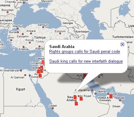
Once again news organisations will be looking over their shoulder at the launch of MetaCarta’s news mapping service. The more I play with this, the better I like it.

The red page icons on the opening page are something of a red herring – those are just the main headlines. A search for “Birmingham” brings up a whole lot more from my home town (and interestingly, not Birmingham, Alabama, meaning the site has worked out where I am).

Perhaps more interestingly, a keyword search gives you a global picture of what’s going on with, say news on the “environment”. How else would I have discovered a story about logging in Indonesia?

You can combine places with keywords, and change the date range of your search (the default is last 24 hours).

There’s a lot of scope for serendipity here, but a few weaknesses.

The most obvious is lack of RSS or bookmarkability. Having to keep checking this site and, worse, repeat a search makes this extra work.

Secondly, the current sources are limited to Reuters, AP and Guardian.co.uk. News organisations should be helping make their content map-friendly to get in on this.

And related to this, locations are currently quite generic, seemingly based on text recognition. Imagine what this could do if it tapped into geotagged stories from local newspapers such as those of Archant?

JEEcamp – when the cottage news industry met mainstream media

What happens when you bring together local journalists, bloggers, web publishers, online journalism experts and new media startups – and get them talking?

That was the question that JEEcamp sought to answer: an ‘unconference’ around journalism enterprise and entrepreneurship that looked to tackle some of the big questions facing news in 2008: how do you make money from news when information is free? Where is the funding for news startups? How do you generate community? What models work for news online? Continue reading

Ten ways journalism has changed in the last ten years (Blogger’s Cut)

A few weeks ago I wrote an 800-word piece for UK Press Gazette on how journalism has changed in the past decade. My original draft was almost 1200 words – here then is the original ‘Blogger’s Cut’ for your delectation…

The past decade has seen more change in the craft of journalism than perhaps any other. Some of the changes have erupted into the mainstream; others have nibbled at the edges. Paul Bradshaw counts the ways…

From a lecture to a conversation

Perhaps the biggest and most widely publicised change in journalism has been the increasing involvement of – and expectation of involvement by – the readers/audience. Yes, readers had always written letters, and occasionally phoned in tips, but the last ten years have seen the relationship between publisher and reader turn into something else entirely.

You could say it started with the accessibility of email, coupled with the less passive nature of the internet in general, as readers, listeners and watchers became “users”. But the change really gained momentum with… Continue reading

Journalism enterprise headlines

The team at JournalismEnterprise.com have been busy – here are some of the most recent reviews:

Pownce: a Twitter with bells on.

EveryBlock: Adrian Holovaty’s much-anticipated news mapping service gets a five-star rating.

Newstin: multilingual news search: “Its taxonomy engine goes way beyond the usual keyword and tags approach. For each article, Newstin’s engine is able to tell you what it’s about, who was mentioned, where it happened, etc.

Gnooze:  satirical daily news show for YouTube browsers.

Skewz: “a political Digg that goes both ways. You can submit any news story and the community can vote on how “liberal” or “conservative” the story is.”

As always, the review is only the start of the process: please add your own comments on the sites. And if you want to review sites for JournalismEnterprise.com, what’s stopping you? Send an email to info@journalismenterprise.com to join.