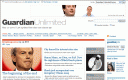
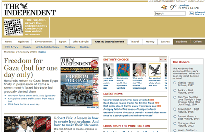
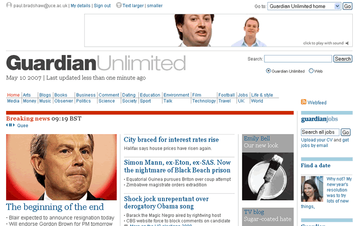
 Today sees the Guardian Unlimited finally getting the makeover it’s been desperately needing since the print product made ‘Berliner’ a polite topic of conversation. For the moment it’s only the front page – as creative editor Mark Porter explains, it “will be a facade concealing a busy building site, as work proceeds on an 18-month programme to redesign and rebuild every part of GU.”
And GU editor-in-chief Emily Bell adds: “an iterative approach is the best. The days when one design or set of functionality on a website lasted for several years is gone, and our aim, with the help of our users, is to constantly improve and update the network, from the story pages to the section and network fronts.”
The design itself is what you’d expect from contemporary newspaper website design – cleaner and clearer (I’d have put money on the Georgia font), with bigger images and more width. It’s not a major change from the old design in terms of content – although the biggest weakness in usability terms is a ridiculously long page you have to scroll down five times to see in its entirety (and that’s on a decent resolution monitor). Yes, multimedia content is more prominent with a box of its own, but still not on the first ‘page’ of content (it’s below the fold, in old parlance).
And was it a coincidence they relaunched on the day Tony Blair is expected to resign? A clever move, if not.
Clearly both Emily and Mark have had a long night – their posts are time-stamped at 1.05 and 1.06am – so hopefully they’ll be enjoying a hard-earned rest this weekend.


