
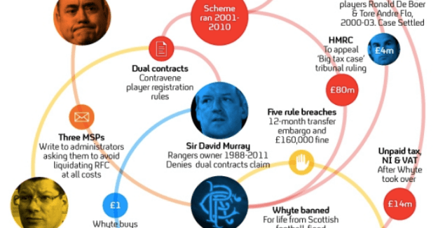
This network diagram comes from a Channel 4 News story
The best-known examples of data journalism tend to be based around text and visuals — but it’s harder to find data journalism in video and audio. Ahead of the launch of my new MA in Data Journalism I thought I would share my list of the examples of video data journalism that I use with students in exploring data storytelling across multiple platforms. If you have others, I’d love to hear about them.
FOI stories in broadcast journalism
Freedom of Information stories are one of the most common situations when broadcasters will have to deal with more in-depth data. These are often brought to life by through case studies and interviewing experts.
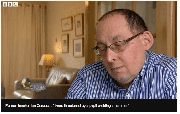
In 2015, for example, a former and then-current MA student worked with the BBC’s Victoria Derbyshire programme on FOI responses from 42 police forces relating to violence in schools. The online version of the story included an interview with a former teacher affected by the issue (captured in the gif above).
Also at the BBC David Rhodes won a Royal Statistical Society award for this data journalism story about councils refusing care applications.
At BBC Yorkshire Victoria Prest has now picked up the data journalism baton.
Other British examples include this ITV story on mental health trusts cutting beds, this Newsnight piece on special needs pupils being ‘squeezed out’ of schools (YouTube version below), and this Channel 4 Dispatches piece on benefit sanctions. And I keep a list of other FOI-based stories by the BBC here.
Broadcast data journalism
In Canada Fifth Estate’s Rate My Hospital investigation in 2013 featured a number of case study and expert video clips online, this time more presenter-led, while also in Canada this Global News story on pit bull attacks uses charts and tables online, but vox pops and archive clips in the (embedded) broadcast treatment.
You can also watch broadcast treatments of stories by their data journalist Patrick Cain into car testing and problem gambling.
Another data journalist in a broadcast organisation is Tisha Thompson at NBCUniversal. Her examples include “collecting rape statistics when the military refuses to hand them over” (more here); government employees accused of stealing the beer they’re supposed to be delivering (more here) (Tisha says this is “Why you should make your own database, especially when the government doesn’t do it”); water quality in Virginia and Maryland; high-end luxury and fashion brands on a list of government seizures; and potholes.
In Switzerland broadcaster SRF has an impressive data operation. In one recent segment a TV team printed a table onto a 60 meter long sheet of paper to illustrate a story.

And here’s another video from SRF, involving the use of AI:
In Ireland broadcaster RTE’s data journalist Karrie Kehoe worked on this investigation into “the widespread failure to implement the 2008 Hospital Consultants Contract and the impact this is having on Ireland’s healthcare system”.
The Bureau of Investigative Journalism use data-driven reporting regularly in their work with broadcasters. Below is an example of how Channel 4 News worked with them to bring one investigation to the screen:
At Sky Ed Conway is part of a combined visual investigations (data and OSINT) team — here’s how they tell a story involving data on exports to Russian neighbours on TV:
This award-winning investigation on modelling in the high fashion industry by NOS Netherlands used scraping techniques alongside interviews:
And students from my MA in Data Journalism helped analyse over 13,000 statements from head teachers as part of this ITV News story; you can see how the same story was told on Facebook and on Twitter.
Video data journalism from print media
This video about racial inequality statistics is embedded in a story by the Trinity Mirror data unit, in the Manchester Evening News -“Racial inequality is still a massive problem in Greater Manchester – and these are the facts that prove it“.
The video below on crimes in Birmingham comes from the same unit, and uses a timer to illustrate the frequency of different crimes:
You can find more examples on unit head David Ottewell’s YouTube account.
The Economist has a number of data-driven videos, including the one below which features data journalist Elliott Morris and a raft of charts from the 3’15” mark. Krystina Shveda, who was part of the team that made the video, says:
“It was a very collaborative team project between the films department and the data team, otherwise it wouldn’t have worked. Everything was put together by producer-director Sarah Collinson and assistant producer Rose Palmer.
“Elliott provided core insights from his political data modelling also featured on the interactive page and was interviewed as the subject matter expert. Then I produced the data sections based on that data plus some additional data, [working with Elliott as well as motion designer Nino Bennett to create the animated charts. There were also many other team members without whom the film wouldn’t have come out.”
Striking statistics
Hans Rosling, who died earlier this year, did much to popularise the use of statistics and data visualisation. His engaging presentation style led BBC4 to commission a series on “The Joy of Stats“. Here’s one of the highlights:
Vox are specialists at using data to illustrate stories. Here’s their explainer on gun violence:
There’s also a version which is used natively in social media: this tweet has been liked and retweeted tens of thousands of times alone at the time of writing.
Broadcast data journalism by students
Karl Idsvoog at Kent State University shared a number of examples of his students producing video reports on their data journalism projects, including pieces on university marketing budgets, free cars for coaches, high school concussions, and athletes missing class (shown above). They’re all good examples of data stories that can be found on your doorstep.
Network analysis in video
Network analysis — analysing relationships between actors in a story — is becoming more and more widely used. Here are a couple of examples where a broadcaster has used it: first, the BBC’s Newsnight leans on a galactic metaphor…
…And second, Channel 4 News uses a network to illustrate the complex story of Rangers Football Club’s troublesome finances:
The data isn’t on screen — but it’s behind the story
One of the reasons it’s not always easy to think of good examples of data journalism in video and audio is because the data itself is hidden. Channel 4’s investigative programme Dispatches often features investigations where data analysis is involved, but it’s not always obvious in the programme itself.
Britain’s Hidden Child Abuse – shown below – involved compiling spreadsheets to demonstrate the scale of the problem, which also helped one reporter to identify recurring reasons why people did not involve the police authorities.
Those spreadsheets were also crucial in convincing the lawyers that they could defend any legal action.
I also quite like this social video, which is really about a data comparison (the same information could have been presented in a chart):
Web-native video
Data video journalism doesn’t have to be made for broadcast. Many of the stories that I’ve worked on in the BBC England data unit have included a video clip. This investigation we did into library cuts includes a caption-led video on how one prominent library has been affected by the cuts.
Across social media the BBC also used a short clip to illustrate some of the key statistics from the story:
As an aside, many radio stations reported on the story by interviewing librarian Lauren Smith, and well known authors.
This story on the impact of a government scheme leads on a video clip which includes interviews with people who used the scheme, and this investigation into midwife led units also led on a video with someone who, like one in four patients, had to be transferred to a consultant led unit. This music festival data story’s lead video goes from a gif-style stop motion to expert interviews.
And if you’re doing a data story involving animals, there really has to be video too.
Germany’s public service broadcaster Bayerischen Rundfunk produces data journalism including the example below…
…and here’s another from SRF with their social video unit Nouvo:
https://twitter.com/NouvoDE/status/839033172016922626
…and Australian journalist Jackson Gothe-Snape:
This example from the FT is particularly interesting: over 12 minutes Federica Cocco and John Burn-Murdoch run the numbers on tax and philanthropy, using Monopoly money and sweets, among other props.
You can find other examples on the FT YouTube channel, including this bar chart race, this ‘discussion programme’ format on struggling coastal towns, and this on Wimbledon tennis stars.
Can you add any?
These are just some of the examples I’ve come across in video and broadcast media (I’ll look at audio in a separate post). I’m always on the look-out for new examples, so please let me know if you’ve seen others.
Update [November 2020]
This Poynter article describes a number of creative ways that broadcasters show documents on-screen.
Update [February 2024]
Ed Conway example added above, replacing examples from the award-winning French programme Cash Investigation which are now no longer on YouTube

Pingback: Here’s the thinking behind my new MA in Data Journalism | Online Journalism Blog
Pingback: Data journalism on radio, audio and podcasts | Online Journalism Blog
Pingback: Data journalism on radio, audio and podcasts – Digital Future
Pingback: Data journalism in broadcast news and video: 27+ examples to inspire and educate | Jornalismo Sem Fronteiras
Pingback: Data journalism on radio, audio and podcasts | Jornalismo Sem Fronteiras
Pingback: Teaching data journalism — fast and slow | Online Journalism Blog
Pingback: FAQ: Books to read in preparation for doing a data journalism course | Online Journalism Blog