
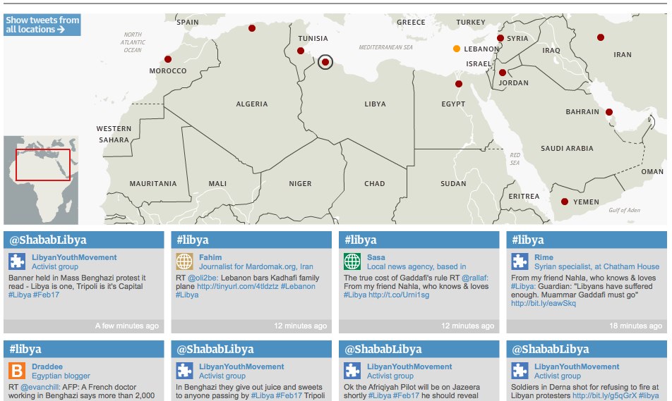
Twitter network of Arab protests – interactive map | guardian.co.uk
The Guardian have published an impressive map displaying Twitter coverage of protests around the Arab world and the Middle East. I asked Matt Wells, who oversaw the project, to explain how it came about.
The initial idea, which I should credit to deputy editor Ian Katz, was to build something that showcased the tweets of our correspondents, along a broader network of vetted tweeters in different countries. We wanted to connect all of these on a map, so you could click on a country and see relevant live-updating tweets.
I was asked to oversee it. The main thing was to check out the best English-language tweeters in each country – preferably people who appeared reliable, who were involved in first-hand reporting themselves, and who did a lot of retweeting of others.
I started by asking our correspondents who they followed, then broadened it out from there. We asked everyone if they minded being included – we had one refusal from a Tweeter in a particularly authoritartian country who was worried about the exposure. Everyone else thought it was a great idea.
Meanwhile one of our developers, Garry Blight, overseen by Alastair Dant, set about building it. As with anything of this kind, it took a bit longer than orginally anticipated, but we had it ready on the day that Mubarak fell. And brilliantly, it has worked for every country since then.
It’s powered by a Google spreadsheet – so it’s really easy to add new people and to attach them to particular countries or search terms.
And it should be very easily adaptable for other news events around the world.
