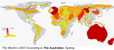
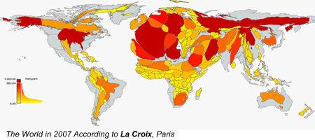
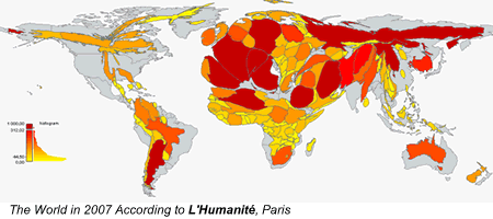
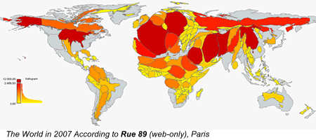
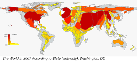
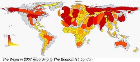
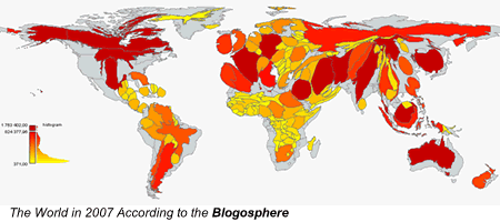
The cartograms below show the world through the eyes of editors-in-chief, in 2007. Countries swell as they receive more media attention; others shrink as we forget them[1].


(We also have a nice, embeddable Flash version with hi-res maps)
These maps allow you to grasp several media trends at a glance. First, traditional newspapers are highly selective in their coverage of world news. Looking at the three British dailies, editors favour countries that are bigger and more populous, but also closer to home and better developed. They also give more room to the countries of origin of British immigrants, especially if they are white (look at the size of Australia and New-Zealand). Hardly surprising, but still disheartening, especially when you consider that the only brand that does not advocate objectivity, The Economist, covers the world more equally.
Second, we see that web-only outlets do not offer such a different view of the world. That makes sense, considering the narrowing of the news agenda on the web that was described in the Project for Excellence in Journalism’s latest report. Their lack of resources forces them to contract their scope. Smaller issues are better covered by the blogosphere, which seems unbeatable at providing niche news.
The world according to newspapers is a project that came up while writing a dissertation for school. I first published some maps on L’Observatoire des Médias, a French blog. Seeing the response, Gilles Bruno and I decided to go further and keep track of newspaper coverage. We want the maps above to be updated daily (or weekly) in order to pressure editors into covering more diverse issues.
We will build a scraper that will automatically retrieve the data for the 164 countries on several newspapers and a Java or Flash interface that will morph the maps. If you have any skill in cartograms, or data scraping, or if you have funds to buy these skills, you are more than welcome in the team!
[1] Colors indicate the same thing. However, a country can appear in red if it’s in the top 10% but still shrink, as the top 3 countries concentrate most of all media attention.
This article was written by Nicolas Kayser-Bril, one of the Online Journalism Blog’s Virtual Interns.

Fascinating.
Pingback: Notes from a Teacher: Mark on Media » Easter Sunday squibs (edited)
Pingback: O peso de cada país nos jornais | The weight of each country in the newspapers « O Lago | The Lake
News sources write about the things their readers are interested in. The vast majority of the people who pay for the Daily Mail live in Britain – they want to know what’s going on around them, they don’t care about the editor being pressured into ‘covering more diverse issues’.
The comparison with ‘the blogosphere’ is pointless. People don’t read the blogosphere, they read the bits that interest them.
Ethan Zuckerman at the Berkman Center started some similar research a few years ago, called the Global Attention Profiles, using data from various English-language news sites and blogs. Perhaps some of the tools you’re planning to develop already exist to some extent…
@tom
Thanks for your comment.
If news sources wrote about what readers are interested in, their circulation figures would certainly plummet less rapidly than, say, The Economist’s.
The comparison with the blogosphere shows that readers *are* interested in more diverse issues and that micro-brands are more able to serve them when it comes to non-mainstream reporting.
@martin
Great, thanks! Their GAP program is as great as it’s ugly, but I’ll look into it.
@nicolas
Sorry I just don’t buy it. The paper I write for, the Birmingham Post, publishes news mainly about Birmingham. I just don’t believe replacing that with articles about Manchester, France or Africa is going to drive up sales.
I don’t think the success of the economist is a model for a local or national newspaper – the magazines sells in more than 200 countries and has its own niche, global, audience, which it caters for.
And as we constantly hear, the blogosphere is a medium, not a publication. Comparing a newspaper to that is like comparing one website to ‘the printed word’.
@tom
Thanks for your reaction.
The model I’ve used shows that a country is less covered as it’s further away from London. Each 100km lead to a country’s getting 1.9 less articles per year in the Daily Mail, 2.3 in the Guardian (provided you take SAfrica, ANZ out of the sample, they skew the data). The same could be true for a local brand, taking your locality as a reference point.
Even if you take this into account, some countries get less coverage than others, thus distorting their representation in the minds of readers. Hence, the point of doing these maps.
As for the blogosphere map, it would be better compared with a ‘print media’ map aggregating data from all national dailies in Britain (and/or the US). We could then see how a fragmented medium distributes coverage in a more diverse and possibly more efficient way.
The point is that the constraints mass media operate under force them to narrow their agenda and focus on what they see as what’s important, whereas readers choose which blogger is relevant to them.
(And the comparison with The Economist was pure sarcasm over MSM’s knowledge of readers tastes.)
Pingback: …My heart’s in Accra » Media attention cartograms
Pingback: links for 2008-03-25 « David Black
Pingback: Green Design » Blog Archive » Media attention cartograms
[…] OK so some media, such as the Daily Mail, are not too much of a surprise with its interest firmly placed on middle England. It also shows remarkable little interest in north and south America and the middle east.
Interestingly the Sun does show more interest in international
affairs, including Iraq, than the Daily Mail and has a lot more
interest in Australia. I would put this down to being owned by
Newscorp (international news company) and Rupert Murdoch
(the owner) being an Aussie himself!
The liberal and internationalist Guardian has one of the strongest world views.
However, if you want a truly international feel to your news and a focus on where the real news is happening you must visit the blogosphere. […]
Great stuff and I would recommend the Digg swarm tool too if you like news visualization!
http://labs.digg.com/swarm/?popular
Pingback: Davos Newbies » Blog Archive
Interesting. I’m not sure I agree with your conclusions – I tend to think Tom’s got it right with regards to comparing a handful of publications with the entire blogosphere. (Do you, or does anybody, read the entirety of blogs in the world? And don’t you find it disappointing that the blogosphere isn’t significantly better than that?)
But I’m also interested in the projection you’ve used – looks like Robinson to me, but I’m no expect. Why not Peters-Gall, which would likely have shown an even more glaring difference between physical geography and the geography of news organisations.
(disclosure: I work for the Guardian)
Pingback: O mundo segundo os xornais | Capítulo 0
Pingback: Mapas del mundo según la cobertura de los medios en Radiocable.com
Pingback: El món real i del que parla la premsa « Xarxes socials i llengües
Pingback: meneame.net
Highly suspicious, in my impeccable judgment.
Pingback: Duvet-Dayz
Pingback: Recent Highlights 88 | Technophobiac Lifestyle
Pingback: cinco dias » O mundo pelos olhos da ideologia jornalística-blogueira
Pingback: De wereld volgens een redactiechef « Leenwoorden
Pingback: Kelso’s Corner » Blog Archive » The World According to Newspapers (Cartograms)
Pingback: Transnets » Blog Archive » L’inconscient des médias révélé par des cartes
Pingback: Diaris comarcals digitals contra el desequilibri informacional « Grup Nació Digital
Pingback: Playing with Processing « MovingDownstream
Newspaper is a regular published print product containing information, news and advertising. Newspapers are living textbooks and they are source of information and learning. It’s a source to find out whats happening in movies, books, concerts, games, jobs and events. Major advantage left to newsprint is that reading it does not require any sophisticated, cumbersome technical equipment. This offers the reader a high level of flexibility: newsprint can basically be read in any place at any time. The reader can absorb the information offered at his own pace. Even the fact that the reader can touch and feel the printed paper while turning the pages may be of some importance.
Disadvantage of Printed edition of newspaper –
Circulation of the newspaper is one of the principal factors, circulation is not the same as copies sold because many copies are read by more than one person this is a major offset as the number of copies distributed are not read.
People away from their home place would always love to read their regional paper wherever they are in any part of the world. Take my case; I have been hunting for my favorite newspaper Times of India in the heart of New York City but in vain and the only solution I found at this time is e-paper.
E-paper and its advantage –
Will e-paper is going to replace the printed edition in future is the question to be asked? ePaper is the replication of newspaper pages which allows one to get the same experience as reading the hard-copy edition and e-paper has the advantages of being interactive, multimedia, of providing internal and external networks and offering selection functions, the possibility of regular updates, access to archives, rapid access to a large number of newspapers, and being paperless, thus creating no problems of waste disposal.
Not even that it’s more convenient from the customer’s point of view while reading the e-paper, I came across Nokia new model cell phone, and by clicking on it; I was taken directly to the website, where I could compare the prices.
So this has led to some predictions that is newspapers will shrink or even disappear?
All the recent surveys both in USA and abroad indicate that print newspaper readership is going down; there has been a dramatic drop in the circulation of papers.
Full time professional employment at daily newspapers is falling. In a desperate attempt to offset the falling revenues, more newspaper groups are setting them up online.
All of the major news publishers have adopted e-paper technology in order to increase their readers and revenue.
Looking at the enormous growth in the Digital News Publishing Industry, many new media companies are offering ePapers and eMagazines at affordable costing with low or no upfront investment. Pressmart Media Limited, a leading new media services company based out of India and USA provides an excellent Multi channel distribution on Web, Mobile, Podcast, Search Engines, Social Networks, Web2.0 sites and RSS.
I hope you do agree that digital versions of news publications will be an added advantage for publishers in increasing their brand value, customer reach and revenues.
Very interesting concept. The issue is that one of the main observations is trivial (newspapers tend to write most often about the country in which they reside…surprise!). To get around that issue, you need to
1a) pull from most all newspapers or
1b) pull from a sample that is representative according to country population (or geographic size or GDP)
2) Remove outliers so that a few oddball papers don’t overly skew your results
Then you could tell which countries receive the most overall press coverage and help people hypothesize why. My guess is that countries with the most wealth and influence, along with nations of special interest to them, would get the bulk of attention.
Neat site, interesting work.
Jay
Pingback: De wereld volgens kaarten « hobbeltjes
http://www.skewz.com/link/link_details/5686 is a good discussion on the whole Wright thing.
Pingback: Interesting charts reveal international news coverage | In No Particular Order
Pingback: How journos see the world. « Lance Wiggs
cartograms like this aren’t actually that useful for abstract stuff like this, since the geographical shape or size of a country is pretty independent from population size, or economy, etc. So Russia, the USA, Canada, Australia, all get squashed since they have lower population vs. geographical area. Proximity is probably the main geographic factor connected to news coverage.
Are a lot of these references to other countries not incidental to stories about the newspaper’s own country? For example – there must be lots of stories in the British press about Madelain McCann (mentioning Portugal), immigration issues (mentioning France), conflict with the EU (mentioning other European countries), Commonwealth issues (mentioning former British colonies), etc. Moreover, there are a number of big issues of interest to readers (such as stories about banking trends) which are somewhat more likely to involve developed countries than non-developed countries.
On top of that, few newspapers make anything much more than a perfunctory nod towards objectivity. Newspapers support political ideologies, even where they don’t support a particular party all the time, and their newspaper is bound to reflect the interests of these ideologies.
Moreover, communication (ie, ripping stories off foreign newspapers) is much easier between countries which speak the same language. And it is far easier for a British person to understand Australian issues than Namibian issues, because the UK is much more similair to Australia than Namibia.
On top of this, some countries have sentimental attachments or enmities with each other – for example, the UK has a sentimental attachment to the old Dominions (where many British expats live, which is another issue), and a traditional enmity with the French – hence, lots of stories in the UK press relating to France or the old Dominions.
It is difficult to understand a story about Indonesian politics without first having the Indonesian political system explained to one. People in the UK are more familiar with the political systems, the culture, and the history of, say, the Irish Republic, than with those of a typical south-east Asian country.
I could certainly go on at greater length. There are myriad obvious and sensible reasons for these results. All that these results expose, in my opinion, are potential niche markets for publications specialising in either general foreign or are-specific foreign news and current affairs. People often seem to know little enough about their own countries without having to try to take in reams of knowledge about west-African politics or the latest criminal trials in Santiago.
Hi,
lokks really great what software did you use to generate the cartograms?
Kurt
Pingback: Time to remove the blinkers | Antony Loewenstein
By what means does a country get awarded points. Does a story that mentions George Bush get tagged as being US related? What about a story about Tokyo?
I would be willing to bet that most stories about George Bush in UK papers don’t mention his association with the US, just as most papers in the US didn’t mention Tony Blair’s or Margaret Thatcher’s connection with the UK (though poor John Major and Gordon Brown often get the additional label). Probably every paper outside of Canada mentions that Stephen Harper is Prime Minister of Canada, when they mention him at all (poor Mr. Harper).
Paul Rudd is meeting (or has just met) with Queen Elizabeth. Does that story get tagged as being related to the UK? After all, from Mr. Rudd’s perspective, he is meeting with the Queen of Australia. If Number 10 is maintaining troop levels to satisfy George Bush, is that a US story, a UK one, or is it an Iraq thing?
Pingback: The World According to Newspapers | Economist Blog
Pingback: The World According to Newspapers | 1800blogger
Pingback: El mundo según los diarios… « consume y calla blog
Pingback: Die Welt nach Zeitungsberichten dargestellt « Medien BackSpin
Pingback: On The Same Page » The Incredible Marylaine Block
Pingback: De wereld volgens de kranten | Verbeelding
Pingback: De wereld volgens ons
The size of Israel in every map shows the West’s maniacal obsession with the Jews. THe West doesn’t care about the plight of Arabs anywhere, except those whose suffering can somehow be blamed on the Jews.
Pingback: Schnellschuss-Links am 19.04.2008 | Werbeblogger - Weblog über Marketing, Werbung und PR » Blog Archiv » Schnellschuss-Links am 19.04.2008
Pingback: De Kromme | Verbeelding
what about WSJ and other US-centric publications?
vive l’economiste!
http://www.thingsinbooks.com
Pingback: 1000 coisas sobre blogs | 1000 things about blogging « O Lago | The Lake
Pingback: A handy list to read to myself on the bus each morning at Sean Yeomans Consulting
Pingback: How to Blog « Welcome to Jack’s Blog
Pingback: 1000 things I’ve learned about blogging | Online Journalism Blog
Pingback: Rising Voices » FOKO Puts Madagascar on the Map
Pingback: 40,000 hits: why news websites should make more of cartoons (and infographics) | Online Journalism Blog
check this out
http://blogs.livemint.com/blogs/career/archive/2008/11/20/building-a-case-for-the-humble-lowly-shorthand.aspx
Pingback: The world according to news editors | The Evolving Newsroom
It´s a shame that Brazil is weak in this area. But it will grow it´s participation.
Great Article!
Thanks. I´ve already subscribed the feeds.
Those graphs are very cool! I think that proximity is the biggest factor here!
Fantastic maps!
really amazing. Nothing like a good “graphic” in order to give more attention to some information
Like this color a lot. Nice to watch.
Europa is strong,
The Guardian – my favorite newspapers
Pingback: The World According to Newspapers | Mortgage Review Site - Latest Daily Mortgage News
Hi, Hello, Morning, your latest post was very curious and I loveit. Now I compose an text on my web site and I would like to use your entry, of course I will write what is the originalarticle. Do you say yes? Have nice day.
Pingback: The Best Sites For Learning About Cartograms | Larry Ferlazzo's Websites of the Day...
This reality of overseas coverage also points to the ongoing need — despite all the Egypt-inspired hype surrounding “citizen journalism” — for foreign correspondents: http://jordanink.wordpress.com/2009/12/09/foreign-reporting-lessons-taught-lessons-learned/
It´s a shame that Brazil is weak in this area. But it will grow it´s participation.
Great Article!
Thanks. I´ve already subscribed the feeds.
Europe is a leader, but i didn’t know there is so many white spots
Hi there everyone, it’s my first visit at this web page, and piece of writing is in fact fruitful in favor of me, keep up posting these types of posts.
Pingback: Nicolas Kayser-Bril: Az a kérdés, mi az újságírás egyáltalán? | Adatújságírás
Pingback: L'inconscient des médias révélé par des cartes - Francis Pisani - Francis Pisani