
Double counting — counting something more than once in data — can present particular risks for journalists, leading to an incorrect total or proportion. Here’s how to spot it — and what to do about it.
Look at the following chart showing the gender of teachers in UK schools, based on data on teacher headcounts. Notice anything wrong? (There are at least two problems)
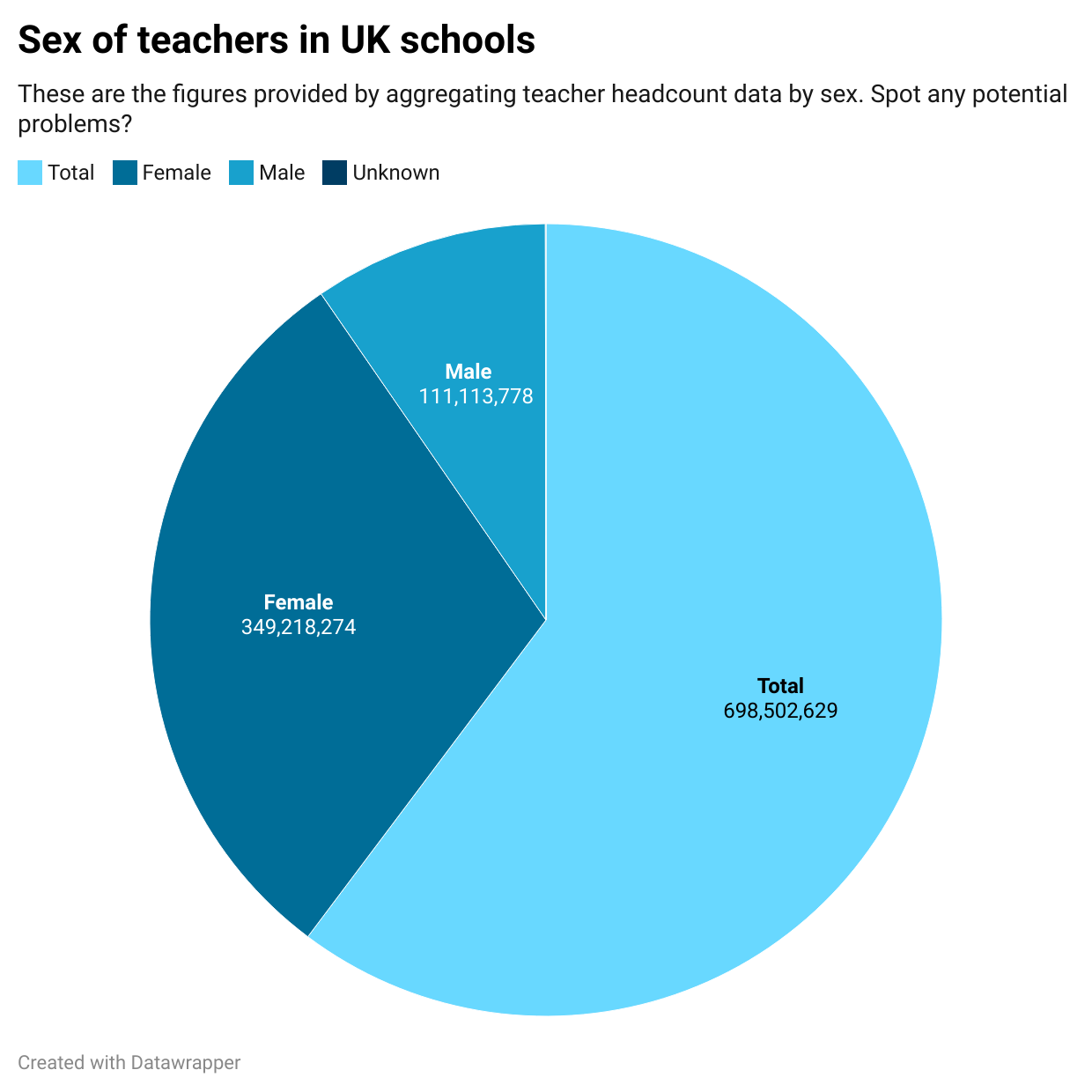
The most obvious problem is that the chart appears to be ‘comparing apples with oranges’ (things that aren’t comparable). Specifically: “male”, “female”, and “unknown” are similar categories which can fairly be compared with each other, but “total” is a wider category that contains the other three.
I’ve used a pie chart here to make it easier to spot: we expect a pie chart to show parts of a whole, not the whole as well as its parts.
But the same problem should be obvious from the same data in a table before visualising it:
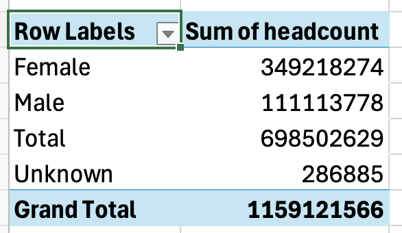
The table shows us that we have both a “Total” and a “Grand Total”. This is a red flag. There can only be one total, so if there’s more than one that’s a strong sign of double counting.
Why is this happening? We need to take a look at the data.
Spotting ‘apples and oranges’ problems in data
The data comes from the School workforce in England dataset — specifically a file called ‘workforce_teacher_characteristics_2010_2024_nat_reg_la.csv’ (there are multiple files in the dataset).
It measures a number of different things about the school workforce, including sex, ethnicity, age group and grade — and it provides classifications by different types of geography and time period. There are over 420,000 rows in that file.
A common approach when presented with such detailed data is to create a pivot table. This allows you to simplify the data by aggregating it into a table showing totals by a particular category. That’s how the table shown above was created.
In a pivot table, whatever measure you want to group by (in this case the sex of teachers) goes in the Rows area of the pivot table.
Whatever you want to total for each of those categories goes in the Values area of the pivot table (in this case there is a column called ‘headcount’ that we want to ‘sum’ for each sex)
And that’s what I did to get the data for the chart.
But because the ‘sex’ column in this data looks at different levels of categorisation, we need to make sure that we filter the data to remove non-comparable categories.
In a pivot table you can do that by using the dropdown menu at the top of your rows to remove any categories/rows not relevant to the analysis. In this case, removing the ‘Total’ category. If we update our chart with that data, it now looks like this:
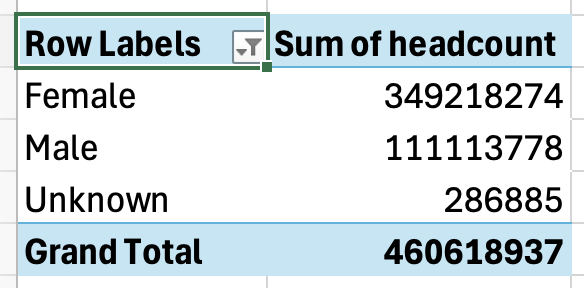
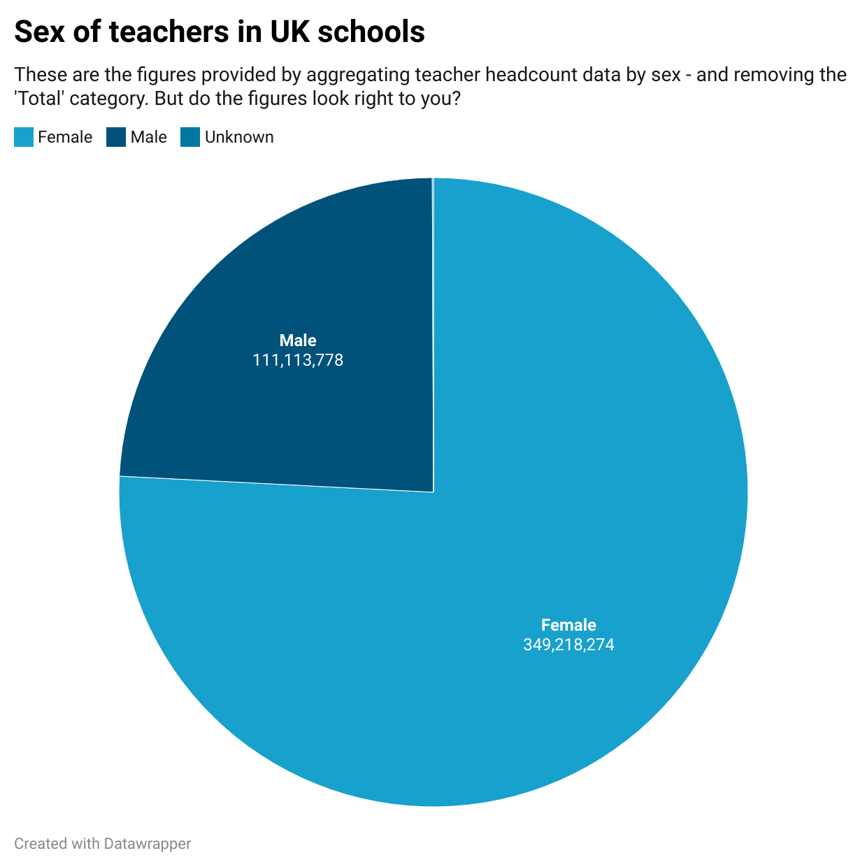
When the chart is updated with the new filtered data, it looks like this:
Counting across multiple measures
It doesn’t look so obviously problematic — but look at the figures and ask yourself if they seem credible to you.
According to the chart, there are almost 350 million female teachers in UK schools.
To put that into context, consider (or find out) what the entire UK population is.
Spoiler alert: it’s less than 350 million people. So it’s impossible for there to be that many teachers.
What’s happening here? It’s another red flag that there is probably more double counting that we need to fix.
At this point we need to look at the original data and try to understand it better. (This is a good lesson in the importance of exploring and understanding the data properly before doing any analysis, as this will prevent many mistakes from happening in the first place).
Specifically, we want to identify where any double counting might exist in the data. Here is a list of the columns:
- time_period
- time_identifier
- geographic_level
- country_code
- country_name
- region_code
- region_name
- old_la_code
- new_la_code
- la_name
- school_type
- grade
- sex
- age_group
- working_pattern
- qts_status
- on_route
- ethnicity_major
- ethnicity_minor
- full_time_equivalent
- headcount
- fte_percent_within_ethnicity
- headcount_percent_within_ethnicity
A useful tip when exploring data is to turn on the Filter option (in the Data menu). This will create a dropdown menu at the top of each column. When you click on any dropdown you will see a list of the unique values in that column. So, for example, clicking on the dropdown for the “sex” column would have shown you that there was a “Total” category alongside the other three.
When we do that for each column, we can see most have opportunities for double counting:
- time_period: the data covers a number of years, so any analysis has the potential to add up all the teachers in all of the years
- geographic_level: the data covers local, regional and national levels. That means teachers will be counted three times, at each of those levels.
- school_type: there are a number of levels here, such as nursery and primary schools being counted separately and jointly. You need to pick just one category (‘Total state-funded schools’ is the top level) to get all schools without including sub-categories that introduce double counting.
- grade: there are four different grades, from head teacher to assistant, and once again a ‘Total’ category which counts those four grades all together. To avoid double counting we need to filter out the total, or just pick that alone.
- age_group: the same problem exists with this column and the next five:
- working_pattern
- qts_status
- on_route
- ethnicity_major
- ethnicity_minor
Measures with potential for double counting
In total there are 10 columns with opportunities for double counting. We can classify these as follows:
- Any column that uses a ‘Total’ category (eight of our columns, including school_type which uses ‘Total state-funded schools’)
- Any column that uses categories and sub-categories that fall inside those (e.g. in geographic_level a nation contains regions that contain local authorities).
- Any column that uses different time periods.
To properly avoid double-counting we need to filter on all the columns where double counting can occur.
There are two main ways to do this: by using the pivot table’s filtering options; or by filtering the original dataset first*, and making a copy of that subset (pivoting further if needed).
Here is what the pivot table filtering option looks like when putting those 10 columns into the Filter box, and then setting each of those filters to remove double counting:
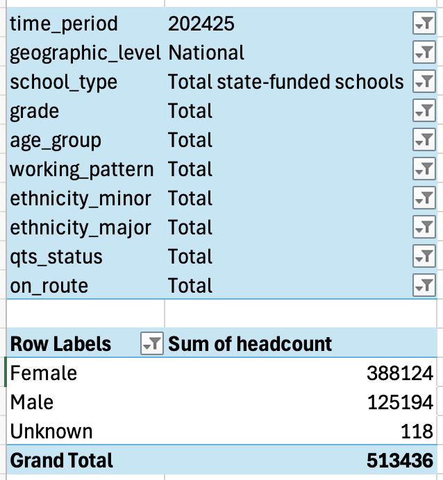
Those figures look more believable, totalling around half a million teachers.
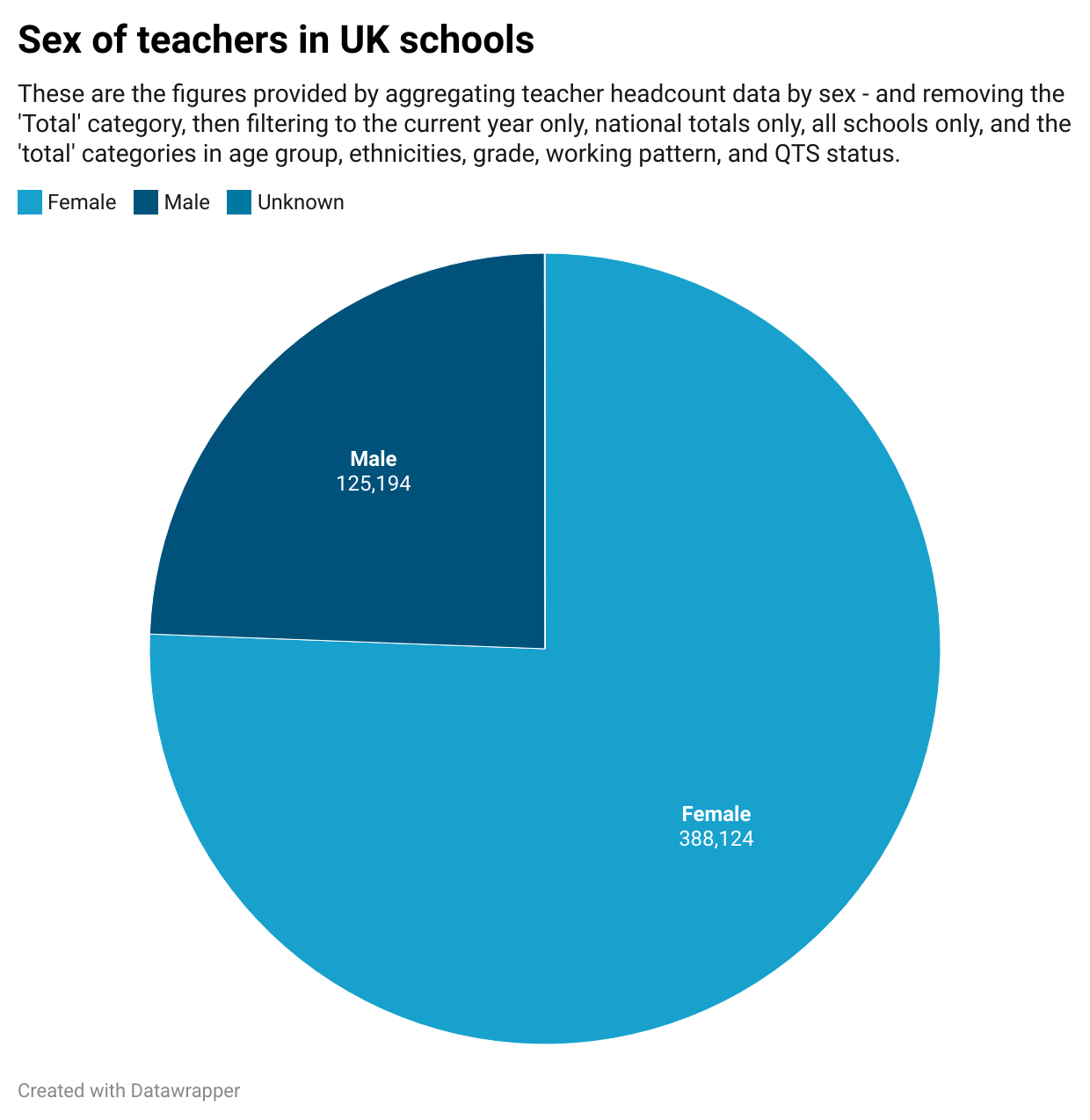
Here’s the final chart using those figures that avoid double counting:
The moral of the story
The key thing to remember here isn’t how to deal with school workforce data in particular — it’s to incorporate a number of processes into your reporting when dealing with data:
- Check whether your data is ‘comparing apples with oranges’, i.e. putting categories in the same column that are not directly comparable, such as regions with nations.
- Check for columns that use ‘Total’ or ‘All’ as a category alongside sub-categories like specific age ranges, pay grades, etc.
- Use filters to ensure you are only calculating with categories at the same level. The simplest way to do this is to select the top-level category (‘Total’, ‘All’, ‘National’ etc) and deselect everything else.
- Sense-check the draft figures or charts: does that figure sound right when compared to what you would expect, e.g. when compared to the population as a whole? Do the categories make sense next to each other?
- Look out for figures which add up to a neat 50% of the whole, or half of the pie: that’s a big clue that they represent the total of everything else.
*Note: I mentioned that there were two ways to filter out double counting. The second way is to use the same filters in the main data itself, instead of in the pivot table — in fact, if the data uses ‘Total’ as a category it often means there’s no reason to use a pivot table at all, because they’ve already aggregated the figures (which is what a pivot table does) as one of the measures. See how to do this in the video below, which also walks through the steps outlined in the post above.
