
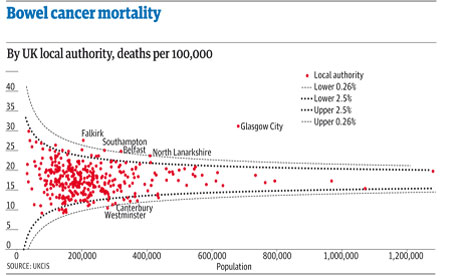
The latest Ben Goldacre Bad Science column provides a particularly useful exercise for anyone interested in avoiding an easy mistake in data journalism: mistaking random variation for a story (in this case about some health services being worse than others for treating a particular condition):
“The Public Health Observatories provide several neat tools for analysing data, and one will draw a funnel plot for you, from exactly this kind of mortality data. The bowel cancer numbers are in the table below. You can paste them into the Observatories’ tool, click “calculate”, and experience the thrill of touching real data.
“In fact, if you’re a journalist, and you find yourself wanting to claim one region is worse than another, for any similar set of death rate figures, then do feel free to use this tool on those figures yourself. It might take five minutes.”
By the way, if you want an easy way to get that data into a spreadsheet (or any other table on a webpage), try out the =importHTML formula, as explained on my spreadsheet blog (and there’s an example for this data here).

Then the story can focus on explaining the important things, like Glasgow, or if the differences between Southampton/Belfast and Canterbury/Westminster are just random, or can be explained by income or number of treatment facilities per thousand inhabitants.
Pingback: Power Tools for Aspiring Data Journalists: R « OUseful.Info, the blog…