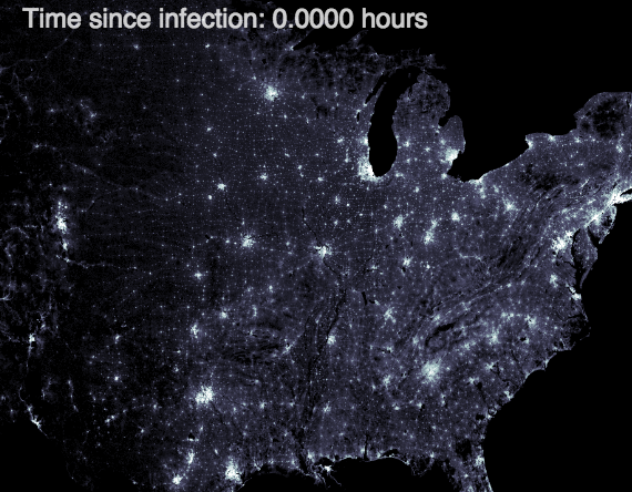
Matt Bierbaum’s zombie map allows you to simulate outbreaks
When it comes to data visualisation, everyone loves a map. More exciting than a chart, easier than an infographic, it’s generally the first thing that journalists and journalism students alike ask: “How can we create a map?”
But just because you have some geographical data doesn’t mean you should map it.
Here’s why: maps, like all methods of visualisation, are designed for a purpose. They tell particular types of stories well – but not all of them.
There is also more than one type of map. You can map points, shapes, or routes. You can create heat maps and choropleth maps.
I’ll tackle those different types of maps first – and then the sorts of stories you might tell with each. But the key rule running throughout is this: make sure you are clear what story you are trying to tell, or the story that users will try to find. The test is whether a map does that job best.
Mapping with points
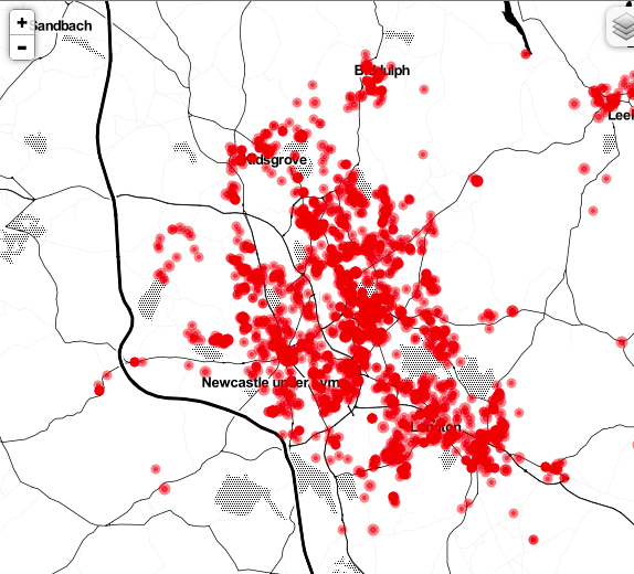
David Elks’s crime map may not show any pattern but it does allow locals to find out about crimes near them
If you are mapping points it means that each row in your dataset is given a location on your map. For example, if you were mapping businesses’ food hygiene inspections then a pointer would be placed at the location of each business.
This approach is one of the simplest ways to get started with mapping. But for the same reason it can be used badly.
Mapping points makes sense if:
- Your data refers to specific locations, such as businesses or crime scenes
- Users will want to look at data points near them, such as how local schools perform, or whether someone was arrested for that crime
- The resulting map shows a clear distribution of those points, and this is the story you are trying to tell: for example fast food vans near the sports stadium are failing food hygiene inspections; or there are more burglaries in one area than another.
Mapping points is not the right approach if:
- Your data refers to larger areas, such as countries or regions. Even cities or parts of cities can make little sense when plotted as points on a map.
- Users do not need a map to find a location relevant to them, or cannot. For example in a national map, many users may not be able to locate their town; after all, how many times do we use national maps to orientate ourselves? In reality we tend to use local maps or specific road maps.
- The story is not about the visible distribution or clustering of those points, but about comparison (for example the worst or best places) or composition.
In this last case you are better using a visualisation device designed for that purpose, such as a bar chart (comparison) or pie chart (composition).
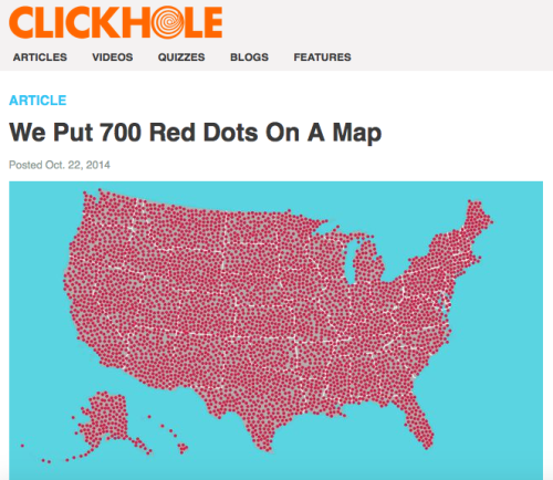
Clickhole satirised some people’s desire to put points on maps without any particular point
If your story is about distribution but not a geographical one, then try a scatter chart.
Geo data: the more detail the better
One thing to note about mapping points is the potential for mapping tools to place marks wrongly.
This is because mapping tools work by geocoding your locations. That effectively means that they convert text in your address fields (such as ‘London’ or ’34 High Street’) into geographical data: typically latitude and longitude.
The best case scenario is if you have latitude and longitude in your data. This means that the tool does not have to perform any conversion, and the process is much quicker and more accurate (assuming your lat/long values are accurate).
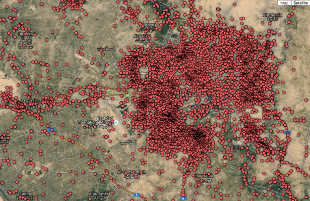
The Guardian mapped every death in Iraq in the Wikileaks war logs. It showed the sheer scale of death and allowed users to explore each one.
But if your geographical information is partial or inexact, and outside the US, you may have problems.
Most mapping tools default to the US, so ‘Cambridge’ will be placed in Massachusetts unless you are able to specify otherwise. It may be able to map zip codes, but not postcodes.
There are two ways to reduce the chances of misplacement: the first is to use any options in your mapping tool to limit the geocoding.
The mapping tool BatchGeo, for example, allows you to specify a particular country rather than the default ‘worldwide’. And Google Fusion Tables allows you to specify ‘hints’ on locations.
The second way to reduce misplacement is by combining the address details into one column, rather than (or as well as) having things like ‘street name’ and ‘city’ and ‘country’ in separate fields.
This is particularly the case with Google Fusion Tables, which maps based on one column (BatchGeo does allow you to specify which column contains the city, which contains a zip or post code, and so on).
Customising markers: avoid the rainbow effect
If you are mapping points it is likely that you’re going to want to classify those points in some way – for example, in order to distinguish between those locations with high values (high crime, high ratings, high performance) and those with low ones.
You should also think about the information which is provided when a user clicks on a particular point – often called the ‘information window’.
There are three main ways of indicating the classification of points: colour, shape and size.
Colour is the most commonly used approach, and certain colours are used particularly often: for example green to indicate ‘good’ values (high ratings; low crime) and red to indicate ‘bad’ ones (high incidence of disease; poor performance), as well as perhaps orange (‘amber’) to indicate values which are neither high nor low, or grey to indicate points where no data exists.
When choosing colour try to avoid the ‘rainbow effect’. This is the temptation to use a different colour for each classification in a system.
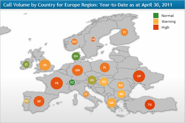
This map is trying to communicate two different things through colour and size. It would be improved by choosing one or the other.
For example the food hygiene rating system in the UK goes from 0 to 5: that’s six different bands.
If you were mapping these ratings by location you may be tempted to use six colours: one for each band. But ask yourself what the story is, or what the user might want to know.
Ultimately the user wants to know ‘Is my local takeaway good or bad?’ and the story might be ‘Which areas have the most restaurants failing food inspections?’
Both are binary: good/bad, pass/fail. So your colour scheme should reflect that. Ratings from 0 to 2 are fails (bad); ratings 3 and above are passes (good). So you only need two colours for those two bands.
The resulting map is much clearer than if we used more colours: patterns (if they exist) are more easily discernible; users can at a glance see if a business is good or bad, without having to check against a legend, and then whether a value is a pass or a fail.
The inverted pyramid is a useful analogy here: we begin a story with the ‘broad brush’ of whether a restaurant has failed an inspection or not; extra details on the specific rating and so on would go lower in the story.
In this case, that information goes in the information window, which the user can click on if they want to know more.
Using shape: don’t repeat yourself
As well as colour you can use shape or size to indicate a value, depending on the tool. BatchGeo, for example, gives the option of a limited range of shapes. Google Fusion Tables has a whole library of them.
Shapes can be appealing to play with – but often add nothing to your ‘story’ (the map). Often people use shapes for points on their map simply because they can, and not because they make the story clear.
Instead, too often the shapes actually get in the way of a story: much as using ten words where one will do is considered bad journalism.
So if you are using shapes ask yourself carefully:
- Are your shapes repeating the same information as the colour? If so, take them out.
- Are the shapes telling the story itself, or adding extra information? If they are not the main story, take them out.
- Are the shapes the easiest way for users to navigate the map? If not, take them out.
Shapes work best when they are instantly recognisable icons, when there are not too many different ones, and when they are the primary use of the map. For example, if you wanted people to find the nearest facilities to them, and they could use icons to identify different types.
But if they are primarily interested in some other numerical criteria (the colour coding) it may be easier for them to filter from a drop-down list second.
Using size: play with opacity
The third way of customising markers is to change their size based on a value or category.
Here again you need to ask yourself whether you are adding too much information and obscuring the story, or making it harder for the user to find what they want.
If you are changing the size of the marker it is normally to indicate an amount. For example, where more than one crime has occurred at the same location you might increase the size of the point at that location to indicate this.
The potential problem here is that particularly large markers (sites with high amounts) can obscure markers in the same area. For that reason it is a good idea to choose semi-transparent colours for your markers, so the user can see other markers underneath.
Your mapping tool may not allow you to do this, so you may have to look at other tools or JavaScript mapping libraries, or reconsider.
If you are using the size to indicate something other than amount, think carefully: if you are showing a percentage (90% being bigger than 50%, for example) is that what people will understand intuitively and be able to compare most easily? Most likely not: colour coding may be clearer.
If you are indicating categories (different sizes for different categories), you have the same problem: size is associated with amount, not category (even if the category is numerical), so it is best to think of other ways to indicate this.
Heatmaps
One type of marker I haven’t mentioned yet is the heatmap. This is where markers show intensity rather than location.
Heatmaps can be useful where you are merely showing distribution, but they can also be misleading.
This is because they do not generally control for population density or other factors. A heatmap of failing food hygiene inspections, for example, may simply show the areas with the most restaurants and cafes. A heatmap of road accidents may simply show roads with the most traffic.
Mapping shapes and routes, and image maps
A more ambitious alternative to mapping points is to map shapes: in other words, instead of each data point being placed on a specific point on a map, instead different areas on that map are drawn and coloured/labelled according to the relevant data. But that’s a whole other post: watch out for that at the end of this week.
This guide is taken from the MA in Online Journalism at Birmingham City University.

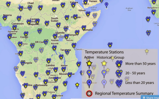
“There is also more than one type of map. You can map points, shapes, or routes. You can create heat maps and chloropleth maps.” Choropleth.
Thanks – corrected.
Reblogged this on Datapolitan and commented:
As much as I love maps, they aren’t for every situation and not every map is good. This is a great breakdown of when and how to use maps to display important information.
Pingback: When to use maps in data visualisation: a great big guide | Big Enterprise Data
Pingback: When to use maps in data visualisation: a great big guide
Overall some very good points – especially about when you should not map geographical data! The temptation to use a data visualization is now easier to accomplish than ever! There are certainly many other related issues to consider besides visual presentation such as the quality, resolution and spatial aggregation of data (e.g. by political boundaries). For example, displaying country-based statistics on a choropleth world map can potentially be visually misleading due to variable resolution and aggregation – is a single value for all of China really comparable to say that of Luxembourg?
Pingback: When to use shape maps in data visualisation: part 2 of a great big guide | Online Journalism Blog
1. There are two maps you can use a climate map and a regional. A climate map shows you how tall something is for a example is a mountain you could find out how tall that mountain is. A regional map is simple it shows the regional on a map.
2. I picked Hawaii for my utopia project. What I am trying to tell for my story is it doesn’t matter is Hawaii is small it just matters what kind of resources you have. In Hawaii it has all the resources I need. It has water, mountains, and a sea to go fishing.
3. This article helped me on the maps since I am having a little bit trouble on the maps
Cohen Mullins B
1. I am going to use a road map which is used to go places Phisycals maps are used to find bulidings.
2. By making maps of roads and bulidings
3. It helpd me find what maps I know and Maps i dont know.
Pingback: DataViz: Auf den Punkt bringen | geoObserver
Pingback: How to survive a hackday | Online Journalism Blog
Pingback: 3 Ways to Improve Map Visualisations on Mobile | Buzzbloggers-Submit Links Free | Free Web Directory
Pingback: 3 Ways to Improve Map Visualisations on Mobile | DigiBlox
This was an enjoyable read. Thanks!
There are several types of maps used to display data. Most of these more common map types and focus on a particular variable that is displayed. But what if you have multiple variables that you would like to present on a map at the same time?
It really depends on the context, but on the whole I would avoid trying to put too many variables on the one map. It’s like trying to combine too many angles in the intro to an article – you have to choose one core angle, and then bring in other details as background or it gets too confused and waffly. So instead of putting multiple variables on a map, try using multiple maps that each tell a different story.
Reblogged this on Matthews' Blog.
Pingback: DEVILS AND CABALS – Civicist