
I discovered Google’s Fusionchart by accident.
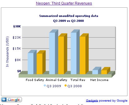
One of our scientists, who left the company to form his own agrochemical patent-tracking subscription news using Blogspot, used this free javascript-based software to illustrate this rather turgid subject matter. I borrowed his idea and used Fusionchart to illustrate a life science story on Neogen, a diagnostics company.
Life science reporting, like technology reporting, employs unnecessary amount of jargons and uninspiring polysyllabic words, often in passive sentences. This is largely down to bad subbing, bad editing (alas, not many can retell the story of science as well as former Nature editor Pete Wrobel) – and bad story-telling skills.
So often, it is down to the web editors to make the content more palatable to the laymen, although we know more about technology than science.
Like the Yahoo! Finance badge, you can easily create your own charts or tables using Fusionchart. Step 1: Create whatever charts you want. Step 2: Generate the codes. Step 3: Imbed the codes in your web page.
Do save the codes in a separate document. Fushionchart does not automatically save any charts you create. If you refresh the Fusionchart page, your chart will disappear for good.
If you have a flair for javascript, and don’t mind tweaking the codes to customise the animation, you can download some of the free apps from the Fusionchart website. Eevn better, you can upgrade by buying some of its products.
A word of caution.
If, however, you are using a content management system, you must generate a page in “raw html”. Meaning that the page is NOT preformatted. If you have a programmer, ask him or her how to do this.
If you’re stuck with a Blogspot or the free version of WordPress cms, I am afraid you can’t imbed the codes in your page. You’d have more success imbedding the codes in a flat html page. The Fusionchart you see in this blog is a GIF photo. You have to see how it works here.

Recently I worked on a Dashboard Project which shows Sales, Invoices, ATB and DSO info. Initially I started with Dundas Charts but later we changed to a nice 3D looking charts in Fusion Charts. Of course Dundas Charts was good enough but I was looking for a better 3D look, therefore I had to switch to Fusion charts. It was very simple but powerful and we use XML as Data Source.
Hi,
Thanks for the review of our FusionCharts Google Gadgets
It’s really great to read opinions/reviews as it helps us in adding new features in our products.
We have recently released FusionCharts v3 with a trial version which is a no-restriction evaluation of the actual component, you can download it at our website. We look forward to views of bloggers & developers on this product. To reach more n more developers we are giving out 2 FREE developer licenses of FusionCharts v3 to 2 best blogs in a month.
It’s only the users who has made us one of the leading players in this market segment.
Thanks
FusionCharts Team