
In March, I appealed to the Audit Bureau of Circulations to sort out its terrible ABCe website. It’s had a redesign. Here’s a list of its latest problems (originally published here).
If at any point the ABC wants to pay me a consultancy fee, for all this free advice, just leave me a comment to tell me how to receive my money …
All the URLs have changed but there are no redirects
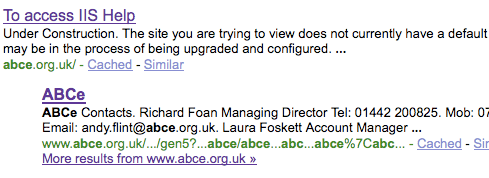
New ABCe homepage in Google
They’ve had a redesign, but they haven’t redirected the old URLs to new ones. So, for instance, if you click the second link shown in Google for a search on ABCe, you get page not found.
Lesson When relaunching a website, always 301 redirect your old pages to new ones (even if they’re all just to your new home page). That way, external links still work and you keep the SEO benefit of any links.
They haven’t sorted www vs non www
The more observant will have noticed that the title of the first result in that screenshot says ‘To access IIS Help’. The ABC hasn’t realised that abce.org.uk is not the same URL as http://www.abce.org.uk. And if you go to the ABC URLs without www, you get page not found or server errors.
Compare these pages:
and these ones:
Lesson When you set up your website, redirect yourdomain.co.uk/whatever to http://www.yourdomain.co.uk/whatever. And log in to your google webmaster account to set your preferred domain (www or non-www).
They’re running two absolutely identical websites
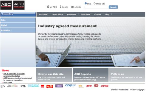
ABCs new homepage. No, it's ABCe's. No, it's aaaaggghhh
You can access the entire website at www.abc.org.uk – or you can see an identical website at www.abce.org.uk.
The only difference for each and every page across the two sites is whether there is an e in the domain name or not. For instance, compare these two URLs:
- www.abc.org.uk/Corporate/AboutABCe/StandardsandMetrics.aspx
- www.abce.org.uk/Corporate/AboutABCe/StandardsandMetrics.aspx
The same is true for every URL. This will cause problems with duplicate content in search engines, plus splitting incoming links over two URLs is problematic for SEO.
They do have two brands – ABC for print, ABCe for online – but they don’t need two websites. And even if they did, they wouldn’t need two identical ones.
Lesson Have a website. Don’t have another identical one.
The navigation is inconsistent
If you go, say, here, some related links appear in the right:
- If you click on the first one, JICwebs, then a jargon buster sudenly appears in the left hand menu, under the links that are for subscribers only.
- If you click on the second one – the jargon buster – you get page not found.
- If you click the others, some random stuff happens.
As far as I can work out, the top navigation bar controls the right hand related links box which in turn controls the left-hand menu.
Some pages have a right hand menu with related links, some are full-width with no right hand menu, and some have an empty right hand menu.
Lesson Make your navigation consistent. And keep things that are together, together. Having the top, left and right navigations interdependant AND inconsistent is really confusing. And use templates consistently.
Some minor points
- Login not clear To get to most pages, you need to login. It’s not clear which pages require this. Although on this page it says “only members can access the following pages” and you can click on the links, so clearly they’re confused at ABCe too …
- Titles unclear Although the titles have improved since the last site, they still aren’t ideal. For a start, capitalisation is random. And secondly, they don’t show the site structure. Instead of going ‘Page name – Section – ABCe’, they just show the page name. This looks unclear in Google.
- Descriptions poor The descriptions aren’t proper English. This isn’t grammatically correct: “How to become a subscriber to ABCe and what are the benefits of doing so.”
- Too many link styles Some links are blue italic. Some are black underlined. Some are red not underlined. Some are grey. Make your mind up …
- Missing images There’s a contact list but all the photos are missing.
I could go on – there’s more. But I won’t.
Yet despite these basic problems, they’re using SIFR to show fancy fonts. I think they should concentrate on these other things …

If you cannot get the basic structure of your website right, all the fancy styles and widgets won’t be what visitors remember! Which company/organisation advised them? These things aren’t even hard to do properly, the behind the scenes stuff that only geeks and search engines should see!