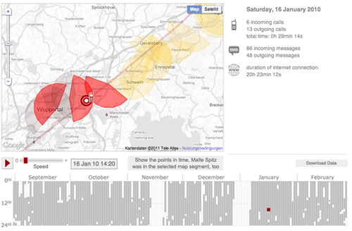
In a guest post Lorenz Matzat, editor of ZEIT Online’s Open Data Blog, writes about the background to their online app exploring the issues around data retention by mobile phone companies.
It’s not very often that one can follow the direct impact of an article, let alone a piece of data journalism. But the visualization of the cellphone data of Malte Spitz from the Green party in Germany led to visible repercussions in the US.
Following a piece in the New York Times about Spitz and the data app, some days ago two senators wrote a letter to the 4 main US-carriers for information about their data retention policy.
After publishing the app in German one month ago (and 20 days later the English version), the feedback was overhelming. We didn’t think that so many people would be so interested in it. But Twitter and Facebook in Germany went wild with it for some days – along with coverage in many major tech websites.
Probably this is why data journalism works: Making an abstract notion everybody knows about visible: that every position of you, and every connection of your mobile phone does is – or could be – logged. Every call, text message and data connection.
The background
Around February 1st, ZEIT Online asked me if I had an idea what do do with the dataset of Malte Spitz (read the background story about the legal action of Spitz to get the data here).
Looking at the dataset with about 36.000 rows he first thing which came to mind was to retell one day of the 181 days covered by the data.
Having a closer look at the data itself it became clear: there is not much to tell. The location of Spitz is quiet unexact, because we only have the geocoordinates of the senders (BTS) his phone is connected to.
In a city like Berlin the data could show Spitz for hours at the same location, but in reality he could have been moving in the BTS cell between different locations. And we had no information on who Malte Spitz had contact with: because of data privacy reasons this information was deleted by the carrier T-Mobile.
But the one day idea would work in a static print picture OK – and we gave the idea, and the data for covering the day of a rally against data retention in September 2009, to the print edition of ZEIT.
Next another idea came up: an interactive map with the timeline over the complete 181 days. In my view that’s what data journalism is about: giving the readers/users an environment to do their own research, follow their own interests and finally make up their own minds on an issue.
I was lucky to hire a talented programmer, Michael Kreil, who was interested in working with the data. He is experienced in handling huge datasets and “speaks” Javascript, which was an extra advantage – ZEIT Online doesn’t like Flash because of their iPad edition.
Michael dug into the data and came up with some great ideas like the matrix (the navigable calendar below the map).
Luckily Malte Spitz was accessing the internet with his phone, so he was permanently connected with a sender tower. His phone checked in every 10 minutes or so to fetch emails, tweets etc.
That why we have his position for about 80 percent of the 181 days. We were able to calculate for every minute where he was. Thus we also knew how fast he was moving: for example, sometimes he was traveling at speeds over 300 mph – when he was flying.
So we were a team of two people working on the map. Two weeks on and off in concept work and research, such as talking to Malte and going through his Twitter account, blog and news website to document what he was doing on any given day. Refining the data, unterstanding it. And getting background on techical aspects of mobile telephones and such.
In the end it took one week of making the app real and getting it working, refining the GUI and so on. In this time I had to coordinate with the editors at ZEIT Online and their IT department and work their feedback into the app. Overall it was maybe 12-14 working days, split between the two of us.
One interesting issue arose: who owns the rights for data journalism apps? Normally ZEIT Online gives the job to an agency, which produces the app for them, or they do them in-house.
But this time most of the concept work, research, design and programming was done by us. My understanding is that the app is more or less an article, a data-article coming as code not text. There needs to be some guidelines about rights and ownership – at least for the freelancing data journalist.
—
Lorenz Matzat is editor of the Open Data Blog at ZEIT Online. As a freelance journalist he also writes about new journalism at datenjournalist.de. Together with one partner he founded a small data journalism agency at the beginning of this year (www.opendatacity.de). Find him on Twitter @lorz


Pingback: Guest post: visualising mobile phone data – the data retention app … | reconWarehouse
Pingback: German journalists add a visual twist to cellphone data | Journalism Tech
Pingback: Personal Data Collection – Visualise Your Phone Records « OUseful.Info, the blog…