
In a guest post for OJB, Natalia Karbasova explains how, with no coding experience, she used German carpool data for the basis of a data visualisation project.
Some time ago I was working on a new blog on the sharing economy, lets-share.de. It was high time to add some data-driven stories visualising important issues of the sharing economy, which change our lives.
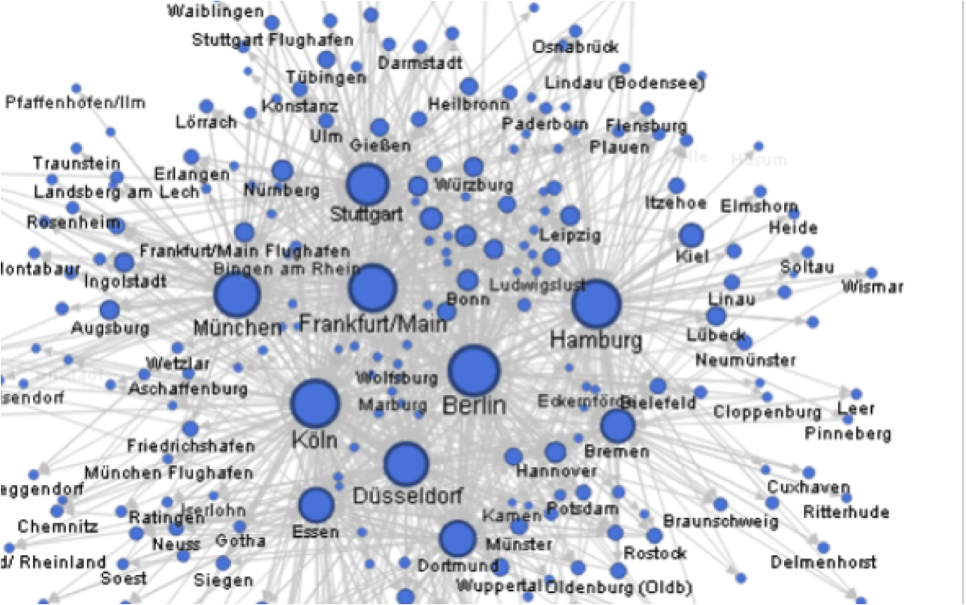
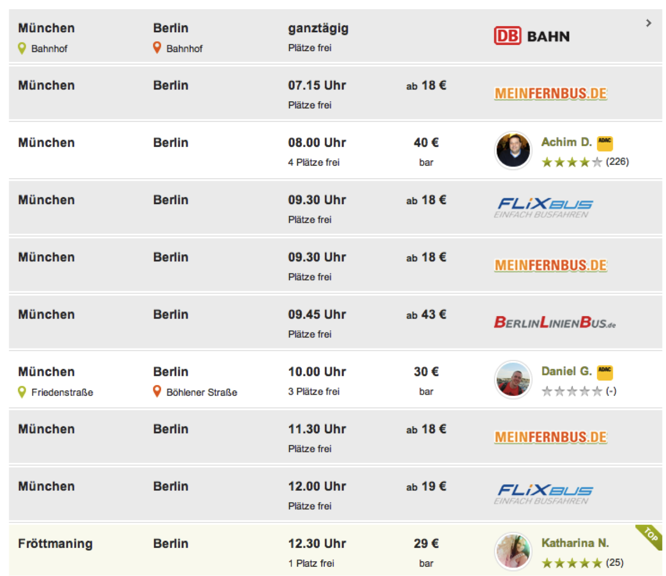
Mitfahrgelegenheit.de is the popular German version of Carpooling.com. I decided to create a visualization which would show carpooling patterns between cities in Germany and, possibly, reveal hidden connections.
Workflow
I called the German office of Mitfahrgelegenheit.de and asked them for the data. What I needed was the database of all travels in the past years.
Well, I didn’t get it.
After that, I had to rethink the concept and think about my limitations more seriously. After all, I had no developer and no designer to support me.
That’s how I came to the idea to limit my visualisation just to one day – May 1, a public holiday in Germany.
Extracting data was the most difficult part: I first resorted to the add-ons and the Google Spreadsheets formula helping to extract tables from a website .
However, the sheer amount of data points made me think of a different solution. I needed a tool which would help me extract subsequent tables from numerous pages following each other.
Outwit Hub proved to be the tool I wanted. In the free version, it can extract up to 100 rows. After buying its full version, I was able to extract all the rows I needed by copying and pasting the URL of the first page and clicking on the arrow symbol which means “extract all following tables as well”. I then saved the data as an Excel file.
Since I didn’t have many rows, it was quite plausible to use Google Spreadsheets (which can only work with 400,000 cells).
After that I cleaned the data using Excel and started to make sense of it using Google spreadsheets’ pivot tables options.
No coding, little time
Remember, I had no coding or scraping experience and no coder at hand and a very limited time.
Tools I used:
- Google spreadsheets’ importHTML function
- Google Chrome Scraper add-on
- OutWit Hub (paid version)
- Excel
- Google spreadsheets’ pivot tables
- Google Fusion Tables: creating the network diagram and embedding it on the blog
- Datawrapper: creating bar charts with top-10 cities
Have a clear idea
This was the first data journalism piece I ever created. I noticed how important it was to have a basic knowledge of statistics (median, modus, correlations) and be able to write a couple of lines of code on your own.
But, most important: you need to have a clear idea of what you want to tell the readers with your story.
If I have had more time and resources, I would have done the following:
- Connect the visualisation to the API of Mitfahrgelegennheit.de should they have one.
- Create a feed which would update the visualisation automatically. That way, the users would always be able to see real-time information.
- Create historical views of the travels to different cities. In an ideal case, every city should have a travel history and be comparable with other cities (how many people came to the city and how many people left on a particular day, compare two and more cities, add events like Oktoberfest to put this into a larger context).
- Personalise the story and let users change their city of destination and have a look at the most common price they would have to pay or the time with the largest number of offers. Ideally, these should be a link, which would bring users direct to the particular offer at mitfahrgelegenheit.de. You could even integrate the booking form into the visualization.
Natalia Karbasova works at Hubert Burda Media where she looks into digital media strategies. She blogs for the German edition of the Huffington Post and the Deutsche Welle Akademie. She also has her personal blog mediakar.org, where she covers multimedia and data journalism in three languages (English, German, Russian). She has also just launched a Visualdatablog featuring best practices in data visualization, tools and blogs covering the topic.

Pingback: Data Viz News [55] | Visual Loop
Pingback: Data Viz News [55] - sqoops
Pingback: 5 reasons why journalists should take part in hackathons | MediaKar
Pingback: What you read most on the Online Journalism Blog in 2014 | Online Journalism Blog