
In this extract from a book chapter in the new Routledge Companion to Visual Journalism, I look at how the explosion of data as a source for journalists, and the separation of content from interface in online publishing, have combined to lay the foundations for a range of new storytelling forms, from interactive infographics and timelines to charticles and scrollytelling.
Although the term ‘data journalism’ is a relatively recent one, popularised around 2010, data has been part of journalism throughout its history, from early newsletters covering stock prices and shipping schedules in the 17th century, to The Guardian’s 1821 first edition front page table of school spending, US investigations of politicians’ travel expenses in the 1840s and campaigning factchecking of lynching in the 1890s.
The introduction of computers into the newsroom in the 20th century added a new dimension to the practice. After some early experimentation by CBS News in predicting the outcome of the 1952 presidential election by applying computer power to data, a major breakthrough came in the 1960s with Philip Meyer’s use of databases and social science methods to investigate the causes of riots in Detroit.
Meyer codified his work in the 1973 book Precision Journalism and this (along with new Freedom of Information laws giving journalists the right to request public data) was to exert a major influence on what became known over the following decades as Computer Assisted Reporting (CAR).
Computer Assisted Reporting techniques extended the stories that journalists could find in data, but journalists were, on the whole, only responsible for the words: charts and visualisation for the stories would be created by the graphics department.
From CAR to data journalism
This would change with the introduction of the World Wide Web and networked news consumption, as would the storytelling options available: the availability of tools for creating charts, maps and infographics from data online multiplied, and their cost dropped to zero. IBM’s Many Eyes (launched in 2007) and Google’s Fusion Tables (2009) allowed anyone — including journalists — to create and publish their own charts and maps, and played an important role in the development of The Guardian’s data journalism among others.
Both tools would later close, however, leaving gaps in many stories that had used them, and highlighting the issues in relying on third party tools (Broussard 2015; Boss and Broussard 2016).
The most innovative journalists and organisations began exploring interactive formats that invited readers to find their own stories in the data directly, whether through tables or visual devices such as maps or interactive charts.
Some emerging genres became codified in the language and technologies of the industry (Klein-Avraham and Reich 2022): The New York Times’s longform feature Snow Fall, for example, helped popularise what came to be known as ‘scrollytelling’ (Dowling and Vogan 2015), while the Financial Times’s Story Playbook formalised the rules of the ‘charticle’ and content creation platforms such as Shorthand and Flourish embedded the practices in their tools.
As publishers hired developers or encouraged their editorial staff to learn how to code, the field also saw cultural and organisational change “where the open data philosophy, free software, collaborative and team work” became part of an emerging identity (Sandoval-Martín and La-Rosa 2018 p193).
Defining data journalism
Definitions of what constitutes ‘data journalism’ have been somewhat contested, focusing variously on output (i.e. visualisation) (Royal and Blasingame, 2015; Veglis and Bratsas 2017, Zamith 2019); culture (Parasie and Dagiral 2013; Karlsen and Stavelin 2014; Lewis and Usher, 2014; Boyles and Meyer 2016); practice (De Maeyer et al, 2014; Ojo 2018); infrastructure; and input (Tabary et al 2015).
Analysis of discourses around data journalism on Twitter also suggests that “the public’s understanding of data-driven journalism … is not refined and clear”.
Caswell, however, criticises these approaches as being:
“rooted solely in practice, observation, description and categorization … historical perspectives that do not empower journalists or news organizations to participate fully in ongoing technological change”.
One recent iteration of that change has been in the increasing role of automation in journalism reflected in the development of “robot journalism” (automated articles, often generated to a template created by data journalists) and “structured journalism”.
Chris Anderson classifies this new “computational” journalism as a separate branch to data journalism as part of a three-part typology that situates both in relation to event-based reporting:
- The journalism of occurrences: the traditional journalism of episodic, individualised, narrative-format reporting, relying on oral evidence for context;
- The journalism of social science: the precision journalism and data journalism of factualising and providing context via statistics;
- And computational journalism: these are structured stories that combine the two categories above, representing applications of computational thinking to news reporting (and context is provided via computable ‘events’)
The rise of data visualisation and interactivity

Interactivity is a complex concept that can be understood as the presence or absence of multiple qualities in a piece of work and the way that it is experienced.
Those qualities include the degree to which the user can influence the story itself; how much they can control the time and place where the story is consumed; and the degree to which they can interact with other parties (such as other users, or journalists) (Liu and Shrum 2002; Downes and McMillan 2000).
Interactive news formats have a history that predates the internet age, from ‘letters to the editor’ and magazine quizzes to radio phone-ins, but online publishing has helped establish a number of further interactive formats that have become generic in the industry.
Some of these — such as online polls and quizzes, interactive maps, charts andtimelines — are remediations of offline equivalents.
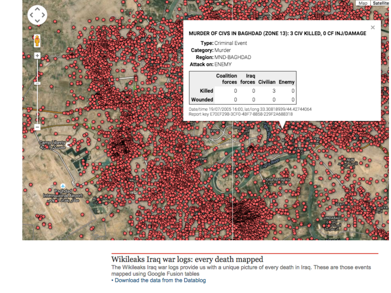
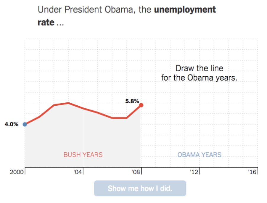
Others are web-native innovations: the ‘image map’, for example, involves taking a static image and adding ‘hotspots’ which trigger extra information on a particular area of the image when clicked or rolled over. A ‘slider’ allows the user to move a bar in order to swipe between two images (typically a ‘before’ and ‘after’ view of the same scene, such as satellite photos before and after a major disaster). And the ‘You Draw It’ genre of interactive charts pioneered by the New York Times presents the user with a partly-drawn chart while inviting them to draw the rest of the chart to show how much they know (or can guess) about a key statistic.
Other formats take genres from outside of journalism, such as the simulator, calculator, or game, and apply them within a current affairs context: The Financial Times’s Uber Game, for example, uses data-driven storytelling to help readers understand the choices facing gig economy drivers: “Uber was already using the language and technique of games in its driver app,” wrote the makers of the game.
“By making a game about it, we would be using the medium as part of the message”
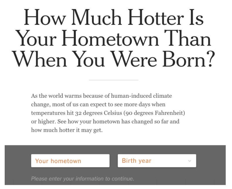
In addition, many examples of data-driven journalism use an element of personalisation that involves changing parts of the story in order to make it relevant to the person consuming it: the New York Times’s ‘How Much Hotter Is Your Hometown Than When You Were Born?’, for example, requires the user to enter their hometown and birth year in order to continue reading past the first paragraph: the rest of the article tells a story that uses the reader’s life and personal history as a frame for the subject matter.
Four ways that interactivity is incorporated
The nature of interactivity varies between formats. Jens Jensen identifies four ways that such interactivity might be incorporated: transmissional; consultation; conversational; and registrational.
Interactive maps, charts and image maps, for example, employ transmissional interactivity, with the user getting extra information in response to their behaviour (moving their mouse over an area of an image, for example).
The ‘You Draw It’ charts, however, employ conversational interactivity, which involves some input from the user, which is then displayed as part of the story.
And personalised stories which incorporate details about the user’s home town (such as the New York Times’s hometown example above) would be classified as registrational interactivity.
Finally, interactive story treatments which provide multiple views of the same information — for example, being able to switch from a bar chart to a map or table showing the same data — would be classed as consultational interactivity.
Like many of journalism’s pre-internet forms of interactivity (Schultz 1999), most generic forms of data-driven interactivity are actually largely “reactive” in the sense that they provide information in reaction to a user’s activity, rather than interactive in the sense that users can interact with journalists or other readers.
Research into interactive visualisations in Israel notes that interactivity’s
“potential to efficiently and intricately mediate rich journalistic knowledge [is not realised] in practice [where] they usually mediate and oversimplify”.
There are exceptions, however, from The Guardian’s transfer gossip stories where users could at one point see how their fellow readers had voted on the credibility of a particular rumour, to the same publication’s Flickr group (now dormant) dedicated to readers’ visualisations based on data the organisation had published.
The growing number of GitHub repositories maintained by data journalism teams might also be considered part of the wider ‘meso news-spaces’ (Tenenboim and Kligler-Vilenchik 2020) where users can participate in news-related processes, although research suggests participation is low.
Separating the content from the interface
One major change facilitated by the shift to online publishing that had a particular impact on interactivity is highlighted by Lev Manovich:
“Historically, the artist made a unique work within a particular medium. Therefore the interface and the work were the same; in other words, the level of an interface did not exist. With new media, the content of the work and the interface become separate. It is therefore possible to create different interfaces to the same material”
Nowhere is this more apparent than in the practice of data visualisation: once a table of data is imported into a chart creation tool, a journalist can instantly preview different interfaces based on that material — a pie chart, bar chart, a simple interactive table, perhaps (if it contains geographical data) a map.
In some cases this choice of interface can be presented directly to the reader: visualisation dashboards, for example, allow readers to apply filters or sorting in order to change the interface to one that is most relevant or meaningful to them.
Another form of database-driven interactive storytelling is the ‘clickable interactive’, where a user is invited to navigate through a story’s elements by making different navigational choices.
Segel and Heer identify three structures commonly employed in this form, providing differing levels of user control: the ‘interactive slideshow’ format, for example, merely invites the reader to click ‘next’ through each chapter in the story as they would a slideshow, whereas the ‘martini glass’ format allows them to explore the data towards the end of the sequence. In contrast the ‘drill-down story’ gives the reader complete freedom to choose which elements of the story to explore, and their order.
Some of these might be considered forms of ergodic storytelling, whereby readers are offered different paths through a story (Aarseth 1997). Ergodic storytelling online typically requires the journalist to convert story material into data stored in a database — in the form of pages in a content management system such as WordPress or updates on a social media platform — which can then be navigated by clicking on hyperlinks that take you from one entry to another.
In the case of a chatbot that database is formally created and navigation takes place through choosing options presented by the chatbot or asking questions which are matched to records in the database (more advanced large language model chatbots might be able to construct more unique answers by accessing and combining billions of text records).
Manovich is at pains to point out that simply linking such records together is not enough alone for a story to qualify as an interactive narrative:
“The author also has to control the semantics of the elements and the logic of their connection so that the resulting object will meet the criteria of narrative”
Those criteria — identified by the narratologist Mieke Bal — include, among other things, that a story should consist of “a series of connected events caused or experienced by actors” (Bal 1985).
Which chart or map the journalist chooses, then, can be seen as an editorial process guided by the same considerations as other aspects of their reporting.
