
In the second part of this extract from a book chapter in the new Routledge Companion to Visual Journalism, I look at the editorial processes involved in data visualisation, along with the ethical considerations and challenges encountered along the way.
Decisions around what data to visualise and how to visualise it involve a range of ethical considerations and challenges, and it is important to emphasise that data visualisation is an editorial process just as much as any other form of factual storytelling.
Journalists and designers employ a range of rhetorical devices to engage an audience and communicate their story, from the choice of the chart and its default views or comparisons, to the use of colour, text and font, and animations and search suggestions (Segel and Heer 2011; Hullman & Diakopoulos 2011).
Chart types are story genres
The chart that a journalist chooses to visualise data plays a key role in suggesting the type of story that is being told, and what the user might do with the data being displayed.
If a pie chart is chosen then this implies that the story is about composition (parts of a whole). In contrast, if a bar chart is used then the story is likely to be about comparison.
Line charts imply that the reader is being invited to see something changing over time, while histograms (where bars are plotted along a continuum, rather than ranked in order of size) invite us to see how something is distributed across a given scale.
Scatterplots — which plot points against two values (such as the cancer rate in each city against the same city’s air pollution) — invite us to see relationships.
Put another way, each chart type acts as a type of genre, bringing with it expectations about the story that it is going to tell.
These expectations are made explicit in much of the literature used to train designers, researchers and journalists, and some news organisations have codified them in internal and public style guides: The Financial Times’s Visual Vocabulary guide, for example, was created in 2016 to improve chart literacy and be “at the core of a newsroom-wide training session”.
Editorial decisions: chart type, colour, text
Simon Scarr’s 2011 award-winning chart for The South China Morning Post, “Iraq’s Bloody Toll”, for example, chooses to employ a histogram in order to tell a story about deaths per month in Iraq, chooses a blood-red colour for the bars and inverts the histogram so that the bars run down the page like blood.
The text chosen to label it — “Iraq’s bloody toll” — draws our attention to the way that the chart shows the scale of deaths in the conflict.
InfoWorld’s Andy Cotgreave illustrated the effect of Scarr’s editorial decisions by presenting the same data in a cooler blue, flipping the histogram vertically, and using the label “Iraq: Deaths on the decline”, drawing the attention instead to the fact that the rate of deaths had decreased over time.
“Neither of those charts is lying,” Cotgreave wrote, making the point that “The opinionated nature of charts should be acknowledged and embraced”.
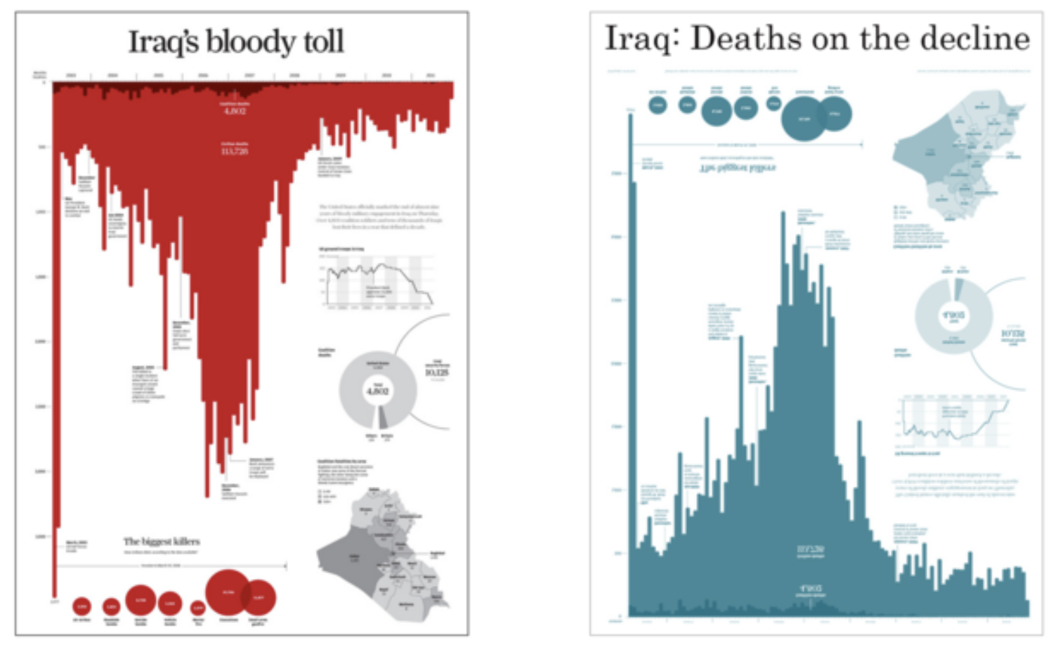
In these examples both pieces of visualisation were accurate — they simply told different stories (one about the scale of deaths, another about change over time).
Accuracy is a fundamental ethical consideration in visualising data: a chart should accurately represent the data that it is based on, and not misrepresent the story that it is trying to communicate.
Graphical integrity
Edward Tufte calls this graphical integrity (Tufte 1983) and outlines six principles underpinning it. The best known of these principles is that “the representation of numbers, as physically measured on the surface of the graphic itself, should be directly proportional to the numerical quantities measured”.
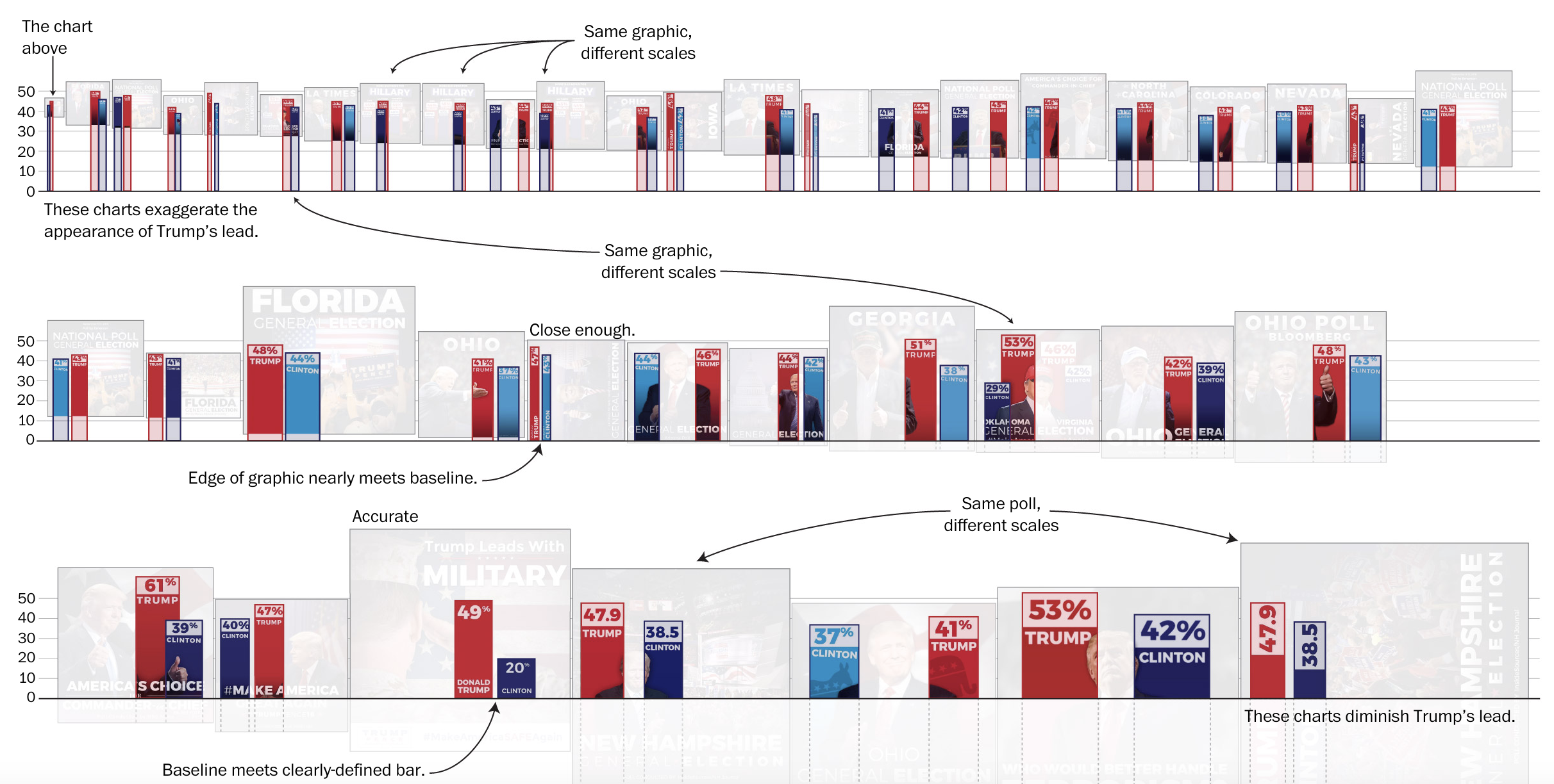
In a bar chart, for example, a bar showing 20 should be twice as long as a bar showing 10. A common technique used to misrepresent data in bar charts is to shift the chart’s y-axis baseline from zero to a different number in order to make gaps between amounts (for example, the gap between political parties’ support) look larger than they actually are.
The technique was used so often during the 2016 US election that the Washington Post devoted an article specifically to it:
“Bar charts represent data using length. This means that if the bars don’t begin at zero, comparisons between bar lengths will distort the data — and a reader’s comprehension of the numbers”
This “baselines should always be zero” rule, however, is often misapplied to line charts, where a zero-based y-axis is not required and can, in fact, be misleading itself.
A common example of this is found in charts shared by climate change sceptics showing how global temperature has changed over the last century: plotting such temperatures against a baseline of zero degrees has the effect of downplaying changes in temperature and making it look as if global temperatures have barely changed, by shrinking the space occupied by the data points.
For line charts, where comparison is being made across time rather than between bars, Tufte advises
“using a baseline that shows the data not the zero point. If the zero point reasonably occurs in plotting the data, fine. But don’t spend a lot of empty vertical space trying to reach down to the zero point at the cost of hiding what is going on in the data line itself”
A zero-based scale is not neutral: it makes the change look relatively flat despite it being a significant drop… 
Picking a minimum and maximum value too close to the smallest and highest values can make change look more dramatic than it is. 
A scale at neither extreme may avoid misrepresenting the data – it is ultimately an editorial decision what scale to use
Tufte’s other five principles of graphical integrity are:
- Labelling should be clear and used to avoid ambiguity, including drawing attention to key data points (annotation);
- Changes in the scale of an element should not be done purely for design reasons, i.e. they should correspond to changes in the values being represented;
- Standardise monetary measurements when showing changes over time (i.e. to factor in inflation);
- Dimensions depicted should not exceed the number of dimensions in the data (e.g. double counting); and
- Data should not be quoted out of context
A truncated axis in bar charts and changes to the aspect ratio (the range shown) in line charts are two of the four common forms of distortion identified by Pandey et al.
Inverting the axis of a chart (to make it look like something is increasing when it is correlating, or vice versa), and encoding quantities in area (especially when it is quantified in the radius of a circle rather than its area) are two others.
Ethical challenges in data visualisation
Aside from accuracy, visualisation faces a number of ethical challenges relating to equality, diversity and inclusivity (EDI). Schwabish and Feng identify a number of techniques that visualisation creators need to consider in this regard, including the use of colour, inclusive language, and chart iconography, as well as data grouping.
People-first language, such as “people with disabilities” rather than ”disabled people”, is recommended, and visualisation designers should keep up to date with current debates about inclusive use of language.
Chart creation should be careful not to order or colour elements in a way which makes a particular group the ‘default’ against which others are compared for no clear reason (‘white’ as an category of ethnicity, for example, would not normally come first alphabetically) or to group categories together to similar effect (footnotes should be used to explain the reasons behind any grouping, and list the categories being grouped).
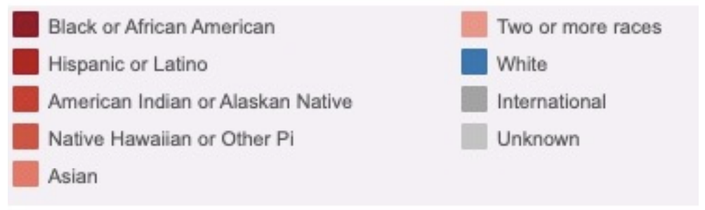
An example of bad practice (shown above) provided by Schwabish and Feng is a data dashboard which grouped racial and ethnic groups into three colour hues: the “white” category was given its own dedicated hue (blue), while five other groups were allocated different shades of a second hue (red) and two final groups (“International” and “Unknown”) were allocated grey. The effect was to create three categories and privilege the white category as more distinct than the others.
If a category of people is placed first in a chart there should be a specific reason for this, such as that the story itself focuses on that particular category, that the ordering reflects the story being told, or that elements are ordered alphabetically, or by size.
It is important to consider what categories are used, and missing, from the data too. In The Guardian visualisation ‘How diverse is the 2018 US Congress?’, for example, the data only records two categories of gender among politicians — male and female — but the creators of a map based on the data chose to display three categories: “cis male”, “cis female”, and “trans and non-binary”.
The effect of this editorial decision was to make visible a group which would otherwise be invisible: the very absence of trans politicians being, in this case, an important part of the story being told.
Deficit-based perspectives
When comparing different groups of people visualisation creators should be conscious of potential “deficit-based perspectives”, whereby lower performing groups are viewed through the prism of comparisons with better performing groups:
“These narratives reduce a group or culture to its “problems,” rather than portraying it with the strengths, creativity, and agency that people from those cultures possess” (D’Ignazio and Klein 2020).
“Deficit thinking encourages ‘victim blaming’,” write Holder and Xiong; “it favors explanations that hold group members personally responsible for outcomes (e.g., “It’s because of who they are”), as opposed to explanations related to external causes (e.g., “It’s because of systemic racism”)”.
Their research into different visualisation techniques found that approaches which hid variability within groups (such as bar charts) tended to increase stereotyping while approaches which emphasised variability (such as jitter plots and prediction intervals) reduced it.
Small multiples — where each group is charted separately, and compared to an overall average — have also been suggested as a way of reducing inter-group comparison, while the importance of labelling is highlighted in an analysis in the book Data Feminism:
“[the subtitle] People of Color Less Likely to Get Mental Health Diagnosis … reduces a social group to negative stereotypes and fails to portray them with creativity and agency … [an alternative subtitle of] White People Get More Mental Health Services … avoids propagating a deficit narrative that reinforces negative associations and clichés.”
Connotations of colour and shape
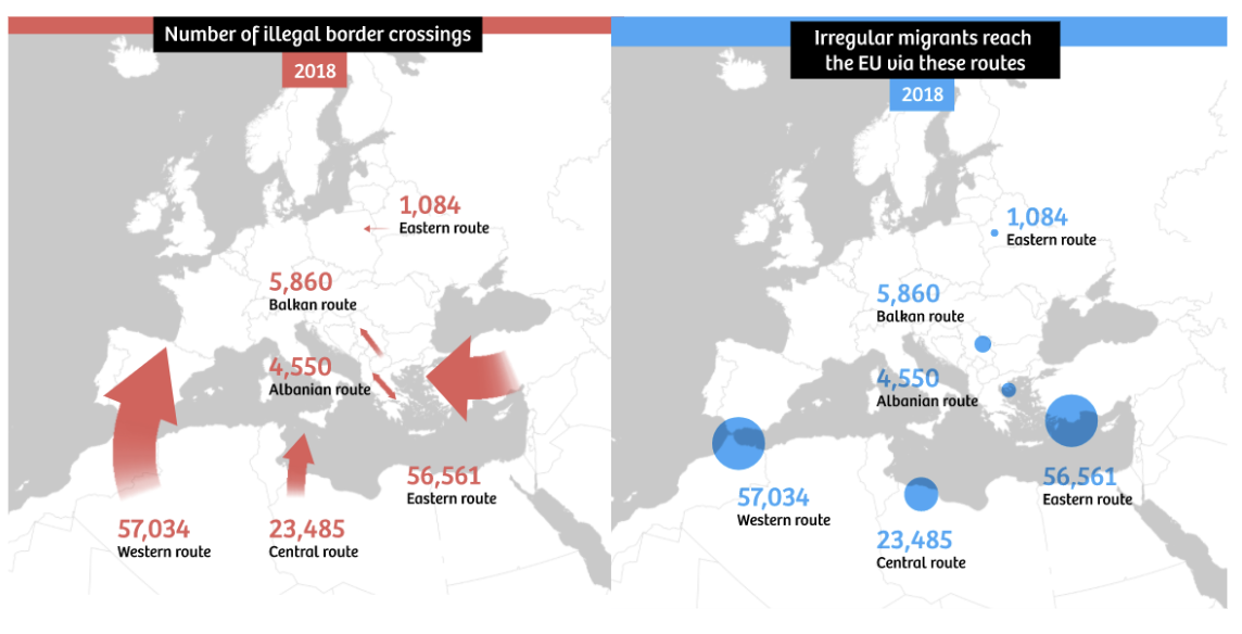
Colour and shape can have strong cultural connotations which should also be considered. One analysis of immigration maps highlights how the choice to use thick arrows “reminiscent of battle maps”, and red — ”the colour of danger” — in many such maps “subconsciously strengthen[s] the ugly underbelly of anti-migration sentiments in Europe”.
The thickness of the lines exaggerates the numbers of migrants involved, and their simple directness belies the reality of most migrants’ journeys to the continent. In addition, the diversity of migrant experience and legal status is belied by the use of a single category: “illegal border crossings”.
When the same map is redrawn with a different use of colour, shape and labelling, the effect is very different. They conclude:
“As journalists and illustrators, there is no way around simplifying the world for the sake of readability. Whether in maps or in text. But we can be much more aware of the consequences of those simplifications – and be honest about what’s happening. We can present a map as a story that contains moral choices, rather than portraying it as the truth.”
Mapping more broadly introduces its own particular challenges for a critical practitioner: choosing to map data leaves the journalist vulnerable to underplaying events which are not given a geographical location (such as financial crime and cybercrime), while there is a danger of dehumanising individuals through the ‘cartographic gaze’ (Kindynis 2014).
Anthropomorphising visualisations
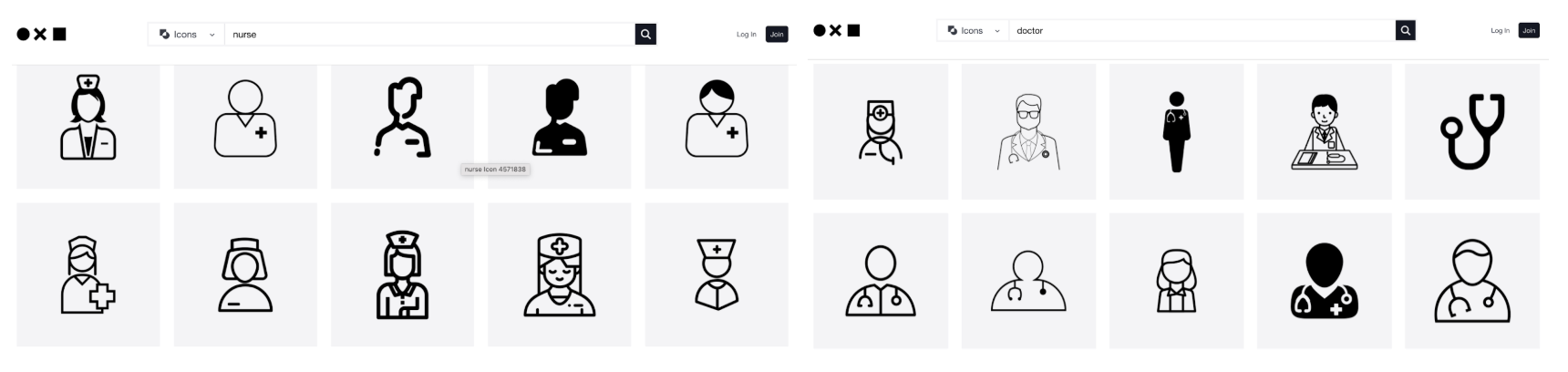
When quantities are represented by icons — “anthropomorphising” visualisations (Boy, Pandey and Nov 2017) — these should also be chosen carefully.
Consider whether such icons reinforce stereotypes, and if they reflect the diversity of the population. A search in icon libraries for ‘nurse’, for example, is likely to be dominated by women, while ‘doctor’ icons are more likely to show men.
Research on photo libraries finds lower representations of certain groups including older people, and care should be taken to avoid similar problems with icon libraries.
Accessibility in data visualisation
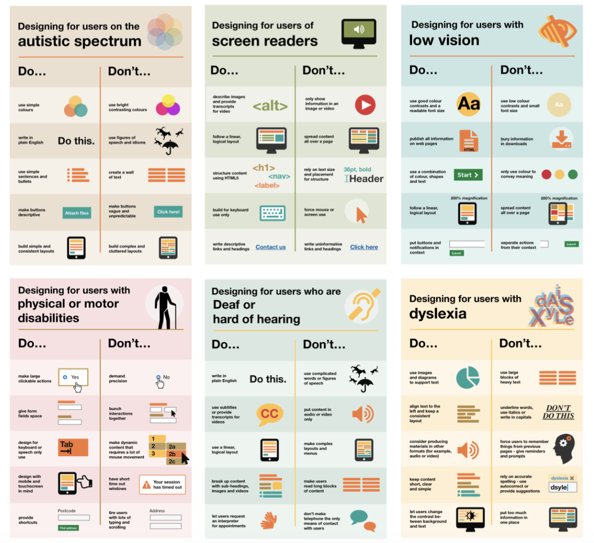
A further ethical consideration in data visualisation is accessibility. At the most basic level this refers to making information in a visual available to everyone: a blind user or someone who is colourblind should not be excluded from understanding a chart simply because they cannot see it or distinguish between its colours.
A number of techniques have been identified in ensuring charts, maps and infographics are accessible. A basic step is the inclusion of an alternative description when an image is uploaded — whether that is to a content management system, or to a social media platform (most of which now offer the ability to add alternative descriptions to images).
Despite the widespread availability of this functionality, the use of alternative text is not universal. Research on how to write such descriptions finds wide variations in the preferences of end users, suggesting alternative text should avoid the extremes of describing every data point, or providing insights into the data, and instead aim to convey the broader trends and key facts that the chart is designed to communicate.
Colour is another key area of consideration in accessibility: colour blind users (around 1 in every 20 people are colour blind) should be able to distinguish between different hues being used (many chart creation tools have ‘colourblind check’ functionality built in), and contrast should be sufficient for people with low vision to distinguish between colours, too (tools such as contrastchecker.com can be used to check). Autistic users can be sensitive to bright contrasting colours, so these are also advised against.
Text forms part of a chart’s accessibility, too: it is recommended that visualisations use simple and clear language, align text consistently and use a linear, logical layout, and avoid underlining or writing in capitals.
Explanatory versus exploratory visualisation
Most of the editorial choices explored so far relate to explanatory visualisation, whereby charts are created to explain a story, and choices around text, colour, and other rhetorical devices are guided by a desire to make that story as clear as possible.
However, not all charts are explanatory: some stories are exploratory, providing visualisation that is ambiguous rather than explicit, with an invitation to the reader to explore it themselves. Al Jazeera’s Visualising the 2021 FIFA Arab Cup, for example, features a number of striking charts with detailed instructions for use, designed to help the reader compare the different teams and players across different metrics, without any explicit angle. And publications will regularly embed a map in a story inviting the reader to find the events or data points in their area, from crimes to restaurant ratings.
Interactivity and ethical challenges
Interactivity and its opportunities for personalisation raise new challenges for journalists, particularly in relation to balance and objectivity: while personalisation engages users with its promise to show how a story affects ‘people like me’, there is a risk that it restricts their ability to learn how it affects people not like them — contributing to wider social atomisation and “putting the societal value of new journalism and audiences as democratic collectives at stake”. Many stories integrating personalisation, then, ensure that they include other experiences in the story.
Offering interactivity represents a delegation of control over the story — as one piece of research into structured journalism expresses it:
“The biggest opportunity and the biggest risk are thus one and the same—the computational system’s ability to make manifold versions over which journalists cannot maintain oversight”.
The use of user data in interactive stories also presents challenges around privacy: the journalist must decide what data they need from the user (such as their location, or age group), how to process that information, and whether to store it — and the evidence suggests a “lack of clear policies and guidelines for how such data should be handled, protected, and ethically used by journalists”.
Conclusions
Data journalism and visualisation has grown quickly, from a fringe activity in the industry pursued by committed and curious individuals, to a formalised set of job roles.
Alongside this, research into the fields has also grown rapidly. From merely mapping the field and listing its challenges, to attempting to understand its interaction with power structures and with established newsroom practices (D’Ignazio and Klein 2020; Morini 2022; Lu and Zhen 2023), its consumption (Appelman 2023; Tong 2023) and the development of data journalism beyond Western contexts (Alaqil and Lugo-Ocando 2023; Wu 2022; Farhi et al 2023), the literature must now keep up with new developments.
Chief among those will be the integration of automation and artificial intelligence (AI) into news production, consumption and distribution. As early as 2016 the UK newspaper The Telegraph introduced an automated graphics tool into its liveblogging and RADAR is just one data journalism team that produces automated versions of its stories to clients (see Thäsler-Kordonouri and Barling 2023 for research into the impacts of that).
Artificial intelligence represents an expanding new frontier for journalism, both as a technology of production, and as a form of power for reporters to hold to account. Its use brings with it new ethical challenges, particularly in the power relations that are embedded in algorithms, and language.
How the industry navigates the challenges and opportunities that these technologies bring — while also continuing to identify and codify best practice in still-new data journalism and visualisation practice — will be the main story of the years to come.
