Category Archives: online journalism

How Might Data Journalists Show Their Working? Sweave

If part of the role of data journalism is to make transparent the justification behind claims that are, or aren’t, backed up by data, there’s good reason to suppose that the journalists should be able to back up their own data-based claims with evidence about how they made use of the data. Posting links to raw data helps to a certain extent – at least third parties can then explore the data themselves and check the claims the press are making – but you could also argue that the journalists should also make their notes available regarding how they worked the data. (The same is true in public reports, where summary statistics and charts are included in a report, along with a link to the raw data, but no transparency in how the summary reports/charts were actually produced from the data.)

In Power Tools for Aspiring Data Journalists: R, I explored how we might use the R statistical programming language to replicate a chart that appeared in one of Ben Goldacre’s Bad Science columns. I included code snippets in the post, along with the figures they generated. But is there a way of getting even closer to the source, as it were, and produce documents that essentially generate their output from some sort of “source code”?

For example, take this view of my working relating to the production of the funnel chart described in Goldacre’s column:

You can find the actual “source code” for that document here: bowel cancer funnel plot working notes If you load it into something like RStudio, you can “run” the code and generate your own PDF from it.

The “source” of the document includes both text and R code. When the Sweave document is processed, the R code contained within the document is executed and the results also included in the document. The charts shown in the report are generated directly from the code included in the document, using data pulled in to the document form a source referenced within the document. If the source data is changed, or the R code is changed, what’s contained in the output document will change as well.

This sort of workflow will be familiar to many experimental scientists, but I wonder: is it something that data journalists have considered, at least as a way of keeping working notes about data related projects they are working on?

PS as well as Sweave, see dexy.it, which generalises the Sweave approach to allow you to create self-documenting software/code. Educators, also take note…;-)

Power Tools for Aspiring Data Journalists: Funnel Plots in R

Picking up on Paul Bradshaw’s post A quick exercise for aspiring data journalists which hints at how you can use Google Spreadsheets to grab – and explore – a mortality dataset highlighted by Ben Goldacre in DIY statistical analysis: experience the thrill of touching real data, I thought I’d describe a quick way of analysing the data using R, a very powerful statistical programming environment that should probably be part of your toolkit if you ever want to get round to doing some serious stats, and have a go at reproducing the analysis using a bit of judicious websearching and some cut-and-paste action…

R is an open-source, cross-platform environment that allows you to do programming like things with stats, as well as producing a wide range of graphical statistics (stats visualisations) as if by magic. (Which is to say, it can be terrifying to try to get your head round… but once you’ve grasped a few key concepts, it becomes a really powerful tool… At least, that’s what I’m hoping as I struggle to learn how to use it myself!)

I’ve been using R-Studio to work with R, a) because it’s free and works cross-platform, b) it can be run as a service and accessed via the web (though I haven’t tried that yet; the hosted option still hasn’t appeared yet, either…), and c) it offers a structured environment for managing R projects.

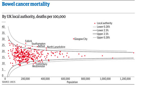
So, to get started. Paul describes a dataset posted as an HTML table by Ben Goldacre that is used to generate the dots on this graph:

The lines come from a probabilistic model that helps us see the likely spread of death rates given a particular population size.

If we want to do stats on the data, then we could, as Paul suggests, pull the data into a spreadsheet and then work from there… Or, we could pull it directly into R, at which point all manner of voodoo stats capabilities become available to us.

As with the =importHTML formula in Google spreadsheets, R has a way of scraping data from an HTML table anywhere on the public web:

#First, we need to load in the XML library that contains the scraper function
library(XML)
#Scrape the table
cancerdata=data.frame( readHTMLTable( 'http://www.guardian.co.uk/commentisfree/2011/oct/28/bad-science-diy-data-analysis', which=1, header=c('Area','Rate','Population','Number')))

The format is simple: readHTMLTable(url,which=TABLENUMBER) (TABLENUMBER is used to extract the N’th table in the page.) The header part labels the columns (the data pulled in from the HTML table itself contains all sorts of clutter).

We can inspect the data we’ve imported as follows:

#Look at the whole table
cancerdata
#Look at the column headers
names(cancerdata)
#Look at the first 10 rows
head(cancerdata)
#Look at the last 10 rows
tail(cancerdata)
#What sort of datatype is in the Number column?
class(cancerdata$Number)

The last line – class(cancerdata$Number) – identifies the data as type ‘factor’. In order to do stats and plot graphs, we need the Number, Rate and Population columns to contain actual numbers… (Factors organise data according to categories; when the table is loaded in, the data is loaded in as strings of characters; rather than seeing each number as a number, it’s identified as a category.)

#Convert the numerical columns to a numeric datatype
cancerdata$Rate=as.numeric(levels(cancerdata$Rate)[as.integer(cancerdata$Rate)])
cancerdata$Population=as.numeric(levels(cancerdata$Population)[as.integer(cancerdata$Population)])
cancerdata$Number=as.numeric(levels(cancerdata$Number)[as.integer(cancerdata$Number)])

#Just check it worked…
class(cancerdata$Number)
head(cancerdata)

We can now plot the data:

#Plot the Number of deaths by the Population
plot(Number ~ Population,data=cancerdata)

If we want to, we can add a title:
#Add a title to the plot
plot(Number ~ Population,data=cancerdata, main='Bowel Cancer Occurrence by Population')

We can also tweak the axis labels:

plot(Number ~ Population,data=cancerdata, main='Bowel Cancer Occurrence by Population',ylab='Number of deaths')

The plot command is great for generating quick charts. If we want a bit more control over the charts we produce, the ggplot2 library is the way to go. (ggpplot2 isn’t part of the standard R bundle, so you’ll need to install the package yourself if you haven’t already installed it. In RStudio, find the Packages tab, click Install Packages, search for ggplot2 and then install it, along with its dependencies…):

require(ggplot2)
ggplot(cancerdata)+geom_point(aes(x=Population,y=Number))+opts(title='Bowel Cancer Data')+ylab('Number of Deaths')

Doing a bit of searching for the “funnel plot” chart type used to display the ata in Goldacre’s article, I came across a post on Cross Validated, the Stack Overflow/Statck Exchange site dedicated to statistics related Q&A: How to draw funnel plot using ggplot2 in R?

The meta-analysis answer seemed to produce the similar chart type, so I had a go at cribbing the code… This is a dangerous thing to do, and I can’t guarantee that the analysis is the same type of analysis as the one Goldacre refers to… but what I’m trying to do is show (quickly) that R provides a very powerful stats analysis environment and could probably do the sort of analysis you want in the hands of someone who knows how to drive it, and also knows what stats methods can be appropriately applied for any given data set…

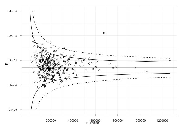
Anyway – here’s something resembling the Goldacre plot, using the cribbed code which has confidence limits at the 95% and 99.9% levels. Note that I needed to do a couple of things:

1) work out what values to use where! I did this by looking at the ggplot code to see what was plotted. p was on the y-axis and should be used to present the death rate. The data provides this as a rate per 100,000, so we need to divide by 100, 000 to make it a rate in the range 0..1. The x-axis is the population.

#TH: funnel plot code from:
#TH: http://stats.stackexchange.com/questions/5195/how-to-draw-funnel-plot-using-ggplot2-in-r/5210#5210
#TH: Use our cancerdata
number=cancerdata$Population
#TH: The rate is given as a 'per 100,000' value, so normalise it
p=cancerdata$Rate/100000

p.se <- sqrt((p*(1-p)) / (number))
df <- data.frame(p, number, p.se)

## common effect (fixed effect model)
p.fem <- weighted.mean(p, 1/p.se^2)

## lower and upper limits for 95% and 99.9% CI, based on FEM estimator
#TH: I'm going to alter the spacing of the samples used to generate the curves
number.seq <- seq(1000, max(number), 1000)
number.ll95 <- p.fem - 1.96 * sqrt((p.fem*(1-p.fem)) / (number.seq))
number.ul95 <- p.fem + 1.96 * sqrt((p.fem*(1-p.fem)) / (number.seq))
number.ll999 <- p.fem - 3.29 * sqrt((p.fem*(1-p.fem)) / (number.seq))
number.ul999 <- p.fem + 3.29 * sqrt((p.fem*(1-p.fem)) / (number.seq))
dfCI <- data.frame(number.ll95, number.ul95, number.ll999, number.ul999, number.seq, p.fem)

## draw plot
#TH: note that we need to tweak the limits of the y-axis
fp <- ggplot(aes(x = number, y = p), data = df) +
geom_point(shape = 1) +
geom_line(aes(x = number.seq, y = number.ll95), data = dfCI) +
geom_line(aes(x = number.seq, y = number.ul95), data = dfCI) +
geom_line(aes(x = number.seq, y = number.ll999, linetype = 2), data = dfCI) +
geom_line(aes(x = number.seq, y = number.ul999, linetype = 2), data = dfCI) +
geom_hline(aes(yintercept = p.fem), data = dfCI) +
scale_y_continuous(limits = c(0,0.0004)) +
xlab("number") + ylab("p") + theme_bw()

fp

As I said above, it can be quite dangerous just pinching other folks’ stats code if you aren’t a statistician and don’t really know whether you have actually replicated someone else’s analysis or done something completely different… (this is a situation I often find myself in!); which is why I think we need to encourage folk who release statistical reports to not only release their data, but also show their working, including the code they used to generate any summary tables or charts that appear in those reports.

In addition, it’s worth noting that cribbing other folk’s code and analyses and applying it to your own data may lead to a nonsense result because some stats analyses only work if the data has the right sort of distribution…So be aware of that, always post your own working somewhere, and if someone then points out that it’s nonsense, you’ll hopefully be able to learn from it…

Given those caveats, what I hope to have done is raise awareness of what R can be used to do (including pulling data into a stats computing environment via an HTML table screenscrape) and also produced some sort of recipe we could take to a statistician to say: is this the sort of thing Ben Goldacre was talking about? And if not, why not?

[If I’ve made any huge – or even minor – blunders in the above, please let me know… There’s always a risk in cutting and pasting things that look like they produce the sort of thing you’re interested in, but may actually be doing something completely different!]

Choosing a strategy for content: 4 Ws and a H

Something interesting happened to journalism when it moved from print and broadcast to the web. Aspects of the process that we barely thought about started to be questioned: the ‘story’ itself seemed less than fundamental. Decisions that you didn’t need to make as a journalist – such as what medium you would use – were becoming part of the job.

In fact, a whole raft of new decisions now needed to be made.

For those launching a new online journalism project, these questions are now increasingly tackled with a content strategy, a phrase and approach which, it seems to me, began outside of the news industry (where the content strategy had been settled on so long ago that it became largely implicit) and has steadily been rediscovered by journalists and publishers.

‘Web first’, for example, is a content strategy; the Seattle Times’s decision to focus on creation, curation and community is a content strategy. Reed Business Information’s reshaping of its editorial structures is, in part, a content strategy:

Why does a journalist need a content strategy?

I’ve written previously about the style challenge facing journalists in a multi platform environment: where before a journalist had few decisions to make about how to treat a story (the medium was given, the formats limited, the story supreme), now it can be easy to let old habits restrict the power, quality and impact of reporting.

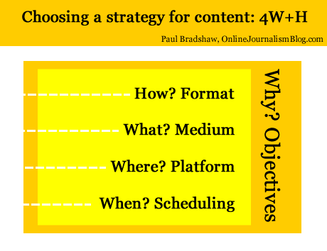
Below, I’ve tried to boil down these new decisions into 4 different types – and one overarching factor influencing them all. These are decisions that often have to be made quickly in the face of changing circumstances – I hope that fleshing them out in this way will help in making those decisions quicker and more effectively.

1. Format (“How?”)

We’re familiar with formats: the news in brief; the interview; the profile; the in-depth feature; and so on. They have their conventions and ingredients. If you’re writing a report you know that you will need a reaction quote, some context, and something to wrap it up (a quote; what happens next; etc.). If you’re doing an interview you’ll need to gather some colour about where it takes place, and how the interviewee reacts at various points.

Formats are often at their most powerful when they are subverted: a journalist who knows the format inside out can play with it, upsetting the reader’s expectations for the most impact. This is the tension between repetition and contrast that underlies not just journalism but good design, and even music.

As online journalism develops dozens of new formats have become available. Here are just a few:

  • the liveblog;
  • the audio slideshow;
  • the interactive map;
  • the app;
  • the podcast;
  • the explainer;
  • the portal;
  • the aggregator;
  • the gallery

Formats are chosen because they suit the thing being covered, its position in the publisher’s news environment, and the resources of the publisher.

Historically, for example, when a story first broke for most publishers a simple report was the only realistic option. But after that, they might commission a profile, interview, or deeper feature or package – if the interest and the resources warranted that.

The subject matter would also be a factor. A broadcaster might be more inclined to commission a package on a story if colourful characters or locations were involved and were accessible. They might also send a presenter down for a two-way.

These factors still come into play now we have access to a much wider range of formats – but a wider understanding of those formats is also needed.

  • Does the event take place over a geographical area, and users will want to see the movement or focus on a particular location? Then a map might be most appropriate.
  • Are things changing so fast that a traditional ‘story’ format is going to be inadequate? Then a liveblog may work better.
  • Is there a wealth of material out there being produced by witnesses? A gallery, portal or aggregator might all be good choices.
  • Have you secured an interview with a key character, and a set of locations or items that tell their own story? Is it an ongoing or recurring story? An audio slideshow or video interview may be the most powerful choice of format.
  • Are you on the scene and raw video of the event is going to have the most impact? Grab your phone and film – or stream.

2. Medium (“What?”)

Depending on what format has been chosen, the medium may be chosen for you too. But a podcast can be audio or video; a liveblog can involve text and multimedia; an app can be accessed on a phone, a webpage, a desktop widget, or Facebook.

This is not just about how you convey information about what’s going on (you’ll notice I avoid the use of ‘story’, as this is just one possible choice of format) but how the user accesses it and uses it.

A podcast may be accessed on the move; a Facebook app on mobile, in a social context; and so on. These are factors to consider as you produce your content.

3. Platform (“Where?”)

Likewise, the platforms where the content is to be distributed need careful consideration.

A liveblog’s reporting might be done through Twitter and aggregated on your own website. A map may be compiled in a Google spreadsheet but published through Google Maps and embedded on your blog.

An audioboo may have subscribers on iTunes or on the Audioboo app itself, and its autoposting feature may attract large numbers of listeners through Twitter.

Some call the choice of platform a choice of ‘channel’ but that does not do justice to the interactive and social nature of many of these platforms. Facebook or Twitter are not just channels for publishing live updates from a blog, but a place where people engage with you and with each other, exchanging information which can become part of your reporting (whether you want it to or not).

(Look at these tutorials for copy editors on Twitter to get some idea of how that platform alone requires its own distinct practices)

Your content strategy will need to take account of what happens on those platforms: which tweets are most retweeted or argued with; reacting to information posted in your blog or liveblog comments; and so on.

[UPDATE, March 25: This video from NowThisNews’s Ed O’Keefe explains how this aspect plays out in his organisation]

4. Scheduling (“When?”)

The choice of platform(s) will also influence your choice of timing. There will be different optimal times for publishing to Facebook, Twitter, email mailing lists, blogs, and websites.

There will also be optimal times for different formats (as the Washington Post found). A short news report may suit morning commuters; an audio slideshow or video may be best scheduled for the evening. Something humorous may play best on a Friday afternoon; something practical on a Wednesday afternoon once the user has moved past the early week slog.

Infographic: The Best Times To Post To Twitter & Facebook

This webcast on content strategy gives a particular insight into how they treat scheduling – not just across the day but across the week.

5. “Why?”

Print and broadcast rest on objectives so implicit that we barely think about them. The web, however, may have different objectives. Instead of attracting the widest numbers of readers, for example, we may want to engage users as much as possible.

That makes a big difference in any content strategy:

  • The rapid rise of liveblogs and explainers as a format can be partly explained by their stickiness when compared to traditional news articles.
  • Demand for video content has exceeded supply for some publishers because it is possible to embed advertising with content in a way which isn’t possible with text.
  • Infographics have exploded as they lend themselves so well to viral distribution.

Distribution is often one answer to ‘why?’, and introduces two elements I haven’t mentioned so far: search engine optimisation and social media optimisation. Blogs as a platform and text as a medium are generally better optimised for search engines, for example. But video and images are better optimised for social network platforms such as Facebook and Twitter.

And the timing of publishing might be informed by analytics of what people are searching for, updating Facebook about, or tweeting about right now.

The objective(s), of course, should recur as a consideration throughout all the stages above. And some stages will have different objectives: for distribution, for editorial quality, and for engagement.

Just to confuse things further, the objectives themselves are likely to change as the business models around online and multiplatform publishing evolve.

If I’m going to sum up all of the above in one line, then, it’s this: “Take nothing for granted.”

I’m looking for examples of content strategies for future editions of the book – please let me know if you’d like yours to be featured.

Choosing a strategy for content: 4 Ws and a H

Choosing a strategy for content: Format, Medium, Platform, Scheduling - and objectives

For this content I chose to write text accompanied by some images and video, published on a blog at a particular moment, for the objective of saving time and gaining feedback.

Something interesting happened to journalism when it moved from print and broadcast to the web. Aspects of the process that we barely thought about started to be questioned: the ‘story’ itself seemed less than fundamental. Decisions that you didn’t need to make as a journalist – such as what medium you would use – were becoming part of the job.

In fact, a whole raft of new decisions now needed to be made.

For those launching a new online journalism project, these questions are now increasingly tackled with a content strategy, a phrase and approach which, it seems to me, began outside of the news industry (where the content strategy had been settled on so long ago that it became largely implicit) and has steadily been rediscovered by journalists and publishers.

‘Web first’, for example, is a content strategy; the Seattle Times’s decision to focus on creation, curation and community is a content strategy. Reed Business Information’s reshaping of its editorial structures is, in part, a content strategy:

Why does a journalist need a content strategy?

I’ve written previously about the style challenge facing journalists in a multi platform environment: where before a journalist had few decisions to make about how to treat a story (the medium was given, the formats limited, the story supreme), now it can be easy to let old habits restrict the power, quality and impact of reporting.

Below, I’ve tried to boil down these new decisions into 4 different types – and one overarching factor influencing them all. These are decisions that often have to be made quickly in the face of changing circumstances – I hope that fleshing them out in this way will help in making those decisions quicker and more effectively. Continue reading

Active Lobbying Through Meetings with UK Government Ministers

In a move that seemed to upset collectors of UK ministerial meeting data, @whoslobbying, on grounds of wasted effort, the Guardian datastore published a spreadsheet last night containing data relating to ministerial meetings between May 2010 and March 2011.

(The first release of the spreadsheet actually omitted the column containing who the meeting was with, but that seems to be fixed now… There are, however, still plenty of character encoding issues (apostrophes, accented characters, some sort of em-dash, etc) that might cripple some plug and play tools.)

Looking over the data, we can use it as the basis for a network diagram with actors (Ministers and lobbiests) with edges representing meetings between Minsiters and lobbiests. There is one slight complication in that where there is a meeting between a Minister and several lobbiests, we ideally need to separate out the separate lobbiests into their own nodes.

UK gov meetings spreadsheet

This probably provides an ideal opportunity to have a play with the Stanford Data Wrangler and try forcing these separate lobbiests onto separate rows, but I didn’t allow myself much time for the tinkering (and the requisite learning!), so I resorted to Python script to read in the data file and split out the different lobbiests. (I also did an iterative step, cleaning the downloaded CSV file in a text editor by replacing nasty characters that caused the script to choke.) You can find the script here (note that it makes use of the networkx network analysis library, which you’ll need to install if you want to run the script.)

The script generates a directed graph with links from Ministers to lobbiests and dumps it to a GraphML file (available here) that can be loaded directly into Gephi. Here’s a view – using Gephi – of the hearth of the network. If we filter the graph to show nodes that met with at least five different Ministers…

Gephi - k-core filter

we can get a view into the heart of the UK lobbying netwrok:

Active Lobbiests

I sized the lobbiest nodes according to eigenvector centrality, which gives an indication of well connected they are in the network.

One of the nice things about Gephi is that it allows for interactive exploration of a graph, For example, I can hover over a lobbiest node – Barclays in this case – to see which Ministers were met:

Bankers connect...

Alternatively, we can see who of the well connected met with the Minister for Welfare Reform:

Welfare meetings...

Looking over the data, we also see how some Ministers are inconsistently referenced within the original dataset:

Multiple mentions

Note that the layout algorithm is such that the different representations of the same name are likely to meet similar lobbiests, which will end up placing the node in a similar location under the force directed layout I used. Which is to say – we may be able to use visual tools to help us identify fractured representations of the same individual. (Note that multiple meetings between the same parties can be visualised using the thickness of the edges, which are weighted according to the number of times the edge is described in the GraphML file…)

Unifying the different representations of the same indivudal is something that Google Refine could help us tidy up with its various clustering tools, although it would be nice if the Datastore folk addressed this at source (or at least, as part of an ongoing data quality enhancement process…;-)

I guess we could also trying reconciling company names against universal company identifiers, for example by using Google Refine’s reconciliation service and the Open Corporates database? Hmmm, which makes me wonder: do MySociety, or Public Whip, offer an MP or Ministerial position reconciliation service that works with Google Refine?

A couple of things I haven’t done: represented the department (which could be done via a node attribute, maybe, at least for the Ministers); represented actual meetings, and what I guess we might term co-lobbying behaviour, where several organisations are in the same meeting.

How I use social bookmarking for journalism

Delicious logo

Delicious icon by Icon Shock

A few weeks back I wrote about my ‘network infrastructure’ – the combination of social networks, an RSS reader and social bookmarking that can underpin a person’s journalism work.

As I said there, the social bookmarking element is the one that people often fail to get, so I wanted to further illustrate how I use Delicious specifically, with a case study.

Here’s a post I wrote about how sentencing decisions were being covered around the UK riots. The ‘lead’ came through a social network, but if I was to write a post that was informed by more than what I could remember about sentencing, I needed some help.

Here’s where Delicious came in.

I looked to see what webpages I’d bookmarked on Delicious with the tag ‘courts’. This led me on to related tags like ‘courtreporting‘.

The results included:

  • An article by Heather Brooke giving her personal experience of not being able to record her own hearing.
  • A report on the launch of a new website by the Judiciary of Scotland, which I’d completely forgotten about. This also helped me avoid making the common mistake of tarring Scottish courts with the same brush as English ones.
  • Various useful resources for courts data.
  • Some context on the drop in court reporters at a regional level – but also some figures on the drop at a national level, which I hadn’t thought about.
  • A specialist academic who has been researching court reporting.

And all this in the space of 10 minutes or so.

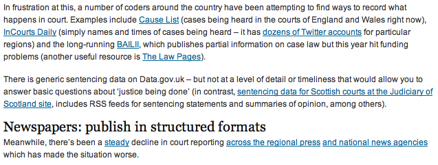
If you look at the resulting post you can see how the first pars are informed by what was coming into my RSS reader and social networks, but after that it’s largely bookmark-informed (as well as some additional research, including speaking to people). The copious links provide an additional level of utility (I hope) which online journalism can do particularly well.

Excerpt from the article - most of these links came from my Delicious bookmarks

Excerpt from the article - most of these links came from my Delicious bookmarks

All about preparation

You can see how building this resource over time can allow you to provide context to a story quicker, and more deeply, than if you had resorted to a quick search on Google.

In addition, it highlights a problem with search: you will largely only find what you’re looking for. Bookmarking on Delicious means you can spot related stories, issues and sources that you might not have thought about – and more importantly, that others might have overlooked too.

Scraping data from a list of webpages using Google Docs

Quite often when you’re looking for data as part of a story, that data will not be on a single page, but on a series of pages. To manually copy the data from each one – or even scrape the data individually – would take time. Here I explain a way to use Google Docs to grab the data for you.

Some basic principles

Although Google Docs is a pretty clumsy tool to use to scrape webpages, the method used is much the same as if you were writing a scraper in a programming language like Python or Ruby. For that reason, I think this is a good quick way to introduce the basics of certain types of scrapers.

Here’s how it works:

Firstly, you need a list of links to the pages containing data.

Quite often that list might be on a webpage which links to them all, but if not you should look at whether the links have any common structure, for example “http://www.country.com/data/australia” or “http://www.country.com/data/country2″. If it does, then you can generate a list by filling in the part of the URL that changes each time (in this case, the country name or number), assuming you have a list to fill it from (i.e. a list of countries, codes or simple addition).

Second, you need the destination pages to have some consistent structure to them. In other words, they should look the same (although looking the same doesn’t mean they have the same structure – more on this below).

The scraper then cycles through each link in your list, grabs particular bits of data from each linked page (because it is always in the same place), and saves them all in one place.

Scraping with Google Docs using =importXML – a case study

If you’ve not used =importXML before it’s worth catching up on my previous 2 posts How to scrape webpages and ask questions with Google Docs and =importXML and Asking questions of a webpage – and finding out when those answers change.

This takes things a little bit further.

In this case I’m going to scrape some data for a story about local history – the data for which is helpfully published by the Durham Mining Museum. Their homepage has a list of local mining disasters, with the date and cause of the disaster, the name and county of the colliery, the number of deaths, and links to the names and to a page about each colliery.

However, there is not enough geographical information here to map the data. That, instead, is provided on each colliery’s individual page.

So we need to go through this list of webpages, grab the location information, and pull it all together into a single list.

Finding the structure in the HTML

To do this we need to isolate which part of the homepage contains the list. If you right-click on the page to ‘view source’ and search for ‘Haig’ (the first colliery listed) we can see it’s in a table that has a beginning tag like so: <table border=0 align=center style=”font-size:10pt”>

We can use =importXML to grab the contents of the table like so:

=Importxml(“http://www.dmm.org.uk/mindex.htm”, ”//table[starts-with(@style, ‘font-size:10pt’)]“)

But we only want the links, so how do we grab just those instead of the whole table contents?

The answer is to add more detail to our request. If we look at the HTML that contains the link, it looks like this:

<td valign=top><a href=”http://www.dmm.org.uk/colliery/h029.htm“>Haig&nbsp;Pit</a></td>

So it’s within a <td> tag – but all the data in this table is, not surprisingly, contained within <td> tags. The key is to identify which <td> tag we want – and in this case, it’s always the fourth one in each row.

So we can add “//td[4]” (‘look for the fourth <td> tag’) to our function like so:

=Importxml(“http://www.dmm.org.uk/mindex.htm”, ”//table[starts-with(@style, ‘font-size:10pt’)]//td[4]“)

Now we should have a list of the collieries – but we want the actual URL of the page that is linked to with that text. That is contained within the value of the href attribute – or, put in plain language: it comes after the bit that says href=”.

So we just need to add one more bit to our function: “//@href”:

=Importxml(“http://www.dmm.org.uk/mindex.htm”, ”//table[starts-with(@style, ‘font-size:10pt’)]//td[4]//@href”)

So, reading from the far right inwards, this is what it says: “Grab the value of href, within the fourth <td> tag on every row, of the table that has a style value of font-size:10pt

Note: if there was only one link in every row, we wouldn’t need to include //td[4] to specify the link we needed.

Scraping data from each link in a list

Now we have a list – but we still need to scrape some information from each link in that list

Firstly, we need to identify the location of information that we need on the linked pages. Taking the first page, view source and search for ‘Sheet 89′, which are the first two words of the ‘Map Ref’ line.

The HTML code around that information looks like this:

<td valign=top>(Sheet 89) NX965176, 54° 32' 35" N, 3° 36' 0" W</td>

Looking a little further up, the table that contains this cell uses HTML like this:

<table border=0 width=”95%”>

So if we needed to scrape this information, we would write a function like this:

=importXML(“http://www.dmm.org.uk/colliery/h029.htm”, “//table[starts-with(@width, ‘95%’)]//tr[2]//td[2]“)

…And we’d have to write it for every URL.

But because we have a list of URLs, we can do this much quicker by using cell references instead of the full URL.

So. Let’s assume that your formula was in cell C2 (as it is in this example), and the results have formed a column of links going from C2 down to C11. Now we can write a formula that looks at each URL in turn and performs a scrape on it.

In D2 then, we type the following:

=importXML(C2, “//table[starts-with(@width, ‘95%’)]//tr[2]//td[2]“)

If you copy the cell all the way down the column, it will change the function so that it is performed on each neighbouring cell.

In fact, we could simplify things even further by putting the second part of the function in cell D1 – without the quotation marks – like so:

//table[starts-with(@width, ‘95%’)]//tr[2]//td[2]

And then in D2 change the formula to this:

=ImportXML(C2,$D$1)

(The dollar signs keep the D1 reference the same even when the formula is copied down, while C2 will change in each cell)

Now it works – we have the data from each of 8 different pages. Almost.

Troubleshooting with =IF

The problem is that the structure of those pages is not as consistent as we thought: the scraper is producing extra cells of data for some, which knocks out the data that should be appearing there from other cells.

So I’ve used an IF formula to clean that up as follows:

In cell E2 I type the following:

=if(D2=””, ImportXML(C2,$D$1), D2)

Which says ‘If D2 is empty, then run the importXML formula again and put the results here, but if it’s not empty then copy the values across

That formula is copied down the column.

But there’s still one empty column even now, so the same formula is used again in column F:

=if(E2=””, ImportXML(C2,$D$1), E2)

A hack, but an instructive one

As I said earlier, this isn’t the best way to write a scraper, but it is a useful way to start to understand how they work, and a quick method if you don’t have huge numbers of pages to scrape. With hundreds of pages, it’s more likely you will miss problems – so watch out for inconsistent structure and data that doesn’t line up.

A model for the 21st century newsroom (Thai Translation)

Joining the Spanish and Russian translations of the Model for a 21st Century Newsroom is this version in Thai. Many thanks to Sakulsri Srisaracam:

(แปลเป็นภาษาไทยโดยอ.สกุลศรี ศรีสารคามจาก Blog onlinejournalismblog.com ของ Paul Bradshaw)

ธรรมชาติของสื่อออนไลน์ที่สำคัญคือ มีความเร็ว (Speed) นักข่าวสามารถเผยแพร่ รายงานข่าวผ่านเครื่องมือบนอินเตอร์เน็ตและเทคโนโลยีมือถือที่เชื่อมต่อกับโลกออนไลน์ได้อย่างรวดเร็วมากกว่าสื่อวิทยุและโทรทัศน์ที่เคยเป็นแชมป์ในเรื่องนี้ ความเร็วที่ทำได้ทันที จากทุกที่ ทุกมุมทำให้รูปแบบการรับสาร การส่งสาร และความต้องการข่าวสารของผู้บริโภคต่างไปจากเดิม Continue reading

A Storify of what Android phones people recommended on Twitter

Yesterday I asked – on this blog, on my Facebook page, and on Twitter – what Android phones were best for a journalism student who didn’t want to buy an iPhone or BlackBerry. The blog post comments are particularly informative on the key features to look out for, while the tweets provide a good overview of who recommends what, and why. I’ve used Storify to organise those below:

View “What Android phone would you recommend to a student journalist?” on Storify

A network infrastructure for journalists online

For some years now, I have started every online journalism course I teach with an introduction to three key tools: RSS readers, social networks, and social bookmarking.

These are, I believe, the basis of a network infrastructure which few modern journalists – whatever their platform – can do without.

The word ‘network’ is key here – because I believe one of the fundamental changes that journalists have to adapt to in the 21st century is the move to networked modes of working.

Firstly, because the newsroom itself is becoming more networked with contributors situated outside of it (the increasingly collaborative nature of journalism).

Secondly, because sources are becoming more networked (formal organisations are increasingly complemented by ad hoc ones formed across Facebook, Twitter, blogs, and so on).

And finally, because distribution of news – which has both commercial and editorial implications – is reliant on networks outside of the journalist or their employer’s control.

When I describe the network infrastructure outlined below, I outline two levels: the tools themselves, and how they connect to each other. In an attempt to clarify that, I’ve created a diagram.

The icons in the diagram attempt to show clearly the purpose of each tool:

  • The exclamation mark representing RSS readers indicate that the tool is focused on monitoring what’s new;
  • The question mark representing social bookmarking indicate that that tool largely serves to answer questions, providing context and background
  • The facial expressions representing social networks indicate that this tool help provide access to sources who may have stories to tell (positive; negative) or who are asking important questions (confused).

Here is a further breakdown of each element, and how they connect to each other.

RSS Reader

As outlined above, this part of the structure is all about ‘What’s new?’ and is quite often the first thing a journalist checks at the start of the working day (indeed, it’s ideal for checking on a phone on the way to work). It is the modern equivalent of picking up the day’s newspapers and tuning into the first radio and TV broadcasts of the day.

The RSS Reader gathers news feeds from a range of sources. Here are just a few:

  • Formal news organisations
  • Journalistic blogs
  • Organisational blogs
  • Personal blogs of individuals in your field

In addition, an RSS reader allows you to follow customised feeds reporting any mention of key terms, organisations and individuals across a variety of platforms:

  • Google News
  • The blogosphere as a whole
  • Social bookmarking services such as Delicious
  • Forums
  • Microblogging services such as Twitter
  • Video sharing services such as YouTube
  • Photo sharing services such as Flickr
  • Audio sharing services such as Audioboo
  • Social networks such as Facebook Pages

This is how the RSS reader connects to the two other elements of the infrastructure: most social networks have RSS feeds of some kind, as do social bookmarking services (one of the reasons I prefer Delicious over other platforms is the fact that it has an RSS feed for every user, for every item bookmarked with a particular ‘tag’ (explained below), for tags by particular users and for any combination of tags.

These are explained in a bit more detail in my post on ‘Passive-Aggressive Newsgathering‘.

But if you can follow these feeds in an RSS reader, why use a social network at all?

Social networks

Why use a social network? To follow people, not just content, and because your own contributions to those networks are a key factor in gaining access to sources.

With many social networking platforms (Twitter, for example) you can of course find individual users’ RSS feeds in an RSS reader, or a feed of people you are ‘following’ – either of which you can subscribe to in an RSS reader. But there’s little point, and your RSS reader will soon become flooded with updates. Instead, you should use the RSS reader to follow subjects and add the individuals talking about those subjects to your social networks.

The social network provides an added level of serendipity to your newsgathering: increased opportunities to encounter leads, tips and stories that you would not otherwise encounter.

It is also a three-way medium: a platform for you to ask questions or invite experiences relevant to the story you are pursuing, or to follow the public conversations of others asking questions or sharing experiences.

Because of this focus on social networks as a serendipity engine, I adopt an approach of seeing Twitter as a ‘stream, not a pool’ – not worrying about following too many people but rather about following too few, but having my cake and eating it by using Lists as a filter for those I want to miss least.

The final use for social networks is often the first use that journalists think of: distribution. And it is here that social networking also connects to the other 2 parts of the network infrastructure.

If you read something interesting in your RSS reader and wish to share it across social networks, you can often do so with a single click – with a bit of preparation. Twitterfeed is a tool which will automatically tweet updates on your Twitter account – all you need to know is the RSS feed for the updates you want to share. If you’re using Google Reader, for example, that feed is on your Shared Items page.

To tweet something interesting you’ve seen in your RSS Reader all you have to do then is (in the case of Google Reader) click on the ‘Share’ button below that item.

Social bookmarking

The first two parts of the network infrastructure – an RSS reader and social networks – are about the initial stages of newsgathering; the first things you check at the start of a working day.

Social bookmarking, however, is about what you do with information from your RSS reader and social networks – and information you deal with throughout your day.

Today’s news is tomorrow’s context. And social bookmarking allows you to keep a record of that context to make it quickly accessible when needed.

That’s the bookmarking part. The social part also allows you to publish information at the same time as you store it; to discover what information other people with similar interests are bookmarking; and to discover which people are bookmarking similar things to you).

Because social bookmarking is the least immediate element of this network infrastructure, it is also the aspect which the fewest students get their heads around and actually use.

Yet it is, for me, perhaps the most useful element. It takes an upfront investment of time and the development of a habit which initially doesn’t have any obvious reward.

But when you’re up against a deadline and are able to retrieve a dozen useful reports, documents and people within minutes – then you’ll get it.

Here’s the process:

  1. You come across something of interest. It may be a useful article, blog post or official report in your RSS reader – or a document linked to by someone in your social network. You might encounter the thing of interest while working on a story. You may read it – you may not have time.
  2. You bookmark the specific webpage containing it using a service like Delicious. You add ‘tags’ to help you find it later: these might include:
    • the subjects of the webpage (e.g. ‘environment’, ‘health’),
    • its author or publisher (e.g. ‘paulbradshaw’, ‘OJB’),
    • specific organisations or individuals (‘nhs’, ‘davidcameron’),
    • the type of document (‘report’, ‘research’, ‘video’)
    • or information (‘statistics’, ‘contacts’),
    • and even tags you have made up which refer to a specific story or event (‘croatia11′)
  3. You can if you wish add ‘Notes’. Many people copy a key passage from the webpage here, such as a quote (if a passage is selected on the page it will be automatically entered, depending how you are bookmarking it) to help them remember more about the page and why it was important.
  4. You can also mark your bookmark as ‘private’. This means that no one else can see it – it becomes ‘non-social’.
  5. Once you save it, it becomes available for you to retrieve at a future date: a personal search engine of items you once encountered.

The key thing here is to think about how you might look for this in future, and make sure you use those tags. For example, the publisher might not seem important now, but if in future you need to re-read a certain report and can recall that it appeared in the FT, that will help you access it quickly.

UPDATE: I’ve written a post explaining how this works with a particular case study.

Remember also that tags can be combined, so if I want to narrow down my search to items that I bookmarked with both ‘UGC’ and ‘BBC’, I can find those at delicious.com/paulb/UGC+BBC.

This is one of the reasons why a social bookmarking service is more effective than an RSS reader. You can, for example, search your shared or starred items in Google Reader – and you can tag them also – but as you tend to get more results it is harder to find what you are looking for. The use and combination of tags in Delicious narrows things down very effectively – but equally importantly, it allows you to bookmark pages that do not appear in your RSS reader.

That said, if you cannot find what you are looking for in Delicious, Google Reader is another option. It is also worth using a backup service which provides another way to search your bookmarks.Trunk.ly is one that does just that.

Of course, the bookmark only points to the live webpage – and it may be that in future the page is moved, changed, or deleted. If you are dealing with that type of information it is worth copying it to another webspace (I use the quote option on Tumblr) or using a (generally paid-for) social bookmarking service that saves copies of the pages you bookmark (Diigo and Pinboard are just two)

Social bookmarking: networks and cross-publishing

One of the features of social bookmarking services is that you can follow the bookmarks of other users. In Delicious this is called your network – and it’s where social bookmarking not only connects to RSS readers but also becomes a form of social network. Here’s how you build your network:

  1. Look at your bookmarks. Next to each one will be a number indicating how many users have bookmarked this. If you click on this you will see a list of who bookmarked it, and when. (Alternatively, you could also look at all users using a particular tag – if you’re a health correspondent, for example, you might want to look at people who are tagging items with ‘NHS’). Click on any name to see all their public bookmarks.
  2. If you would like to follow that person’s future bookmarks (because they are bookmarking items which relate to your interests), click on ‘Add to my network’
  3. You will now be able to see their bookmarks – and those of anyone else you have added – on your ‘Network’ page. It is, essentially, a mini RSS reader.

Which is why I use Google Reader to follow my network’s bookmarks instead. Because at the bottom of your Delicious Network page is, of course, a link to an RSS feed. Right-click on this and copy the link, then paste it into your RSS reader and you don’t need to keep checking your Delicious Network separately to all your other RSS feeds.

Of course, if you find someone interesting on Delicious, you might find them interesting on Twitter or a blog. If they’ve edited their Delicious public profile (the one you found in step 1 above) it might include a link. Alternatively, there’s a good chance they’ve used the same username on other social networks – so search for them using that.

This is another example of how social bookmarking can connect to social networking.

Here’s another: you can use a service like Twitterfeed (explained above) to auto-publish every item you bookmark – or just those with a particular tag, or a combination of tags. Because Delicious provides RSS feeds for your bookmarks as a whole, those with a particular tag, and any combination of tags.

For example, anything I tag ‘t’ is automatically tweeted by Twitterfeed on my @paulbradshaw Twitter account. Anything I tag ‘hmitwt’ is tweeted the same way – but to my @helpmeinvestig8 account. Editor Marc Reeves uses the same service to tweet all of his bookmarks with “I’m reading…”.

You can use a Facebook app like RSS Graffiti to do the same thing on a Facebook page.

One process across your network infrastructure then starts to look like this:

  1. Read interesting blog post on Google Reader
  2. Bookmark using Delicious – use a tag which is automatically tweeted
  3. Link auto-tweeted on Twitter

Conversely, if you want to automatically bookmark links that you share on Twitter, you can do so by signing up to Packrati.us. Tweeted links will be given the tag ‘packrati.us’ as well as any hashtags that you include in the same tweet (So a link tweeted with the hashtag ‘#crime’ will be tagged ‘crime’).

Another process across your network infrastructure then starts to look like this:

  1. Read interesting link tweeted on Twitter
  2. Retweet it, adding relevant hashtags
  3. Link is auto-bookmarked on Delicious

Listen, connect, publish

This has turned out to be a long post – which is why I think the diagram is needed. The initial set up is simple: sign up to social networks and a social bookmarking service, and set up an RSS reader. Subscribe to feeds, and add people to your networks.

But once you’ve done the technical part, you need to develop the habit of listening and continuing to add to those networks: check your RSS feeds and networks every day (but know when to switch off), and look for new sources. Bookmark useful resources – articles, documents, reports, research and profile pages – and tag them effectively.

Finally, contribute to those networks and connect the different parts together so it is as easy as possible to gather, store, publish and distribute useful information.

As you start to understand the possibilities that RSS feeds open up, you also start to see all sorts of possibilities beyond this. A site like If This Then That (IFTTT) not only showcases those possibilities particularly effectively, it also makes them as easy as they’ve ever been

It is a small – and regular – investment of time. But it will keep you in touch with your field, lead you to new sources and new stories, and help you work faster and deeper in reporting what’s happening.