For some years now, I have started every online journalism course I teach with an introduction to three key tools: RSS readers, social networks, and social bookmarking.
These are, I believe, the basis of a network infrastructure which few modern journalists – whatever their platform – can do without.
The word ‘network’ is key here – because I believe one of the fundamental changes that journalists have to adapt to in the 21st century is the move to networked modes of working.
Firstly, because the newsroom itself is becoming more networked with contributors situated outside of it (the increasingly collaborative nature of journalism).
Secondly, because sources are becoming more networked (formal organisations are increasingly complemented by ad hoc ones formed across Facebook, Twitter, blogs, and so on).
And finally, because distribution of news – which has both commercial and editorial implications – is reliant on networks outside of the journalist or their employer’s control.
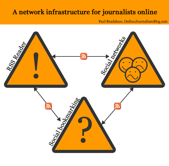
When I describe the network infrastructure outlined below, I outline two levels: the tools themselves, and how they connect to each other. In an attempt to clarify that, I’ve created a diagram.
The icons in the diagram attempt to show clearly the purpose of each tool:
- The exclamation mark representing RSS readers indicate that the tool is focused on monitoring what’s new;
- The question mark representing social bookmarking indicate that that tool largely serves to answer questions, providing context and background
- The facial expressions representing social networks indicate that this tool help provide access to sources who may have stories to tell (positive; negative) or who are asking important questions (confused).
Here is a further breakdown of each element, and how they connect to each other.
RSS Reader
As outlined above, this part of the structure is all about ‘What’s new?’ and is quite often the first thing a journalist checks at the start of the working day (indeed, it’s ideal for checking on a phone on the way to work). It is the modern equivalent of picking up the day’s newspapers and tuning into the first radio and TV broadcasts of the day.
The RSS Reader gathers news feeds from a range of sources. Here are just a few:
- Formal news organisations
- Journalistic blogs
- Organisational blogs
- Personal blogs of individuals in your field
In addition, an RSS reader allows you to follow customised feeds reporting any mention of key terms, organisations and individuals across a variety of platforms:
- Google News
- The blogosphere as a whole
- Social bookmarking services such as Delicious
- Forums
- Microblogging services such as Twitter
- Video sharing services such as YouTube
- Photo sharing services such as Flickr
- Audio sharing services such as Audioboo
- Social networks such as Facebook Pages
This is how the RSS reader connects to the two other elements of the infrastructure: most social networks have RSS feeds of some kind, as do social bookmarking services (one of the reasons I prefer Delicious over other platforms is the fact that it has an RSS feed for every user, for every item bookmarked with a particular ‘tag’ (explained below), for tags by particular users and for any combination of tags.
These are explained in a bit more detail in my post on ‘Passive-Aggressive Newsgathering‘.
But if you can follow these feeds in an RSS reader, why use a social network at all?
Social networks
Why use a social network? To follow people, not just content, and because your own contributions to those networks are a key factor in gaining access to sources.
With many social networking platforms (Twitter, for example) you can of course find individual users’ RSS feeds in an RSS reader, or a feed of people you are ‘following’ – either of which you can subscribe to in an RSS reader. But there’s little point, and your RSS reader will soon become flooded with updates. Instead, you should use the RSS reader to follow subjects and add the individuals talking about those subjects to your social networks.
The social network provides an added level of serendipity to your newsgathering: increased opportunities to encounter leads, tips and stories that you would not otherwise encounter.
It is also a three-way medium: a platform for you to ask questions or invite experiences relevant to the story you are pursuing, or to follow the public conversations of others asking questions or sharing experiences.
Because of this focus on social networks as a serendipity engine, I adopt an approach of seeing Twitter as a ‘stream, not a pool’ – not worrying about following too many people but rather about following too few, but having my cake and eating it by using Lists as a filter for those I want to miss least.
The final use for social networks is often the first use that journalists think of: distribution. And it is here that social networking also connects to the other 2 parts of the network infrastructure.
If you read something interesting in your RSS reader and wish to share it across social networks, you can often do so with a single click – with a bit of preparation. Twitterfeed is a tool which will automatically tweet updates on your Twitter account – all you need to know is the RSS feed for the updates you want to share. If you’re using Google Reader, for example, that feed is on your Shared Items page.
To tweet something interesting you’ve seen in your RSS Reader all you have to do then is (in the case of Google Reader) click on the ‘Share’ button below that item.
Social bookmarking
The first two parts of the network infrastructure – an RSS reader and social networks – are about the initial stages of newsgathering; the first things you check at the start of a working day.
Social bookmarking, however, is about what you do with information from your RSS reader and social networks – and information you deal with throughout your day.
Today’s news is tomorrow’s context. And social bookmarking allows you to keep a record of that context to make it quickly accessible when needed.
That’s the bookmarking part. The social part also allows you to publish information at the same time as you store it; to discover what information other people with similar interests are bookmarking; and to discover which people are bookmarking similar things to you).
Because social bookmarking is the least immediate element of this network infrastructure, it is also the aspect which the fewest students get their heads around and actually use.
Yet it is, for me, perhaps the most useful element. It takes an upfront investment of time and the development of a habit which initially doesn’t have any obvious reward.
But when you’re up against a deadline and are able to retrieve a dozen useful reports, documents and people within minutes – then you’ll get it.
Here’s the process:
- You come across something of interest. It may be a useful article, blog post or official report in your RSS reader – or a document linked to by someone in your social network. You might encounter the thing of interest while working on a story. You may read it – you may not have time.
- You bookmark the specific webpage containing it using a service like Delicious. You add ‘tags’ to help you find it later: these might include:
- the subjects of the webpage (e.g. ‘environment’, ‘health’),
- its author or publisher (e.g. ‘paulbradshaw’, ‘OJB’),
- specific organisations or individuals (‘nhs’, ‘davidcameron’),
- the type of document (‘report’, ‘research’, ‘video’)
- or information (‘statistics’, ‘contacts’),
- and even tags you have made up which refer to a specific story or event (‘croatia11′)
- You can if you wish add ‘Notes’. Many people copy a key passage from the webpage here, such as a quote (if a passage is selected on the page it will be automatically entered, depending how you are bookmarking it) to help them remember more about the page and why it was important.
- You can also mark your bookmark as ‘private’. This means that no one else can see it – it becomes ‘non-social’.
- Once you save it, it becomes available for you to retrieve at a future date: a personal search engine of items you once encountered.
The key thing here is to think about how you might look for this in future, and make sure you use those tags. For example, the publisher might not seem important now, but if in future you need to re-read a certain report and can recall that it appeared in the FT, that will help you access it quickly.
UPDATE: I’ve written a post explaining how this works with a particular case study.
Remember also that tags can be combined, so if I want to narrow down my search to items that I bookmarked with both ‘UGC’ and ‘BBC’, I can find those at delicious.com/paulb/UGC+BBC.
This is one of the reasons why a social bookmarking service is more effective than an RSS reader. You can, for example, search your shared or starred items in Google Reader – and you can tag them also – but as you tend to get more results it is harder to find what you are looking for. The use and combination of tags in Delicious narrows things down very effectively – but equally importantly, it allows you to bookmark pages that do not appear in your RSS reader.
That said, if you cannot find what you are looking for in Delicious, Google Reader is another option. It is also worth using a backup service which provides another way to search your bookmarks.Trunk.ly is one that does just that.
Of course, the bookmark only points to the live webpage – and it may be that in future the page is moved, changed, or deleted. If you are dealing with that type of information it is worth copying it to another webspace (I use the quote option on Tumblr) or using a (generally paid-for) social bookmarking service that saves copies of the pages you bookmark (Diigo and Pinboard are just two)
Social bookmarking: networks and cross-publishing
One of the features of social bookmarking services is that you can follow the bookmarks of other users. In Delicious this is called your network – and it’s where social bookmarking not only connects to RSS readers but also becomes a form of social network. Here’s how you build your network:
- Look at your bookmarks. Next to each one will be a number indicating how many users have bookmarked this. If you click on this you will see a list of who bookmarked it, and when. (Alternatively, you could also look at all users using a particular tag – if you’re a health correspondent, for example, you might want to look at people who are tagging items with ‘NHS’). Click on any name to see all their public bookmarks.
- If you would like to follow that person’s future bookmarks (because they are bookmarking items which relate to your interests), click on ‘Add to my network’
- You will now be able to see their bookmarks – and those of anyone else you have added – on your ‘Network’ page. It is, essentially, a mini RSS reader.
Which is why I use Google Reader to follow my network’s bookmarks instead. Because at the bottom of your Delicious Network page is, of course, a link to an RSS feed. Right-click on this and copy the link, then paste it into your RSS reader and you don’t need to keep checking your Delicious Network separately to all your other RSS feeds.
Of course, if you find someone interesting on Delicious, you might find them interesting on Twitter or a blog. If they’ve edited their Delicious public profile (the one you found in step 1 above) it might include a link. Alternatively, there’s a good chance they’ve used the same username on other social networks – so search for them using that.
This is another example of how social bookmarking can connect to social networking.
Here’s another: you can use a service like Twitterfeed (explained above) to auto-publish every item you bookmark – or just those with a particular tag, or a combination of tags. Because Delicious provides RSS feeds for your bookmarks as a whole, those with a particular tag, and any combination of tags.
For example, anything I tag ‘t’ is automatically tweeted by Twitterfeed on my @paulbradshaw Twitter account. Anything I tag ‘hmitwt’ is tweeted the same way – but to my @helpmeinvestig8 account. Editor Marc Reeves uses the same service to tweet all of his bookmarks with “I’m reading…”.
You can use a Facebook app like RSS Graffiti to do the same thing on a Facebook page.
One process across your network infrastructure then starts to look like this:
- Read interesting blog post on Google Reader
- Bookmark using Delicious – use a tag which is automatically tweeted
- Link auto-tweeted on Twitter
Conversely, if you want to automatically bookmark links that you share on Twitter, you can do so by signing up to Packrati.us. Tweeted links will be given the tag ‘packrati.us’ as well as any hashtags that you include in the same tweet (So a link tweeted with the hashtag ‘#crime’ will be tagged ‘crime’).
Another process across your network infrastructure then starts to look like this:
- Read interesting link tweeted on Twitter
- Retweet it, adding relevant hashtags
- Link is auto-bookmarked on Delicious
Listen, connect, publish
This has turned out to be a long post – which is why I think the diagram is needed. The initial set up is simple: sign up to social networks and a social bookmarking service, and set up an RSS reader. Subscribe to feeds, and add people to your networks.
But once you’ve done the technical part, you need to develop the habit of listening and continuing to add to those networks: check your RSS feeds and networks every day (but know when to switch off), and look for new sources. Bookmark useful resources – articles, documents, reports, research and profile pages – and tag them effectively.
Finally, contribute to those networks and connect the different parts together so it is as easy as possible to gather, store, publish and distribute useful information.
As you start to understand the possibilities that RSS feeds open up, you also start to see all sorts of possibilities beyond this. A site like If This Then That (IFTTT) not only showcases those possibilities particularly effectively, it also makes them as easy as they’ve ever been
It is a small – and regular – investment of time. But it will keep you in touch with your field, lead you to new sources and new stories, and help you work faster and deeper in reporting what’s happening.



 Online Journalism Blog