Tag Archives: openlylocal

Let’s explode the myth that data journalism is ‘resource intensive’

"Data Journalism is very time consuming, needs experts, is hard to do with shrinking news rooms" Eva Linsinger, Profil

Is data journalism ‘time consuming’ or ‘resource intensive’? The excuse – and I think it is an excuse – seems to come up at an increasing number of events whenever data journalism is discussed. “It’s OK for the New York Times/Guardian/BBC,” goes the argument. “But how can our small team justify the resources – especially in a time of cutbacks?

The idea that data journalism inherently requires extra resources is flawed – but understandable. Spectacular interactives, large scale datasets and investigative projects are the headliners of data journalism’s recent history. We have oohed and aahed over what has been achieved by programmer-journalists and data sleuths…

But that’s not all there is.

Continue reading

Inter-Council Payments and the Google Fusion Tables Network Graph

One of the great things about aggregating local spending data from different councils in the same place – such as on OpenlyLocal – is that you can start to explore structural relations in the way different public bodies of a similar type spend money with each other.

On the local spend with corporates scraper on Scraperwiki, which I set up to scrape how different councils spent money with particular suppliers, I realised I could also use the scraper to search for how councils spent money with other councils, by searching for suppliers containing phrases such as “district council” or “town council”. (We could also generate views to to see how councils wre spending money with different police authorities, for example.)

(The OpenlyLocal API doesn’t seem to work with the search, so I scraped the search results HTML pages instead. Results are paged, with 30 results per page, and what seems like a maximum of 1500 (50 pages) of results possible.)

The publicmesh table on the scraper captures spend going to a range of councils (not parish councils) from other councils. I also uploaded the data to Google Fusion tables (public mesh spending data), and then started to explore it using the new network graph view (via the Experiment menu). So for example, we can get a quick view over how the various county councils make payments to each other:

Hovering over a node highlights the other nodes its connected to (though it would be good if the text labels from the connected nodes were highlighted and labels for unconnected nodes were greyed out?)

(I think a Graphviz visualisation would actually be better, eg using Canviz, because it can clearly show edges from A to B as well as B to A…)

As with many exploratory visualisations, this view helps us identify some more specific questions we might want to ask of the data, rather than presenting a “finished product”.

As well as the experimental network graph view, I also noticed there’s a new Experimental View for Google Fusion Tables. As well as the normal tabular view, we also get a record view, and (where geo data is identified?) a map view:

What I’d quite like to see is a merging of map and network graph views…

One thing I noticed whilst playing with Google Fusion Tables is that getting different aggregate views is rather clunky and relies on column order in the table. So for example, here’s an aggregated view of how different county councils supply other councils:

In order to aggregate by supplied council, we need to reorder the columns (the aggregate view aggregates columns as thet appear from left to right in the table view). From the Edit column, Modify Table:

(In my browser, I then had to reload the page for the updated schema to be reflected in the view). Then we can get the count aggregation:

It would be so much easier if the aggregation view allowed you to order the columns there…

PS no time to blog this properly right now, but there are a couple of new javascript libraries that are worth mentioning in the datawrangling context.

In part coming out of the Guardian stable, Misoproject is “an open source toolkit designed to expedite the creation of high-quality interactive storytelling and data visualisation content”. The initial dataset library provides a set of routines for: loading data into the browser from a variety of sources (CSV, Google spreadsheets, JSON), including regular polling; creating and managing data tables and views of those tables within the browser, including column operations such as grouping, statistical operations (min, max, mean, moving average etc); playing nicely with a variety of client side graphics libraries (eg d3.js, Highcharts, Rickshaw and other JQuery graphics plugins).

Recline.js is a library from Max Ogden and the Open Knowledge Foundation that if its name is anything to go by is positioning itself as an alternative (or complement?) to Google Refine. To my mind though, it’s more akin to a Google Fusion Tables style user interface (“classic” version) wherever you need it, via a Javascript library. The data explorer allows you to import and preview CSV, Excel, Google Spreadsheet and ElasticSearch data from a URL, as well as via file upload (so for example, you can try it with the public spend mesh data CSV from Scraperwiki). Data can be sorted, filtered and viewed by facet, and there’s a set of integrated graphical tools for previewing and displaying data too. Refine.js views can also be shared and embedded, which makes this an ideal tool for data publishers to embed in their sites as a way of facilitating engagement with data on-site, as I expect we’ll see on the Data Hub before too long.

More reviews of these two libraries later…

PPS These are also worth a look in respect of generating visualisations based on data stored in Google spreadsheets: DataWrapper and Freedive (like my old Guardian Datastore explorer, but done properly… Wizard led UI that helps you create your own searchable and embeddable database view direct from a Google Spreadsheet).

Get started in data scraping – and earn £75 for the pleasure

OpenlyLocal are trying to scrape planning application data from across the country. They want volunteers to help write the scrapers using Scraperwiki – and are paying £75 for each one.

This is a great opportunity for journalists or journalism students looking for an excuse to write their first scraper: there are 3 sample scrapers to help you find your feet, with many more likely to appear as they are written. Hopefully, some guidance will appear too (if not, I may try to write some myself).

Add your names in the comments on Andrew’s blog post, and happy scraping!


SFTW: How to scrape webpages and ask questions with Google Docs and =importXML

XML puzzle cube
Image by dullhunk on Flickr

Here’s another Something for the Weekend post. Last week I wrote a post on how to use the =importFeed formula in Google Docs spreadsheets to pull an RSS feed (or part of one) into a spreadsheet, and split it into columns. Another formula which performs a similar function more powerfully is =importXML.

There are at least 2 distinct journalistic uses for =importXML:

  1. You have found information that is only available in XML format and need to put it into a standard spreadsheet to interrogate it or combine it with other data.
  2. You want to extract some information from a webpage – perhaps on a regular basis – and put that in a structured format (a spreadsheet) so you can more easily ask questions of it.

The first task is the easiest, so I’ll explain how to do that in this post. I’ll use a separate post to explain the latter.

Converting an XML feed into a table

If you have some information in XML format it helps if you have some understanding of how XML is structured. A backgrounder on how to understand XML is covered in this post explaining XML for journalists.

It also helps if you are using a browser which is good at displaying XML pages: Chrome, for example, not only staggers and indents different pieces of information, but also allows you to expand or collapse parts of that, and colours elements, values and attributes (which we’ll come on to below) differently.

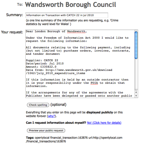
Say, for example, you wanted a spreadsheet of UK council data, including latitude, longitude, CIPFA code, and so on – and you found the data, but it was in XML format at a page like this: http://openlylocal.com/councils/all.xml

To pull that into a neatly structured spreadsheet in Google Docs, type the following into the cell where you want the import to begin (try typing in cell A2, leaving the first row free for you to add column headers):

=ImportXML(“http://openlylocal.com/councils/all.xml”, ”//council”)

The formula (or, more accurately, function) needs two pieces of information, which are contained in the parentheses and separated by a comma: a web address (URL), and a query. Or, put another way:

=importXML(“theURLinQuotationMarks”, “theBitWithinTheURLthatYouWant”)

The URL is relatively easy – it is the address of the XML file you are reading (it should end in .xml). The query needs some further explanation.

The query tells Google Docs which bit of the XML you want to pull out. It uses a language called XPath – but don’t worry, you will only need to note down a few queries for most purposes.

Here’s an example of part of that XML file shown in the Chrome browser:

XML from OpenlyLocal

The indentation and triangles indicate the way the data is structured. So, the <councils> tag contains at least one item called <council> (if you scrolled down, or clicked on the triangle to collapse <council> you would see there are a few hundred).

And each <council> contains an <address>, <authority-type>, and many other pieces of information.

If you wanted to grab every <council> from this XML file, then, you use the query “//council” as shown above. Think of the // as a replacement for the < in a tag – you are saying: ‘grab the contents of every item that begins <council>’.

You’ll notice that in your spreadsheet where you have typed the formula above, it gathers the contents (called a value) of each tag within <council>, each tag’s value going into their own column – giving you dozens of columns.

You can continue this logic to look for tags within tags. For example, if you wanted to grab the <name> value from within each <council> tag, you could use:

=ImportXML(“http://openlylocal.com/councils/all.xml”, ”//council//name”)

You would then only have one column, containing the names of all the councils – if that’s all you wanted. You could of course adapt the formula again in cell B2 to pull another piece of information. However, you may end up with a mismatch of data where that information is missing – so it’s always better to grab all the XML once, then clean it up on a copy.

If the XML is more complex then you can ask more complex questions – which I’ll cover in the second part of this post. You can also put the URL and/or query in other cells to simplify matters, e.g.

=ImportXML(A1, B1)

Where cell A1 contains http://openlylocal.com/councils/all.xml and B1 contains //council (note the lack of quotation marks). You then only need to change the contents of A1 or B1 to change the results, rather than having to edit the formula directly)

If you’ve any other examples, ideas or corrections, let me know. Meanwhile, I’ve published an example spreadsheet demonstrating all the above techniques here.


SFTW: How to scrape webpages and ask questions with Google Docs and =importXML

XML puzzle cube

Image by dullhunk on Flickr

Here’s another Something for the Weekend post. Last week I wrote a post on how to use the =importFeed formula in Google Docs spreadsheets to pull an RSS feed (or part of one) into a spreadsheet, and split it into columns. Another formula which performs a similar function more powerfully is =importXML.

There are at least 2 distinct journalistic uses for =importXML:

  1. You have found information that is only available in XML format and need to put it into a standard spreadsheet to interrogate it or combine it with other data.
  2. You want to extract some information from a webpage – perhaps on a regular basis – and put that in a structured format (a spreadsheet) so you can more easily ask questions of it.

The first task is the easiest, so I’ll explain how to do that in this post. I’ll use a separate post to explain the latter. Continue reading

New UK site launches to tackle lobbying data

Who's Lobbying treemap

I’ve been waiting for the launch of Who’s Lobbying ever since they stuck up that little Post-It note on a holding page in the run-up to the general election. Well now the site is live – publishing and visualising lobbying data, beginning with information about “ministerial meetings with outside interests, based on the reports released by UK government departments in October.”

This information is presented on the homepage very simply: with 3 leaderboards and a lovely search interface.

Who's Lobbying homepage

There are also a couple of treemaps to explore, for a more visual (and clickable) kick.

These allow you to see more quickly any points of interest in particular areas. The Who’s Lobbying blog notes, for instance, that “the treemap shows about a quarter of the Department of Energy and Climate Change meetings are with power companies. Only a small fraction are with environmental or climate change organisations.”

It also critically notes in another post that

“The Number 10 flickr stream calls [its index to transparency] a “searchable online database of government transparency information”. However it is really just a page of links to department reports. Each report containing slightly different data. The reports are in a mix of PDF, CSV, and DOC formats.

“Unfortunately Number 10 and the Cabinet Office have not mandated a consistent format for publishing ministerial meeting information.

“The Ministry of Defence published data in a copy-protected PDF format, proventing copy and paste from the document.

DEFRA failed to publish the name of each minister in its CSV formatted report.

“The Department for Transport is the only department transparent enough to publish the date of each meeting.

“All other departments only provided the month of each meeting – was that an instruction given centrally to departments? Because of this it isn’t possible to determine if two ministers were at the same meeting. Our analysis is likely to be double counting meetings with two ministers in attendance.

“Under the previous Labour government, departments had published dates for individual meetings. In this regard, are we seeing less transparency under the Conservative/Lib Dem coalition?”

When journalists start raising these questions then something will really have been achieved by the open data movement. In the meantime, we can look at Who’s Lobbying as a very welcome addition to a list of sites that feels quite weighty now: MySociety’s family of tools as the grandaddy, and ElectionLeaflets.org (formerly The Straight Choice), OpenlyLocal, Scraperwiki, Where Does My Money Go? and OpenCharities as the new breed (not to mention all the data-driven sites that sprung up around this year’s election). When they find their legs, they could potentially be quite powerful.

Open data meets FOI via some nifty automation

OpenlyLocal generated FOI request

Now this is an example of what’s possible with open data and some very clever thinking. Chris Taggart blogs about a new tool on his OpenlyLocal platform that allows you to send a Freedom of Information (FOI) request based on a particular item of spending. “This further lowers the barriers to armchair auditors wanting to understand where the money goes, and the request even includes all the usual ‘boilerplate’ to help avoid specious refusals.”

It takes around a minute to generate an FOI request.

The function is limited to items of spending above £10,000. Cleverly, it’s also all linked so you can see if an FOI request has already been generated and answered.

Although the tool sits on OpenlyLocalFrancis Irving at WhatDoTheyKnow gets enormous credit for making their side of the operation work with it.

Once again you have to ask why a media organisation isn’t creating these sorts of tools to help generate journalism beyond the walls of its newsroom.