
The website of the ABCe, the Audit Bureau of Circulations (ABC) subsidiary responsible for website traffic measurement standards, is embarrassingly bad.
ABCe figures are supposed to tell the media industry how popular individual sites are. But although ABCe is in charge of standards in its industry, its own website ignores web-building best practice.
Put bluntly, the ABCe site is impossible to use, inaccessible to anyone with a disability, and badly written and edited.
Criticisms include:
Widespread use of frames. These are badly coded – so they are hard to use with assistive technologies like screen readers, and hard for google to understand. This has led to the google sitelinks for ABCe pointing to a page called ‘navigation frame’ with some blue stripes and broken links.

The use of frames leads to Google thinking this is the second most important page on the site - a blue stripy page with broken links
Broken URLs. The use of frames means that the URLs can’t be reliably copied and pasted. So you can’t email anyone about a page – which means this post can’t even link to many of the problematic pages.
An incomprehensible description. When you search for ABCe in google it is described like this: “ABCe is the industry owned, tri-partite, not-for-profit organisation that works with and for media owners, advertisers and media buyers to help them better …“. Help them better … what? ABCe can change what this says, but have chosen not to.
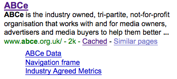
ABCe in Google: meaningless description, absurd sitelinks
Multiple pages with the same title. Lots of pages have the title ‘ABCe’. This is a bad idea from an SEO point of view, and prevents humans understanding what pages are about. This picture shows the problem – all the pages have the same title.
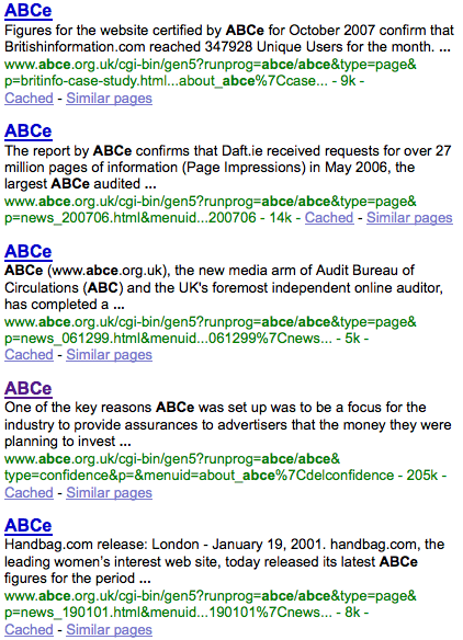
Identical titles on many pages
Pointless pages. As you browse around, there are several pages with just links to other pages on and no content, so it requires more clicks than necessary to get anywhere. One page has just 3 words on it: Options, map and directions. And nothing else.
Incomprehensible data search form. This uses lots of jargon or unclear labels with no help text.
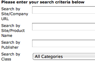
ABCe form: labels use jargon but with no help text
Badly written and edited copy throughout. There are all sorts of typos on the site. But it it also so badly edited that it is extremely hard to follow – automated readability tests rate it as less easy to read than an academic journal, the Harvard Law Review.
You can see more screenshots of the site’s problems at the original review.
What do you think? Have you had problems using the site? Do you think it matters how good an industry-body website is?

You should see their TV news and entertainment programming .
Very informative post. Really a lot of useful information. Glad I found your blog. Will note it and return for more info.
Pingback: The Guardian continues to impress me | @NewCommBiz