

Here’s a wonderful reimagining of the News Diamond from the first part of my Model for a 21st Century Newsroom. Gaurav Mishra’s diagram (shown above) takes my rhombus (shown below) and plots it against two axes. It’s rather lovely.
Helpfully, however, Mishra takes the concept forward a little. As he explains:
“my “news lifecycle” is different from Paul Bradshaw’s “news diamond” in two ways –
“1. Paul’s “news diamond” looks at news from a news organization’s perspective, whereas my “news lifecycle” acknowledges that the boundaries between news creators, news curators and news consumers have blurred beyond recognition.
“2. Paul does not make the distinction between unplanned breaking news events (like accidents and terrorist attacks) and planned live coverage of events (like the Super Bowl or the US presidential inauguration). Paul’s “news diamond” and my “news lifecycle” models are much more valid for unplanned breaking news events.”
It’s fair to say that my diamond does take the perspective of a news organisation – that’s who it was aimed at. But I’m not sure that that means it doesn’t acknowledge the blurring of boundaries.
Anyway, Mishra poses some questions:
- How do we increase the number and variety of sources in the process of creating, curating and consuming news?
- How do we separate signal from noise during each stage of the news lifecycle?
- How do we contract the “alert” to “analysis” stages of the news lifecycle, in order to get better signal to noise ratio sooner in the cycle?
- How to we expand the “conversation” to “customization” stages of the news lifecycle, in order to maximize the returns from the content we have created?
- How do we expand the requisite participatory media ecosystem so that exceptions to this news lifecycle (like the information void in the Israel-Hamas Gaza conflict or the Russia-Georgia Otessia conflict) become increasingly rare?
I’d be very interested in any responses.
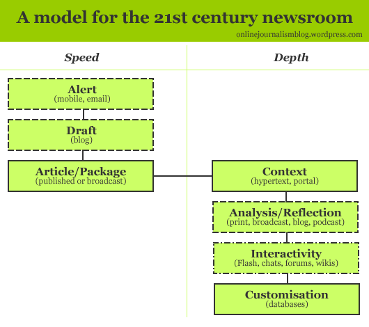
In the meantime, here’s those original diagrams for your conceptual enjoyment…

As it happens, the diamond was just another way of showing the following flow diagram from the same post, so now I have 3 diagrams to refer to…

Paul, I saw yesterday the graph, and I was thinking, that actually, conversation take place now during the whole cycle. Moreover, the challenge today can be how to integrate this “conversations”, even collaboration, to the entirely process.
Don’t you think so?
Yes, agree completely. Gaurav is right to highlight that my diagram is from the news organisation’s point of view, so the dotted lines are points at which they are taking in and inviting inputs from users. That doesn’t mean that conversation won’t take place around the article or the database, just that (at the time) I imagined it to be peripheral. I’d probably just make the whole thing porous now as comments on an article will still inform the analysis, etc.
Pingback: links for 2010-06-03 « Onlinejournalismtest's Blog
Pingback: Recommended Links for June 3rd | Alex Gamela - Digital Media & Journalism
Pingback: Ciclo de vida de las noticias digitales: el Diamante de noticias reimaginado | tejiendo redes
I agree. The point is increasingly about how to integrate the conversation. Also, in many ways this model also works for planned events, not just breaking news, certainly in the inital stages.
We have an organisation view, and a story view.
Developing yuor point, I think we also need a perspective which catches the involvement of the reader community as they participate in conversation with, and around, an organisation, about a story.
I’d start off by putting one reader at the centre of the new diagram, and imagining flows in and out via different channels to that single person.
Hmmm.
Is it useful to have one view oriented around a live-blog as the timeline and backbone for impact of the different tools, since this method is used more and more for real stories?
Pingback: Visualizing the Lifecycle of Digital News Content « Predicate, LLC | Editorial + Content Strategy
I think there’s a serious problem with the Mishra’s diagram. By plotting a time axis against a reach/depth axis, he’s created a useless paradigm because the reach/depth can never come down, it only goes up as the cumulative total increases. This is in keeping with the long-tail theory of information. I realize this may be a picky point but I hardly see how his diagram advances the model.
It’s a very good point – a specific problem is how you quantify reach/depth: does older coverage ‘fade’ over time or is it indeed cumulative?