

Twitter’s analytics service is a useful tool for journalists to understand which tweets are having the biggest impact. The dashboard at analytics.twitter.com provides a general overview under tabs like ‘tweets’ and ‘audiences’, and you can download raw data for any period then sort it in a spreadsheet to see which tweets performed best against a range of metrics.
However, if you want to perform any deeper analysis, such as finding out which days are best for tweeting or which times perform best — you’ll need to get stuck in. Here’s how to do it.
First, download your data
I made the brief video below to explain how to find the ‘tweets’ section on Twitter Analytics, and then download and open the data you need.
If you prefer Google Drive, create a new spreadsheet there, then select File > Import > Upload (leaving all options as default) to bring the data into that.
Split the timestamps into date and time
When you download Twitter analytics data on your tweets, there should be one column which shows the timestamp for each tweet, typically column D. This contains the date, the time, and +0000.
There are various ways to split this up, but one of the simplest is to use a feature called ‘Text to columns‘. This will split a column into multiple columns based on criteria you specify.
But those new columns will overwrite anything to the right of the column you’re splitting, so here’s what you need to do:
- Create two new empty columns to the right of the time column. You can do this by right-clicking on column E and selecting Insert, twice.

- Select the time column. Then click on the Data menu and select Text to Columns…
- The Text to Columns Wizard should now open, on Step 1. Choose delimited data: this means data that you want to split based on a character, like a comma or space. Click Next.
- The next step asks you what character you want to split on. Tick the Space option and untick all the others. You should see the preview below update to show the 3 columns that this will generate. Cilck Next.
- The final step doesn’t matter, just click Finish.

Tick the Space box to split the column on that character
Your time data should now be split across three columns:
- Column D – ‘time’ – now just contains the date. Notice that this has moved from left-aligned to right-aligned, meaning Excel now recognises it as a number (which is how dates are stored). Change the column heading to ‘date’
- Column E now shows the time. Give the column the heading ‘time’
- Column F contains the 0. This isn’t much use, so feel free to right-click on the column and delete it.
Create a new column for the hour
Having time in its own column is useful, but doesn’t help us aggregate results by the hour. We can generate that now, however, by using the HOUR function. Here’s how:
- Insert a new column by right-clicking on column F and selecting Insert. Call the new column ‘Hour’
- In the first cell, F2, type the function =HOUR(E2)
- This should generate a number that rounds the time in E2 down to a single number. However, it will have inherited the formatting of the other column. To change this, right-click on the cell and select Format Cells… then on the window that appears make sure it is formatted as Number and that the number of decimal places is set to 0. Click OK.
- Copy the cell with your new formula all the way down the column so that you have an hour for every row.
Create a new column for the day of the week
There is a similar process for extracting the day of the week, but it’s a bit more complex:
- Insert a new column by right-clicking on column G and selecting Insert. Call the new column ‘Day’
- In the first cell, F2, type the function =TEXT(D2,”dddd”)
- This will look at the date in cell D2 and work out what day of the week that date fell on: “dddd” means ‘give me the day of the week as a full word’. By contrast, “ddd” will give you a three-character day (like ‘Wed’), and “dd” and “d” will give you numbers.
- Copy the cell with your new formula all the way down the column so that you have an hour for every row.
Create a pivot table based on what you want to test
Now that you’ve created separate columns for the hour and day you can create a pivot table which shows how each hour or day performed on aggregate. How you do this varies depending on the spreadsheet software you’re using, but here’s the approach that works in recent versions of Excel:
- Make sure you are somewhere in your data, but do not select more than one cell.
- Click Data > Pivot table. If you can’t find a pivot table option there, try the Insert menu instead.
- A window will appear where you can specify what data you want to use and other things. As long as you were somewhere in your data it should have automatically detected the edges, so you don’t need to do anything here: just click OK.
- You will be taken to a new worksheet with an empty pivot table. This has 4 areas: rows, columns, a ‘values area’ in the middle, and a filter area at the top. On the right should be the PivotTable Builder. This has 4 boxes corresponding to those 4 areas at the bottom, and above those, a Field name list of all the fields in your data. You create a pivot table by dragging fields from the top area into the boxes below. But which ones and where..?
- Generally, you put the focus into the Row Labels box. Let’s say we’re interested in the best hours for engagement rates. Click and drag hours from the Field name list at the top, into the Row Labels area.
- In Values you put whatever column you want to calculate with. Click and drag engagement rate from the Field name list into the Values area. Note that when you do this it calls it Sum of engagement rate. That’s going to be important.
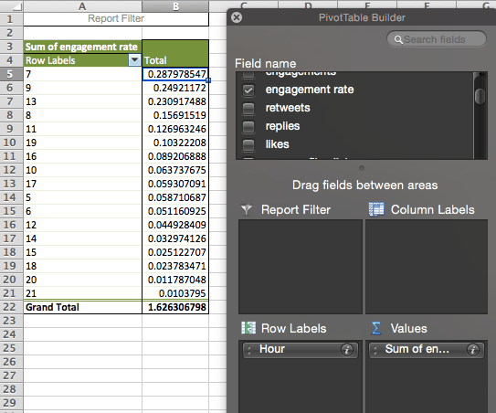
- The pivot table on the left should now show the results: a list of hours, and against each a total engagement rate. You can see which hour got the highest engagement rate, and which the least. Or does it? Actually, no. Remember that it has added up each engagement rate, so it probably just means those hours are when you tweet the most already. Instead of a sum of total engagement rate, we are better to calculate an average.
- To change the calculation from sum to average, go back to your PivotTable Builder area and look at the Sum of engagement rate bit. On PC versions of Excel there will be a drop-down menu: click on it and select Value field settings. On Mac versions of Excel there should be an ‘i’ instead: click on that.
- Here you should see the options for how that value is calculated. Currently Sum is selected, but you can change it to Average. (If you just want to count how many times something occurs, you can choose Count)

- Now the numbers in the pivot table should change, and you have a more accurate idea of the average engagement rate each tweet gets during those hours.

You can adapt this process to perform the same calculation using a different metric, such as engagements (again, don’t use a sum, use an average), retweets, replies, URL clicks, and so on.
You can drag more than one field into the Values box to compare them side by side.
You can also change the row to compare day instead of hour.
Beyond Twitter analytics
The same techniques can be used with Facebook‘s analytics tool: Insights. Thankfully the timestamp data doesn’t need splitting up, as it’s already stored as a date. Instead you can skip straight to the HOUR and TEXT formulae.
Oh, and by the way, once you can do all this the same techniques can be used to analyse similar data for stories. And that’s much more interesting…


Reblogged this on Matthews' Blog.
Pingback: Online Journalism Blog: How to: analyse your Twitter or Facebook analytics for the best days or times to post | ResearchBuzz: Firehose
Pingback: Kenya Police, Conspiracy Theories, Montana Life, More: Monday Afternoon Buzz, October 3, 2016 | ResearchBuzz
Pingback: Prime Time to Post | maddie vlismas