
That’s the question Birmingham Post reporter Joanna Geary has been asking herself, and has come up with the following rather lovely graphic:
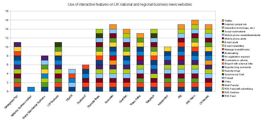
Clickon the image for a larger, more readable version – you’ll see she’s looking for availability of email contacts, use of things like maps, blogs, bookmarking, video (is that interactive? Or multimedia?), email newsletters, mobile alerts, RSS, podcasts, chats, forums – and Twitter: “I know it’s not yet a mass communication device but I think it’s a good indicator of those who are thinking about the development of the market”
Here’s her findings:
“There’s an indication that regional news is a little behind the nationals when it comes to interactive features – but some regionals, such as The Post and LDP Business are catching up.
“I think there a few limitations with the categories that are provided and naming individual elements of interactivity does not necessarily give you a strong insight into the experience of the user (e.g. there’s no point having video if no one can figure out how to get to it).”
She’s asking:
- “how is your experience of a news site improved, or indeed made worse, by interactive tools?
- “if there are tools that you think this study is missing.
- “Also, are there any similar studies out there?”

Pingback: Sarmale si mici » Blog Archive » Oglinda oglinjoara, cine-i mai interactiv in tara?
Great stuff! Would be very interesting to extend the rating to other news sites (that are not business-related and/or not from the UK). This could become the Global News Interactivity Index 🙂
Pingback: Interaction on business news websites « Joanna Geary
Hi Nico,
I know there were a number of studies done in 2006. The Bivings Report also replicated the study for the US in 2007.
I don’t know if others have been completed more recently. It would be good to find out and to compare!
Pingback: Pages tagged "journalism"
Pingback: How interactive are Romanian news websites? « Online Journalism Blog
Pingback: My graph is to be published! « Joanna Geary
Pingback: evo