
Last year I decided to require my students to submit analytics as part of all their online journalism work. One of the tools that I recommended was Twittercounter.
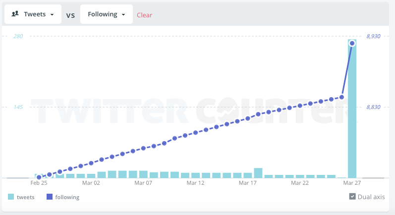
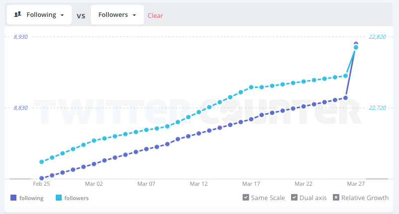
The free version of Twittercounter does something very simple: it shows you a chart comparing two of three metrics: your followers, your volume of tweets, or the number of people you are following.
It’s not completely accurate, but its simplicity does something very important: it focuses your attention on whether your use of social media has any impact, on one metric at least: the size of your audience.
Of course followers is only one metric – I’ll write in a future post about other metrics and other ways of measuring those – but the ease with which Twittercounter works makes it as good a place as any for aspiring students to begin exploring the importance of measurement in modern journalism.
By way of example, here are 11 charts which show how a simple tool like Twittercounter can illustrate what you’re going right as a journalist – and where you can improve.
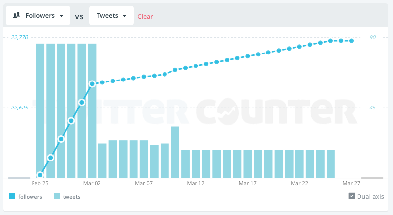
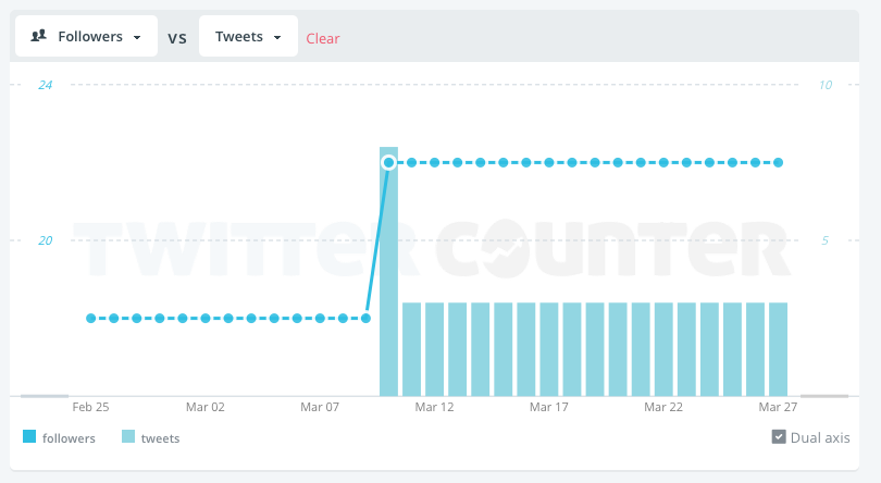
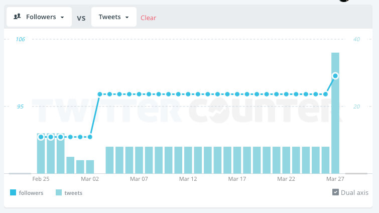
The ‘Liveblogging got me lot of followers’ charts
A night of liveblogging – and lots of tweets – coincides with a steep increase in the rate of new followers. But is it just the tweets..?
…Or is it the fact that the account has followed more accounts too? Experiment with both (following more, or tweeting more) and see which coincides with the biggest increases? Or perhaps it’s only when more tweets are combined with following more people?

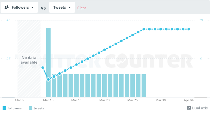
A similar chart from someone else also sees followers go up during one evening of live tweeting sees followers go up too. But notice how a dip in Twitter activity just before also coincides with a plateau in follower numbers
The ‘Need to start tweeting again’ charts
In this example of a newly created Twitter account there has been very little tweeting, and follower numbers have actually gone down from their starting point.
Look at the tweets themselves: are they aimed at anyone? Use hashtags? Perhaps you need to identify and address an audience.
Below another chart from another user shows a similar pattern: there is some tweeting after that initial splurge, but it’s not having any impact judging by follower numbers.
And here we see how stopping tweeting means followers stop increasing too:
A less dramatic decrease in new followers can be seen as tweeting frequency declines after some initial enthusiasm:
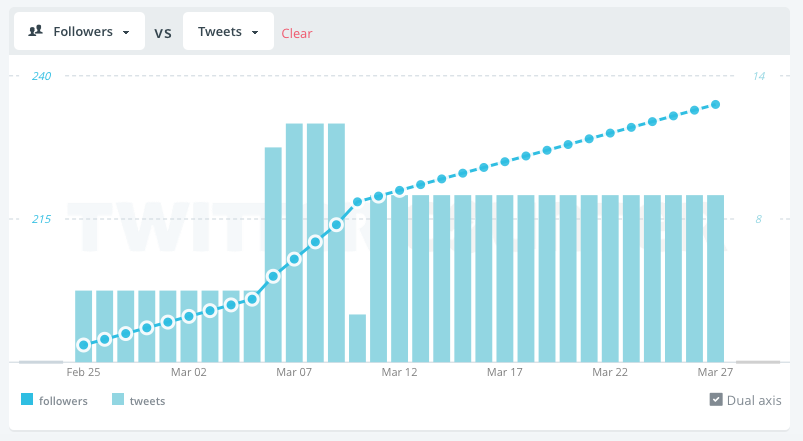
The ‘tweeting more often sees more followers’ charts
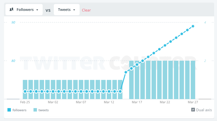
This chart shows the opposite pattern: a plateau of low tweeting activity is mirrored by a plateau of followers. But an uptake in frequency seems to have some impact.
What’s curious is the increase in followers starts before the increase in tweets: could that be because there was an increase in meeting new contacts offline?
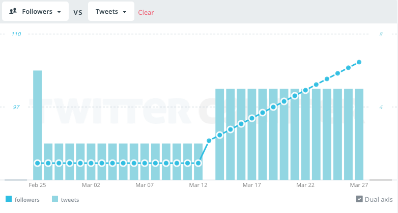
A similar pattern is shown below – or is this an issue with Twittercounter’s measurement?
And below is a user whose spike of activity and followers both come in the middle of their time on Twitter.
Use your journalistic scepticism
As I said at the start, metrics like Twittercounter’s are not always precise: I’ve seen charts which report lower Twitter activity than it should about the user’s account. This may be because the account is not checked regularly enough, so it’s always worth checking against the account itself.
It’s also worth checking the number of new accounts followed as these can also impact on the number of followers.
More importantly, use tools like Twittercounter as a starting point, not as an end in itself. Try to identify why that particular day resulted in more followers: what were you tweeting about, and how? Were you using a hashtag, or mentioning particular Twitter names? Using images or tweeting at a particular time?
Twitter’s own analytics – analytics.twitter.com – will give you a more granular insight into which tweets had the biggest impact. But that’s for another post…

Pingback: Lastest Check News | Discussion is a virtue
Pingback: This is the new age, baby. | katie-easter
Pingback: SNO Sites Customers | Aggressive advisers, apathetic students, and sentence writing 101