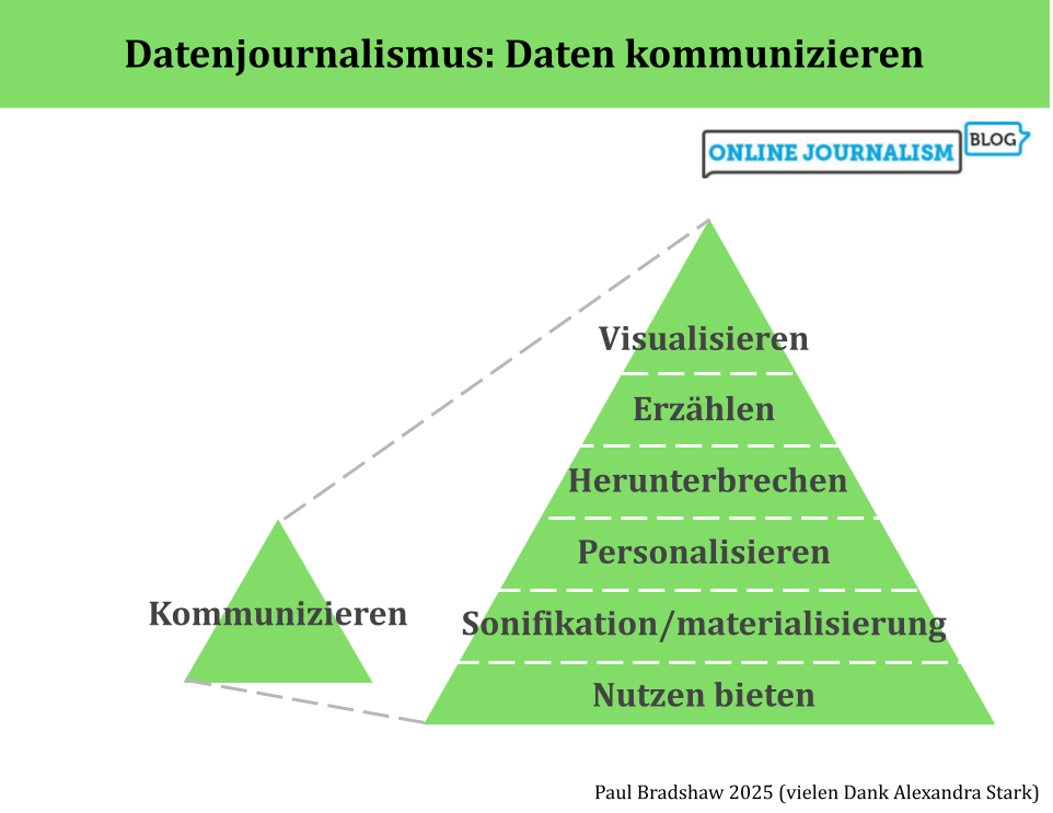
Die umgekehrte Pyramide des Datenjournalismus bildet den Prozess der Datennutzung in der Berichterstattung ab, von der Ideenentwicklung über die Bereinigung, Kontextualisierung und Kombination bis hin zur Kommunikation. In dieser letzten Phase – der Kommunikation – sollten wir einen Schritt zurücktreten und unsere Optionen betrachten: von Visualisierung und Erzählung bis hin zu Personalisierung und Werkzeugen.
Visualisierung kann ein schneller Weg sein, die Ergebnisse des Datenjournalismus zu vermitteln: Kostenlose Tools wie Datawrapper und Flourish erfordern oft nur, dass du deinen Daten hochlädst und aus verschiedenen Visualisierungsoptionen auswählst.
If you’ve been working on a story involving data, the temptation can be to throw all the figures you’ve found into the resulting report — but the same rules of good writing apply to numbers too. Here are some tips to make sure you’re putting the story first.
In a previous post I explored how AI performed on data analysis tasks — and the importance of understanding the code that it used to do so. If you do understand code, here are some tips for using large language models (LLMs) for analysis — and addressing the risks of doing so.
TL;DR: If you understand code, or would like to understand code, genAI tools can be a useful tool for data analysis — but results depend heavily on the context you provide, and the likelihood of flawed calculations mean code needs checking. If you don’t understand code (and don’t want to) — don’t do data analysis with AI.
ChatGPT used to be notoriously bad at maths. Then it got worse at maths. And the recent launch of its newest model, GPT-5, showed that it’s still bad at maths. So when it comes to using AI for data analysis, it’s going to mess up, right?
Well, it turns out that the answer isn’t that simple. And the reason why it’s not simple is important to explain up front.
But over the last two years AI platforms have added the ability to generate and run code (mainly Python) in response to a question. This means that, for some questions, they will try to predict the code that a human would probably write to solve your question — and then run that code.
When it comes to data analysis, this has two major implications:
Responses to data analysis questions are often (but not always) the result of calculations, rather than a predicted sequence of words. The algorithm generates code, runs that code to calculate a result, then incorporates that result into a sentence.
Because we can see the code that performed the calculations, it is possible to checkhow those results were arrived at.
I et tidligere innlegg skrev jeg om fire av vinklene som oftest brukes til å fortelle historier om data. I denne andre delen ser jeg på de tre øvrige vinklene: historier som fokuserer på sammenhenger; ‘metadata’-vinkler som fokuserer på dataenes fravær, dårlige kvalitet eller innsamling — og utforskende artikler som blander flere vinkler eller gir en mulighet til å bli kjent med selve dataene.
Datenjournalistische Projekte lassen sich in einzelne Schritte aufteilen – jeder einzelne Schritt bringt eigene Herausforderungen. Um dir zu helfen, habe ich die “Umgekehrte Pyramide des Datenjournalismus” entwickelt. Sie zeigt, wie du aus einer Idee eine fokussierte Datengeschichte machst. Ich erkläre dir Schritt für Schritt, worauf du achten solltest, und gebe dir Tipps, wie du typische Stolpersteine vermeiden kannst.
Last month the BBC’s Shared Data Unit held its annual Data and Investigative Journalism UK conference at the home of my MA in Data Journalism, Birmingham City University. Here are some of the highlights…
In many countries public data is limited, and access to data is either restricted, or information provided by the authorities is not credible. So how do you obtain data for a story? Here are some techniques used by reporters around the world.
Datadrevet historiefortelling kan deles i syv hovedkategorier ifølge en analyse av 200 artikler. I den første av to poster vil jeg demonstrere de fire mest brukte vinklene i nyhetshistorier, hvordan de kan gi deg flere muligheter som reporter, og hvordan de kan hjelpe deg med å arbeide mer effektivt med data.
De fleste datasett kan fortelle mange historier — så mange at det for noen kan virke overveldende eller forstyrrende. Å identifisere hvilke historier som er mulige, og å velge den beste historien innenfor den tiden og de ferdighetene du har tilgjengelig, er en viktig redaksjonell ferdighet.
Mange nybegynnere innen datajournalistikk søker ofte først etter historier om sammenhenger (årsak og virkning) — men disse historiene er vanskelig og tidkrevende. Du kan ønske å fortelle en historie om ting som blir verre eller bedre — men mangle dataene for å fortelle den. Hvis du har svært liten tid og vil komme i gang med datajournalistikk, er de raskeste og enkleste historiene du kan fortelle med data, historier om omfang.