Category Archives: data journalism

2 guest posts: 2012 predictions and “Social media and the evolution of the fourth estate”

Memeburn logo

I’ve written a couple of guest posts for Nieman Journalism Lab and the tech news site Memeburn. The Nieman post is part of a series looking forward to 2012. I’m never a fan of futurology so I’ve cheated a little and talked about developments already in progress: new interface conventions in news websites; the rise of collaboration; and the skilling up of journalists in data.

Memeburn asked me a few months ago to write about social media’s impact on journalism’s role as the Fourth Estate, and it took me until this month to find the time to do so. Here’s the salient passage:

“But the power of the former audience is a power that needs to be held to account too, and the rise of liveblogging is teaching reporters how to do that: reacting not just to events on the ground, but the reporting of those events by the people taking part: demonstrators and police, parents and politicians all publishing their own version of events — leaving journalists to go beyond documenting what is happening, and instead confirming or debunking the rumours surrounding that.

“So the role of journalist is moving away from that of gatekeeper and — as Axel Bruns argues — towards that of gatewatcher: amplifying the voices that need to be heard, factchecking the MPs whose blogs are 70% fiction or the Facebook users scaremongering about paedophiles.

“But while we are still adapting to this power shift, we should also recognise that that power is still being fiercely fought-over. Old laws are being used in new waysnew laws are being proposed to reaffirm previous relationships. Some of these may benefit journalists — but ultimately not journalism, nor its fourth estate role. The journalists most keenly aware of this — Heather Brooke in her pursuit of freedom of information; Charles Arthur in his campaign to ‘Free Our Data’ — recognise that journalists’ biggest role as part of the fourth estate may well be to ensure that everyone has access to information that is of public interest, that we are free to discuss it and what it means, and that — in the words of Eric S. Raymond — “Given enough eyeballs, all bugs are shallow“.”

Comments, as always, very welcome.

Tools or Tales?

Christmas gifts image by Michael Wyszomierski

Christmas gifts image by Michael Wyszomierski

This month’s Carnival of Journalism asks what journalists want for Christmas from programmers, and vice versa. Here’s my take.

Programmers and developers have already given journalists enough presents to last a century of Christmases. Programmers created content management systems and blogging platforms; they wrapped up networks of contacts in social networks, and parcelled up fast-moving updates on Twitter and SMS. They tied media in ribbons of metadata, making it easier to verify. They digitised content, making it possible to mix it with other content.

But I think it’s time for journalists to start giving back.

All of these gifts have made it easier for journalists to report stories. But that’s only part of publishing.

Technology’s place in journalism

Traditionally, journalism’s technology came after the story: sub-editors or designers laid the story out in the way they judged to be the most effective; printers gave it physical form; and distributors made sure it reached people.

Each stage in that process considers the next person. The inverted pyramid, for example, helps subs trim copy to fit available space. Subs talk to printers. Printers work with distributors. Processes are designed to reduce friction. The journalist’s work – whether they realise it or not – is a compromise reached over decades between different parties. An exchange of gifts, if you like.

But when it comes to publishing online, there’s been very little Christmas spirit.

Stories as a vehicle

Stories help us connect with current issues; they act as a vehicle for information that allows us to participate in society, whether that’s politically, socially, or economically.

The job of a journalist is to find stories in current events.

But those stories do not have to be told in one particular way. And if we were to try to tell them in some different ways (adding important metadata; publishing raw data; linking to supporting material; flagging false information), we could be giving a gift much desired by developers.

Here are some things that they could do with that gift – it is, if you like, my own fantasy Christmas list:

They’re just ideas – and will remain so as long as journalists assume they’re only writing for newspapers, and newspaper readers.

The newspaper is a tool: a way for groups of people to exchange information. In the 19th century those groups might have been political activists, or merchants who needed to know the latest trading conditions.

The web is a tool too – a different tool. We can use it to ask information to come to us, or to seek out supplementary information; we can use it to draw connections; and we can act on what we find in the same space. Stories need to adapt to the possibilities of the new tool they sit in.

This year, put a developer on your Christmas list. It’s the gift that keeps on giving.

New UK open data moves: following the money and other curiosities

Tim Davies has done a wonderful job of combing through the fine print of the UK government’s Autumn statement open data measures (PDF), highlighting the dynamics that appear to be driving it, and the data conspicuous by its absence.

Here are the passages most relevant for journalists. Firstly, following the money and accountability:

“The [Data Strategy Board] body seeking public data will be reliant upon the profitability of the PDG [Public Data Group] in order to have the funding it needs to secure the release of data that, if properly released in free forms, would likely undermine the current trading revenue model of the PDG. That doesn’t look like the foundation for very independent and effective governance or regulation to open up core reference data!

“Furthermore, whilst the proposed terms for the DSB [Data Strategy Board] terms state that “Data users from outside the public sector, including representatives of commercial re-users and the Open Data community, will represent at least 30% of the members of DSB”, there are also challenges ahead to ensure data users from civil society interests are represented on the board”

Secondly, the emphasis on clinical data and issues surrounding privacy and the sale of personal data:

“The first measures in the Cabinet Office’s paper are explicitly not about open data as public data, but are about the restricted sharing of personal medical records with life-science research firms – with the intent of developing this sector of the economy. With a small nod to “identifying specified datasets for open publication and linkage”, the proposals are more centrally concerned with supporting the development of a Clinical Practice Research Datalink (CPRD) which will contain interlinked ‘unidentifiable, individual level’ health records, by which I interpret the ability to identify a particular individual with some set of data points recorded on them in primary and secondary care data, without the identity of the person being revealed.

“The place of this in open data measures raises a number of questions, such as whether the right constituencies have been consulted on these measures and why such a significant shift in how the NHS may be handing citizens personal data is included in proposals unlikely to be heavily scrutinised by patient groups? In the past, open data policies have been very clear that ‘personal data’ is out of scope – and the confusion here raises risks to public confidence in the open data agenda. Leaving this issue aside for the moment, we also need to critically explore the evidence that the release of detailed health data will “reinforce the UK’s position as a global centre for research and analytics and boost UK life sciences”. In theory, if life science data is released digitally and online, then the firms that can exploit it are not only UK firms – but the return on the release of UK citizens personal data could be gained anywhere in the world where the research skills to work with it exist.”

UPDATE: More on that in The Guardian.

Thirdly, it looks like this data will allow journalists to scrutinise welfare and credit (so plenty of material for the tabloids and mid-market press), but not data that scrutinises corporations or governments:

“When we look at the other administrative datasets proposed for release in the Measures the politicisation of open data release is evident: Fit Note Data; Universal Credit Data; and Welfare Data (again discussed for ‘linking’ implying we’re not just talking about aggregate statistics) are all proposed for increased release, with specific proposals to “increase their value to industry”. By contrast, no mention of releasing more details on the tax share paid by corporations, where the UK issues arms export licenses, or which organisations are responsible for the most employment law violations. Although the stated aims of the Measures include increasing “transparency and accountability” it would not be unreasonable to read the detail of the measures as very one-sided on this point: and emphasising industry exploitation of data far more than good governance and citizen rights with respect to data.

“The blurring of the line between ‘personal data’ and ‘open data’, and the state’s assumption of the right to share personal data for industrial gain should give cause for concern, and highlights the need for build a stronger constituency scrutinising government open data action.”

It’s nice to see a data initiative being greeted with a critical eye rather than Three Cheers for the Numbers.

UPDATE: On a similar note, Access Info Europe highlights problems with the Open Government Partnership, which “must significantly improve its internal access to information policy to meet the standards it is advancing”. Specifically:

“The policy should be reformed to incorporate basic open data principles such as that information will be made available in a machine-readable, electronic format free of restrictions on reuse.”

“A key problem is the lack of detail in the policy, which has the result of leaving important matters to the discretion of the OGP. Other key problems include:
» The failure of the policy to recognise the fundamental human right to information;
» The significantly overbroad and discretionary regime of exceptions;
» The failure of the draft Policy to put in place a system of protections and sanctions.”

Maps “in the public interest” now exempt from Google Maps API charge

If you thought you couldn’t use the Google Maps API any more as a journalist, this update to the Google Geo Developers Blog should make you reconsider. From Nieman Journalism Lab:

“Certain web apps will be given blanket exemptions from charging. Here’s Google: “Maps API applications developed by non-profit organisations, applications deemed by Google to be in the public interest, and applications based in countries where we do not support Google Checkout transactions or offer Maps API Premier are exempt from these usage limits.” So nonprofit news orgs look to be in the clear, and Google could declare other news org maps apps to be “in the public interest” and free to run. (It also notes that nonprofits could be eligible for a free Maps API Premier license, which comes with extra goodies around advertising and more.)”

Sentencing data update: Manchester Evening News make another splash

Since I wrote about the need for more data journalism around sentencing in August, the Manchester Evening News have been beavering away keeping track of riot sentencing data on their own patch with stories on the first 60 looters to be sentenced and the role of poverty. Last week the newspaper finally made a splash on the figures.

The collected data led to this front page story: Looters jailed straight after Manchester riots given terms 30 per cent longer than those punished later.

While another article builds up a detailed profile of the rioters with plenty of visualisation, and links to the raw data.

The MEN’s Paul Gallagher had previously told me in an email correspondence that they were expecting at least 250-300 cases to be going through the courts in total, making “enough to make a very interesting and useful dataset but not so many as to make it too big a job.

“This spreadsheet is being completed using information provided by our journalists in court. The MEN is committed to staffing every court hearing so we should be able to fill this over time. This is a trial project limited only to the riots, and I don’t know if we will do anything with other court data in future.”

At the time Paul was trying to set up a system that would see court reporters add information when they covered a case, a system that could be used to publish court data in future.

“One of the biggest problems I have found is that we can produce graphics quite easily for online using Google Fusion Tables and other tools but it is difficult to turn these into graphics that will work in print without getting a graphic designer to recreate the image.”

A couple months on Paul remarks that the project has required significant editorial resources:

“Around ten MEN journalists have either sat in court to take down details of one or more riot cases in the last three months, or have been involved in the data analysis.”

He also says the exercise has raised some questions about the use, and sharing, of court data.

“Although the names and home addresses of adult defendants are published in court reports in the media, it does not seem appropriate to include them in shared spreadsheets, or to plot them on street level maps.

“For that reason, I decided to remove the names and personal details when we plotted home addresses of defendants on a map of Greater Manchester to visualise the correlation between rioters and high levels of poverty and deprivation.

The Manchester Evening News have not decided if they will continue their data work on other non-riot-related court data, which Paul feels “begs the question why court data is not publicly available from official sources.”
“At the moment there is no other way of getting this information than to have a person sat in court at every hearing, jotting down the details in their notebook and then copying them into a spreadsheet.”

The data and visualisation was also used in last night’s Panorama: Inside The Riots. Disappointingly, the Panorama website and solitary blog post include no links to the MEN coverage or data, and the official Twitter account not only failed to link – it has failed to tweet at all in almost two weeks.

Following the money: making networks visible with HTML5

Network analysis – the ability to map connections between people and organisations – is one branch of data journalism which has enormous potential. But it is also an area which has not yet been particularly well explored, partly because of the lack of simple tools with which to do it.

One recent example – AngelsOfTheRight.net – is particularly interesting, because of the way that it is experimenting with HTML5.

The site is attempting to map “relationships among institutions due to the exchange of large quantities of money between them as reported to IRS in a decade of Form 990 tax filings.”

But it’s also attempting to “push the limits” of using HTML5 to create network maps. As this blog post explains:

“This project was built using the NodeViz project […] which wraps up a bunch of the functionality needed to squeeze network ties out of a database, through Graphviz, and into a browser with features like zooming, panning, and full DOM and JavaScript interaction with the rest of the page content. This means that we can do fun things like have a tour to mode a viewer through the map, and have list views of related data alongside the map that will open and focus on related nodes when clicked. It is also supposed to degrade gracefully to just display a clickable image on non-SVG browsers like Internet Explorer 7 and 8.”

HTML5 offers some other interesting possibilities, such as improved search engine optimisation compared to a static image or Flash interactive, although I have no idea how much this project explores that (comments invited).

Also interesting is the discussion section of AngelsOfTheRight.net, which outlines some of the holes in the data, methodological flaws, and ways that the project could be improved:

“In this sort of survey, it is always hard to tell if organizations are missing because they really didn’t make contributions, or just because nobody had time to record the data from their financial statements into the database. Several sources mention the Adolph Coors Foundation as an important funder of the conservative agenda, yet they do not appear in this database. Why not?”

via Pete Warden

Data Referenced Journalism and the Media – Still a Long Way to Go Yet?

Reading our local weekly press this evening (the Isle of Wight County Press), I noticed a page 5 headline declaring “Alarm over death rates at St Mary’s”, St Mary’s being the local general hospital. It seems a Department of Health report on hospital mortality rates came out earlier this week, and the Island’s hospital, it seems, has not performed so well…

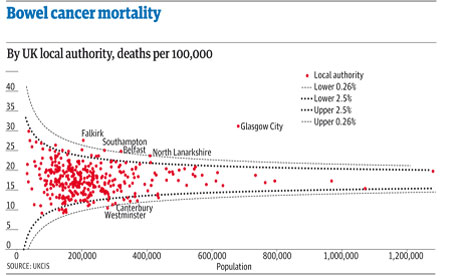
Seeing the headline – and reading the report – I couldn’t help but think of Ben Goldacre’s Bad Science column in the Observer last week (DIY statistical analysis: experience the thrill of touching real data ), which commented on the potential for misleading reporting around bowel cancer death rates; among other things, the column described a statistical graphic known as a funnel plot which could be used to support the interpretation of death rate statistics and communicate the extent to which a particular death rate, for a given head of population, was “significantly unlikely” in statistical terms given the distribution of death rates across different population sizes.

I also put together a couple of posts describing how the funnel plot could be generated from a data set using the statistical programming language R.

Given the interest there appears to be around data journalism at the moment (amongst the digerati at least), I thought there might be a reasonable chance of finding some data inspired commentary around the hospital mortality figures. So what sort of report was produced by the Guardian (Call for inquiries at 36 NHS hospital trusts with high death rates) or the Telegraph (36 hospital trusts have higher than expected death rates), both of which have pioneering data journalists working for them, come up with? Little more than the official press release: New hospital mortality indicator to improve measurement of patient safety.

The reports were both formulaic, picking on leading with the worst performing hospital (which admittedly was not mentioned in the press release) and including some bog standard quotes from the responsible Minister lifted straight out of the press release (and presumably written by someone working for the Ministry…) Neither the Guardian nor the Telegraph story contained a link to the original data, which was linked to from the press release as part of the Notes to editors rider.

If we do a general, recency filtered, search for hospital death rates on either Google web search:

UK hosptial death rates reporting

or Google news search:

UK hospital death rate reporting

we see a wealth of stories from various local press outlets. This was a story with national reach and local colour, and local data set against a national backdrop to back it up. Rather than drawing on the Ministerial press released quotes, a quick scan of the local news reports suggests that at least the local journalists made some effort compared to the nationals’ churnalism, and got quotes from local NHS spokespeople to comment on the local figures. Most of the local reports I checked did not give a link to the original report, or dig too deeply into the data. However, This is Tamworth, (which had a Tamworth Herald byline in the Google News results), did publish the URL to the full report in its article Shock report reveals hospital has highest death rate in country, although not actually as a link… Just by the by, I also noticed the headline was flagged with a “Trusted Source” badge:

WHich is the trusted source?

Is that Tamworth Herald as the trusted source, or the Department of Health?!

Given that just a few days earlier, Ben Goldacre had provided an interesting way of looking at death rate data, it would have been nice to think that maybe it could have influenced someone out there to try something similar with the hospital mortality data. Indeed, if you check the original report, you can find a document describing How to interpret SHMI bandings and funnel plots (although, admittedly, not that clearly perhaps?). And along with the explanation, some example funnel plots.

However, the plots as provided are not that useful. They aren’t available as image files in a social or rich media press release format, nor are statistical analysis scripts that would allow the plots to be generated from the supplied data in too like R; that is to say, the executable working wasn’t shown…

So here’s what I’m thinking: firstly, we need data press officers as well as data journalists. Their job would be to put together the tools that support the data churnalist in taking the raw data and producing statistical charts and interpretation from it. Just like the ministerial quote can be reused by the journalist, so the data press pack can be used to hep the journalist get some graphs out there to help them illustrate the story. (The finishing of the graph would be up to the journalist, but the mechanics of the generation of the base plot would be provided as part of the data press pack.)

Secondly, there may be an opportunity for an enterprising individual to take the data sets and produced localised statistical graphics from the source data. In the absence of a data press officer, the enterprising individual could even fulfil this role. (To a certain extent, that’s what the Guardian Datastore does.)

(Okay, I know: the local press will have allocated only a certain amount of space to the story, and the editor would likely see any mention of stats or funnel plots as scaring folk off, but we have to start changing attitudes, expectations, willingness and ability to engage with this sort of stuff somehow. Most people have very little education in reading any charts other than pie charts, bar charts, and line charts, and even then are easily misled. We have start working on this, we have to start looking at ways of introducing more powerful plots and charts and helping people get a folk understanding of them. And funnel plots may be one of the things we should be starting to push?)

Now back to the hospital data. In How Might Data Journalists Show Their Working? Sweave, I posted a script that included the working for generating a funnel plot from an appropriate online CSV data source. Could this script be used to generate a funnel plot from the hospital data?

I had a quick play, and managed to get a scatterplot distribution that looks like the one on the funnel plot explanation guide by setting the number value to the SHMI Indicator data (csv) EXPECTED column and the p to the VALUE column. However, because the p value isn’t a probability in the range 0..1, the p.se calculation fails:
p.se <- sqrt((p*(1-p)) / (number))

Anyway, here’s the script for generating the straightforward scatter plot (I had to read the data in from a local file because there was some issue with the security certificate trying to read the data in from the online URL using the RCurl library and hospitaldata = data.frame( read.csv( textConnection( getURL( DATA_URL ) ) ) ):

hospitaldata = read.csv("~/Downloads/SHMI_10_10_2011.csv")
number = hospitaldata$EXPECTED
p = hospitaldata$VALUE
df = data.frame(p, number, Area=hospitaldata$PROVIDER.NAME)
ggplot(aes(x = number, y = p), data = df) + geom_point(shape = 1)

There’s presumably a simple fix to the original script that will take the range of the VALUE column into account and allow us to plot the funnel distribution lines appropriately? If anyone can suggest the fix, please let me know in a comment…;-)

VIDEO: Advice for investigative journalists, from the Balkan Investigative Reporters Network Summer School

In September I spoke at the Balkan Investigative Reporters Network (BIRN) Summer School in Croatia. I took the opportunity to film brief interviews with 4 journalists on their tips for investigating companies, bribery and corruption, and finding and analysing data and experts.

These were originally published on the Help Me Investigate blog, but I’m cross-posting them all here for those who don’t follow that.

As always these videos are published under a Creative Commons licence, so you are free to re-edit the material or add it to other work, with attribution. (In fact, these videos were actually re-edited from the original uploads on my own YouTube account – adding simple titles and re-publishing on the Help Me Investigate YouTube channel using the YouTube editor).

A quick exercise for aspiring data journalists

A funnel plot of bowel cancer mortality rates in different areas of the UK

The latest Ben Goldacre Bad Science column provides a particularly useful exercise for anyone interested in avoiding an easy mistake in data journalism: mistaking random variation for a story (in this case about some health services being worse than others for treating a particular condition):

“The Public Health Observatories provide several neat tools for analysing data, and one will draw a funnel plot for you, from exactly this kind of mortality data. The bowel cancer numbers are in the table below. You can paste them into the Observatories’ tool, click “calculate”, and experience the thrill of touching real data.

“In fact, if you’re a journalist, and you find yourself wanting to claim one region is worse than another, for any similar set of death rate figures, then do feel free to use this tool on those figures yourself. It might take five minutes.”

By the way, if you want an easy way to get that data into a spreadsheet (or any other table on a webpage), try out the =importHTML formula, as explained on my spreadsheet blog (and there’s an example for this data here).