Category Archives: data journalism

“Data laundering”

Wonderful post by Tony Hirst in which he sort-of-coins* a lovely neologism in explaining how data can be “laundered”:

“The Deloitte report was used as evidence by Facebook to demonstrate a particular economic benefit made possible by Facebook’s activities. The consultancy firm’s caveats were ignored, (including the fact that the data may in part at least have come from Facebook itself), in reporting this claim.

“So: this is data laundering, right? We have some dodgy evidence, about which we’re biased, so we give it to an “independent” consultant who re-reports it, albeit with caveats, that we can then report, minus the caveats. Lovely, clean evidence. Our lobbyists can then go to a lazy policy researcher and take this scrubbed evidence, referencing it as finding in the Deloitte report, so that it can make its way into a policy briefing.”

So, perhaps we can now say “Follow the data” in the same way that we “Follow the money”?

*Although a search for “money laundering” generates thousands of results on Google, most of them seemingly influenced by serial neologist William Gibson‘s use of the term to refer to using illegally acquired data, I can’t find an example of it being used in the way that Tony means it.

The £10,000 question: who benefits most from a tax threshold change?

UPDATE [Feb 14 2012]: Full Fact picked up the challenge and dug into the data:

“The crucial difference is in methodology – while the TPA used individuals as its basis, the IFS used households as provided by the Government data.

“This led to substantially different conclusions. The IFS note that using household income as a measure demonstrates increased gains for households with two or more earners. As they state:

“”families with two taxpayers would gain more than families with one taxpayer, who tend to be worse off. Thus, overall, better-off families (although not the very richest) would tend to gain most in cash terms from this reform…””

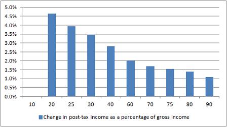
Here’s a great test for eagle-eyed journalists, tweeted by Guardian’s James Ball. It’s a tale of two charts that claim to show the impact of a change in the income tax threshold to £10,000. Here’s the first:

Change in post-tax income as a percentage of gross income

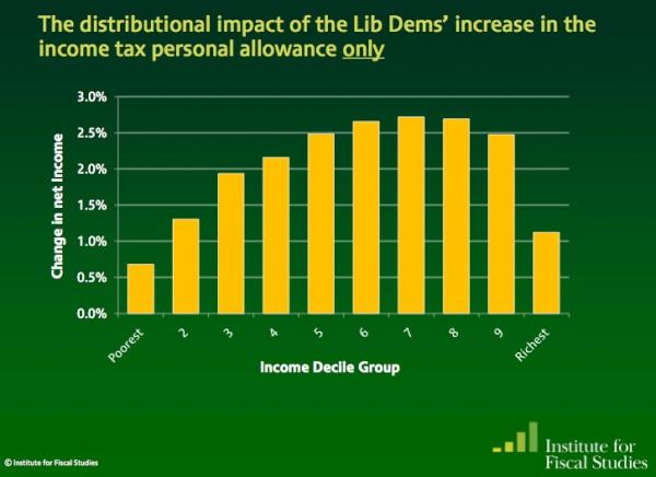
And here’s the second:

Net impact of income tax threshold change on incomes - IFS

So: same change, very different stories. In one story (Institute for Fiscal Studies) it is the the wealthiest that appear to benefit the most; but in the other (Taxpayers’ Alliance via Guido Fawkes) it’s the poorest who are benefiting.

Did you spot the difference? The different y axis is a slight clue – the first chart covers a wider range of change – but it’s the legend that gives the biggest hint: one is measuring change as a percentage of gross income (before, well, taxes); the other as a change in net income (after tax).

James’s colleague Mary Hamilton put it like this: “4.5% of very little is of course much less than 1% of loads.” Or, more specifically: 4.6% of £10,853 (the second decile mentioned in Fawkes’ post) is £499.24; 1.1% of £47,000 (the 9th decile according to the same ONS figures) is £517. (Without raw data, it’s hard to judge what figures are being used – if you include earnings over that £47k marker then it changes things, for example, and there’s no link to the net earnings).

In a nutshell, like James, I’m not entirely sure why they differ so strikingly. So, further statistical analysis welcome.

UPDATE: Seems a bit of a Twitter fight erupted between Guido Fawkes and James Ball over the source of the IFS data. James links to this pre-election document containing the chart and this one on ‘Budget 2011’. Guido says the chart’s “projections were based on policy forecasts that didn’t pan out”. I’ve not had the chance to properly scrutinise the claims of either James or Guido. I’ve also yet to see a direct link to the Taxpayers’ Alliance data, so that is equally in need of unpicking.

In this post, however, my point isn’t to do with the specific issue (or who is ‘right’) but rather how it can be presented in different ways, and the importance of having access to the raw data to ‘unspin’ it.

A new Scottish datablog (and a treemap in Liverpool)

The Scotsman has a newish data blog, set up (I’m rather proud to say) by one of my former PA/Telegraph trainees: Jennifer O’Mahony. This is particularly important as so much data covered in the ‘national’ press tends to be English-only due to devolution.

The Department of Education, for example, only publishes English education data. If you want Scottish education data you need to go to the Scottish Government website or Education ScotlandOfsted inspects schools in England; for Scottish schools reports you need to visit HM Inspectorate of Education. (Meanwhile, the National Statistics site, publishes data from England, Scotland, Wales and Northern Ireland).

So if there’s any Scottish data – or that of Wales or Northern Ireland – that you want me to help with, let me or Jennifer know. By way of illustrating the process, here’s a post over on Help Me Investigate: Education on how I helped Jennifer collect data on free school meals in Scotland.

A treemap in Liverpool

On the same note of non-national data journalism, here’s a particularly nice bit of data visualisation at the Liverpool Post. It’s not often you see treemaps on a local newspaper website – this one was designed by Ilan Sheady based on data gathered by City Editor David Bartlett after a day’s data journalism training.

Infographic showing the huge scale of the £5.5bn Liverpool Waters scheme


Word cloud or bar chart?

Bar charts preferred over word clouds

One of the easiest ways to get someone started on data visualisation is to introduce them to word clouds (it also demonstrates neatly how not all data is numerical).

Using tools like Wordle and Tagxedo, you can paste in a major speech and see it visualised within a minute or so.

But is a word cloud the best way of visualising speeches? The New York Times appear to think otherwise. Their visualisation (above) comparing President Obama’s State of the Union address and speeches by Republican presidential candidates chooses to use something far less fashionable: the bar chart.

Why did they choose a bar chart? The key is the purpose of the chart: comparison. If your objective is to capture the spirit of a speech, or its key themes, then a word cloud can still work well, if you clean the data (see this interactive example that appeared on the New York Times in 2009).

But if you want to compare it to speeches of others – and particularly if you want to compare on specific issues such as employment or tax – then bar charts are a better choice. Compare, for example, ReadWriteWeb’s comparison of inaugural speeches, and how effective that is compared to the bar charts.

In short, don’t always reach for the obvious chart type – and be clear what you’re trying to communicate.

UPDATE: More criticism of word clouds by New York Times software architect here (via Harriet Bailey)

Obama inaugural speech word cloud by ReadWriteWeb

Obama inaugural speech word cloud by ReadWriteWeb

via Flowing Data

Data journalism awards

Yesterday saw the launch of the first (surprisingly) international data journalism awards, backed by the European Journalism Centre*, Google, and the Global Editors Network.

There are 6 awards – 3 categories, each split into national/international and local/regional subcategories: investigative journalism; visualisation; and apps.

Each comes with prize money of 7,500 euros.

The closing date for entries is April 10. It’s particularly good to see a jury and pre-jury that isn’t dominated by Anglo-American traditional media, so if your work is unconventionally innovative it stands a decent chance of making it through. There’s also no specification on where your work is published, so students and independent journalists can enter.

The one thing I’d like to see in future years is the ‘visualisation and storytelling’ category expanded to include non-visual storytelling – there’s a tendency to reach for visualisation as a way to communicate data when other methods could be just as, or more, engaging.

*Declaration of interest: I am on the editorial board for the EJC’s Data Driven Journalism project.

SFTW: Scraping data with Google Refine

For the first Something For The Weekend of 2012 I want to tackle a common problem when you’re trying to scrape a collection of webpage: they have some sort of structure in their URL like this, where part of the URL refers to the name or code of an entity:

  1. http://www.ltscotland.org.uk/scottishschoolsonline/schools/freemealentitlement.asp?iSchoolID=5237521
  2. http://www.ltscotland.org.uk/scottishschoolsonline/schools/freemealentitlement.asp?iSchoolID=5237629
  3. http://www.ltscotland.org.uk/scottishschoolsonline/schools/freemealentitlement.asp?iSchoolID=5237823

In this instance, you can see that the URL is identical apart from a 7 digit code at the end: the ID of the school the data refers to.

There are a number of ways you could scrape this data. You could use Google Docs and the =importXML formula, but Google Docs will only let you use this 50 times on any one spreadsheet (you could copy the results and select Edit > Paste Special > Values Only and then use the formula a further 50 times if it’s not too many – here’s one I prepared earlier).

And you could use Scraperwiki to write a powerful scraper – but you need to understand enough coding to do so quickly (here’s a demo I prepared earlier).

A middle option is to use Google Refine, and here’s how you do it.

Assembling the ingredients

With the basic URL structure identified, we already have half of our ingredients. What we need  next is a list of the ID codes that we’re going to use to complete each URL.

An advanced search for “list seed number scottish schools filetype:xls” brings up a link to this spreadsheet (XLS) which gives us just that.

The spreadsheet will need editing: remove any rows you don’t need. This will reduce the time that the scraper will take in going through them. For example, if you’re only interested in one local authority, or one type of school, sort your spreadsheet so that you can delete those above or below them.

Now to combine  the ID codes with the base URL.

Bringing your data into Google Refine

Open Google Refine and create a new project with the edited spreadsheet containing the school IDs.

At the top of the school ID column click on the drop-down menu and select Edit column > Add column based on this column…

In the New column name box at the top call this ‘URL’.

In the Expression box type the following piece of GREL (Google Refine Expression Language):

http://www.ltscotland.org.uk/scottishschoolsonline/schools/freemealentitlement.asp?iSchoolID=”+value

(Type in the quotation marks yourself – if you’re copying them from a webpage you may have problems)

The ‘value’ bit means the value of each cell in the column you just selected. The plus sign adds it to the end of the URL in quotes.

In the Preview window you should see the results – you can even copy one of the resulting URLs and paste it into a browser to check it works. (On one occasion Google Refine added .0 to the end of the ID number, ruining the URL. You can solve this by changing ‘value’ to value.substring(0,7) – this extracts the first 7 characters of the ID number, omitting the ‘.0’) UPDATE: in the comment Thad suggests “perhaps, upon import of your spreadsheet of IDs, you forgot to uncheck the importer option to Parse as numbers?”

Click OK if you’re happy, and you should have a new column with a URL for each school ID.

Grabbing the HTML for each page

Now click on the top of this new URL column and select Edit column > Add column by fetching URLs…

In the New column name box at the top call this ‘HTML’.

All you need in the Expression window is ‘value’, so leave that as it is.

Click OK.

Google Refine will now go to each of those URLs and fetch the HTML contents. As we have a couple thousand rows here, this will take a long time – hours, depending on the speed of your computer and internet connection (it may not work at all if either isn’t very fast). So leave it running and come back to it later.

Extracting data from the raw HTML with parseHTML

When it’s finished you’ll have another column where each cell is a bunch of HTML. You’ll need to create a new column to extract what you need from that, and you’ll also need some GREL expressions explained here.

First you need to identify what data you want, and where it is in the HTML. To find it, right-click on one of the webpages containing the data, and search for a key phrase or figure that you want to extract. Around that data you want to find a HTML tag like <table class=”destinations”> or <div id=”statistics”>. Keep that open in another window while you tweak the expression we come onto below…

Back in Google Refine, at the top of the HTML column click on the drop-down menu and select Edit column > Add column based on this column…

In the New column name box at the top give it a name describing the data you’re going to pull out.

In the Expression box type the following piece of GREL (Google Refine Expression Language):

value.parseHtml().select(“table.destinations”)[0].select(“tr”).toString()

(Again, type the quotation marks yourself rather than copying them from here or you may have problems)

I’ll break down what this is doing:

value.parseHtml()

parse the HTML in each cell (value)

.select(“table.destinations”)

find a table with a class (.) of “destinations” (in the source HTML this reads <table class=”destinations”>. If it was <div id=”statistics”> then you would write .select(“div#statistics”) – the hash sign representing an ‘id’ and the full stop representing a ‘class’.

[0]

This zero in square brackets tells Refine to only grab the first table – a number 1 would indicate the second, and so on. This is because numbering (“indexing”) generally begins with zero in programming.

.select(“tr”)

Now, within that table, find anything within the tag <tr>

.toString()

And convert the results into a string of text.

The results of that expression in the Preview window should look something like this:

<tr> <th></th> <th>Abbotswell School</th> <th>Aberdeen City</th> <th>Scotland</th> </tr> <tr> <th>Percentage of pupils</th> <td>25.5%</td> <td>16.3%</td> <td>22.6%</td> </tr>

This is still HTML, but a much smaller and manageable chunk. You could, if you chose, now export it as a spreadsheet file and use various techniques to get rid of the tags (Find and Replace, for example) and split the data into separate columns (the =SPLIT formula, for example).

Or you could further tweak your GREL code in Refine to drill further into your data, like so:

value.parseHtml().select(“table.destinations”)[0].select(“td”)[0].toString()

Which would give you this:

<td>25.5%</td>

Or you can add the .substring function to strip out the HTML like so (assuming that the data you want is always 5 characters long):

value.parseHtml().select(“table.destinations”)[0].select(“td”)[0].toString().substring(5,10)

When you’re happy, click OK and you should have a new column for that data. You can repeat this for every piece of data you want to extract into a new column.

Then click Export in the upper right corner and save as a CSV or Excel file.

More on how this data was used on Help Me Investigate Education.

The test of data journalism: checking the claims of lobbyists via government

Day 341 - Pull The Wool Over My Eyes - image by Simon James

Day 341 - Pull The Wool Over My Eyes - image by Simon James

While the public image of data journalism tends to revolve around big data dumps and headline-grabbing leaks, there is a more important day-to-day application of data skills: scrutinising the claims regularly made in support of spending public money.

I’m blogging about this now because I recently came across a particularly good illustration of politicians being dazzled by numbers from lobbyists (that journalists should be checking) in this article by Simon Jenkins, from which I’ll quote at length:

“This government, so draconian towards spending in public, is proving as casual towards dodgy money in private as were Tony Blair and Gordon Brown. Earlier this month the Olympics boss, Lord Coe, moseyed into Downing Street and said that his opening and closing ceremonies were looking a bit mean at £40m. Could he double it to £81m for more tinsel? Rather than scream and kick him downstairs, David Cameron said: my dear chap, but of course. I wonder what the prime minister would have said if his lordship had been asking for a care home, a library or a clinic.

“Much of the trouble comes down to the inexperience of ingenue ministers, and their susceptibility to the pestilence of lobbying now infecting Westminster. On this occasion the hapless Olympics minister, Hugh Robertson, claimed that the extra £41m was “worth £2-5bn in advertising revenue alone”, a rate of return so fanciful as to suggest a lobbyist’s lunch beyond all imagining. Robertson also claimed to need another £271m for games security (not to mention 10,000 troops, warships and surface-to-air missiles), despite it being “not in response to any specific security threat”. It was just money.

“This was merely the climax of naivety. In their first month in office, ministers were told – and believed – that it would be “more expensive” to cancel two new aircraft carriers than to build them. Ministers were told it would cost £2bn to cancel Labour’s crazy NHS computer rather than dump it in the nearest skip. Chris Huhne, darling of the renewables industry, wants to give it £8bn a year to rescue the planet, one of the quickest ways of transferring money from poor consumer to rich landowner yet found. The chancellor, George Osborne, was told by lobbyists he could save £3bn a year by giving away commercial planning permissions. All this was statistical rubbish.

“If local government behaved as credulously as Whitehall it would be summoned before the audit commission and subject to surcharge.”

And if you want to keep an eye on such claims, try a Google News search like this one.

20 free ebooks on journalism (for your Xmas Kindle)

For some reason there are two versions of this post on the site – please check the more up to date version here.

2011: the UK hyper-local year in review

In this guest post, Damian Radcliffe highlights some topline developments in the hyper-local space during 2011. He also asks for your suggestions of great hyper-local content from 2011. His more detailed slides looking at the previous year are cross-posted at the bottom of this article.

2011 was a busy year across the hyper-local sphere, with a flurry of activity online as well as more traditional platforms such as TV, Radio and newspapers.

The Government’s plans for Local TV have been considerably developed, following the Shott Review just over a year ago. We now have a clearer indication of the areas which will be first on the list for these new services and how Ofcom might award these licences. What we don’t know is who will apply for these licences, or what their business models will be. But, this should become clear in the second half of the year.

Whilst the Leveson Inquiry hasn’t directly been looking at local media, it has been a part of the debate. Claire Enders outlined some of the challenges facing the regional and local press in a presentation showing declining revenue, jobs and advertising over the past five years. Her research suggests that the impact of “the move to digital” has been greater at a local level than at the nationals.

Across the board, funding remains a challenge for many. But new models are emerging, with Daily Deals starting to form part of the revenue mix alongside money from foundations and franchising.

And on the content front, we saw Jeremy Hunt cite a number of hyper-local examples at the Oxford Media Convention, as well as record coverage for regional press and many hyper-local outlets as a result of the summer riots.

I’ve included more on all of these stories in my personal retrospective for the past year.

One area where I’d really welcome feedback is examples of hyper-local content you produced – or read – in 2011. I’m conscious that a lot of great material may not necessarily reach a wider audience, so do post your suggestions below and hopefully we can begin to redress that.