

Whether you need an image for your blog post, a soundtrack to your video or that YouTube clip for your documentary, if you’re dealing with multimedia it’s likely you’ll end up using – or wanting to use – someone else’s work as part of your own.
Here are some basic tips on finding and using multimedia across the web in a way that won’t (hopefully) land you in hot water.
The public domain myth
One of the mistakes that has repeatedly landed journalists and their employers in trouble is confusion over the term “public domain“.
Public domain has two possible meanings. In copyright terms, public domain refers to work whose copyright has expired, meaning that anyone can use it without having to ask the copyright holder. Disney – a fierce lobbyist itself for extending copyright – has used ‘public domain’ material as the basis for most of its cartoons, from the work of the Grimm Brothers to a host of other fairy tales, myths and legends.
But sometimes you will hear journalists talk about something being “in the public domain“, in other words ‘public’. For instance, when the Irish Daily Mail published photos of an air traffic controller from her website, they defended the decision on the grounds that the image was “in the public domain”.
But this is not the same.
For example, pretty much every piece of media, almost by definition, is “in the public domain”. Newspapers and magazines sit on the newsstands; television and radio reports are broadcast on huge city centre screens and speakers.
But if you take that content and reproduce it in its entirety without permission, you are breaking copyright law.
The $7,500 copyright scam
If you need any persuading about this, read this post about a copyright scam whereby images are pushed to the top of Google Images search results pages, and then bloggers sued for using them without permission.
It seems odd that media organisations so used to protecting their own, very public, content, should think that another person’s photo, or video, or report, should be fair game because it is “in the public domain”. But they do.
If you want public domain (in the sense of ‘copyright expired’) content, there are some useful sources. The Public Domain Review, for example, publishes a range of public domain work and has this guide to finding them. And Angela Grant writes here about finding public domain video, among other things (note that Angela refers to US law, not that of other countries).
But never assume something is public domain because it is “in public”.
One point to make: while an image, story, or composition may be out of copyright, its performance, re-design or re-telling may not.
Just ask Disney.
Creative Commons – making UGC copyright explicit
If you’re dealing with content that’s been published on a platform like Flickr or YouTube, you may be able to find out the copyright status of that content relatively easily.
Both allow users to easily establish copyright through the Creative Commons licence. You can either look for that licence in the relevant part of the page hosting the content.
On YouTube it is under the video:
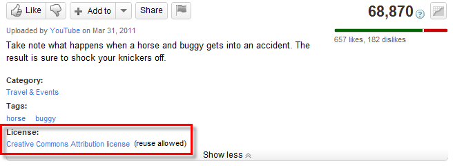
Where to find a YouTube video’s licensing information – image from YouTube.
On Flickr this is on the right hand side under License:
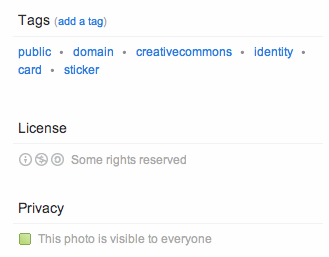
Look for an image’s licensing information on Flickr on the right hand column.
Make sure you click on that licence to find out what terms it requires.
Creative Commons, for example, has a number of elements:
- Whether the material can be used only in noncommercial contexts, or for commercial use as well
- Whether the material can be adapted and changed, or must be left unchanged
- Whether you must use the same CC licence if you use this material (e.g. you cannot use a noncommercial licence but then allow your work to be used commercially)
- Whether you must attribute the work (this is where many people breach the licence)
If you’re unsure of where your work fits against those criteria (for example, whether it’s considered as “commercial”), then approach the copyright holder for clarity. Remember that the CC licence is only a default position, and can be negotiated. Also, if you cannot get any response and decide to publish anyway, your attempts to contact the copyright holder will be important if there are any legal proceedings.
If you want others to publish their content under a CC licence, it helps if you publish at least some of your own work under a CC licence too. Indeed, if it contains other CC material, their licences may require you to.
Flickr and YouTube aren’t the only sites that use Creative Commons licences, of course. To search for media under a CC licence (including on those sites), use the search facility on the Creative Commons site and select the engine you want to search through.
If you’re running a hyperlocal site, or any site that needs images of places, check out Geograph, which hosts Creative Commons-licensed images of locations around the UK.
There are also specialist sites for sharing music under CC, such as Freesound.
Even if the media you are interested in using does not use a CC licence, of course, you can still approach the copyright holder for permission to use it.
Attribution does not cover you for copyright
Another mistake that some people make is to believe that simply linking to the source, or naming the photographer/source, is enough to avoid copyright issues.
This is only the case if the licence for the material says so.
Copyright has two elements: moral rights, and economic rights.
The moral right is the right to be identified as the author of a piece of work. This is the attribution which is in pretty much every copyright licence, Creative Commons or otherwise.
But it’s not the right that most people sue over.
The economic right is the right to right to “allow or prevent the copying of their work or the performance of their work in public” (IPO). This translates into the ability to earn money from a piece of work. And this is what people largely sue over.
Attributing a photo only covers the moral right. It does not mean you won’t be sued.
If, then, you have used an image, video or audio without the permission of the rights holder (granted through a Creative Commons licence or directly to you through correspondence) then you are still probably breaking copyright law.
Embedding versus re-broadcasting
If the media is hosted on a platform like YouTube, you may be able to embed it on a webpage without seeking permission at all: if the creator* has enabled embedding then they would have little argument in suing for breach of copyright because:
- By enabling embedding they have given an ‘implied’ right; and
- They could stop you publishing it instantly by disabling embedding.
- Also, your embedding of their media would not lead to any loss of revenue (as advertising can be embedded too), so it is unlikely that there would be any damages to sue for.
*note: this does not apply to video created by other people and uploaded by someone other than the copyright holder.
UPDATE: Interestingly on this note, in March 2014 Getty Images made it possible to embed 35 million of its images for non-commercial use:
“In essence, anyone will be able to visit Getty Images’ library of content, select an image and copy an embed HTML code to use that image on their own websites. Getty Images will serve the image in a embedded player – very much like YouTube currently does with its videos – which will include the full copyright information and a link back to the image’s dedicated licensing page on the Getty Images website.”
Reality bites
Of course, it’s one thing to talk about the strict legal position, and another to talk about what actually happens. Journalists regularly publish content that breaks the law – but make a judgement about the likelihood of ending up in court over that. For example, I can say that the Queen is corrupt (a defamatory statement) and be almost certain that the Queen is not going to sue me (because she has a history of not doing so).
Media lawyers are not just there to advise publishers on their strict legal position, but on the balance of risk involved, and how to reduce those risks. While you cannot always avoid risks, you can avoid them in simple ways:
- Always try to establish the copyright situation regarding any media you use: who holds the copyright (there may be more than one copyright owner: for example, performer and composer), and what are the terms of the licence?
- Try to contact the copyright holder if you’re in any doubt – even if you can’t contact them your efforts to do so will help you if you do end up in court.
- Always attribute authorship and link to the source (this can be done in title credits, captions and/or links on the host webpage). Copyright claims normally revolve around loss of earnings: anything that may have contributed to that (i.e. not linking to the source) will likely add to damages.
Minimal cost and royalty free
‘Royalty free’ is a vague term which is often confused with, simply, ‘free’. It most often refers to media which is paid for once and can then be used multiple times in different contexts.
For example, you might pay for a CD of ‘royalty free’ music or sound effects which can be used across multiple video projects – saving you the hassle of acquiring permissions every time for different music.
Or you might buy a CD of royalty free images (clip art, for example) that you can use across various design projects.
If you’re studying in a school of media, or working in a large media organisation, they will probably have some royalty free media for students or employees to use – so ask around to find out what’s available.
But don’t use it for the sake of it: the quality can vary. In addition, many other media projects may have relied on the same libraries, so you can lose distinctiveness.
You should also be aware that the licences of even so-called ‘royalty free’ material can be restrictive: the Wikipedia entry on royalty free music notes that “the royalty-free music license at SmartSound states “You must obtain a “mechanical” license for replication of quantities in excess of 10,000 units.” (Read the licence here)
Thankfully for those who want more diversity, the internet has made new types of royalty free media – and new pricing – possible, as a wider range of photographers and other media creators can now sell their work through online marketplaces.
Pond5 has sound effects, photos, video, illustrations, music and even After Effects projects from $2 up – as well as occasional free material. iStockphoto covers most of those, and adds Flash files too – again at often very cheap prices. Quality, however, does cost more.
Stock.XCHNG deserves special mention, boasting that it is the world’s “leading free stock photo site” and hosting thousands of royalty free images. Even if the image is ‘free’, however, it’s only free under the terms of the licence – so always check them.
You can find many more sources by searching for articles like this on the ‘best places to get free images’.
On the audio front, there are sites like Audiosocket, which allow you to browse and licence independent music for your film (if you use Vimeo you can also add this through their music store).
If you know of other sources or issues to consider in finding material for multimedia, I’d love to know.
UPDATE: Here’s a useful flow chart on copyright via Mau Gris – although note that this is based on US law, which is more forgiving on images used for satirical purposes.
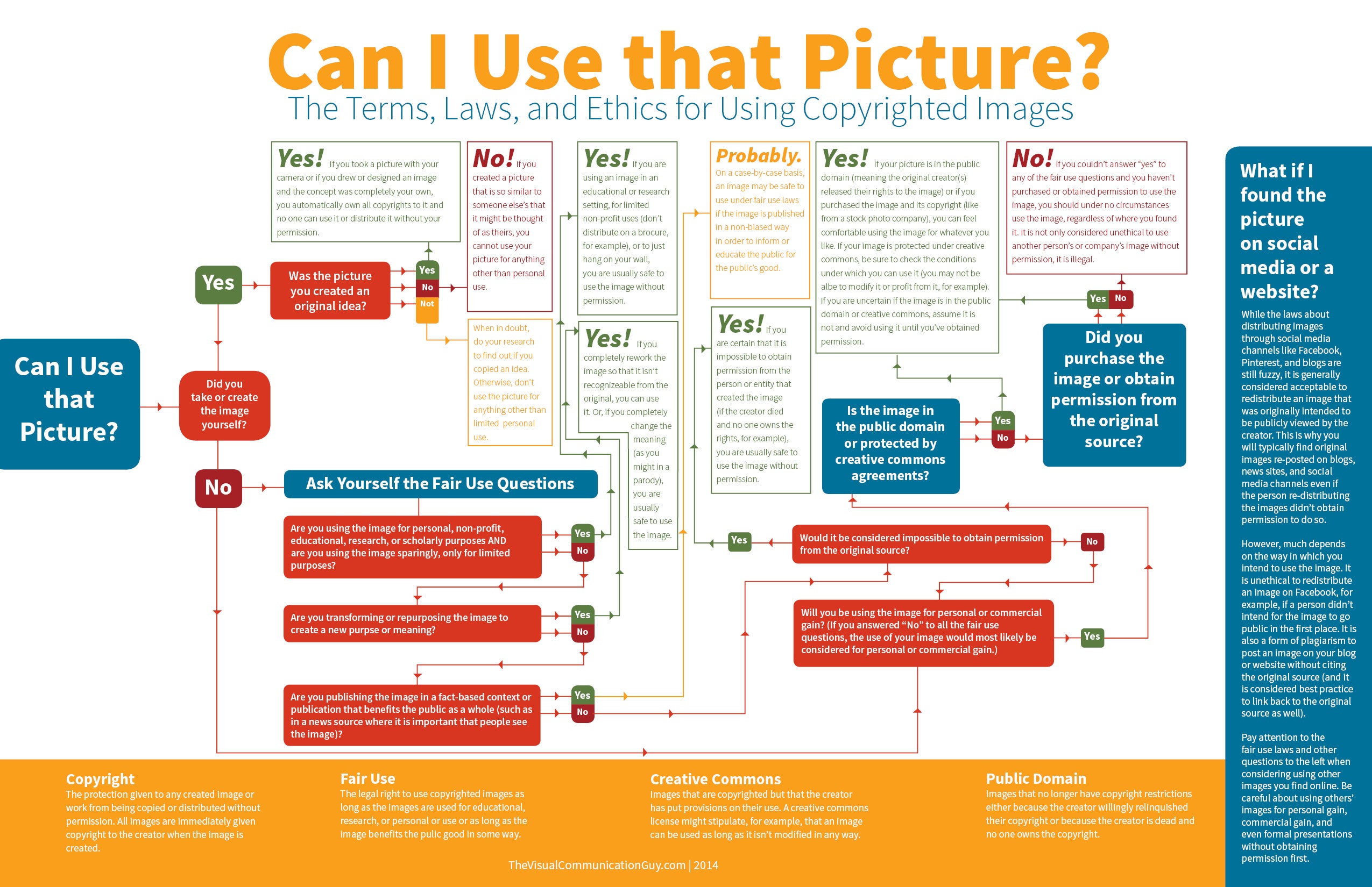
Can I Use that Picture? by The Visual Communication Guy via Visually & Lifehacker – click for full size
For more on these issues, and for related tools and links, see my bookmarks at http://delicious.com/paulb/creativecommons


