Liberating Data from the Guardian… Has it Really Come to This?

When the data is the story, should a news organisation make it available? When the Telegraph started trawling through MPs’ expenses data it had bought from a source, industry commentators started asking questions around whether it was the Telegraph’s duty to release that data (e.g. Has Telegraph failed by keeping expenses process and data to itself?).

Today, the Guardian released its University guide 2011: University league table, as a table:

Guardian university tables, sort of

Yes, this is data, sort of (though the javascript applied to the table means that it’s hard to just select and copy the data from the page – unless you turn javascript off, of course: Continue reading

Mexican Senate uses Google Moderator for a Q&A session with citizenship

Built upon the Google Apps Engine, Google Moderator is the tool used by the Mountain View company’s executives to hold their town hall meetings that sometimes include Q&A sessions with thousands of people from all over the world. The software allows participants to submit questions and vote for those who want to meet with priority.

Google has announced on its official Latin American blog that the President of the Mexican Senate will use Google Moderator to answer questions to the citizenship next June 14th.

“El Senado Responde” (The Senate answers) is the site that will host all the questions from the Mexican public to Carlos Navarrete, President of Senate.

The Q&A session will also be broadcast live through the Senate Channel and website, and later will be uploaded to YouTube.

Political blogs and how people read them: Sunday Salon Webchat 8pm #onlinepolitics

Following on from last week’s experimental webchat about how different people make a small or a large income from their political blogs (debate starter, actual webchat), I am running another one this evening at 8pm.

There will be a Sunday Salon tomorrow (June 6th at 8pm), looking at different aspects of linking, promotion, how people read blogs and the interaction of blogs and Twitter.

The chat will be hosted at the Wardman Wire using CoverItLive. I will put out a few key points to Twitter using the hashtag #onlinepolitics, but the main debate will be on the blog.

As a discussion starter, this post includes a podcast interview (35 minutes) I recorded earlier this week with Dan Levy, who manages the UK website of Wikio.

We covered everything from the history of Wikio to how the rankings are compiled, how the Wikio service is used, and what developments will be happening in the future.

Any help in promoting the event is welcome. This will be the pattern:

  1. Article published to give a focus for the debate.
  2. Webchat on Sunday night 8pm-9pm.
  3. Publication of lightly edited script on the Wardman Wire, and circulation by email of a short analysis.

If you add a comment below I will email you with a reminder in future.

Get used to reading this…

“We have a team of developers going through the data now – and we’ll let you know here what we learn as and when we learn it.”

If you had any doubt over the concept of ‘programmer as journalist’, that quote above from The Guardian’s liveblog of the opening of the COINS database gives you a preview of things to come. While you’re at it, you might as well add in ‘statistician as journalist‘ and ‘information designer as journalist‘ – or look at my post from 2008 on New Journalists for New Information Flows. Are we there yet?

Coins Expenditure Database Published by Government – Open Data

(Cross-posted from the Wardman Wire.)

This looks like an excellent start. The Coalition Government has just published the COINS database, which is the detailed database of Government spending:

The release of COINS data is just the first step in the Government’s commitment to data transparency on Government spending.

You can get the database from the data.gov website here. There are explanations to help you get to grips with it here. Continue reading

Online journalism and the promises of new technology PART 4: Interactivity

This post is cross-published from my new journalism/new media-blog. Previous posts in this series:

In the fourth part of this series I will take a closer look at the research on interactivity  in online journalism and to what degree this asset of new technology has been and is utilized.

Content analysis studies

As with hypertext, the research on interactivity in online journalism is dominated by content analysis, even though a greater body of this research also relies on surveys and interviews with journalists. Kenny et al. (2000) concluded that only 10 percent of the online newspapers in their study offered “many opportunities for interpersonal communication” and noted that little had changed since the introduction of Videotex 25 years earlier: “Videotex wanted to electronically push news into people’s homes, and so do today’s online papers”. Continue reading

Wikio Overall Blog Rankings for June 2010

The Wikio rankings are a measure of how much blogs are being “talked about” on other independent sites, and are produced by Wikio for a number of categories of blogs in Europe and North America, including politics, techology, culture and even Wine and Beer.

The Wikio ranking is measured by incoming editorial links (i.e., not blogrolls) from blogs registered with Wikio which appear in RSS feeds. To be clear (again), this is no measure of traffic. Links are weighted by time, prominence of the linking blog, and prominence of the link in the linking article.

There is also a toolkit, Wikio Labs, which allows you to dig down into the detail to the level of individual links.

This month I have advanced notice of the “Overall” rankings, which are below.

1 Iain Dale’s Diary (=)
2 Liberal Conspiracy (+1)
3 Guy Fawkes’ blog (-1)
4 ConservativeHome’s ToryDiary (=)
5 Liberal Democrat Voice (+1)
6 Left Foot Forward (-1)
7 A Spoon Full of Sugar (+1)
8 Cute Card Thursday (+4)
9 And another thing… (=)
10 Labourlist (-3)
11 Allsorts challenge blog (=)
12 Jason Cartwright (+17)
13 Sketch saturday (+13)
14 Charisma Cardz (+2)
15 Just Magnolia (+3)
16 Cupcake Craft Challenges (+3)
17 Saturday Challenge (+10)
18 UKPolling Report (-8)
19 Next Left (+5)
20 Creative Card Crew (=)
21 Papertake Weekly Challenge (+87)
22 Standard.co.uk – Paul Waugh (-1)
23 Harry’s Place (-6)
24 Dizzy Thinks (-9)
25 Old Holborn (-12)
26 EU Referendum (+2)
27 Stamping Ground (+27)
28 Nick Robinson’s Newslog (-14)
29 Penny Black Saturday Challenge (+22)
30 Mark Reckons (-7)

Ranking by Wikio

(Disclosure: I am the “Host” of the UK Wikio Politics rankings. The position is unpaid.)

The Great Government Data Rush – what does it mean for journalists?

Earlier this week I posted briefly on what I consider to be the most significant move for journalism by the UK government since the Freedom of Information Act. But I wanted to look more systematically at what is likely to be a huge change in the information landscape that journalists deal with…

So. In the spirit of data journalism, here is an embedded spreadsheet of the timetable of data to be released by national government, local government, and other bodies. I’ve added notes on how I feel each piece of data could be important, and any useful links – but I’d like you to add any thoughts on other possibilities. Here it is:

Meanwhile, over at Data.gov.uk, the Local Data Panel has published a post inviting comment on the format that data might be supplied in, and fields it might contain.

  • As a first stage, publish the raw data and any lookup table needed to interpret it in a spreadsheet as a CSV or XML file as soon as possible. This should be put on the council’s website as a document for anyone to download. Or even published in a service such as Google Docs
  • There is not yet a national approach for publishing local authority expenditure data. This should not stop publication of data in its raw, machine-readable form. Observing such raw data being used is the only route to a national approach, should one be required
  • Publishing raw data will allow the panel and others to assess how that data could/should be presented to users. Sight of the data is worth a hundred meetings. Members of the panel will study the data, take part in the discussion and revise this advice.
  • As a second stage, informed by the discussion, the panel and users can then give feedback about publishing data (RDF, CSV, etc) in a way that can be consistent across all local authorities involving structured, regularly updated data published on the Web using open standards.

Help Me Investigate contributor and all-round good guy Neil Houston has already responded with some very interesting points.

“You’d be surprised how many times there are some systems where it’s not totally easily to identify the payment, back to the relevant invoice (apart from a manual reconciliation), you need to know the invoice side of the transactions – as that is where the cost will be booked to (as the payment details will just be crediting cash, debiting Accounts Payable).”

The News Diamond reimagined as ‘The Digital News Lifecycle’

Digital news lifecycle

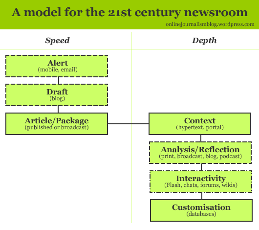
Here’s a wonderful reimagining of the News Diamond from the first part of my Model for a 21st Century Newsroom. Gaurav Mishra’s diagram (shown above) takes my rhombus (shown below) and plots it against two axes. It’s rather lovely.

Helpfully, however, Mishra takes the concept forward a little. As he explains:

“my “news lifecycle” is different from Paul Bradshaw’s “news diamond” in two ways –

“1. Paul’s “news diamond” looks at news from a news organization’s perspective, whereas my “news lifecycle” acknowledges that the boundaries between news creators, news curators and news consumers have blurred beyond recognition.

“2. Paul does not make the distinction between unplanned breaking news events (like accidents and terrorist attacks) and planned live coverage of events (like the Super Bowl or the US presidential inauguration). Paul’s “news diamond” and my “news lifecycle” models are much more valid for unplanned breaking news events.”

It’s fair to say that my diamond does take the perspective of a news organisation – that’s who it was aimed at. But I’m not sure that that means it doesn’t acknowledge the blurring of boundaries.

Anyway, Mishra poses some questions:

  1. How do we increase the number and variety of sources in the process of creating, curating and consuming news?
  2. How do we separate signal from noise during each stage of the news lifecycle?
  3. How do we contract the “alert” to “analysis” stages of the news lifecycle, in order to get better signal to noise ratio sooner in the cycle?
  4. How to we expand the “conversation” to “customization” stages of the news lifecycle, in order to maximize the returns from the content we have created?
  5. How do we expand the requisite participatory media ecosystem so that exceptions to this news lifecycle (like the information void in the Israel-Hamas Gaza conflict or the Russia-Georgia Otessia conflict) become increasingly rare?

I’d be very interested in any responses.

In the meantime, here’s those original diagrams for your conceptual enjoyment…

news diamond

As it happens, the diamond was just another way of showing the following flow diagram from the same post, so now I have 3 diagrams to refer to…

model for a 21st century newsroom

Local and national government open up data – starting now

Yesterday saw the publication of an incredible letter by David Cameron to government departments, including local government. It sets out a whole range of areas where data is to be released – some of it scheduled for January 2011, but some of it straight away.

You can find my thoughts about the release in this article by Laura Oliver, along with those of the likes of David Higgerson. This is probably as important an event as the passing of the FOI Act – it is more important than the launch of data.gov.uk. Note it.