Tag Archives: Guardian

FAQ: Mobile Reporting

Another FAQ:

What good examples of mobile reporting have you seen?

It’s hard to say because the fact that it’s mobile is not always very visible – but @documentally’s work is always interesting. The Telegraph’s use of Twitter and Audioboo during its coverage of the royal wedding was well planned, and Paul Lewis at the Guardian uses mobile technology well during his coverage of protests and other events. Generally the reporting of these events – in the UK and in the Arab Spring stories – includes lots of good examples.

Could it become a genuine niche in journalism or just offer an alternative?

Neither really – I just think it’s a tool of the job that’s particularly useful when you’re covering a moving event where you don’t have time or resources to drive a big truck there.

Do you think more newspapers and print outlets will embrace the possibilities to use mobile technology to “broadcast”?

Very much so – especially as 3G and wifi coverage expands, mobile phones become more powerful, the distribution infrastructure improves (Twitter etc.) and more journalists see how it can be done.

But broadcast is the wrong word when you’re publishing from a situation where a thousand others are doing the same. It needs to be plugged into that.

Do you think the competition that mobile reporting could offer could ever seriously rival traditional broadcast technology?

It already is. The story almost always takes priority over production considerations. We’ve seen that time and again from the July 7 bombing images to the Arab Spring footage. We’ll settle for poor production values as long as we get the story – but we won’t settle for a poor story, however beautifully produced.

Have you seen any good examples of how media orgs are encouraging their staff to adopt mobile reporting techniques?

Trinity Mirror bought a truckload of N97s and N98s and laptops for its reporters a couple years back, and encouraged them to go out, and various news organisations are giving reporters iPhones and similar kit – but that’s just kit. Trinity Mirror also invested in training, which is also useful, and you can see journalists are able to use the kit well when they need to – but as long as the time and staffing pressures remain few journalists will have the time to get out of the office.

What are the main limitations that are holding back this sector – are they technological, training related or all in the mind?

Time and staff, and the cultural habits of working to print and broadcast deadlines rather than reporting live from the scene.

What advice would you give to individual journalists thinking of embracing the opportunities mobile reporting offers?

Start simple – Twitter is a good way to get started, from simple text alerts to tweeting images, audio and video. Once you’re comfortable with tweeting from a phone, find easy ways to share images, then find a video app like Twitcaster and an audio app like Audioboo. Then it all comes down to being able to spot opportunities on the move.

How will people use your content? (Bad slideshow design)

gruffalo cake recipe

Design is not just about aesthetics but usability as well. This is particularly relevant when you are designing content online. So when I encountered this example of a slideshow for a cake recipe, I had to share it.

1. There is no ‘print’ option on the page

2. The ingredients are on one page, the recipe instructions take up a further 9 pages. So using the browser’s print option would involve clicking at least 19 times (9 times to get to the next page, 10 times to print each page – more clicks if you add in clicking on menus, etc.)

What do people do with recipes? Not this, if they can help it.

Thinking about how people might use your content should be part of how you design it. Newspapers have evolved over centuries in response to this – and even that doesn’t stay still, as the way that people use newspapers continues to change.

So what should this slideshow include? Well if you have to use a slideshow then at least include a link to a printable or fullscreen version (if they have the laptop or tablet in the kitchen) of the full recipe.

And if you’re going to allow people to ‘share’ it (as this slideshow did), don’t let that mean sharing just one part of the recipe (as, sadly, this slideshow did. I pity the person who received my message saying that I thought they might like step 1 of an incomplete recipe).

Thankfully the slideshow format is not used for any other recipe on The Guardian’s recipes page. Meanwhile, it’s a good lesson in bad design.

Should you ‘brand’ a hashtag?

Faisal Islam: Sure that all the brilliant BBC reporters realise that #BBCBudget goes against the entire point of SOCIAL media. It will be abandoned.

Two experiments by news organisations with Twitter hashtags during today’s UK budget have raised an issue around ‘branding’ and how appropriate it is to social media.

The BBC, it seems, is encouraging users to adopt the #BBCBudget hashtag to flag their tweets as part of the ‘national conversation’. Channel 4’s Faisal Islam, above, feels it’s a waste of 3 characters.

But Channel 4 itself is trying something not too dissimilar: #C4cuts aims to crowdsource details of UK spending cuts. Ed Fraser, online editor for Channel 4 News, is quoted by Journalism.co.uk as saying the channel wants to “harness the power of social media and the wisdom of the crowd”. Continue reading

Guest post: Do we need moderation guidelines for dealing with mental health issues?

Last month the Press Complaints Commission made a judgement in a case involving discriminatory comments on a newspaper article. The case highlighted the issue of journalism on mental health and how it is treated by publishers alongside similar considerations such as sexuality, gender, religion and ethnicity. The complaint also led to a change in The Guardian’s moderation rules.

In a guest post for the Online Journalism Blog the person who brought that case, Beatrice Bray, writes about her experiences of comment abuse, and the role she feels publishers should take in dealing both with comments relating to mental health, as well as writers with mental health issues.

Last April I wrote a rallying cry for the Guardian for all who have endured taunts about mental ill health. In my reply article Cartoonists should be careful how they portray mental health (23/4/10) I reclaimed the word “psychotic”. Guardian cartoonist Martin Rowson had used the word to abuse Mrs Thatcher. I put him right.

I am a long-standing reader of the Guardian newspaper but I did not know the website audience. Being a proud campaigner I told Guardian readers that I had bipolar disorder and had experienced psychosis.

I expected a civil hearing. Newspaper readers did oblige but many online readers were foul.

The Guardian’s managing editor Chris Elliott did not warn me about the impending abuse. That was a mistake. I think Mr Elliott knew I would face hostility but I do not think he realised how badly I would be hurt.

Those insults made me physically sick. My head was sore for many weeks. This was all so pointless. If Mr Elliott had given me a chance to discuss the risks involved we both could have taken precautions. Instead there was a row.

Guardian staff gave me an apology but told me to grow a “thick skin”. That jibe spurned me into going to the Press Complaints Commission. It is free. It is also less adversarial and less costly than a disability tribunal.

I was not asking for anything unprecedented. The BBC has guidelines on working with vulnerable people. We need to extend this to new media.

Working with vulnerable people

For example when dealing with discussion sites moderators need to deal swiftly with abuse. They also must facilitate discussions so that they do not turn nasty.

Staff should appreciate the reasons for this action. This is not prima donna treatment. This action is necessary because the writer and many of the readers share a common disability. They all have mental health problems.

Section 2 of the PCC Editors’ code promised fairness to complainants. I thought it only fair to ask for warning of abuse but in my PCC ruling the Guardian and the PCC disagreed with me. The PCC did not say why.

However, I did score other points.

Before the PCC ruling the Guardian at my request did add the word “disability” to its moderation rules.

The PCC and the Guardian and did apologise with regard to the abuse.

Guardian online readers called me, amongst other things, a “nutter” and a “retard”. Unfortunately both the Guardian and PCC refused to accept that this was discrimination as defined by the terms of section 12 of the Editor’s code of the PCC.

This is not just semantics. To me the word “discrimination” is a word with power. It holds the abuser responsible but the PCC fights shy of doing that online.

I now know that you can only complain to the PCC if a staff member makes a discriminatory remark about you. Comments made by non-staff members do not fall within the PCC’s remit. My abusers were not Guardian staff.

It is a shame. By being discrimination deniers both the Guardian and the PCC cut themselves off from a store of knowledge on handling disability and mental health in particular.

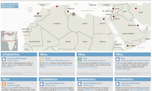
Matt Wells on The Guardian’s interactive protests Twitter map

Twitter network of Arab protests - interactive map | guardian.co.uk

Twitter network of Arab protests – interactive map | guardian.co.uk

The Guardian have published an impressive map displaying Twitter coverage of protests around the Arab world and the Middle East. I asked Matt Wells, who oversaw the project, to explain how it came about.

The initial idea, which I should credit to deputy editor Ian Katz, was to build something that showcased the tweets of our correspondents, along a broader network of vetted tweeters in different countries. We wanted to connect all of these on a map, so you could click on a country and see relevant live-updating tweets.

I was asked to oversee it. The main thing was to check out the best English-language tweeters in each country – preferably people who appeared reliable, who were involved in first-hand reporting themselves, and who did a lot of retweeting of others.

I started by asking our correspondents who they followed, then broadened it out from there. We asked everyone if they minded being included – we had one refusal from a Tweeter in a particularly authoritartian country who was worried about the exposure. Everyone else thought it was a great idea.

Meanwhile one of our developers, Garry Blight, overseen by Alastair Dant, set about building it. As with anything of this kind, it took a bit longer than orginally anticipated, but we had it ready on the day that Mubarak fell. And brilliantly, it has worked for every country since then.

It’s powered by a Google spreadsheet – so it’s really easy to add new people and to attach them to particular countries or search terms.

And it should be very easily adaptable for other news events around the world.

The Independent’s Facebook innovation

The-Independent-Robert-Fisk

The Independent newspaper has introduced a fascinating new feature on the site that allows users to follow articles by individual writers and news about specific football teams via Facebook.

It’s one of those ideas so simple you wonder why no one else appears to have done it before*: instead of just ‘liking’ individual articles, or having to trudge off to Facebook to see if there’s a relevant page you can become a fan of, the Indie have applied the technology behind the ‘Like’ button to make the process of following specific news feeds more intuitive.

To that end, you can pick your favourite football team from this page or click on the ‘Like’ button at the head of any commentator’s homepage. The Independent’s Jack Riley says that the feature will be rolled out to columnists next, followed by public figures, places, political parties, and countries.

The move is likely to pour extra fuel on the overblown ‘RSS is dying‘ discussion that has been taking place recently. The Guardian’s hugely impressive hackable RSS feeds (with full content) are somewhat put in the shade by this move – but then the Guardian have generated enormous goodwill in the development community for that, and continue to innovate. Both strategies have benefits.

At the moment the Independent’s new Facebook feature is plugged at the end of each article by the relevant commentator or about a particular club. It’s not the best place to put given how many people read articles through to the end, nor the best designed to catch the eye, and it will be interesting to see whether the placement and design changes as the feature is rolled out.

It will also be interesting to see how quickly other news organisations copy the innovation.

*If I told you I said this deliberately in the hope someone would point me to a previous example – would you believe me? Martin Stabe in the comments points to The Sporting News as one organisation that got here first. And David Moynihan points out that NME have ‘Like’ buttons for each artist on their site.

More coverage at Read Write Web and Future of Media.

FAQ: Data journalism, laziness, information overload & localism

I seem to have lost the habit of publishing interview responses here under the FAQ category for the past year, but the following questions from a journalist, and my answers, were worth publishing in case anyone has the same questions:

Simon Rogers, Editor of the Datablog, said that he thinks in the future simply publishing the raw data will become acceptable journalism. Do you not think that an approach like this to raw data is lazy journalism? And equally, do you think that would be a type of journalism that the public will really be able to engage with?

It’s not lazy at all, and to think otherwise is pure journalistic egoism. We have a tendency to undervalue things because we haven’t invested our own effort into it, but the value lies in its usefulness, not in the effort. Increasingly I think being a journalist will be as much about making journalism possible for other people as it will be about creating that journalism yourself. You have to ask yourself: do I just want to write pretty stories, or allow people to hold power to account?

In a world where we can access information directly I think it’s a central function of journalists to make important information findable. The first level of that is to publish raw data.

It’s interesting to see that this seems to be a key principle for hyperlocal bloggers – making civic information findable.

The second level – if you have the time and resources – is then to analyse that raw data and pull stories out of it. But ultimately there will always be other ‘stories’ in the information that people want to find for themselves, which may be too specific to be of interest to the journalist or publisher.

The third level – which really requires a lot of investment – is to create tools that make it easier for the user to find what they want, to make it easier to understand (e.g. through visualisation), and to share it with others.

Do you think that alot of the information can be quite overwhelming and sometimes not go anywhere?

Of course, but that isn’t a reason for not publishing the information. It’s natural that when the information is released some of it will attract more attention than other parts – but also, if other questions come up in future there is a dataset that people can go back and interrogate even if they didn’t at the time.

At the moment we have a lot of data but very few tools to interrogate that. That’s going to change – just in the last 6 months we’ve seen some fantastic new tools for filtering data, and the momentum is building in this area. It’s notable how many of the bids for the Knight News Challenge were data-related.

Additionally, do you tihnk The Guardian continue to pursue stories from the masses of data as consistently as they have done in previous years?

Yes, I think the Guardian has now built a reputation in this field and will want to maintain that, not to mention the fact that its reputation means it will attract more and more data-related stories, and benefit from the work of people outside the organisation who are interrogating data. They’ll also get better and better as they learn from experience.

And why do you think that smaller news resources struggle to use this sort of information as a source for news?

Partly because data has historically been more national than local. Even now I get frustrated when I find a dataset but then discover it’s only broken down into England, Wales, Scotland and Northern Ireland. But we are now finally getting more and more local data.

Also, at a local level journalists tend to be less specialised. On a national you might have a health or environment or financial reporter who is more used to dealing with figures and data. On a local newspaper that’s less likely – and there’s a high turnover of staff because of the low wages.

Something I wrote for the Guardian Datablog (and caveats)

I’ve written a piece on ‘How to be a data journalist’ for The Guardian’s Datablog. It seems to have proven very popular, but I thought I should blog briefly about it if you haven’t seen one of those tweets.

The post is necessarily superficial – it was difficult enough to cover the subject area for a 12,000-word book chapter, so summarising further into a 1,000 word article was almost impossible.

In the process I had to leave a huge amount out, compensating slightly by linking to webpages which expanded further.

Visualising and mashing, as the more advanced parts of data journalism, suffered most, because it seemed to me that locating and understanding data necessarily took precedence.

Heather Billings, for example, blogged about my “very British footnote [which was the] only nod to visual presentation”. If you do want to know more about visualisation tips, I wrote 1,000 words on that alone here. There’s also this great post by Kaiser Fung – and the diagram below, of which Fung says: “All outstanding charts have all three elements in harmony. Typically, a problematic chart gets only two of the three pieces right.”:

Trifecta checkup

On Monday I blogged the advice on where aspiring data journalists should start in full. There’s also the selection of passages from the book chapter linked above. And my Delicious bookmarks on data journalism, visualisation and mashups. Each has an RSS feed.

I hope that helps. If you do some data journalism as a result, it would be great if you could let me know about it – and what else you picked up.

"The mass market was a hack": Data and the future of journalism

The following is an unedited version of an article written for the International Press Institute report ‘Brave News Worlds (PDF)

For the past two centuries journalists have dealt in the currency of information: we transmuted base metals into narrative gold. But information is changing.

At first, the base metals were eye witness accounts, and interviews. Later we learned to melt down official reports, research papers, and balance sheets. And most recently our alloys have been diluted by statements and press releases.

But now journalists are having to get to grips with a new type of information: data. And this is a very rich seam indeed.

Data: what, how and why

Data is a broad term so I should define it here: I am not talking here about statistics or numbers in general, because those are nothing new to journalists. When I talk about data I mean information that can be processed by computers.

This is a crucial distinction: it is one thing for a journalist to look at a balance sheet on paper; it is quite another to be able to dig through those figures on a spreadsheet, or to write a programming script to analyse that data, and match it to other sources of information. We can also more easily analyse new types of data, such as live data, large amounts of text, user behaviour patterns, and network connections.

And that, for me, is hugely important. Indeed, it is potentially transformational. Adding computer processing power to our journalistic arsenal allows us to do more, faster, more accurately, and with others. All of which opens up new opportunities – and new dangers. Things are going to change. Continue reading

The BBC and missed data journalism opportunities

Bar chart: UN progress on eradication of world hunger

I’ve tweeted a couple of times recently about frustrations with BBC stories that are based on data but treat it poorly. As any journalist knows, two occasions of anything in close proximity warrants an overreaction about a “worrying trend”. So here it is.

“One in four council homes fails ‘Decent Homes Standard'”

This is a good piece of newsgathering, but a frustrating piece of online journalism. “Almost 100,000 local authority dwellings have not reached the government’s Decent Homes Standard,” it explained. But according to what? Who? “Government figures seen by BBC London”. Ah, right. Any chance of us seeing those too? No.

The article is scattered with statistics from these figures “In Havering, east London, 56% of properties do not reach Decent Homes Standard – the highest figure for any local authority in the UK … In Tower Hamlets the figure is 55%.”

It’s a great story – if you live in those two local authorities. But it’s a classic example of narrowing a story to fit the space available. This story-centric approach serves readers in those locations, and readers who may be titillated by the fact that someone must always finish bottom in a chart – but the majority of readers will not live in those areas, and will want to know what the figures are for their own area. The article does nothing to help them do this. There are only 3 links, and none of them are deep links: they go to the homepages for Havering Council, Tower Hamlets Council, and the Department of Communities and Local Government.

In the world of print and broadcast, narrowing a story to fit space was a regrettable limitation of the medium; in the online world, linking to your sources is a fundamental quality of the medium. Not doing so looks either ignorant or arrogant.

“Uneven progress of UN Millennium Development Goals”

An impressive piece of data journalism that deserves credit, this looks at the UN’s goals and how close they are to being achieved, based on a raft of stats, which are presented in bar chart after bar chart (see image above). Each chart gives the source of the data, which is good to see. However, that source is simply given as “UN”: there is no link either on the charts or in the article (there are 2 links at the end of the piece – one to the UN Development Programme and the other to the official UN Millennium Development Goals website).

This lack of a link to the specific source of the data raises a number of questions: did the journalist or journalists (in both of these stories there is no byline) find the data themselves, or was it simply presented to them? What is it based on? What was the methodology?

The real missed opportunity here, however, is around visualisation. The relentless onslaught on bar charts makes this feel like a UN report itself, and leaves a dry subject still looking dry. This needed more thought.

Off the top of my head, one option might have been an overarching visualisation of how funding shortfalls overall differ between different parts of the world (allowing you to see that, for example, South America is coming off worst). This ‘big picture’ would then draw in people to look at the detail behind it (with an opportunity for interactivity).

Had they published a link to the data someone else might have done this – and other visualisations – for them. I would have liked to try it myself, in fact.

UPDATE: After reading this post, a link has now been posted to the report (PDF).

Compare this article, for example, with the Guardian Datablog’s treatment of the coalition agreement: a harder set of goals to measure, and they’ve had to compile the data themselves. But they’re transparent about the methodology (it’s subjective) and the data is there in full for others to play with.

It’s another dry subject matter, but The Guardian have made it a social object.

No excuses

The BBC is not a print outlet, so it does not have the excuse of these stories being written for print (although I will assume they were researched with broadcast as the primary outlet in mind).

It should also, in theory, be well resourced for data journalism. Martin Rosenbaum, for example, is a pioneer in the field, and the team behind the BBC website’s Special Reports section does some world class work. The corporation was one of the first in the world to experiment with open innovation with Backstage, and runs a DataArt blog too. But the core newsgathering operation is missing some basic opportunities for good data journalism practice.

In fact, it’s missing just one basic opportunity: link to your data. It’s as simple as that.

On a related note, the BBC Trust wants your opinions on science reporting. On this subject, David Colquhoun raises many of the same issues: absence of links to sources, and anonymity of reporters. This is clearly more a cultural issue than a technical one.

Of all the UK’s news organisations, the BBC should be at the forefront of transparency and openness in journalism online. Thinking politically, allowing users to access the data they have spent public money to acquire also strengthens their ideological hand in the Big Society bunfight.

UPDATE: Credit where it’s due: the website for tonight’s Panorama on public pay includes a link to the full data.