In a guest post Jane Haynes speaks to investigative journalist Peter Geoghegan of the award-winning news site The Ferret about data, contacts and “nosing up the trousers of power”.
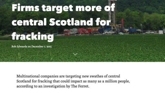
When the Scottish Government announced last month that it was banning fracking, it was a moment to savour for a group of journalists from an independent news site in the heart of the country.
The team from investigative cooperative The Ferrethad been the first news organisation to reveal plans by nine energy companies to bid for licences to extract shale gas from central Scotland.
Using a combination of contact-led information and FOI requests, they uncovered the extent of the ambitions to dig deep into Scottish soil.
It was part of a steady flow of fracking stories from the Ferret team, ensuring those involved in making decisions were in no doubt of their responsibilities and recognised that every step would be scrutinised. Continue reading →
In a guest post for OJB, Steve Carufel interviews Dutch data journalist Thomas de Beusabout visualisation, storytelling — and useful new tools for data journalists.
Data journalism is, among other things, the art of resisting the temptation to show spectacular visualisations that fail to highlight the data behind a story.
Insights and relevant statistics can get lost in visual translation, so Thomas de Beus’ Colourful Facts is a great place to start thinking more about clarity and your audience — and less about spectacular graphic design (although you do not want to forego attractiveness entirely). Continue reading →
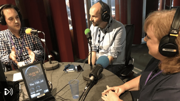
I took part in a BBC Academy podcast about data journalism last week, along with The Guardian’s Helena Bengtsson and the BBC’s Daniel Wainwright and John Walton, in the wake of the BBC’s annual plan and three-year strategy which included a focus on the “interrogation of data”.
Among other things we talked about why data journalism is increasingly important, what skills are needed (including the role of code), why I’m launching an MA in Data Journalism, and what sorts of stories can be done with those skills.
The best-known examples of data journalism tend to be based around text and visuals — but it’s harder to find data journalism in video and audio. Ahead of the launch of my new MA in Data Journalism I thought I would share my list of the examples of video data journalism that I use with students in exploring data storytelling across multiple platforms. If you have others, I’d love to hear about them.
FOI stories in broadcast journalism
Freedom of Information stories are one of the most common situations when broadcasters will have to deal with more in-depth data. These are often brought to life by through case studies and interviewing experts. Continue reading →
Eva Constantaras is a data journalist and trainer who recently wrote the Data Journalism Manual for the UN Development Program. In a special guest post she talks about the background to the manual, her experiences in working with journalists and professors who want to introduce data journalism techniques in developing nations, and why the biggest challenges not technological, but cultural.
Over the last few years, there has been a significant shift in global experiments in data journalism education away from short term activities like boot camps and hackathons to more sustained and sustainable interventions including fellowships and institutes.
There is a growing awareness that the challenge of teaching data journalism in many countries is split straight down the middle between teaching data and teaching journalism — where neither data science nor public interest journalism are particularly common. Open data can be a boon to democracy — but only if there are professionals capable and motivated to transform that data into information for the public. Continue reading →
Spanish citizens are now a step closer to understanding how power operates in the country, and how decisions affect them, thanks to the work of organisations like Civio fighting for transparency and access to public data. In October their work was recognised with the Gabriel Garcia Marquez award in innovative journalism for their investigations Medicamentalia. In a guest post for OJB, Nuria Riquelme Palazón spoke with Javier de la Vega, one of the members of Civio.
Access to public information, accountability and participatory democracy may have been a reality in many countries for some time — but in Spain they sounded like a utopia. Entrepreneur Jacobo Elosua and computer technician David Cabo decided that this had to change.
The pair used their savings to build an organisation with the intention of serving those active citizens who, like them, believed in transparency: Civio Foundation.
Taking inspiration from organisations like mySociety in the UK, Ciudadano Inteligente in Chile and the Sunlight Foundation in the USA, they began the long process in 2011. Continue reading →
La ciudadanía española se encuentra un paso más cerca de saber como su gobierno y sus políticos hacen qué, cuándo, por qué y, lo más importante, cómo todo esto les afecta. Y este logro ha sido posible gracias al incesante trabajo de organizaciones como Civio, que lucha por una transparencia real y el libre acceso a la información. El esfuerzo de este equipo fue recompensado el pasado octubre con el premio Gabriel García Márquez en Innovación por una de sus últimas investigaciones: Medicamentalia. Nuria Riquelme Palazón ha hablado con Javier de la Vega, uno de los integrantes de Civio.
Acceso a la información pública, rendición de cuentas, democracia participativa… términos que en países como Reino Unido son una realidad desde hace tiempo, en otros como en España sonaban a una utopía descabellada, y esto tenía que cambiar.
Y el cambio empezó cuando Jacobo Elosua (emprendedor) y David Cabo (informático) juntaron sus ahorros para construir una organización bajo el servicio de aquellos ciudadanos que, como ellos, creen en la transparencia: la Fundación Civio.
Throw in journalism’s default dislike of ambiguity and a political tendency to play to that… well, it can all make for some flawed reporting.
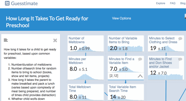
I was so impressed with Guesstimate and the opportunities it presents for a new style of data reporting that I sought out Gooen to find out more about the project and how he came to launch it. Continue reading →
Giving a voice to the voiceless is one of the core principles of journalism. Traditionally this means those without the power or money to amplify their own voices, but in recent years a strand of work has developed in data journalism that deserves particular attention: projects which give a voice to people who literally don’t have one — because they are dead. Continue reading →
Last month I watched the founder of OpenOil, Johnny West, talk via video link about a dashboard he had designed to help people more effectively report on government announcements related to Chad’s hugely important oil industry.
The dashboard struck me in all sorts of ways: firstly in automating certain processes it lowered the barrier to more effective reporting; secondly it reduced the time needed to do so; and thirdly it turned a numerical topic into something more visual, and in the process made stories easier to spot.
More from Johnny later.
First, however, it’s worth taking stock of just how big a part dashboards play in our lives, and how little a role journalists play in their creation:
Publishers create content management systems to allow reporters and other staff to navigate between stories, media, metrics and other tools and information
Social mediaservices create dashboards as a way of navigating our networks
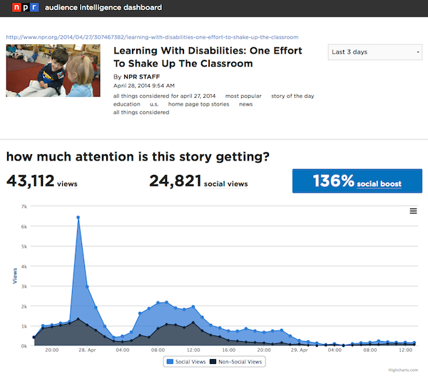
Analytics companies create dashboards to help users monitor the performance of their content
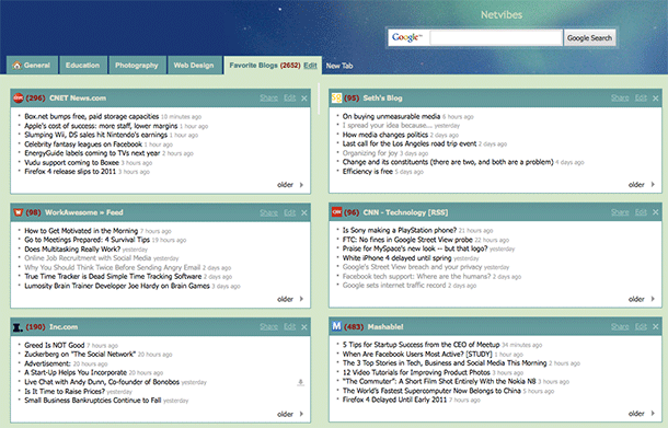
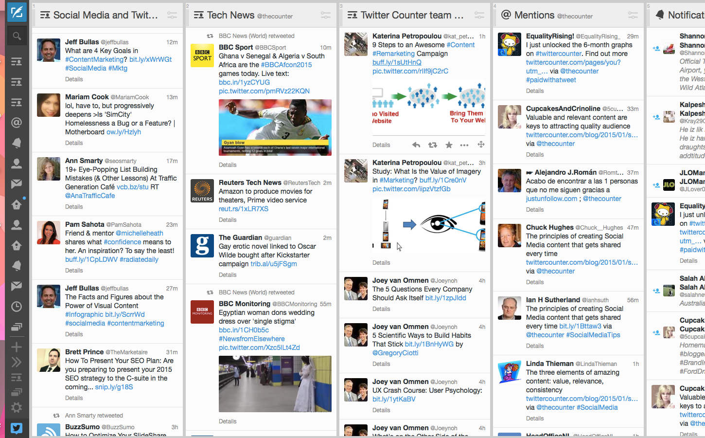
Tweetdeck and Netvibes are good examples of dashboards that save us time as journalists: specifically search time.
RSS readers like Netvibes mean that we do not need to check multiple websites or perform multiple searches to see if new information has been published or shared: instead we only need to check the Netvibes dashboard.
This Netvibes account has multiple tabs for different dashboards
In fact, we can set up more than one dashboard depending on when or where we might be using them: one for when we are covering health, for example; or another one for a specific event.
Social media management dashboards like Tweetdeck and Hootsuite perform a similar function, but more narrowly focused on social media and with the ability to publish through the dashboard too, and in some cases access analytics.
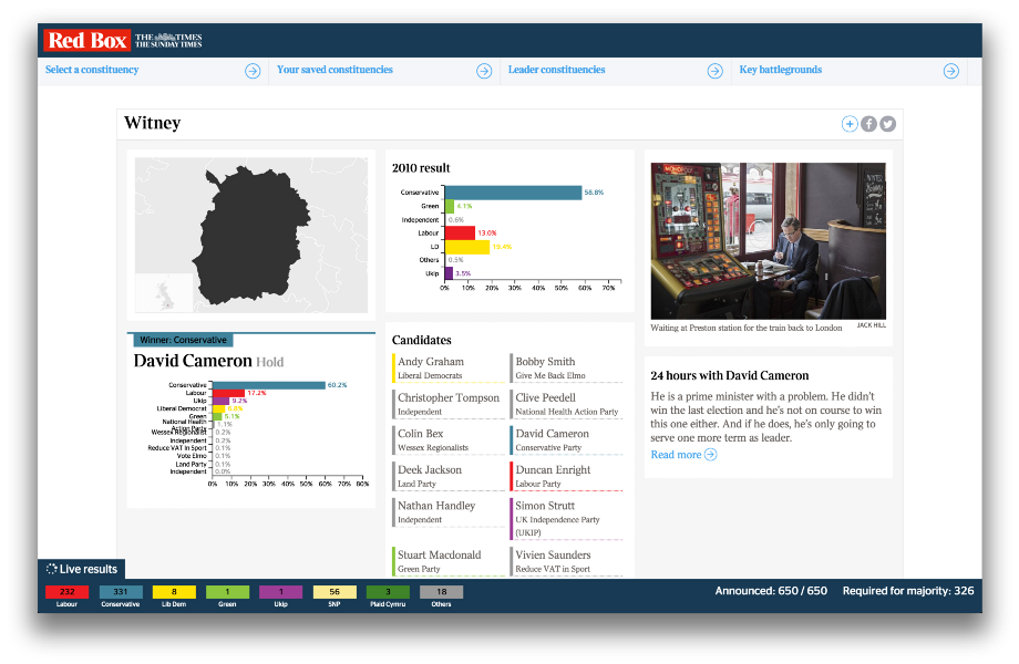
The Times’ audience-facing dashboard for the 2015 election was also useful for journalists
If you’re not using dashboards like these then you are probably wasting time unnecessarily. But these all rely on existing infrastructures, whether those are RSS feeds or social network APIs.
We can do better than that.
Dashboards that help more people hold power to account
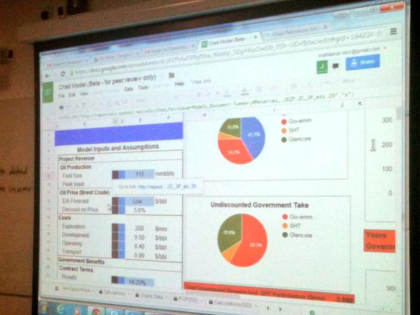
This is where Johnny West comes in. Johnny was one of the speakers at the Centre for Investigative Journalism’s recent Illicit Finance course. Here’s that dashboard he designed to make it easier to interrogate new figures from Chad’s government and oil industry:
Chad’s public finances, he explained, are over 70% dependent on oil revenues and under “severe pressure” from falls in prices. The dashboard made it easier to frame questions:
“…Of whether a budget holds up with likely revenues etc [or compare] Chad’s annual EITI reports – which state revenues actually received – with what you would expect the government to receive.”
He argues that creating a visual interface to the information the journalist needs (in this case oil prices and contract agreements) is essential:
“You cannot achieve any real understanding of the many interlocking parts of the contract and revenue flows without a model of their relationships with each other. I would not trust any financial comment or analysis of oil economics done blind to a model.
“It is a bit of a challenge to get journalists to accept this – since many of them are not familiar with or comfortable with financial models.”
One result of financial illiteracy, he argues, is an inclination towards simple but meaningless comparisons: one royalty rate being higher than another; or how much an income tax rate was raised by.
“Nine out of ten such stories are simply not accurate enough to provide any service to the reader. What if the royalty rate is lower because the income tax rate was raised? Or this one has a higher royalty because it is the second discovery in an area (with less exploration risk to the company therefore putting government in a stronger negotiating position)? And so on…”
The dashboard supports the journalist in reporting something richer despite the pressure to deliver something on deadline. And it’s not just for journalists:
“We know there are many governments which do not have models like this one for contracts they themselves negotiated and signed. It may be a question of institutional knowledge: perhaps one individual once had one, or a consultancy or visiting IMF delegation. But these get hoarded and not passed on. The need for public domain versions of these kinds of applications is critical in helping states build their capacity, not just the media.”
At a broader level there are also dashboards designed by journalists to help make their colleagues’ work easier. The Investigative Dashboard was designed a few years ago to help journalists and civil society investigate organised crime and corruption. It has subsequently had an injection of cash and a relaunch:
Those are isolated examples, but they shouldn’t be. I once created a dashboard for journalists at a Scottish newspaper to pick stories out of some data I had scraped.
It meant that journalists with very little spreadsheet skills could call up data on any one of hundreds of measures by using a drop-down menu and be shown where to focus their follow up calls instantly.
Some great original stories and big splashes came out of that, yet all it took was a little initial effort, after which dozens of stories were easy to report.
Online spreadsheet tools like Google Sheets allow us to pull in live information, using built-in functions that fetch stock prices, or scrape web tables or feeds (which themselves might be generated by scrapers).
Once we have that live information it can be connected to historical information, and display those relationships visually.
Imagine a dashboard that pulls in the latest crime reports and tells us whether they’re going up or down – and where.
Imagine the BBC’s A&E tracker redesigned for journalists as well as readers.
Imagine sports performance shown dynamically, so you can pick up on the most improved performers and not just the top performers.
Much of this is already happening – but it’s not being done by journalists or news organisations.
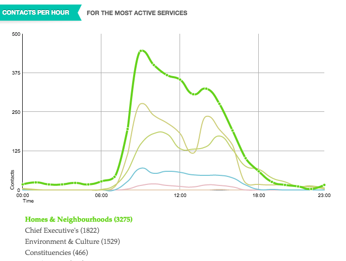
FixMyStreet has long pioneered the ability to report – and see – local problems. And Birmingham’s Civic Dashboard showed all sorts of information on things like which parts of the council were getting the most contacts and when.
The Birmingham Civic Dashboard
Expect to see more of these dashboards as the growth of ‘smart cities’ drives the connection of transport systems, policing, education, business and health.
But they’re not being done by news organisations. And that’s the point.
We need to change that.
Where data is already published we need to be setting up dashboards that bring it to the journalists. Where data is not, we need to be pushing for access to it.





 Online Journalism Blog