Twitterfall has been around for a month now, and if you’re a journalist, this is a must-see – for about ten minutes. Then it becomes a must-use.

Yes, this is Yet Another Twitter Interface.
But. Continue reading

Twitterfall has been around for a month now, and if you’re a journalist, this is a must-see – for about ten minutes. Then it becomes a must-use.
Yes, this is Yet Another Twitter Interface.
But. Continue reading
My iPhone’s gmail is full of messages today.
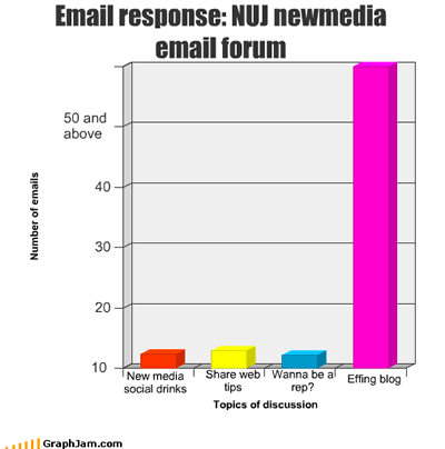

I hope the ‘lively debate’ is over by now.
Currently, there is a debate going on the NUJ Newmedia email forum. I got inspired to do this Wordle chart. How do I make the word ‘Effing’ big’?

USA Today interactive - click for larger image
Here’s a hugely rich interactive from USA Today which does a number of things very well.
Firstly, it’s an intelligent use of resources: the recession is likely to last for some time, and be the biggest ongoing story of our time. With everyone talking about it, you need something with that ‘wow’ factor, that will not only attract a great deal of attention now, but also a long tail of repeat visits.
Secondly, it’s personalised – not only can you get information on jobs growth in your state, but your particular industry in your state.
Thirdly, it’s dynamic – the graphic promises to be updated each month “with revised data from Moody’s Economy.com.”
There’s one major element missing – interaction. Find a way to capture users’ experiences (value) and you have an extra dimension that really capitalises on all the attention your interactive is getting.
Still, I’m not complaining…
You may have seen this on Mashable, but equally, you may not, so I thought I’d pass it on. Demonstrating the value of being open about your processes (because this document will now be viewed by thousands of people), PhotoKast created this 37-page guide to how they developed their iPhone app. Very useful reading if you’re thinking of doing something for iPhones.
After years writing for both print and web, I decided to express myself in a different way. I’ve done photojournalism for some time now, but I need another form of expression to convey humour in my narration. Photography is cool, but much too refined for lampoons (feel free to disagree with me). Paul pointed me to a few websites on infographics, and I thought: wow, this is cool.
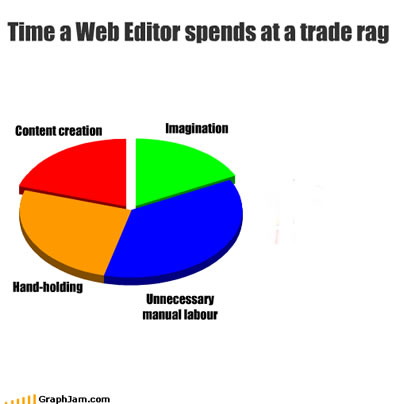
I use Graphjam to teach myself, and the business writers, how to create charts to illustrate business stories. Prof Randy Pausch, that great 3D imaging engineer, said that if you want to teach someone a very difficult computer concept, use a ‘head fake’. Tell him to build a game, not a programming language, and the whole learning process will be a lot easier.
Here’s the 3rd in my series of classes in online journalism. Having already set up an RSS readers and Delicious account, a Twitter account and a blog, this week they start the news website, and learn about writing and producing for the web:
I love remixes. A couple weeks ago I posted my ‘Twitter for Beginners’ slideshow – now it’s been remixed with an ever-so-slightly more cynical spin by Lumor2. Here it is:
Want to know the value of opening up your article databases and APIs? Suburbified is one of the first mashups created using the New York Times’ recently opened API.
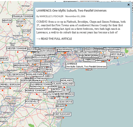
suburbified
Here’s what it does, according to KillerStartUps: Continue reading
