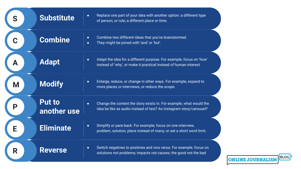
Explainers are one of the most widely used forms of ‘evergreen’ content. In this unpublished extract from the latest edition of the Online Journalism Handbook, removed due to word limit, I explore why they are so popular, what types of subject are suitable, and how explainers are structured.
A few months ago I delivered a webinar for the European Data Journalism Network and DataNinja about the range of ways that journalists can use ChatGPT and other generative AI tools — from idea generation and mapping systems to help with spelling and coding — and what issues they need to be aware of.
The video is now available online and you can watch it below.
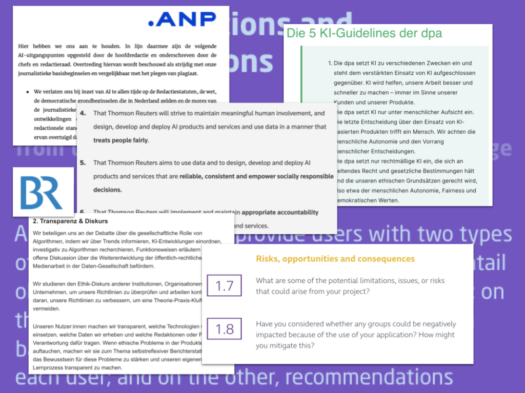
In this latest post in the FAQ series, I’ve been asked to help answer a question on the “ethical dilemmas faced by news organisations when considering the use of AI in reporting stories“.
Planning an investigation, or any larger editorial project, raises its own particular challenges — but if you know where to look, you can find resources that are especially useful in anticipating and tackling those.
The CORRECTIV.Europe project, founded by German investigative media outlet Correctiv, aims to help local journalists publish data stories who wouldn’t otherwise have the time or money to do it. Cristina Puerta speaks to its editor-in-chief Olaya Argüeso.
“[CORRECTIV.Europe] is about giving the European citizens a feeling that they are on the same boat together”, editor-in-chief Olaya Argüeso explains.
Local journalism, she says, has been “neglected”, and it is now, when people suffer the consequences of global phenomena — for example, climate change because of flooding and droughts where they live — that they realise how important local journalism is.
News avoidance is at an all-time high, and while Argüeso feels breaking global problems down to a local level cannot be the solution, it can, she says, show citizens what they can do about those problems.
The most basic change to the Inverted Pyramid of Data Journalism is the recognition of a stage that precedes all others — idea generation — labelled ‘Conceive’ in the diagram above.
This is often a major stumbling block to people starting out with data journalism, and I’ve written a lot about it in recent years (see below for a full list).
The second major change is to make questioning more explicit as a process that (should) take place through all stages — not just in data analysis but in the way we question our sources, our ideas, and the reliability of the data itself.
A third change is to remove the ‘socialise‘ option from the communication pyramid: in conversation with Alexandra Stark I realised that this is covered sufficiently by the ‘utilise’ stage (i.e. making something useful socially).
Alongside the updated pyramid I’ve been using for the past few years I also wanted to round up links to a number of resources that relate to each stage. Here they are…
One of the most common challenges in a data-driven story is combining two sets of data — such as events and populations — to put a story into context. In an extract from the ebook Finding Stories in Spreadsheets, I explain how to use lookup functions to combine two tables.The longer ebook version of this tutorial includes a dataset and exercise to employ these techniques.
Combining data is often a great way of telling new stories about spreadsheets. For example: you may have one table showing pass rates for each school in an area, and another table showing their addresses. Combining these would allow you to identify geographical patterns, or to place them on a map.
You could also combine the addresses with poverty rates for different locations, or unemployment to see if there’s a possible relationship (remembering that correlation does not equal causation), or to identify the schools performing particularly well despite local conditions. In the video below, for example, I walk through an example of combining data on different sports teams’ attendances with data on their rankings, allowing you to see who’s attracting large crowds despite their poor performance.
The VLOOKUP function is one of the most widely-used tools in combining data in this way. It stands for Vertical lookup, and means that the spreadsheet will look up and down a column (i.e. vertically) for whatever you ask it. In more recent versions of Excel the XLOOKUP function has been introduced to make the process easier — but the process is similar for both.
Graham Barrow has worked to prevent money laundering and fraud for decades — in recent years working with journalists to investigate companies. In a guest post he shares his tips with Tony Jarne on what you can do when you are following the money.
But, how do we begin, and what are the details we need to look out for? To navigate the company’s world, Graham gives some advice when you are tracking the money.
Start with Companies House
Companies House is where all the businesses based in the UK need to be registered. It is fully transparent, open, and free. Check the basics of a company: who are the directors? Does the company have real activity? A website? If a company does not have a website, it is a red flag.
In this latest post in the FAQ series, I’ve been asked to help answer a question on “the distribution of work between journalist, data analyst and designer” in data journalism.
Automation was key to the work of data journalism pioneers such as Adrian Holovaty — and it’s becoming increasingly central once again. This video, made for students on the MA in Data Journalism at Birmingham City University, explores the variety of roles that automation plays in data journalism; new concepts such as robot journalism, natural language generation (NLG) and structured journalism; and how data journalists’ editorial role becomes “delegated to the future” through the creation of algorithms.