Tag Archives: onlinejournalismblog

Journalist Filters on Twitter – The Reuters View

It seems that Reuters has a new product out – Reuters Social Pulse. As well as highlighting “the stories being talked about by the newsmakers we follow”, there is an area highlighting “the Reuters & Klout 50 where we rank America’s most social CEOs.” Of note here is that this list is ordered by Klout score. Reuters don’t own Klout (yet?!) do they?!

The offering also includes a view of the world through the tweets of Reuters own staff. Apparently, “Reuters has over 3,000 journalists around the world, many of whom are doing amazing work on Twitter. That is too many to keep up with on a Twitter list, so we created a directory Reuters Twitter Directory] that shows you our best tweeters by topic. It let’s you find our reporters, bloggers and editors by category and location so you can drill down to business journalists in India, if you so choose, or tech writers in the UK.”

If you view the source of Reuters Twitter directory page, you can find a Javascript object that lists all(?) the folk in the Reuters Twitter directory and the tags they are associated with… Hmm, I thought… Hmmm…

If we grab that object, and pop it into Python, it’s easy enough to create a bipartite network that links journalists to the categories they are associated with:

import simplejson
import networkx as nx
#http://mlg.ucd.ie/files/summer/tutorial.pdf
from networkx.algorithms import bipartite

g = nx.Graph()

#need to bring in reutersJournalistList
users=simplejson.loads(reutersJournalistList)

#I had some 'issues' with the parsing for some reason? Required this hack in the end...
for user in users:
	for x in user:
		if x=='users':
			u=user[x][0]['twitter_screen_name']
			print 'user:',user[x][0]['twitter_screen_name']
			for topic in user[x][0]['topics']:
				print '- topic:',topic
				#Add edges from journalist name to each tag they are associated with
				g.add_edge(u,topic)
#print bipartite.is_bipartite(g)
#print bipartite.sets(g)

#Save a graph file we can visualise in Gephi corresponding to bipartite graph
nx.write_graphml(g, "usertags.graphml")

#We can find the sets of names/tags associated with the disjoint sets in the graph
users,tags=bipartite.sets(g)

#Collapse the bipartite graph to a graph of journalists connected via a common tag
ugraph= bipartite.projected_graph(g, users)
nx.write_graphml(ugraph, "users.graphml")

#Collapse the bipartite graph to a set of tags connected via a common journalist
tgraph= bipartite.projected_graph(g, tags)
nx.write_graphml(tgraph, "tags.graphml")

#Dump a list of the journalists Twitter IDs
f=open("users.txt","w+")
for uo in users: f.write(uo+'n')
f.close()

Having generated graph files, we can then look to see how the tags cluster as a result of how they were applied to journalists associated with several tags:

Reuters journalists twitter directory cotags

Alternatively, we can look to see which journalists are connected by virtue of being associated with similar tags (hmm, I wonder if edge weight carries information about how many tags each connected pair may be associated through? [UPDATE: there is a projection that will calculate this – bipartite.projection.weighted_projected_graph]). In this case, I size the nodes by betweenness centrality to try to highlight journalists that bridge topic areas:

Reuters twitter journalists list via cotags, sized by betweenness centrality

Association through shared tags (as applied by Reuters) is one thing, but there is also structure arising from friendship networks…So to what extent do the Reuters Twitter List journalists follow each other (again, sizing by betweenness centrality):

Reuters twitter journalists friend connections sized by betweenness centrality

Finally, here’s a quick look at folk followed by 15 or more of the folk in the Reuters Twitter journalists list: this is the common source area on Twitter for the journalists on the list. This time, I size nodes by eigenvector centrality.

FOlk followed by 15 or more of folk on reuters twitter journliasts list, size by eigenvector centrality

So why bother with this? Because journalists provide a filter onto the way the world is reported to us through the media, and as a result the perspective we have of the world as portrayed through the media. If we see journalists as providing independent fairwitness services, then having some sort of idea about the extent to which they are sourcing their information severally, or from a common pool, can be handy. In the above diagram, for example, I try to highlight common sources (folk followed by at least 15 of the journalists on the Twitter list). But I could equally have got a feeling for the range of sources by producing a much larger and sparser graph, such as all the folk followed by journalists on the list, or folk followed by only 1 person on the list (40,000 people or so in all – see below), or by 2 to 5 people on the list…

The twitterverse as directly and publicly followed by folk on the Reuters Journalists twitter list

Friends lists are one sort of filter every Twitter user has onto the content been shared on Twitter, and something that’s easy to map. There are other views of course – the list of people mentioning a user is readily available to every Twitter user, and it’s easy enough to set up views around particular hashtags or search terms. Grabbing the journalists associated with one or more particular tags, and then mapping their friends (or, indeed, followers) is also possible, as is grabbing the follower lists for one or more journalists and then looking to see who the friends of the followers are, thus positioning the the journalist in the social media environment as perceived by their followers.

I’m not sure that value Reuters sees in the stream of tweets from the folk on its Twitter journalists lists, or the Twitter networks they have built up, but the friend lenses at least we can try to map out. And via the bipartite user/tag graph, it also becomes trivial for us to find journalists with interests in Facebook and advertising, for example…

PS for associated techniques related to the emergent social positioning of hashtags and shared links on Twitter, see Socially Positioning #Sherlock and Dr John Watson’s Blog… and Social Media Interest Maps of Newsnight and BBCQT Twitterers. For a view over @skynews Twitter friends, and how they connect, see Visualising How @skynews’ Twitter Friends Connect.

Different Speeches? Digital Skills Aren’t just About Coding…

Secretary of State for Education, Michael Gove, gave a speech yesterday on rethinking the ICT curriculum in UK schools. You can read a copy of the speech variously on the Department for Education website, or, err, on the Guardian website.

Seeing these two copies of what is apparently the same speech, I started wondering:

a) which is the “best” source to reference?
b) how come the Guardian doesn’t add a disclaimer about the provenance of, and link, to the DfE version? [Note the disclaimer in the DfE version – “Please note that the text below may not always reflect the exact words used by the speaker.”]
c) is the Guardian version an actual transcript, maybe? That is, does the Guardian reprint the “exact words” used by the speaker?

And that made me think I should do a diff… About which, more below…

Before that, however, here’s a quick piece of reflection on how these two things – the reinvention of the the IT curriculum, and the provenance of, and value added to, content published on news and tech industry blog sites – collide in my mind…

So for example, I’ve been pondering what the role of journalism is, lately, in part because I’m trying to clarify in my own mind what I think the practice and role of data journalism are (maybe I should apply for a Nieman-Berkman Fellowship in Journalism Innovation to work on this properly?!). It seems to me that “communication” is one important part (raising awareness of particular issues, events, or decisions), and holding governments and companies to account is another. (Actually, I think Paul Bradshaw has called me out on that, before, suggesting it was more to do with providing an evidence base through verification and triangulation, as well as comment, against which governments and companies could be held to account (err, I think? As an unjournalist, I don’t have notes or a verbatim quote against which to check that statement, and I’m too lazy to email/DM/phone Paul to clarify what he may or may not have said…(The extent of my checking is typically limited to what I can find on the web or in personal archives…which appear to be lacking on this point…))

Another thing I’ve been mulling over recently in a couple of contexts relates to the notion of what are variously referred to as digital or information skills.

The first context is “data journalism”, and the extent to which data journalists need to be able to do programming (in the sense of identifying the steps in a process that can be automated and how they should be sequenced or organised) versus writing code. (I can’t write code for toffee, but I can read it well enough to copy, paste and change bits that other people have written. That is, I can appropriate and reuse other people’s code, but can’t write it from scratch very well… Partly because I can’t ever remember the syntax and low level function names. I can also use tools such as Yahoo Pipes and Google Refine to do coding like things…) Then there’s the question of what to call things like URL hacking or (search engine) query building?

The second context is geeky computer techie stuff in schools, the sort of thing covered by Michael Gove’s speech at the BETT show on the national ICT curriculum (or lack thereof), and about which the educational digerati were all over on Twitter yesterday. Over the weekend, houseclearing my way through various “archives”, I came across all manner of press clippings from 2000-2005 or so about the activities of the OU Robotics Outreach Group, of which I was a co-founder (the web presence has only recently been shut down, in part because of the retirement of the sys admin on whose server the websites resided.) This group ran an annual open meeting every November for several years hosting talks from the educational robotics community in the UK (from primary school to HE level). The group also co-ordinated the RoboCup Junior competition in the UK, ran outreach events, developed various support materials and activities for use with Lego Mindstorms, and led the EPSRC/AHRC Creative Robotics Research Network.

At every robotics event, we’d try to involve kids and/or adults in elements of problem solving, mechanical design, programming (not really coding…) based around some sort of themed challenge: a robot fashion show, for example, or a treasure hunt (both variants on edge following/line following;-) Or a robot rescue mission, as used in a day long activity in the “Engineering: An Active Introduction” (TXR120) OU residential school, or the 3 hour “Robot Theme Park” team building activity in the Masters level “Team Engineering” (T885) weekend school. [If you’re interested, we may be able to take bookings to run these events at your institution. We can make them work at a variety of difficulty levels from KS3-4 and up;-)]

Given that working at the bits-atoms interface is where the a lot of the not-purely-theoretical-or-hardcore-engineering innovation and application development is likely to take place over the next few years, any mandate to drop the “boring” Windows training ICT stuff in favour of programming (which I suspect can be taught in not only a really tedious way, but a really confusing and badly delivered way too) is probably Not the Best Plan.

Slightly better, and something that I know is currently being mooted for reigniting interest in computing, is the Raspberry Pi, a cheap, self-contained, programmable computer on a board (good for British industry, just like the BBC Micro was…;-) that allows you to work at the interface between the real world of atoms and the virtual world of bits that exists inside the computer. (See also things like the OU Senseboard, as used on the OU course “My Digital Life” (TU100).)

If schools were actually being encouraged to make a financial investment on a par with the level of investment around the introduction of the BBC Micro, back in the day, I’d suggest a 3D printer would have more of the wow factor…(I’ll doodle more on the rationale behind this in another post…) The financial climate may not allow for that (but I bet budget will manage to get spent anyway…) but whatever the case, I think Gove needs to be wary about consigning kids to lessons of coding hell. And maybe take a look at programming in a wider creative context, such as robotics (the word “robotics” is one of the reason why I think it’s seen as a very specialised, niche subject; we need a better phrase, such as “Creative Technologies”, which could combine elements of robotics, games programming, photoshop, and, yex, Powerpoint too… Hmm… thinks.. the OU has a couple of courses that have just come to the end of their life that between them provide a couple of hundred hours of content and activity on robotics (T184) and games programming (T151), and that we delivered, in part, to 6th formers under the OU’s Young Applicants in Schools Scheme.

Anyway, that’s all as maybe… Because there are plenty of digital skills that let you do coding like things without having to write code. Such as finding out whether there are any differences between the text in the DfE copy of Gove’s BETT speech, and the Guardian copy.

Copy the text from each page into a separate text file, and save it. (You’ll need a text editor for that..) Then, if you haven’t already got one, find yourself a good text editor. I use Text Wrangler on a Mac. (Actually, I think MS Word may have a diff function?)

FInding diffs between txt doccs in Text Wrangler

The difference’s all tend to be in the characters used for quotation marks (character encodings are one of the things that can make all sorts of programmes fall over, or misbehave. Just being aware that they may cause a problem, as well as how and why, would be a great step in improving the baseline level understanding of folk IT. Some of the line breaks don’t quite match up either, but other than that, the text is the same.

Now, this may be because Gove was a good little minister and read out the words exactly as they had been prepared. Or it may be the case that the Guardian just reprinted the speech without mentioning provenance, or the disclaimer that he may not actually have read the words of that speech (I have vague memories of an episode of Yes, Minister, here…;-)

Whatever the case, if you know: a) that it’s even possible to compare two documents to see if they are different (a handy piece of folk IT knowledge); and b) know a tool that does it (or how to find a tool that does it, or a person that may have a tool that can do it), then you can compare the texts for yourself. And along the way, maybe learn that churnalism, in a variety of forms, is endemic in the media. Or maybe just demonstrate to yourself when the media is acting in a purely comms, rather than journalistic, role?

PS other phrases in the area: “computational thinking”. Hear, for example: A conversation with Jeannette Wing about computational thinking

PPS I just remembered – there’s a data journalism hook around this story too… from a tweet exchange last night that I was reminded of by an RT:

josiefraser: RT @grmcall: Of the 28,000 new teachers last year in the UK, 3 had a computer-related degree. Not 3000, just 3.
dlivingstone: @josiefraser Source??? Not found it yet. RT @grmcall: 28000 new UK teachers last year, 3 had a computer-related degree. Not 3000, just 3
josiefraser: That ICT qualification teacher stat RT @grmcall: Source is the Guardian http://www.guardian.co.uk/education/2012/jan/09/computer-studies-in-schools

I did a little digging and found the following document on the General Teaching Council of England website – Annual digest of statistics 2010–11 – Profiles of registered teachers in England [PDF] – that contains demographic stats, amongst others, for UK teachers. But no stats relating to subject areas of degree level qualifications held, which is presumably the data referred to in the tweet. So I’m thinking: this is partly where the role of data journalist comes in… They may not be able to verify the numbers by checking independent sources, but they may be able to shed some light on where the numbers came from and how they were arrived at, and maybe even secure their release (albeit as a single point source?)

Social Interest Positioning – Visualising Facebook Friends’ Likes With Data Grabbed Using Google Refine

What do my Facebook friends have in common in terms of the things they have Liked, or in terms of their music or movie preferences? (And does this say anything about me?!) Here’s a recipe for visualising that data…

After discovering via Martin Hawksey that the recent (December, 2011) 2.5 release of Google Refine allows you to import JSON and XML feeds to bootstrap a new project, I wondered whether it would be able to pull in data from the Facebook API if I was logged in to Facebook (Google Refine does run in the browser after all…)

Looking through the Facebook API documentation whilst logged in to Facebook, it’s easy enough to find exemplar links to things like your friends list (https://graph.facebook.com/me/friends?access_token=A_LONG_JUMBLE_OF_LETTERS) or the list of likes someone has made (https://graph.facebook.com/me/likes?access_token=A_LONG_JUMBLE_OF_LETTERS); replacing me with the Facebook ID of one of your friends should pull down a list of their friends, or likes, etc.

(Note that validity of the access token is time limited, so you can’t grab a copy of the access token and hope to use the same one day after day.)

Grabbing the link to your friends on Facebook is simply a case of opening a new project, choosing to get the data from a Web Address, and then pasting in the friends list URL:

Google Refine - import Facebook friends list

Click on next, and Google Refine will download the data, which you can then parse as a JSON file, and from which you can identify individual record types:

Google Refine - import Facebook friends

If you click the highlighted selection, you should see the data that will be used to create your project:

Google Refine - click to view the data

You can now click on Create Project to start working on the data – the first thing I do is tidy up the column names:

Google Refine - rename columns

We can now work some magic – such as pulling in the Likes our friends have made. To do this, we need to create the URL for each friend’s Likes using their Facebook ID, and then pull the data down. We can use Google Refine to harvest this data for us by creating a new column containing the data pulled in from a URL built around the value of each cell in another column:

Google Refine - new column from URL

The Likes URL has the form https://graph.facebook.com/me/likes?access_token=A_LONG_JUMBLE_OF_LETTERS which we’ll tinker with as follows:

Google Refine - crafting URLs for new column creation

The throttle control tells Refine how often to make each call. I set this to 500ms (that is, half a second), so it takes a few minutes to pull in my couple of hundred or so friends (I don’t use Facebook a lot;-). I’m not sure what limit the Facebook API is happy with (if you hit it too fast (i.e. set the throttle time too low), you may find the Facebook API stops returning data to you for a cooling down period…)?

Having imported the data, you should find a new column:

Google Refine - new data imported

At this point, it is possible to generate a new column from each of the records/Likes in the imported data… in theory (or maybe not..). I found this caused Refine to hang though, so instead I exprted the data using the default Templating… export format, which produces some sort of JSON output…

I then used this Python script to generate a two column data file where each row contained a (new) unique identifier for each friend and the name of one of their likes:

import simplejson,csv

writer=csv.writer(open('fbliketest.csv','wb+'),quoting=csv.QUOTE_ALL)

fn='my-fb-friends-likes.txt'

data = simplejson.load(open(fn,'r'))
id=0
for d in data['rows']:
	id=id+1
	#'interests' is the column name containing the Likes data
	interests=simplejson.loads(d['interests'])
	for i in interests['data']:
		print str(id),i['name'],i['category']
		writer.writerow([str(id),i['name'].encode('ascii','ignore')])

[I think this R script, in answer to a related @mhawksey Stack Overflow question, also does the trick: R: Building a list from matching values in a data.frame]

I could then import this data into Gephi and use it to generate a network diagram of what they commonly liked:

Sketching common likes amongst my facebook friends

Rather than returning Likes, I could equally have pulled back lists of the movies, music or books they like, their own friends lists (permissions settings allowing), etc etc, and then generated friends’ interest maps on that basis.

[See also: Getting Started With The Gephi Network Visualisation App – My Facebook Network, Part I and how to visualise Google+ networks]

PS dropping out of Google Refine and into a Python script is a bit clunky, I have to admit. What would be nice would be to be able to do something like a “create new rows with new column from column” pattern that would let you set up an iterator through the contents of each of the cells in the column you want to generate the new column from, and for each pass of the iterator: 1) duplicate the original data row to create a new row; 2) add a new column; 3) populate the cell with the contents of the current iteration state. Or something like that…

PPS Related to the PS request, there is a sort of related feature in the 2.5 release of Google Refine that lets you merge data from across rows with a common key into a newly shaped data set: Key/value Columnize. Seeing this, it got me wondering what a fusion of Google Refine and RStudio might be like (or even just R support within Google Refine?)

PPPS this could be interesting – looks like you can test to see if a friendship exists given two Facebook user IDs.

Mapping the New Year Honours List – Where Did the Honours Go?

When I get a chance, I’ll post a (not totally unsympathetic) response to Milo Yiannopoulos’post The pitiful cult of ‘data journalism’, but in the meantime, here’s a view over some data that was released a couple of days ago – a map of where the New Year Honours went [link]

New Year Honours map

[Hmm… so WordPress.com doesn’t seem to want to let me embed a Google Fusion Table map iframe, and Google Maps (which are embeddable) just shows an empty folder when I try to view the Fusion Table KML… (the Fusion Table export KML doesn’t seem to include lat/lng data either? Maybe I need to explore some hosting elsewhere this year…]

Note that I wouldn’t make the claim that this represents an example of data journalism. It’s a sketch map showing which parts of the country various recipients of honours this time round presumably live. Just by posting the map, I’m not reporting any particular story. Instead, I’m trying to find a way of looking at the day to see whether or not there may be any interesting stories that are suggested by viewing the data in this way.

There was a small element of work involved in generating the map view, though… Working backwards, when I used Google Fusion tables to geocode the locations of the honoured, some of the points were incorrectly located:

Google Fusion Tables - correcting fault geocoding

(It would be nice to be able to force a locale to the geocoder, maybe telling it to use maps.google.co.uk as the base, rather than (presumably) maps.google.com?)

The approach I took to tidying these was rather clunky, first going into the table view and filtering on the mispositioned locations:

Google Fusion Tables - correcting geocoding errors

Then correcting them:

Google Fusion Table, Correct Geocode errors

What would be really handy would be if Google Fusion Tables let you see a tabular view of data within a particular map view – so for example, if I could zoom in to the US map and then get a tabular view of the records displayed on that particular local map view… (If it does already support this and I just missed it, please let me know via the comments..;-)

So how did I get the data into Google Fusion Tables? The original data was posted as a PDF on the DirectGov website (New Year Honours List 2012 – in detail)…:

New Year Honours data

…so I used Scraperwiki to preview and read through the PDF and extract the honours list data (my scraper is a little clunky and doesnlt pull out 100% of the data, missing the occasional name and contribution details when it’s split over several lines; but I think it does a reasonable enough job for now, particularly as I am currently more interested in focussing on the possible high level process for extracting and manipulating the data, rather than the correctness of it…!;-)

Here’s the scraper (feel free to improve upon it….:-): Scraperwiki: New Year Honours 2012

I then did a little bit of tweaking in Google Refine, normalising some of the facets and crudely attempting to separate out each person’s role and the contribution for which the award was made.

For example, in the case of Dr Glenis Carole Basiro DAVEY, given column data of the form “The Open University, Science Faculty and Health Education and Training Programme, Africa. For services to Higher and Health Education.“, we can use the following expressions to generate new sub-columns:

value.match(/.*(For .*)/)[0] to pull out things like “For services to Higher and Health Education.”
value.match(/(.*)For .*/)[0] to pull out things like “The Open University, Science Faculty and Health Education and Training Programme, Africa.”

I also ran each person’s record through Reuters Open Calais service using Google Refine’s ability to augment data with data from a URL (“Add column by fetching URLs”), pulling the data back as JSON. Here’s the URL format I used (polling once every 500ms in order to stay with the max. 4 calls per limit threshold mandated by the API.)

"http://api.opencalais.com/enlighten/rest/?licenseID=<strong>MY_LICENSE_KEY</strong>&content=" + escape(value,'url') + "&paramsXML=%3Cc%3Aparams%20xmlns%3Ac%3D%22http%3A%2F%2Fs.opencalais.com%2F1%2Fpred%2F%22%20xmlns%3Ardf%3D%22http%3A%2F%2Fwww.w3.org%2F1999%2F02%2F22-rdf-syntax-ns%23%22%3E%20%20%3Cc%3AprocessingDirectives%20c%3AcontentType%3D%22TEXT%2FRAW%22%20c%3AoutputFormat%3D%22Application%2FJSON%22%20%20%3E%20%20%3C%2Fc%3AprocessingDirectives%3E%20%20%3Cc%3AuserDirectives%3E%20%20%3C%2Fc%3AuserDirectives%3E%20%20%3Cc%3AexternalMetadata%3E%20%20%3C%2Fc%3AexternalMetadata%3E%20%20%3C%2Fc%3Aparams%3E"

Unpicking this a little:

licenseID is set to my license key value
content is the URL escaped version of the text I wanted to process (in this case, I created a new column from the name column that also pulled in data from a second column (the contribution column). The GREL formula I used to join the columns took the form: value+', '+cells["contribution"].value)
paramsXML is the URL encoded version of the following parameters, which set the content encoding for the result to be JSON (the default is XML):

<c:params xmlns:c="http://s.opencalais.com/1/pred/" xmlns:rdf="http://www.w3.org/1999/02/22-rdf-syntax-ns#">
<c:processingDirectives c:contentType="TEXT/RAW" c:outputFormat="Application/JSON"  >
</c:processingDirectives>
<c:userDirectives>
</c:userDirectives>
<c:externalMetadata>
</c:externalMetadata>
</c:params>

So much for process – now where are the stories? That’s left, for now, as an exercise for the reader. An obvious starting point is just to see who received honours in your locale. Remember, Google Fusion Tables lets you generate all sorts of filtered views, so it’s not too hard to map where the MBEs vs OBEs are based, for example, or have a stab at where awards relating to services to Higher Education went. Some awards also have a high correspondence with a particular location, as for example in the case of Enfield…

If you do generate any interesting views from the New Year Honours 2012 Fusion Table, please post a link in the comments. And if you find a problem with/fix for the data or the scraper, please post that info in a comment too:-)

A Quick Peek at Three Content Analysis Services

A long, long time ago, I tinkered with a hack called Serendipitwitterous (long since rotted, I suspect), that would look through a Twitter stream (personal feed, or hashtagged tweets), use the Yahoo term extraction service to try to identify concepts or key words/phrases in each tweet, and then use these as a search term on Slideshare, Youtube and so on to find content that may or may not be loosely related to each tweet.

The Yahoo Term Extraction is still hanging in there – just – but I think it finally gets deprecated early next year. From my feeds today, however, it seems there may be a replacement in the form of a new content analysis service via YQL – Yahoo! Opens Content Analysis Technology to all Developers:

[The Y! COntent Analysis service will] extract key terms from the content, and, more importantly, rank them based on their overall importance to the content. The output you receive contains the keywords and their ranks along with other actionable metadata.
On top of entity extraction and ranking, developers need to know whether key terms correspond to objects with existing rich metadata. Having this entity/object connection allows for the creation of highly engaging user experiences. The Y! Content Analysis output provides related Wikipedia IDs for key terms when they can be confidently identified. This enables interoperability with linked data on the semantic Web.

What this means is that you can push a content feed through the service, and get an annotated version out that includes identifier based hooks into other domains (i.e. little-l, little-d linked data). You can find the documentation here: Content Analysis Documentation for Yahoo! Search

So how does it fare? As I’ve previously explored using the Reuters Open Calais service to annotate OU/BBC programme listings (e.g. Augmenting OU/BBC Co-Pro Programme Data With Semantic Tags), I thought I’d use a programme feed from The Bottom Line again…

To start, we need to open the YQL developer console: http://developer.yahoo.com/yql/console/

We can then pull in an example programme description from the BBC using a YQL query of the form:

select long_synopsis from xml where url='http://www.bbc.co.uk/programmes/b00vy3l1.xml'

Grabbing a BBC programme feed into YQL

For reference, the text looks like this:

The view from the top of business. Presented by Evan Davis, The Bottom Line cuts through confusion, statistics and spin to present a clearer view of the business world, through discussion with people running leading and emerging companies.
In the week that Facebook launched its own new messaging service, Evan and his panel of top business guests discuss the role of email at work, amid the many different ways of messaging and communicating.
And location, location, location. It’s a cliche that location can make or break a business, but how true is it really? And what are the advantages of being next door to the competition?
Evan is joined in the studio by Chris Grigg, chief executive of property company British Land; Andrew Horton, chief executive of insurance company Beazley; Raghav Bahl, founder of Indian television news group Network 18.
Producer: Ben Crighton
Last in the series. The Bottom Line returns in January 2011.

The content analysis query example provided looks like this:

select * from contentanalysis.analyze where text="Italian sculptors and painters of the renaissance favored the Virgin Mary for inspiration"

but we can nest queries in order to pass the long_synposis from the BBC programme feed through the service:

select * from contentanalysis.analyze where text in (select long_synopsis from xml where url='http://www.bbc.co.uk/programmes/b00vy3l1.xml')

Here’s the result:

<?xml version="1.0" encoding="UTF-8"?>
<query xmlns:yahoo="http://www.yahooapis.com/v1/base.rng"
    yahoo:count="2" yahoo:created="2011-12-22T11:03:51Z" yahoo:lang="en-US">
    <diagnostics>
        <publiclyCallable>true</publiclyCallable>
        <url execution-start-time="2" execution-stop-time="370"
            execution-time="368" proxy="DEFAULT"><![CDATA[http://www.bbc.co.uk/programmes/b00vy3l1.xml]]></url>
        <user-time>572</user-time>
        <service-time>565</service-time>
        <build-version>24402</build-version>
    </diagnostics> 
    <results>
        <categories xmlns="urn:yahoo:cap">
            <yct_categories>
                <yct_category score="0.536">Business &amp; Economy</yct_category>
                <yct_category score="0.421652">Finance</yct_category>
                <yct_category score="0.418182">Finance/Investment &amp; Company Information</yct_category>
            </yct_categories>
        </categories>
        <entities xmlns="urn:yahoo:cap">
            <entity score="0.979564">
                <text end="57" endchar="57" start="48" startchar="48">Evan Davis</text>
                <wiki_url>http://en.wikipedia.com/wiki/Evan_Davis</wiki_url>
                <types>
                    <type region="us">/person</type>
                    <type region="us">/place/place_of_interest</type>
                    <type region="us">/place/us/town</type>
                </types>
                <related_entities>
                    <wikipedia>
                        <wiki_url>http://en.wikipedia.com/wiki/Don%27t_Tell_Mama</wiki_url>
                        <wiki_url>http://en.wikipedia.com/wiki/Lenny_Dykstra</wiki_url>
                        <wiki_url>http://en.wikipedia.com/wiki/Los_Angeles_Police_Department</wiki_url>
                        <wiki_url>http://en.wikipedia.com/wiki/Today_%28BBC_Radio_4%29</wiki_url>
                        <wiki_url>http://en.wikipedia.com/wiki/Chrisman,_Illinois</wiki_url>
                    </wikipedia>
                </related_entities>
            </entity>
            <entity score="0.734099">
                <text end="265" endchar="265" start="258" startchar="258">Facebook</text>
                <wiki_url>http://en.wikipedia.com/wiki/Facebook</wiki_url>
                <types>
                    <type region="us">/organization</type>
                    <type region="us">/organization/domain</type>
                </types>
                <related_entities>
                    <wikipedia>
                        <wiki_url>http://en.wikipedia.com/wiki/Mark_Zuckerberg</wiki_url>
                        <wiki_url>http://en.wikipedia.com/wiki/Social_network_service</wiki_url>
                        <wiki_url>http://en.wikipedia.com/wiki/Twitter</wiki_url>
                        <wiki_url>http://en.wikipedia.com/wiki/Social_network</wiki_url>
                        <wiki_url>http://en.wikipedia.com/wiki/Digital_Sky_Technologies</wiki_url>
                    </wikipedia>
                </related_entities>
            </entity>
            <entity score="0.674621">
                <text end="477" endchar="477" start="450" startchar="450">location, location, location</text>
            </entity>
            <entity score="0.651227">
                <text end="79" endchar="79" start="60" startchar="60">The Bottom Line cuts</text>
                <types>
                    <type region="us">/other/movie/movie_name</type>
                </types>
            </entity>
            <entity score="0.646818">
                <text end="799" endchar="799" start="789" startchar="789">Raghav Bahl</text>
                <wiki_url>http://en.wikipedia.com/wiki/Raghav_Bahl</wiki_url>
                <types>
                    <type region="us">/person</type>
                </types>
                <related_entities>
                    <wikipedia>
                        <wiki_url>http://en.wikipedia.com/wiki/Network_18</wiki_url>
                        <wiki_url>http://en.wikipedia.com/wiki/Superpower</wiki_url>
                        <wiki_url>http://en.wikipedia.com/wiki/Deng_Xiaoping</wiki_url>
                        <wiki_url>http://en.wikipedia.com/wiki/The_Amazing_Race</wiki_url>
                        <wiki_url>http://en.wikipedia.com/wiki/Hare</wiki_url>
                    </wikipedia>
                </related_entities>
            </entity>
            <entity score="0.644349">
                <text end="144" endchar="144" start="133" startchar="133">clearer view</text>
            </entity>
            <entity score="0.54609">
                <text end="675" endchar="675" start="665" startchar="665">Chris Grigg</text>
                <types>
                    <type region="us">/person</type>
                </types>
            </entity>
        </entities>
    </results>
</query>

So, some success in pulling out person names, and limited success on company names. The subject categories look reasonably appropriate too.

[UPDATE: I should have run the desc contentanalysis.analyze query before publishing this post to pull up the docs/examples… As well as the where text= argument, there is a where url= argument that will pul back semantic information about a URL. Running the query over the OU homepage, for example, using select * from contentanalysis.analyze where url=”http://www.open.ac.uk” identifies the OU as an organisation, with links out to Wikipedia, as well as geo-information and a Yahoo woe_id.]

Another related service in this area that I haven’t really explored yet is TSO’s Data Enrichment Service (API).

Here’s how it copes with the same programme synposis:

TSO Data Enrichment Service

Pretty good… and links in to dbpedia (better for machine readability) compared to the Wikipedia links that the Yahoo service offers.

For completeness, here’s what the Reuters Open Calais service comes up with:

OPen Calais - content analysis

The best of the bunch on this sample of one, I think, albeit admittedly in the domain the Reuters focus on?

But so what…? What are these services good for? Automatic metadata generation/extraction is one thing, as I’ve demonstrated in Visualising OU Academic Participation with the BBC’s “In Our Time”, where I generated a quick visualisation that showed the sorts of topics that OU academics had talked about as guests on Melvyn Bragg’s In Our Time, along with the topics that other universities had been engaged with on that programme.

More Dabblings With Local Sentencing Data

In Accessing and Visualising Sentencing Data for Local Courts I posted a couple of quick ways in to playing with Ministry of Justice sentencing data for the period July 2010-June 2011 at the local court level. At the end of the post, I wondered about how to wrangle the data in R so that I could look at percentage-wise comparisons between different factors (Age, gender) and offence type and mentioned that I’d posted a related question to to the Cross Validated/Stats Exchange site (Casting multidimensional data in R into a data frame).

Courtesy of Chase, I have an answer🙂 So let’s see how it plays out…

To start, let’s just load the Isle of Wight court sentencing data into RStudio:

require(ggplot2)
require(reshape2)
iw = read.csv("http://dl.dropbox.com/u/1156404/wightCrimRecords.csv")

Now we’re going to shape the data so that we can plot the percentage of each offence type by gender (limited to Male and Female options):

iw.m = melt(iw, id.vars = "sex", measure.vars = "Offence_type")
iw.sex = ddply(iw.m, "sex", function(x) as.data.frame(prop.table(table(x$value))))
ggplot(subset(iw.sex,sex=='Female'|sex=='Male')) + geom_bar(aes(x=Var1,y=Freq)) + facet_wrap(~sex)+ opts(axis.text.x=theme_text(angle=-90)) + xlab('Offence Type')

Here’s the result:

Splitting down offences by percentage and gender

We can also process the data over a couple of variables. So for example, we can look to see how female recorded sentences break down by offence type and age range, displaying the results as a percentage of how often each offence type on its own was recorded by age:

iw.m2 = melt(iw, id.vars = c("sex","Offence_type" ), measure.vars = "AGE")
iw.off=ddply(iw.m2, c("sex","Offence_type"), function(x) as.data.frame(prop.table(table(x$value))))

ggplot(subset(iw.off,sex=='Female')) + geom_bar(aes(x=Var1,y=Freq)) + facet_wrap(~Offence_type) + opts(axis.text.x=theme_text(angle=-90)) + xlab('Age Range (Female)')

Offence type broken down by age and gender

Note that this graphic may actually be a little misleading because percentage based reports donlt play well with small numbers…: whilst there are multiple Driving Offences recorded, there are only two Burglaries, so the statistical distribution of convicted female burglars is based over a population of size two… A count would be a better way of showing this

PS I was hoping to be able to just transmute the variables and generate a raft of other charts, but I seem to be getting an error, maybe because some rows are missing? So: anyone know where I’m supposed to post R library bug reports?

Accessing and Visualising Sentencing Data for Local Courts

A recent provisional data release from the Ministry of Justice contains sentencing data from English(?) courts, at the offence level, for the period July 2010-June 2011: “Published for the first time every sentence handed down at each court in the country between July 2010 and June 2011, along with the age and ethnicity of each offender.” Criminal Justice Statistics in England and Wales [data]

In this post, I’ll describe a couple of ways of working with the data to produce some simple graphical summaries of the data using Google Fusion Tables and R…

…but first, a couple of observations:

– the web page subheading is “Quarterly update of statistics on criminal offences dealt with by the criminal justice system in England and Wales.”, but the sidebar includes the link to the 12 month set of sentencing data;
– the URL of the sentencing data is http://www.justice.gov.uk/downloads/publications/statistics-and-data/criminal-justice-stats/recordlevel.zip, which does not contain a time reference, although the data is time bound. What URL will be used if data for the period 7/11-6/12 is released in the same way next year?

The data is presented as a zipped CSV file, 5.4MB in the zipped form, and 134.1MB in the unzipped form.

The unzipped CSV file is too large to upload to a Google Spreadsheet or a Google Fusion Table, which are two of the tools I use for treating large CSV files as a database, so here are a couple of ways of getting in to the data using tools I have to hand…

Unix Command Line Tools

I’m on a Mac, so like Linux users I have ready access to a Console and several common unix commandline tools that are ideally suited to wrangling text files (on Windows, I suspect you need to install something like Cygwin; a search for windows unix utilities should turn up other alternatives too).

In Playing With Large (ish) CSV Files, and Using Them as a Database from the Command Line: EDINA OpenURL Logs and Postcards from a Text Processing Excursion I give a couple of examples of how to get started with some of the Unix utilities, which we can crib from in this case. So for example, after unzipping the recordlevel.csv document I can look at the first 10 rows by opening a console window, changing directory to the directory the file is in, and running the following command:

head recordlevel.csv

Or I can pull out rows that contain a reference to the Isle of Wight using something like this command:

grep -i wight recordlevel.csv > recordsContainingWight.csv

(The -i reads: “ignoring case”; grep is a command that identifies rows contain the search term (wight in this case). The > recordsContainingWight.csv says “send the result to the file recordsContainingWight.csv” )

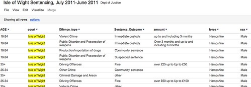
Having extracted rows that contain a reference to the Isle of Wight into a new file, I can upload this smaller file to a Google Spreadsheet, or as Google Fusion Table such as this one: Isle of Wight Sentencing Fusion table.

Isle fo wight sentencing data

Once in the fusion table, we can start to explore the data. So for example, we can aggregate the data around different values in a given column and then visualise the result (aggregate and filter options are available from the View menu; visualisation types are available from the Visualize menu):

Visualising data in google fusion tables

We can also introduce filters to allow use to explore subsets of the data. For example, here are the offences committed by females aged 35+:

Data exploration in Google FUsion tables

Looking at data from a single court may be of passing local interest, but the real data journalism is more likely to be focussed around finding mismatches between sentencing behaviour across different courts. (Hmm, unless we can get data on who passed sentences at a local level, and look to see if there are differences there?) That said, at a local level we could try to look for outliers maybe? As far as making comparisons go, we do have Court and Force columns, so it would be possible to compare Force against force and within a Force area, Court with Court?

R/RStudio

If you really want to start working the data, then R may be the way to go… I use RStudio to work with R, so it’s a simple matter to just import the whole of the reportlevel.csv dataset.

Once the data is loaded in, I can use a regular expression to pull out the subset of the data corresponding once again to sentencing on the Isle of Wight (i apply the regular expression to the contents of the court column:

recordlevel <- read.csv("~/data/recordlevel.csv")
iw=subset(recordlevel,grepl("wight",court,ignore.case=TRUE))

We can then start to produce simple statistical charts based on the data. For example, a bar plot of the sentencing numbers by age group:

age=table(iw$AGE)
barplot(age, main="IW: Sentencing by Age", xlab="Age Range")

R - bar plot

We can also start to look at combinations of factors. For example, how do offence types vary with age?

ageOffence=table(iw$AGE, iw$Offence_type)
barplot(ageOffence,beside=T,las=3,cex.names=0.5,main="Isle of Wight Sentences", xlab=NULL, legend = rownames(ageOffence))

R barplot - offences on IW

If we remove the beside=T argument, we can produce a stacked bar chart:

barplot(ageOffence,las=3,cex.names=0.5,main="Isle of Wight Sentences", xlab=NULL, legend = rownames(ageOffence))

R - stacked bar chart

If we import the ggplot2 library, we have even more flexibility over the presentation of the graph, as well as what we can do with this sort of chart type. So for example, here’s a simple plot of the number of offences per offence type:

require(ggplot2)
#You may need to install ggplot2 as a library if it isn't already installed
ggplot(iw, aes(factor(Offence_type)))+ geom_bar() + opts(axis.text.x=theme_text(angle=-90))+xlab('Offence Type')

GGPlot2 in R

Alternatively, we can break down offence types by age:

ggplot(iw, aes(AGE))+ geom_bar() +facet_wrap(~Offence_type)

ggplot facet barplot

We can bring a bit of colour into a stacked plot that also displays the gender split on each offence:

ggplot(iw, aes(AGE,fill=sex))+geom_bar() +facet_wrap(~Offence_type)

ggplot with stacked factor

One thing I’m not sure how to do is rip the data apart in a ggplot context so that we can display percentage breakdowns, so we could compare the percentage breakdown by offence type on sentences awarded to males vs. females, for example? If you do know how to do that, please post a comment below 😉

PS HEre’s an easy way of getting started with ggplot… use the online hosted version at http://www.yeroon.net/ggplot2/ using this data set: wightCrimRecords.csv; download the file to your computer then upload it as shown below:

yeroon.net/ggplot2

PPS I got a little way towards identifying percentage breakdowns using a crib from here. The following command:
iwp=tapply(iw$Offence_type,iw$sex,function(x){prop.table(table(x))})
generates a (multidimensional) array for the responseVar (Offence) about the groupVar (sex). I don’t know how to generate a single data frame from this, but we can create separate ones for each sex as follows:
iwpMale=data.frame(iwp['Male'])
iwpFemale=data.frame(iwp['Female'])

We can then plot these percentages using constructions of the form:
ggplot(iwp2)+geom_bar(aes(x=Male.x,y=Male.Freq))
What I haven’t worked out how to do is elegantly map from the multidimensional array to a single data.frame? If you know how, please add a comment below…(I also posted a question on Cross Validated, the stats bit of Stack Exchange…)

Finding Common Terms around a Twitter Hashtag

@aendrew sent me a link to a StackExchange question he’s just raised, in a tweet asking: “Anyone know how to find what terms surround a Twitter trend/hashtag?”

I’ve dabbled in this area before, though not addressing this question exactly, using Yahoo Pipes to find what hashtags are being used around a particular search term (Searching for Twitter Hashtags and Finding Hashtag Communities) or by members of a particular list (What’s Happening Now: Hashtags on Twitter Lists; that post also links to a pipe that identifies names of people tweeting around a particular search term.).

So what would we need a pipe to do that finds terms surrounding a twitter hashtag?

Firstly, we need to search on the tag to pull back a list of tweets containing that tag. Then we need to split the tweets into atomic elements (i.e. separate words). At this point, it might be useful to count how many times each one occurs, and display the most popular. We might also need to generate a “stop list” containing common words we aren’t really interested in (for example, the or and.

So here’s a quick hack at a pipe that does just that (Popular words round a hashtag).

For a start, I’m going to construct a string tokeniser that just searches for 100 tweets containing a particular search term, and then splits each tweet up in separate words, where words are things that are separated by white space. The pipe output is just a list of all the words from all the tweets that the search returned:

Twitter string tokeniser

You might notice the pipe also allows us to choose which page of results we want…

We can now use the helper pipe in another pipe. Firstly, let’s grab the words from a search that returns 200 tweets on the same search term. The helper pipe is called twice, once for the first page of results, once for the second page of results. The wordlists from each search query are then merged by the union block. The Rename block relabels the .content attribute as the .title attribute of each feed item.

Grab 200 tweets and check we have set the title element

The next thing we’re going to do is identify and count the unique words in the combined wordlist using the Unique block, and then sort the list accord to the number of times each word occurs.

Preliminary parsing of a wordlist

The above pipe fragment also filters the wordlist so that only words containing alphabetic characters are allowed through, as well as words with four or more characters. (The regular expression .{4,} reads: allow any string of four or more ({4,}) characters of any type (.). An expression .{5,7} would say – allow words through with length 5 to 7 characters.)

I’ve also added a short routine that implements a stop list. The regular expression pattern (?i)b(word1|word2|word3)b says: ignoring case ((?i)),try to match any of the words word1, word2, word3. (b denotes word boundary.) Note that in the filter below, some of the words in my stop list are redundant (the ones with three or fewer characters. Remember, we have already filtered the word list to show only words of length four or more characters.)

Stop list

I also added a user input that allows additional stop terms to be added (they should be pipe (|) separated, with no spaces between them). You can find the pipe here.

Getting Started With Twitter Analysis in R

Earlier today, I saw a post vis the aggregating R-Bloggers service a post on Using Text Mining to Find Out What @RDataMining Tweets are About. The post provides a walktrhough of how to grab tweets into an R session using the twitteR library, and then do some text mining on it.

I’ve been meaning to have a look at pulling Twitter bits into R for some time, so I couldn’t but have a quick play…

Starting from @RDataMiner’s lead, here’s what I did… (Notes: I use R in an R-Studio context. If you follow through the example and a library appears to be missing, from the Packages tab search for the missing library and import it, then try to reload the library in the script. The # denotes a commented out line.)

require(twitteR)
#The original example used the twitteR library to pull in a user stream
#rdmTweets <- userTimeline("psychemedia", n=100)
#Instead, I'm going to pull in a search around a hashtag.
rdmTweets <- searchTwitter('#mozfest', n=500)
# Note that the Twitter search API only goes back 1500 tweets (I think?)

#Create a dataframe based around the results
df <- do.call("rbind", lapply(rdmTweets, as.data.frame))
#Here are the columns
names(df)
#And some example content
head(df,3)

So what can we do out of the can? One thing is look to see who was tweeting most in the sample we collected:

counts=table(df$screenName)
barplot(counts)

# Let's do something hacky:
# Limit the data set to show only folk who tweeted twice or more in the sample
cc=subset(counts,counts>1)
barplot(cc,las=2,cex.names =0.3)

Now let’s have a go at parsing some tweets, pulling out the names of folk who have been retweeted or who have had a tweet sent to them:

#Whilst tinkering, I came across some errors that seemed
# to be caused by unusual character sets
#Here's a hacky defence that seemed to work...
df$text=sapply(df$text,function(row) iconv(row,to='UTF-8'))

#A helper function to remove @ symbols from user names...
trim <- function (x) sub('@','',x)

#A couple of tweet parsing functions that add columns to the dataframe
#We'll be needing this, I think?
library(stringr)
#Pull out who a message is to
df$to=sapply(df$text,function(tweet) str_extract(tweet,"^(@[[:alnum:]_]*)"))
df$to=sapply(df$to,function(name) trim(name))

#And here's a way of grabbing who's been RT'd
df$rt=sapply(df$text,function(tweet) trim(str_match(tweet,"^RT (@[[:alnum:]_]*)")[2]))

So for example, now we can plot a chart showing how often a particular person was RT’d in our sample. Let’s use ggplot2 this time…

require(ggplot2)
ggplot()+geom_bar(aes(x=na.omit(df$rt)))+opts(axis.text.x=theme_text(angle=-90,size=6))+xlab(NULL)

Okay – enough for now… if you’re tempted to have a play yourself, please post any other avenues you explored with in a comment, or in your own post with a link in my comments;-)

Data Referenced Journalism and the Media – Still a Long Way to Go Yet?

Reading our local weekly press this evening (the Isle of Wight County Press), I noticed a page 5 headline declaring “Alarm over death rates at St Mary’s”, St Mary’s being the local general hospital. It seems a Department of Health report on hospital mortality rates came out earlier this week, and the Island’s hospital, it seems, has not performed so well…

Seeing the headline – and reading the report – I couldn’t help but think of Ben Goldacre’s Bad Science column in the Observer last week (DIY statistical analysis: experience the thrill of touching real data ), which commented on the potential for misleading reporting around bowel cancer death rates; among other things, the column described a statistical graphic known as a funnel plot which could be used to support the interpretation of death rate statistics and communicate the extent to which a particular death rate, for a given head of population, was “significantly unlikely” in statistical terms given the distribution of death rates across different population sizes.

I also put together a couple of posts describing how the funnel plot could be generated from a data set using the statistical programming language R.

Given the interest there appears to be around data journalism at the moment (amongst the digerati at least), I thought there might be a reasonable chance of finding some data inspired commentary around the hospital mortality figures. So what sort of report was produced by the Guardian (Call for inquiries at 36 NHS hospital trusts with high death rates) or the Telegraph (36 hospital trusts have higher than expected death rates), both of which have pioneering data journalists working for them, come up with? Little more than the official press release: New hospital mortality indicator to improve measurement of patient safety.

The reports were both formulaic, picking on leading with the worst performing hospital (which admittedly was not mentioned in the press release) and including some bog standard quotes from the responsible Minister lifted straight out of the press release (and presumably written by someone working for the Ministry…) Neither the Guardian nor the Telegraph story contained a link to the original data, which was linked to from the press release as part of the Notes to editors rider.

If we do a general, recency filtered, search for hospital death rates on either Google web search:

UK hosptial death rates reporting

or Google news search:

UK hospital death rate reporting

we see a wealth of stories from various local press outlets. This was a story with national reach and local colour, and local data set against a national backdrop to back it up. Rather than drawing on the Ministerial press released quotes, a quick scan of the local news reports suggests that at least the local journalists made some effort compared to the nationals’ churnalism, and got quotes from local NHS spokespeople to comment on the local figures. Most of the local reports I checked did not give a link to the original report, or dig too deeply into the data. However, This is Tamworth, (which had a Tamworth Herald byline in the Google News results), did publish the URL to the full report in its article Shock report reveals hospital has highest death rate in country, although not actually as a link… Just by the by, I also noticed the headline was flagged with a “Trusted Source” badge:

WHich is the trusted source?

Is that Tamworth Herald as the trusted source, or the Department of Health?!

Given that just a few days earlier, Ben Goldacre had provided an interesting way of looking at death rate data, it would have been nice to think that maybe it could have influenced someone out there to try something similar with the hospital mortality data. Indeed, if you check the original report, you can find a document describing How to interpret SHMI bandings and funnel plots (although, admittedly, not that clearly perhaps?). And along with the explanation, some example funnel plots.

However, the plots as provided are not that useful. They aren’t available as image files in a social or rich media press release format, nor are statistical analysis scripts that would allow the plots to be generated from the supplied data in too like R; that is to say, the executable working wasn’t shown…

So here’s what I’m thinking: firstly, we need data press officers as well as data journalists. Their job would be to put together the tools that support the data churnalist in taking the raw data and producing statistical charts and interpretation from it. Just like the ministerial quote can be reused by the journalist, so the data press pack can be used to hep the journalist get some graphs out there to help them illustrate the story. (The finishing of the graph would be up to the journalist, but the mechanics of the generation of the base plot would be provided as part of the data press pack.)

Secondly, there may be an opportunity for an enterprising individual to take the data sets and produced localised statistical graphics from the source data. In the absence of a data press officer, the enterprising individual could even fulfil this role. (To a certain extent, that’s what the Guardian Datastore does.)

(Okay, I know: the local press will have allocated only a certain amount of space to the story, and the editor would likely see any mention of stats or funnel plots as scaring folk off, but we have to start changing attitudes, expectations, willingness and ability to engage with this sort of stuff somehow. Most people have very little education in reading any charts other than pie charts, bar charts, and line charts, and even then are easily misled. We have start working on this, we have to start looking at ways of introducing more powerful plots and charts and helping people get a folk understanding of them. And funnel plots may be one of the things we should be starting to push?)

Now back to the hospital data. In How Might Data Journalists Show Their Working? Sweave, I posted a script that included the working for generating a funnel plot from an appropriate online CSV data source. Could this script be used to generate a funnel plot from the hospital data?

I had a quick play, and managed to get a scatterplot distribution that looks like the one on the funnel plot explanation guide by setting the number value to the SHMI Indicator data (csv) EXPECTED column and the p to the VALUE column. However, because the p value isn’t a probability in the range 0..1, the p.se calculation fails:
p.se <- sqrt((p*(1-p)) / (number))

Anyway, here’s the script for generating the straightforward scatter plot (I had to read the data in from a local file because there was some issue with the security certificate trying to read the data in from the online URL using the RCurl library and hospitaldata = data.frame( read.csv( textConnection( getURL( DATA_URL ) ) ) ):

hospitaldata = read.csv("~/Downloads/SHMI_10_10_2011.csv")
number = hospitaldata$EXPECTED
p = hospitaldata$VALUE
df = data.frame(p, number, Area=hospitaldata$PROVIDER.NAME)
ggplot(aes(x = number, y = p), data = df) + geom_point(shape = 1)

There’s presumably a simple fix to the original script that will take the range of the VALUE column into account and allow us to plot the funnel distribution lines appropriately? If anyone can suggest the fix, please let me know in a comment…;-)