Double counting — counting something more than once in data — can present particular risks for journalists, leading to an incorrect total or proportion. Here’s how to spot it — and what to do about it.
Look at the following chart showing the gender of teachers in UK schools, based on data on teacher headcounts. Notice anything wrong? (There are at least two problems)
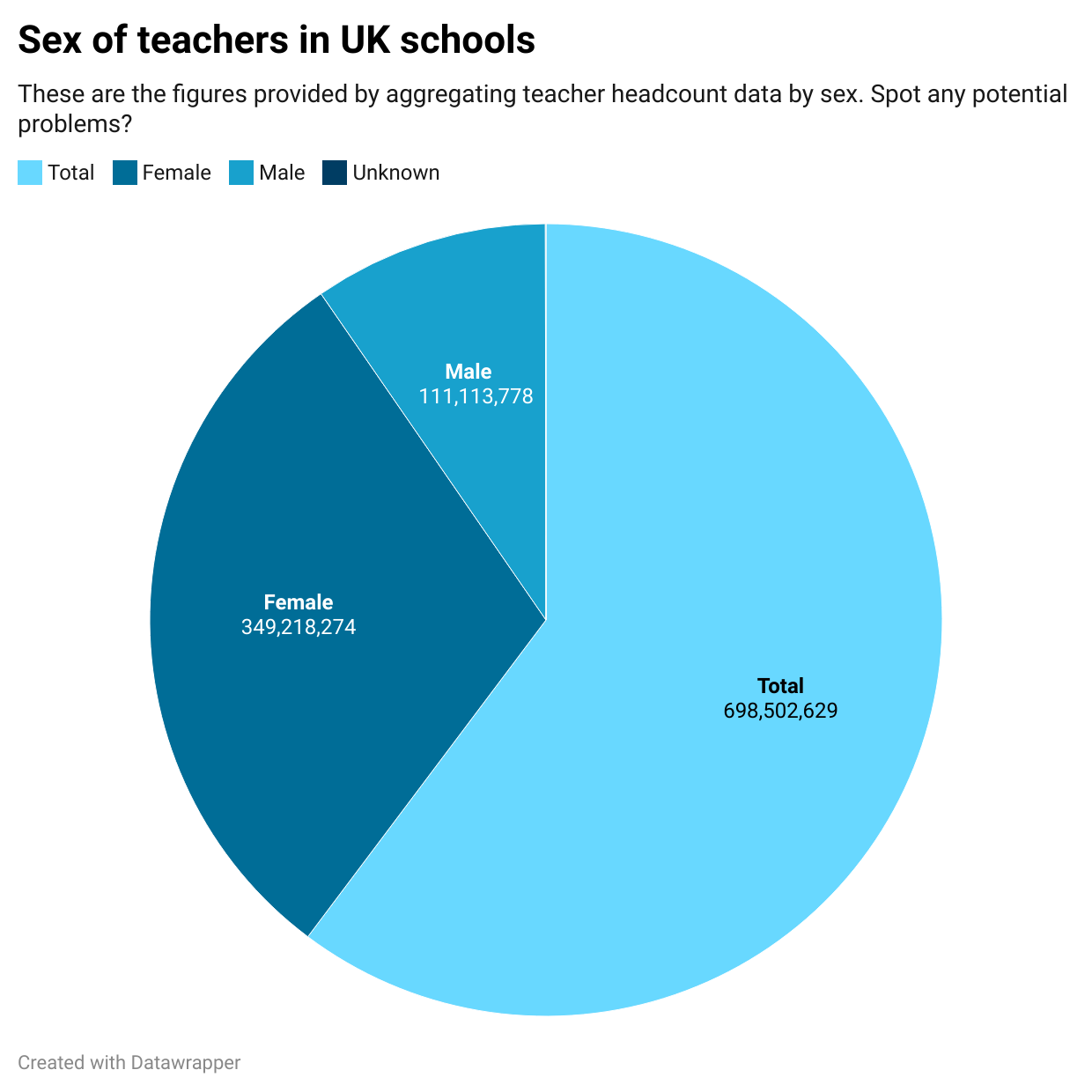
The most obvious problem is that the chart appears to be ‘comparing apples with oranges’ (things that aren’t comparable). Specifically: “male”, “female”, and “unknown” are similar categories which can fairly be compared with each other, but “total” is a wider category that contains the other three.
I’ve used a pie chart here to make it easier to spot: we expect a pie chart to show parts of a whole, not the whole as well as its parts.
But the same problem should be obvious from the same data in a table before visualising it:
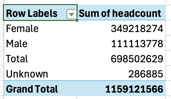
The table shows us that we have both a “Total” and a “Grand Total”. This is a red flag. There can only be one total, so if there’s more than one that’s a strong sign of double counting.
Why is this happening? We need to take a look at the data.
Continue reading