Author Archives: Paul Bradshaw

Designing data journalism courses: reflections on a decade of teaching

Presentation

Students from the MA Data Journalism join conference attendees in a session at the Data Journalism UK conference

In this second extract from a commentary for Asia Pacific Media Educator I reflect on the lessons learned from a decade of teaching dedicated data journalism courses. You can read Part One — on teaching one-off data journalism classes — here.

In contrast to the one-off classes involving data journalism, courses and modules that focus on data journalism skills present a different type of challenge.

These courses typically attract a different type of student, and provide more time and space to work with.

My own experience of teaching on such courses comes from three contexts: in 2009 I launched an MA in Online Journalism at Birmingham City University with an explicit focus on data-driven techniques (the term “data journalism” was yet to be popularised). A year later I acted as an advisor to the MA in Interactive Journalism that City University London were then developing (delivering guest classes in data journalism for the following 5 years as a visiting professor). Finally, in 2017 I replaced the MA in Online Journalism with a dedicated MA in Data Journalism at Birmingham City University.

In this post I talk about the factors that shaped course design, and how student output compared to the objectives of the course. Continue reading

Teaching data journalism — fast and slow

lecture theatre

Lecture theatre image by judy dean

I’ve now been teaching data journalism for over a decade — from one-off guest classes at universities with no internal data journalism expertise, to entire courses dedicated to the field. In the first of two extracts from a commentary I was asked to write for Asia Pacific Media Educator I reflect on the lessons I’ve learned, and the differences between what I describe (after Daniel Kahneman) as “teaching data journalism fast” and “teaching data journalism slow”. First up, ‘teaching data journalism fast‘ — techniques for one-off data journalism classes aimed at general journalism students.

Like a gas, data journalism teaching will expand to fill whatever space is allocated to it. Educators can choose to focus on data journalism as a set of practices, a form of journalistic output, a collection of infrastructure or inputs, or a culture (see also Karlsen and Stavelin 2014; Lewis and Usher 2014; Boyles and Meyer 2016). Or, they might choose to spend all their time arguing over what we mean by ‘data journalism’ in the first place.

We can choose to look to the past of Computer Assisted Reporting and Precision Journalism, emerging developments around computational and augmented journalism, and everything that has happened in between.

In this commentary, I outline the different pedagogical approaches I have adopted in teaching data journalism within different contexts over the last decade. In each case, there was more than enough data journalism to fill the space — the question was how to decide which bits to leave out, and how to engage students in the process. Continue reading

3 concepts from archive studies that every data journalist should know

Until last month I hadn’t heard of diplomatic studies. It’s the discipline of studying historical documents, and comes from the word ‘diploma’, as in ‘verifying that someone hasn’t faked their records’ (I’m paraphrasing here). But this discipline of verification has some useful lessons for journalists — particularly data journalists — because it provides a very handy framework for picking apart what makes a record (data) credible, and what we should be looking out for when establishing that.

Particularly useful are three terms that are used to distinguish different aspects of a record’s credibility: authenticity; reliability; and accuracy.

Luciana Duranti’s paper on electronic records (PDF) defines each of the three concepts in depth, and — although she notes that the terms are given different meanings in different sectors — it is worth exploring in detail… Continue reading

GEN Summit: AI’s breakthrough year in publishing

This week’s GEN Summit marked a breakthrough moment for artificial intelligence (AI) in the media industry. The topic dominated the agenda of the first two days of the conference, from Facebook’s Antoine Bordes opening keynote to voice AI, bots, monetisation and verification – and it dominated my timeline too.

At times it felt like being at a conference in the 1980s discussing how ‘computers’ could be used in the newsroom, or listening to people talking about the use of mobile phones for journalism in the noughties — in other words, it feels very much like early days. But important days nonetheless.

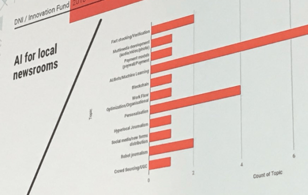
Ludovic Blecher‘s slide on the AI-related projects that received Google Digital News Initiative funding illustrated the problem best, with proposals counted in categories as specific as ‘personalisation’ and as vague as ‘hyperlocal’.

Digging deeper, then, here are some of the most concrete points I took away from Lisbon — and what journalists and publishers can take from those.

Continue reading

This Twitter hack can help journalists to check what a group of people was tweeting about on a particular day

You may have seen a cute little Twitter hack — popularised by Andy Baio — which allows you to roll back the years and recreate a decade-old Twitter timeline. The twist is that you’ll be seeing updates from people who you may not have been following at the time but discovered later.

Nostalgia aside, the same technique could be used by journalists to track what was being said by any particular group of interest at a particular point in time. Here’s how. Continue reading

How to: uncover Excel data only revealed by a drop-down menu

Sometimes an organisation will publish a spreadsheet where only a part of the full data is shown when you select from a drop-down menu. In order to get all the data, you’d have to manually select each option, and then copy the results into a new spreadsheet.

It’s not great.

In this post, I’ll explain some tricks for finding out exactly where the full data is hidden, and  how to extract it without getting Repetitive Strain Injury. Here goes…

The example

fire data dropdown

To get the data from this spreadsheet you have to select 51 different options from a dropdown menu

The spreadsheet I’m using here is pretty straightforward: it’s a list of the populations for each fire and rescue authority in the UK (XLS). These figures are essential for putting any story about fires into context (giving us a per capita figure rather than just whole numbers) — and yet the authority behind the spreadsheet has made it very difficult to extract those numbers. Continue reading

Wanted: MA Data Journalism applicants to work with Haymarket Automotive

Autocar and What Car?

image: Haymarket

One of the industry partners for the MA in Data Journalism is Haymarket Automotive (What Car?, PistonHeads and Autocar) — we’re now inviting applications from people who are particularly interested in studying data journalism in relation to the automotive sector. In other words, data motoring journalism!

You should have a passion for journalism and retail journeys, cars or the car industry, be interested in helping find new sources of data for stories, and working on stories based on data collected by third parties, and have lots of ideas that tap into the power of data-driven journalism.

Editorial director Jim Holder explains:

“The automotive industry is awash with historic data, from car specs to buyer behaviour, and populated by experts who believe they know how to produce and read it. But our brands – and buyer’s guide What Car? in particular – have unique access to live data from in-market car buyers. Harnessed properly, the data has the potential to surprise and delight the car industry, and car buyers – and shake-up outmoded suppositions and attitudes.”

Successful applicants approved by Haymarket will work with a Haymarket Automotive brand during part or all of their MA studies.

If you are interested, please apply through the course webpage specifying in your supporting statement that you are specifically interested in working with Haymarket Automotive.

Opportunities are also available to work with FourFourTwo, or The Telegraph, or a number of other news organisations.

2018 has been a good year for UK local data journalism — here’s the story so far

Local data journalism in the UK has been undergoing a quiet revolution in the last 12 months, but 2018 in particular has seen a number of landmarks already in its first few months. Here’s some of the highlights in just its first 12 and a half weeks…

January: BBC Shared Data Unit publishes its first secondee-led investigation

The BBC Shared Data Unit had already been producing stories before in late 2017 it took on its first three-month secondees from the news industry. Over the next 12 weeks they received training in data journalism and work on a joint investigation. Continue reading

FAQ: Is UGC more helpful or harmful to journalism?

The latest set of questions in the semi-regular FAQ section on this blog are about UGC, and come from a student at Liverpool John Moores. Here they are…

Is UGC more helpful or harmful to journalism?

Helpful, of course! Journalism has always relied on information and media (photos, video, audio) from readers/the audience and sources. The difference is that we now have access to a much larger amount of that information. Continue reading

3 weeks left to enter the Data Journalism Awards

maidan revolution map

One of the projects from last year’s winning portfolio in the young data journalist category

The deadline for the Data Journalism Awards is now just 3 weeks away. One category for educators and young journalists to look out for is the ‘Student and young data journalist of the year‘ which seeks to shine a light “the outstanding work of a new talent in data journalism, for projects done while they are still studying or early in their professional careers.”

The category is open to all data journalists under the age of 27 — but not students over that age (who I’m told should apply for the Best Individual Portfolio category). Submissions can include one or as many as ten pieces of data journalism. Winners get $1801 (the year William Playfair reportedly created the pie chart) and a trophy.

Last year’s winner Yaryna Serkez won for a portfolio that included a reconstruction of the last three days of the Ukraine’s 2014 Maidan revolution, the Snow Fall-esque “Anatomy of the Carpathians“, and a network analysis of pro-Russian trolls on Facebook in Ukraine.

There are also some new categories: Innovation in data journalism, and Best data journalism team. More on the website.


Continue reading