As part of the process I also created a series of cards, available as a printable PDF, which you can use to prompt these ideas in a classroom or editorial brainstorming situation. Please let me know if you find them useful!
Company accounts can be a goldmine of story leads — from “following the money” and uncovering complex webs of relationships, to simply reporting concerns and individual payments.
I’ve put together a playlist of videos covering a number of different techniques you can use to find stories. Those are:
In this video — first made for students on the MA in Data Journalism at Birmingham City University and shared as part of a series of video posts — I explain what computational thinking is and how it can improve your ability to work with data as a journalist, with some exercises and examples that help you exercise your own computational thinking.
If you’re using maps as a data journalist it’s important to be aware of the editorial choices you are making — and how they can skew your reporting.
In this video — first made for students on the MA in Data Journalism at Birmingham City University and shared as part of a series of video posts — I introduce critical cartography, the different types of maps you might choose to use to tell a story, and the different types of stories that they can tell.
I also give some examples of geography-based stories that might be better told with other charts, and list some tools and tips that can be used to tell geographical stories.
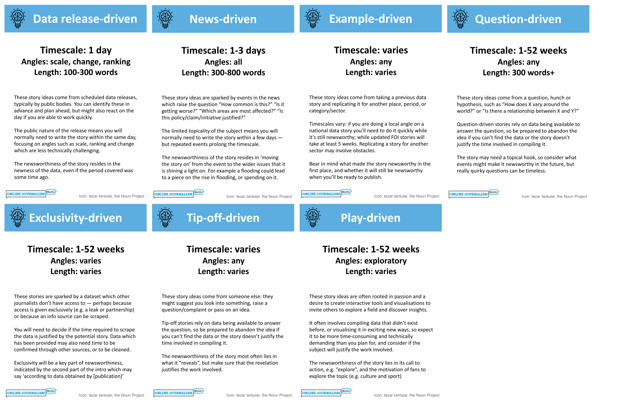
With just a few basic data journalism techniques you can tell a lot of data journalism stories. I call these the “three chords of data journalism” — a nod to Simon Rogers’s talk on data journalists as the new punks. Those chords are: sorting; filtering; and calculating percentages.
In this third video first made for students on the MA in Data Journalism at Birmingham City University and shared as part of a series of video posts, I walk through how to use those techniques in practice, using gender pay gap data to demonstrate how those techniques can be used to find outliers and potential interviewees; to drill down to a particular category or area in a dataset; and to put figures into context.
Journalists get hold of data using four broad approaches: it might be newly published or issued; it might be leaked; they might request it; or they might seek it out based on an idea or in reaction to a news event.
In this second short video first made for students on the MA in Data Journalism at Birmingham City University and shared as part of a series of video posts, I go through the different ways that journalists obtain data and the different types of story that those sources can lead to.
Data journalism isn’t just about spreadsheets and interactives: in this video from my MA Data Journalism classes at Birmingham City University I look at why the news industry has expanded its focus on data journalism over the past decade, and how thinking about definitions of data journalism can help reporters think more broadly about potential stories and subjects beyond official statistics.
I also look at related terms such as computational journalism, robot journalism and augmented journalism — and what we can learn from those definitions as practitioners.
This is part of a series of videos recorded during the coronavirus pandemic.
I am from Brazil, a country well-known for football and FIFA World Cup titles — and the host of the World Cup in 2014. Being a sceptical journalist, in 2019 I tried to discover the real impacts of that 2014 World Cup on the 213 million residents of Brazil: tracking the 121 infrastructure projects that the Brazilian government carried out for the competition and which were considered the “major social legacy” of the tournament.
In 2018 the Brazilian government had taken the website and official database on the 2014 FIFA World Cup infrastructure projects offline — so I had to make Freedom of Information (FOIA) requests to get data.
The investigation took 3 months and more than 230 FOIA requests to 33 different public bodies in Brazil. On August 23, my story was published.
Here is everything that I have learned from making those hundreds of FOIA requests:
If you follow me on Twitter you’ll know every so often I highlight a story which uses company accounts. This latest one has celebrity and fashion, and involves a charity that’s raising money through star-studded events — what more can you ask for?
🧵It's time for another journey into the world of telling stories through company accounts – this time Naomi Campbell's fashion charity is under investigation! The story is here: https://t.co/iRvYuDbTbF But how did the reporter find the details..?
In an extract from a new chapter in the ebook Finding Stories in Spreadsheets, I explain what regular expressions are — and how they can be used to extract information from spreadsheets.The ebook version of this tutorial includes a dataset and exercise to employ these techniques.
The story was an unusual one: the BBC Data Unit had been given access to a dataset on more than 200,000 works of art in galleries across the UK. What patterns could we find in the data that would allow us to tell a story about the nature of the nation’s paintings?
Some of the data was straightforward to work with: the ‘artist’ column was relatively clean, and allowed us to identify the most common male and female artist. It turned out that the latter – the Victorian botanist Marianne North – was relatively unknown. So, that was one story we could tell.
But other parts of the data were more problematic. The date column, for example, contained inconsistently formatted data: in the majority of cases a specific year had been entered, but in many others the data contained text such as “18th century” or “1900-1920” or “1800s”.
We also noticed that monarchs featured heavily in the art – but understandably there was no column that was specifically dedicated to classifying those. If we wanted to identify the most-painted monarchs we would have to create new data that somehow extracted those names from the paintings’ titles.
These problems – extracting data from existing data, particular text data – are what regular expressions are designed for. In this chapter I will explain what regular expressions are, and how to use them in spreadsheets.