Category Archives: online journalism

FAQ: 24 questions about data journalism

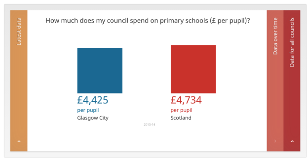
The latest in the FAQ series is a whopper: a PhD researcher from Iran asks 24 questions about data journalism. I’ve actually only shown 22 below. (Only).

What are the most common definitions of data journalism? What is your definition?

I had a stab at this in the introduction to The Data Journalism Handbook, and Tony Hirst has a good overview of three different ways of defining it.

More recently, here’s a definition from the forthcoming second edition of my Online Journalism Handbook:

“Data journalism is, basically, any journalism that involves structured data. And when everything is online – from government spending and last month’s weather to music sales, fashion gossip, social network connections and sports performances – that basically means the world is your oyster.”

What are the different types of data journalism?

There are all sorts, from short simple pieces that only fill a few paragraphs to longform investigative pieces or interactive tools. It can relate to getting the data, analysing it, telling the story or making that interactive. Continue reading

Press officers to be given data to back up speeches – will journalists be able to interrogate it?

Full Fact report that the Department of Health is to give press officers data so they can field press enquiries about claims made in ministerial speeches:

“An internal ‘data document’ will provide press officers with links to sources for each factual claim made in a speech, as well as contact details for the official or analyst who provided the information.”

It’s an important move, and given that it comes in response to a body  (the UK Statistics Authority) which has also rebuked other arms of government for misusing stats, you might expect other departments to follow.

Of course, it relies on journalists being aware that this exists, being willing to ask for the data, and able to interrogate it (or its author). Another on the list for the case for data literacy.

Comparison chart between Glasgow and national average

How Scotland made its council audit data less open (with happy ending)

Once upon a time Audit Scotland published performance data for every council in Scotland. The approach was simple: a spreadsheet for every council with dozens of indicators across several pages.

audit scotland data

Audit Scotland data from 2012/13

As far as open data goes it wasn’t ideal: comparing councils involved manually downloading spreadsheets and combining them, unless you wrote a scraper to do that for you. Which is what I did last year while working with the Sunday Post on a series of stories.

But at least you had the data in some sort of raw format.

If you look for the data this year, however, you will find things a little more complicated:

“The local government community now produce council performance information through the Local Government Benchmarking Framework.”

Now there’s a middleman. And here things start to go downhill (before a happy ending). Continue reading

Tips from Andrzej Marczewski for journalists interested in gamification and news games

Andrzej Marczewski

Andrzej Marczewski

Are journalists confusing gamification with serious games? Andrzej Marczewski, an expert and thought-leader in the field, tells Alex Iacovangelo that he thinks that journalists should first learn the difference.

I spend a lot of time splitting the definitions up. Gamification gets a bad name because people think that it is a catch-all for any attempt at non-entertainment related use of games or game mechanics.

“Really, it is just about using game elements in non-games – not making them. Serious games are different.”

Continue reading

The BBC’s new statistics role has ended after 18 months. Here’s what the person in that role did

At the end of July this year the BBC ended a quiet experiment that had been going on for the last 18 months: a Head of Statistics role funded initially by the corporation’s innovation fund and then by election coverage money.

Anthony Reuben was the person occupying that role. A business reporter with almost two decades’ experience at the BBC, Reuters, Sky, the Money Channel and the FT, he was helping to design a new statistics course for the BBC College of Journalism when the need for a new role became clear.

“We got to the last slide, which was where to turn for more help. There were plenty of people outside the BBC, but nobody in it who had the time or skills to help with statistical questions. So we applied for a year’s funding from the Innovation Fund.”

What the head of statistics role involved

Once in the role Reuben would sit with the planning team and attend some of the daily news and planning meetings to anticipate big stories which might “set off alarm bells”. Continue reading

A crowdfunded contributor on why the death of Contributoria was sudden but not unexpected

contributoria logo

In a post originally published on his blog theplan, Contributoria contributor Jon Hickman explains why he wasn’t surprised by the closure of the site

The journalism project Contributoria has announced that it has published its last issue this month. I wasn’t surprised to hear that the site would close, but the pace of the closure did catch me off guard.

I’ve written for the site several times as I was interested in the mechanics of its crowdfunding model.

Contributoria was both a crowdfunding platform and a web and print magazine. Articles were commissioned based on the distribution of ‘points’ by Contributoria members, and those members could engage with writers during the drafting of articles. Continue reading

When to use shape maps in data visualisation: part 2 of a great big guide

maps xkcd

xkcd’s take on mapping, via Duarte Romero

In a previous post I explained some of the considerations in deciding to use a map in data visualisation, and went into detail about mapping points and heatmaps. In this second part, taken from the MA in Online Journalism at Birmingham City University, I’m going to look at other types of maps: shape-based maps and image maps.

Mapping shapes

A more ambitious alternative to mapping points is to map shapes: in other words, instead of each data point being placed on a specific point on a map, instead different areas on that map are drawn and coloured/labelled according to the relevant data. Continue reading

When to use maps in data visualisation: a great big guide

Zombie map

Matt Bierbaum’s zombie map allows you to simulate outbreaks

When it comes to data visualisation, everyone loves a map. More exciting than a chart, easier than an infographic, it’s generally the first thing that journalists and journalism students alike ask: “How can we create a map?”

But just because you have some geographical data doesn’t mean you should map it.

Here’s why: maps, like all methods of visualisation, are designed for a purpose. They tell particular types of stories well – but not all of them.

There is also more than one type of map. You can map points, shapes, or routes. You can create heat maps and choropleth maps.

I’ll tackle those different types of maps first – and then the sorts of stories you might tell with each. But the key rule running throughout is this: make sure you are clear what story you are trying to tell, or the story that users will try to find. The test is whether a map does that job best. Continue reading

VIDEO: Jornalismo de Dados – “Dados no contexto digital”

Inês Rodrigues interviewed me and a bunch of other people for a Portuguese video project about data journalism. The results can be seen in the video above, while you can also watch longer versions of the individual interviews with experts including Alberto Cairo, Simon Rogers and Raquel Albuquerque, and separate videos on subjects such as open access (in Portuguese). I’ve embedded these below. Continue reading

How one journalist found hidden code in a Google report and turned it into a story

right to be forgotten analysis

The story found that most requests were made by private individuals, not politicians or criminals. Image: The Guardian

Sylvia Tippmann wasn’t looking for a story. In fact, she was working on a way that Google could improve the way that it handled ‘right to be forgotten‘ processes, when she stumbled across some information that she suspected the search giant hadn’t intended to make public.

Two weeks ago The Guardian in the UK and Correct!v in Germany published the story of the leaked data, which was then widely picked up by the business and technology press: Google had accidentally revealed details on hundreds of thousands of ‘right to be forgotten’ requests, providing a rare insight into the controversial law and raising concerns over the corporation’s role in judging requests.

But it was the way that Tippmann stumbled across the story that fascinated me: a combination of tech savvy, a desire to speed up work processes, and a strong nose for news that often characterise data journalists’ reporting. So I wanted to tell it here. Continue reading