
In a guest post for OJB, James Hickman pulls together a set of basic best-practice guidelines for creating data journalism videos on TikTok, from length and location to animation and style.

Short-form vertical video is quickly becoming a key format for telling all types of news stories — and data journalism is no exception.
As a data journalist, I wanted to know how these outlets use this new and evolving digital video format to create “data shorts”: short-form social media videos in a vertical, reel-style format, that analyses or reports on specific datasets or newly released data.
I analysed 50 data shorts from the TikTok accounts of five major UK news publications — the BBC, ITV News, Guardian, Times and Financial Times — to examine how these digital news outlets approach the format. I looked at the genre of story they covered, the angles they focused on, their length, and their use of animation, to help inform my guidelines.
Tip 1: Keep your data shorts under 90 seconds

My analysed data shorts averaged a runtime of just under 84 seconds.
The BBC ranked lowest for average video length, at just under a minute, while the Financial Times had the highest at 105 seconds.
Notably, none of the publications had an average video length over two minutes, despite TikTok allowing longer uploads up to 60 minutes.
By keeping their runtimes short and using an average speaking rate of 100–150 words per minute, data shorts act as video equivalents to the traditional News in Brief (NIB) format — short news articles usually summarised in a single paragraph — rather than conventional 300–500-word news stories.
Based on the average runtime, a script for a data short should be around 200 words, presenting a condensed overview rather than deep-dives into causes and effects which would require a more time-demanding feature-length format.
By condensing the runtime of a data short, journalists can also get to the story’s point more quickly, maintaining audience engagement with the video by removing unnecessary details, pauses or words that may increase the chances of viewers scrolling to the next video in their timeline.
Tip 2: Maintain a human connection and get in front of the camera
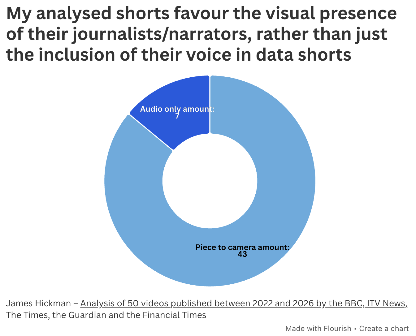
Journalists had a presence in all 50 shorts.
43 out of the 50 shorts were shot in the piece-to-camera format, physically establishing a human relationship between a journalist and the data story — and all the videos featured a journalist’s voice-over.
Featuring the voice and face of a presenter in a data short is important, as vertical video platforms like TikTok are personality-driven and built on relationships with audiences.
By being present, journalists and presenters act as a point of engagement, recognition, and credibility with their audience, building trust faster and establishing themselves as a reliable news source and industry presence.
Tip 3: Locations reinforce your authority
Where you film your piece-to-camera is also important.
All the data shorts with pieces-to-camera I analysed were filmed in a recording studio or a newsroom setting, except one, which was recorded on location.
By recording in professional environments, you further reinforce your reliability as a news source, creating an innate sense of trust with your audience by visually communicating your professionalism.
Tip 4: Show don’t tell
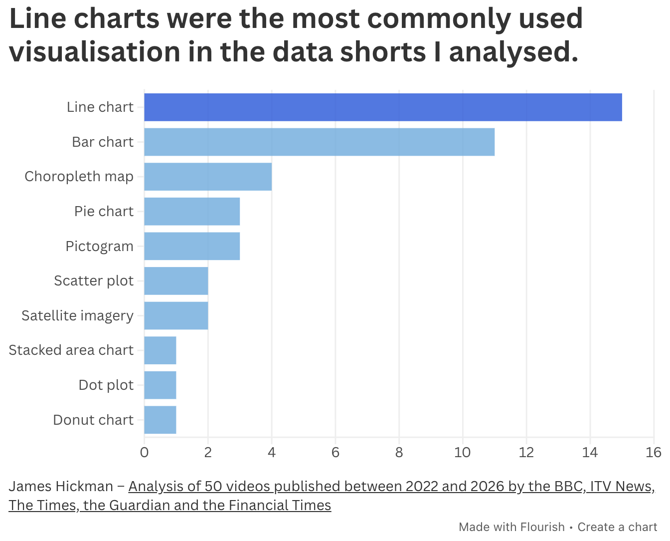
Data visualisations are commonly used in data journalism — and data shorts are no exception, with 33 of the 50 TikTok videos analysed including some form of data visualisation.
Line charts (used 15 times) were the most common form of visualisation, suggesting that change stories such as this video by the FT’s John Burn-Murdoch were one of the most common angles chosen.
Bar charts — used primarily to show ranking comparisons — were the second-most popular form of visualisation.
Choropleth maps (appearing four times) were the third most prevalent visualisation, used in political and economic stories to visualise statistical differences between geographical areas.
More complex visualisations, like dot plots and stacked area charts, appeared only once each throughout my analysis, suggesting that intricate graphs may be too complicated to use effectively in short-form vertical-video formats.
Only eight of the 33 data shorts that included visualisations used more than one type of chart, suggesting that the short time frame may further restrict the amount of analysis achievable through visualisations.
Tip 5: Animate your graphs to maintain momentum
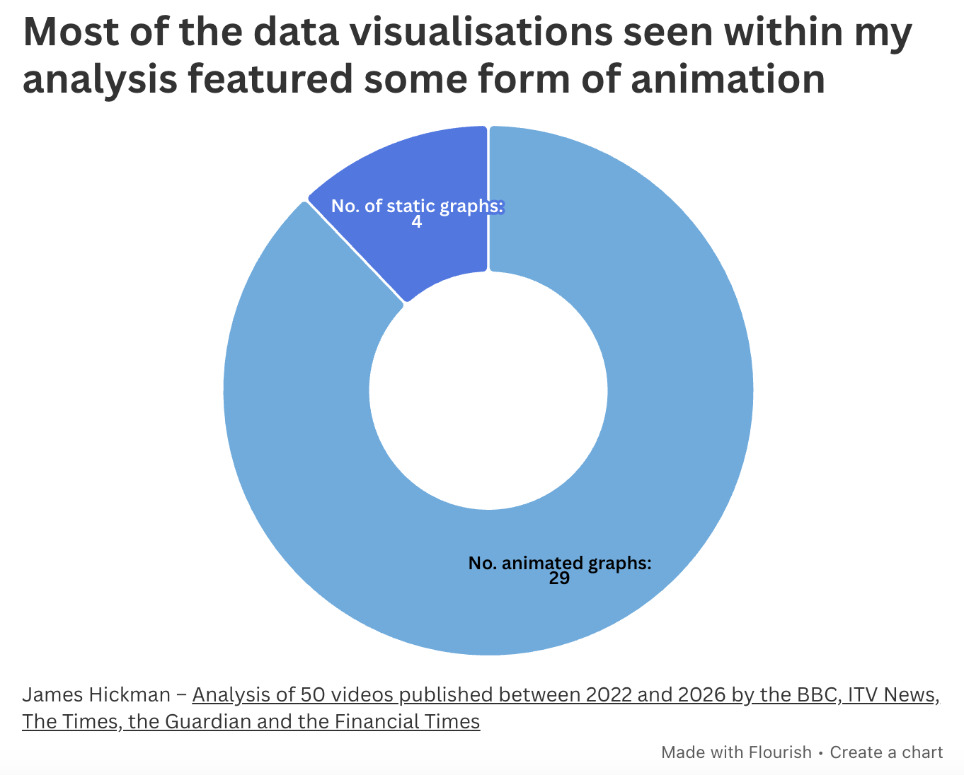
Digitally animated graphics are a visual storytelling technique frequently used in short-form vertical video to engage viewers.
29 of the 33 data visualisations in my analysis featured animation, either zooming in on specific data, revealing data over time or highlighting specific elements through using colour.
This proved effective in adding further storytelling to the graphs, while allowing the video to elaborate on specific datapoints within the visualisation.
Animated text was equally as common, primarily used to emphasise statistical information or to draw attention to particular words or names that were important to the story. An example can be seen in the Times’ 2026 data short on the increase in UK expatriates, which uses text animations to highlight the rising figures, as well as the factors driving the increase in people leaving the UK.
Tip 6: Don’t be afraid to innovate and adapt
Although the analysis documented the most common practices used by five major news brands, there are no set-in-stone methods for creating a data short — and my analysis also highlighted some newly emerging storytelling techniques.
Two of the videos, for example, used satellite imagery as data visualisations. Robert Simmon and Niels de Hoog have used this approach in the past to show how geographical areas have changed over time, and on TikTok both The Guardian and the BBC experimented with satellite data in a similar way, creating effective, visually-led data shorts that show real geographical change rather than simply describing it. Both videos keep the runtime of these data shorts under the two-minute mark, and also allow time to give context on how and why these changes are occurring.
The Guardian frequently implemented more elaborate animations and graphics within their work, giving many of their data shorts greater visual spectacle and flair than those produced by other publications.
Don’t be afraid to experiment and innovate with your data shorts to push the medium further.
If you have produced or work in the field of data shorts or vertical video journalism, I would love to get in contact with you in the comments of this post, through email or on LinkedIn.
A version of this post with further analysis and more detail about methodology was first published on Medium.

