One way to ensure you generate a wide range of potential sources for a story — or for potential story leads — is to use a checklist. The PEER framework is just that: four categories to help journalists generate more names on any given story — and think more creatively about whose voices might add something to that story.
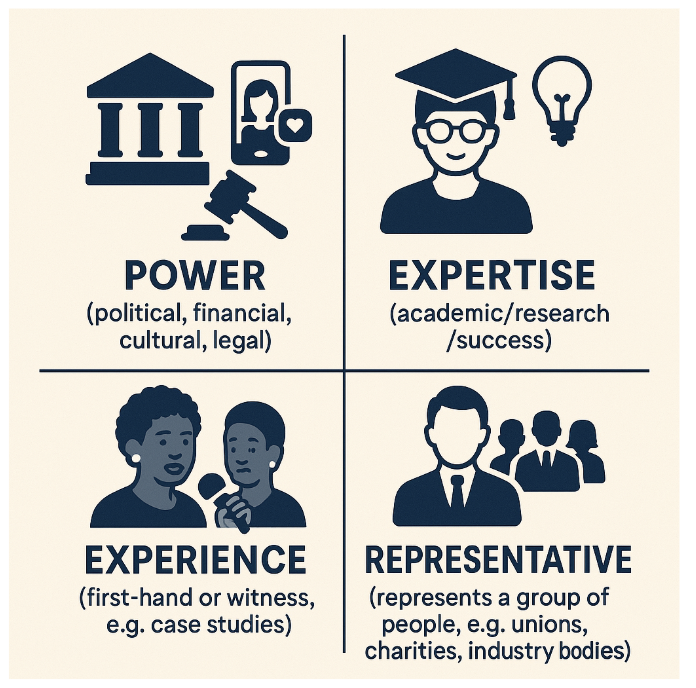
PEER is a mnemonic (based on a previous post) for remembering the following four types of source:
- 💪 Power
- 🧠 Expertise
- 👁️🗨️ Experience
- 🗣️ Representative
Each type of source brings something different to the story: voices of power primarily (but not solely) answer questions about action: what was or is being done, what should or would be done about a particular issue. These are easily the most commonly quoted sources in news reporting.
People with expertise can answer the “why” and “how” questions — and are often more likely to speak to journalists — while those with experience can verify or validate (put a human face to) events. Representatives can speak to the wider impact or significance of an issue, or represent community sentiment about it.
Making each type of source explicit allows us to think about what those roles really mean — and identify less obvious ideas for sources with power, expertise, experience or representative qualities.
Continue reading