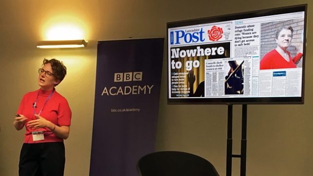
Category Archives: online journalism

“Data matters — but people are still the best sources of stories”  —  insights from investigative journalist Peter Geoghegan

Peter Geoghegan

Peter Geoghegan

In a guest post Jane Haynes speaks to investigative journalist Peter Geoghegan of the award-winning news site The Ferret about data, contacts and “nosing up the trousers of power”.

When the Scottish Government announced last month that it was banning fracking, it was a moment to savour for a group of journalists from an independent news site in the heart of the country.

The team from investigative cooperative The Ferret had been the first news organisation to reveal plans by nine energy companies to bid for licences to extract shale gas from central Scotland.

Using a combination of contact-led information and FOI requests, they uncovered the extent of the ambitions to dig deep into Scottish soil.

Firms target more of central Scotland for fracking

It was part of a steady flow of fracking stories from the Ferret team, ensuring those involved in making decisions were in no doubt of their responsibilities and recognised that every step would be scrutinised. Continue reading

Data storytelling done right: 8 easy tips to avoid bad visualisation

tesselationIn a guest post for OJB, Steve Carufel interviews Dutch data journalist Thomas de Beus about visualisation, storytelling — and useful new tools for data journalists.

Data journalism is, among other things, the art of resisting the temptation to show spectacular visualisations that fail to highlight the data behind a story.

Insights and relevant statistics can get lost in visual translation, so Thomas de BeusColourful Facts is a great place to start thinking more about clarity and your audience — and less about spectacular graphic design (although you do not want to forego attractiveness entirely). Continue reading

A potted history of the last 6 years? How the Online Journalism Handbook changed between 2011 and 2017

A few weeks ago the second edition of the Online Journalism Handbook was published. Two years in the making, it was more than just an update of the first edition — it was an almost complete rewrite (and 50% longer). The changes since that first edition in 2011 highlight just how the industry has changed in those six years — here are just a few of the things that I noticed when I looked back…

Blogging: “If you strike me down, I shall become more powerful than you can possibly imagine”

In the first edition of the Online Journalism Handbook a whole chapter was devoted to blogging. In the new edition the chapter is gone. Does that mean that blogging is dead? No. It means that ‘blogging’ is now so ubiquitous it has become almost invisible. Continue reading

Want to work as a sports data journalist? Inviting MA Data Journalism applications in partnership with FourFourTwo

FourFourTwo infographic

One of FourFourTwo’s infographics – they want to expand the organisation’s ability to produce social-friendly data-driven content

As part of the new MA in Data Journalism I have partnered with a number of organisations who are keen to bring data journalism expertise into their newsroom. One of those is Haymarket’s football media brand FourFourTwo – which has grown from a UK football magazine to a network of websites in six countries around the world, and is looking to expand its data-driven reporting.

I am now inviting applications from people who are particularly interested in studying data journalism in partnership with FourFourTwo.

You should have a passion for football and sports journalism, be interested in helping find new sources of data for stories, and working on stories based on data collected by third parties, and have lots of ideas that tap into the power of data-driven sports journalism.

Global digital editor Gary Parkinson explains:

“We are very aware of the power of social media – we have a monthly reach of around 60m from our various accounts – and as part of that have been exploring the shareability of data visualisation and infographics. We also have scheduled major online events which would benefit from dataviz, such as our annual #FFT100 Best Players In The World.”

If you are interested, please apply through the course webpage specifying in your supporting statement that you are specifically interested in working with FourFourTwo.

9 *more* newsletters about data and vis? Yes!

A few weeks ago I posted a list of 9 great newsletters about data. The post generated so many suggestions of other newsletters that I thought I’d gather them together in a follow-up post. So, here are 9 more newsletters about data journalism, data science, and data visualisation.

1. Graphic Content

graphic content logo

Graphic Content is a regular email newsletter — and Tumblr blog — from the head of data and transparency at the Institute for Government, Gavin Freeguard. Continue reading

Announcing the line up for Data Journalism UK 2017

The Bureau Local's Megan Lucero

The Bureau Local’s Megan Lucero

We’ve confirmed the line up for this year’s Data Journalism UK conference on December 5 — and I’m pretty excited about it.

We’ve managed to pack in networked data journalism and investigations, automation and the internet of things, and some practical sessions too, with my new MA Data Journalism students pitching in to help.

Tickets are available here including early bird and afternoon-only options, but you’ll need to be quick — the event sold out last year.

Here’s more detail on the running order… Continue reading

Wanted: MA Data Journalism applicants to partner with The Telegraph

telegraph expenses data journalism

The Telegraph was behind one of the biggest data journalism stories of the last decade

As part of the new MA in Data Journalism we have partnered with a number of organisations who are keen to bring data journalism expertise into their newsroom.

I am now inviting applications from people who want to work with The Telegraph during their MA in Data Journalism at Birmingham City University.

The Telegraph has a long history of data journalism, most famously breaking a series of stories around MPs’ expenses in 2009. Examples of its data journalism – ranging from sport and politics to text analysis and data video – can be found in its TeleGraphs section.

The news organisation is looking for applicants who are interested in developing the ability to clean and analyse data to find interesting stories; an awareness of tools that you can use to source and scrape data; and a knowledge of data visualisation in order to communicate your stories. Successful applicants will learn these skills on the MA course and have the opportunity to apply them in collaboration with The Telegraph. Continue reading

(More than) 4 examples of computational thinking in journalism

Tennis balls hitting journalist

Computational thinking helps you break down a problem and solve each part logically. Image from BuzzFeed Tennis investigation

Today I will be introducing my MA Data Journalism students to computational thinking techniques (you can read my post about why that’s important here). As part of my preparations I’ve been collecting some of my favourite examples of computational thinking being used to spot and execute data journalism stories – and I’m sharing them here…

Story 1: Which singer has the biggest vocal range?

Which singer has the best vocal range in the UK No it s not who you think Mirror OnlineThis story, published in the UK tabloid newspaper The Mirror, is a great example of understanding how a computer might ‘see’ information and be able to help you extract a story from it. Continue reading

Why journalists ditch the thesaurus when it comes to “said” (for new journalism students who don’t)

Synonyms for "said"

It’s the start of a new term in journalism courses across the country, and journalism lecturers will once again be spending the first few weeks helping students to ‘unlearn’ a habit they acquire at school: the impulse to use multiple synonyms instead of the word “said”*.

It’s not their fault. At school pupils are encouraged to extend their vocabulary when writing. Using “said” repetitively is seen as limited or uncreative, and pupils are told to find other words to add variety. “Stated”, “uttered”, and “commented” are just three words that journalism tutors will be striking out in the coming weeks.

But these synonyms are rarely used in journalism. To find out just how rarely they are used — and what the exceptions are — I looked at a sample of the 10 most recent news stories from three outlets: the BBC, Daily Mail/MailOnline, and BuzzFeed (30 in total).

Here’s what I found — plus a little explanation of why we do this. Continue reading

How to: use the AtF Spark font to create charts with just text

atfspark examples

AtF Spark is “a typeface for creating sparklines in text”. In other words, the fonts will convert numbers into something that looks like a chart. It looks pretty cool, and is a neat way to add a little spark (ahem) to your text.

But while the GitHub repo gives some basic instruction on using the fonts, it also assumes quite a bit of prior knowledge, so here’s a tutorial to explain how to use it if you’re not already familiar with web fonts and other technicalities of web design. Continue reading