Category Archives: online journalism

Leveraging music to help people understand data

In a guest post for OJB, Ion Mates interviews Tom Levine and Roman Heindorff about the role of audio in data journalism.

Audiolisation (sometimes called ‘auralization‘ or ‘sonification’) is the process of turning complex data to sound.

Instead of using graphics and bar charts, one can represent the contents of a spreadsheet by assigning sounds to different kinds of data.

In the above example, the activity of newsrooms is represented by verses, phrases and different rhythms. The author is Thomas Levine.

Beginning to represent data as audio

Tom started playing with computers from an early age. His main interest was to design things towards them being easier to use.

Continue reading

Data journalism at the 2015 UK General Election: geeks bearing gifts

bbc election quizThis has been the election when the geeks came in from the cold. There may be no Nate Silver-style poster boy for the genre this side of the pond – but instead, I believe we’ve finally seen the culmination of a decade of civic hacking outside the newsroom. And if anyone deserves credit for that, it is not the Guardian or the Telegraph, but MySociety, Tweetminster, and Democracy Club.

Looking back at my review of online election reporting in 2010 it’s striking how much has changed. Back then data journalism’s contribution was all about interactive presentation of results, but little else.

In the time between that election and this one, however, two things have changed within the news industry: firstly, a more code-literate workforce, including dedicated data project teams; and secondly, the rise of mobile, social media-driven consumption and, as part of that, visual journalism. Continue reading

Create your own parliamentary team – Fantasy Frontbench and other Voting Advice Applications

By Agustin Palacio

Who would be in your MP fantasy team? Fantasy Frontbench (FF) is a voting advice app which has been exploring this concept for the last few weeks, in the lead up to the General Election.

Using the tool, users can build a team of 22 politicians based on features such as gender or the university where they studied, but also how he or she voted in Parliament on particular issues.

“I felt as so many people were already familiar with the concept of a ‘dream team’ that it had a real chance of capturing the imagination of people who are not generally interested in politics,” says Project Manager Matthew Smith.

The app not only includes MPs elected in 2010, but also those politicians with high profiles during this campaign, like Natalie Bennett (Green Party candidate) or Nigel Farage (UK Independence Party).

There are also politicians from the smaller parties who have a chance to win their seats.

Smith works as learning technologist at University College London, where he is exploring ways in which information can be presented “in a more interesting and engaging way.”

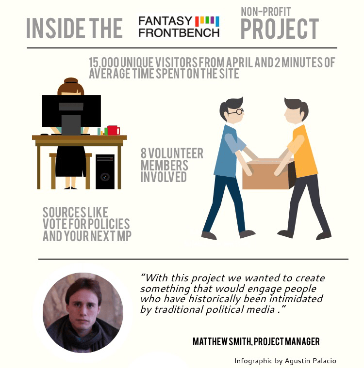
FF claims to have had 15,000 unique visitors, with the average time spent on the site being roughly 2 minutes.

The 8 volunteer members who run the non-profit project say they are happy with the figures but that a large audience is not their main purpose.

Smith says:

“In my view, even if the site had only helped one person raise their political understanding, the project would have been worthwhile.”

Taking advantage of Voting Advice Applications (VAAs)

According to Smith, this election campaign has been “the first where Voting Advice Applications (VAAs) have reached a level of maturity where their use can no longer be said to be insignificant.”

In fact, FF comes from around 3 data sources which are open to everybody, through which it is possible to get information related to different candidates and issues. Here are those 3, plus some others Smith recommends:

Matthew Smith also recommends Democratic Dashboard:

“The way they have visualised data ranging from share of the vote and past MPs, to forecasts and party spending is truly excellent. A perfect example of the adage ‘simple but effective’.”

Are you a hyperlocal covering #GE2015?

Are you a hyperlocal covering this year’s general and local elections? If so, then Online Journalism Blog would love to hear from you!

In particular, we’d love to hear what you’re doing and how it is going, as well as if you’ve encountered any problems/challenges. Do leave comments below or contact us via Twitter.

We’ll then feature links to your coverage in a future post, as part of our wider efforts to showcase the great work being done by this sector, as well as where local publishers might need more help in terms of access to candidates, accreditation etc.

Related reading:

Tips on choosing the right Twitter hashtag: a tale of 5 hashtags

brumvote related tags

What do you do when you’ve been using a hashtag for some time and another one comes along with the potential to be more popular? Do you jump on board – or do you stick with the hashtag you’ve built up? How do you measure the best hashtag to use for your work?

That’s the question that a team of my undergraduate journalism students at Birmingham City University faced last month. And here’s how they addressed it. 

First, some background: in February this year the students launched their election coverage under the hashtag #brumvote.

The hashtag worked well – it took in everything from BuzzFeed-style listicles to hustings liveblogs and data-driven analysis of local MPs’ expenses and voting patterns.

Then last month a similar hashtag appeared: the BBC launched their own youth-targeting election project, with the hashtag #brumvotes.

At this point the students faced 3 choices:

  1. Keep using the #brumvote hashtag
  2. Adopt the new #brumvotes hashtag
  3. Use both

Changing hashtag would involve changing dozens of posts from previous coverage, but would the clout of the BBC mean missing out on a potentially more successful hashtag? Continue reading

AudioBoom on election coverage, moving from hosting to publishing – and SoundCloud

By Antia Geada and Agustin Palacio

The AudioBoom digital news team is facing its first big challenge: covering the upcoming General Election. 

The team was created at the beginning of the year, specialising in covering international news, as it aimed to be not only a platform where others share audio, but also a publisher in its own right. 
Team leader David Marsland has joined this group, which is now focused on engaging people in politics in the run up to the general election. He says:

“People don’t get involved with politics that much outside of the election’s time. But with the elections approaching, we are getting a lot of listeners for all of our political staff.”

Continue reading

Free travel and accommodation being offered to Journalists’ Colloquium on Crisis/Disaster Reporting in November

The Asia-Europe Foundation (ASEF) is offering to pay travel and accommodation for journalists from ASEM countries (these include the UK, China, Australia, Spain, Thailand, India, Ireland and Japan) to attend the 10th ASEF Journalists’ Colloquium on Crisis/Disaster Reporting.

The event will be held in Luxembourg from 4-6 November 2015.

Applications need to be submitted online by Tuesday, 12 May 2015 – more details here.

Linked data and why the current approach to archives is “just not working” – David Caswell on Structured Stories

By Agustin Palacio

Structured Stories is a news database under construction which intends to empower everyone to collect, use and improve a permanent record of news events. Creator David Caswell wants to switch the current approach to archives, which “is just not working”, for “some form of structured information that can be networked.”

According to Caswell, adding value to the structured narrative could be a way to return to something similar to the economic mechanism of the 20th century: a distribution-based bundle.

And as for journalists? Caswell believes it could be a powerful tool: Continue reading

“How do I embed a map/video/infographic/audio/timeline/chart/liveblog on WordPress?” Everything you need to know

wordpress logo

Every year one of the questions most frequently asked by journalism students is “How do I embed a map/chart/infographic/liveblog/video/audio/gallery/tweet/document in a WordPress site?”

Here is a comprehensive overview of what is and is not possible in terms of embedding, and what you should do if you cannot embed. Continue reading

Is this the new swingometer? Network analysis given the broadcast journalism treatment (VIDEO)

The BBC current affairs programme Newsnight delved into network analysis this week. Network analysis generally involves generating diagrams which show clusters of relationships between people: a particularly powerful way of showing everything from power relationships to echo chambers and which people dominate or bridge particular groups of people. Continue reading