Author Archives: Paul Bradshaw

How to get started as a multimedia journalist

Investigations team flowchart

I’ve now covered almost all of the 5 roles in an investigations team I posted about earlier this year – apart from the multimedia journalist role. So here’s how to get started in that role.

Multimedia journalism is a pretty nebulous term. As a result, in my experience, when students try to adopt the role two main problems recur: 1) having a narrow assumption of what multimedia means (i.e. video) and 2) not being able to see the multimedia possibilities of your work.

Multimedia journalism is a very different beast to broadcast journalism. In broadcast journalism your role was comparatively simple: you had one medium to use, and a well-worn format to employ.

Put another way: in broadcast journalism the medium was imposed on the story; in multimedia journalism, the story imposes the medium.

Continue reading

Has the increase in data changed your newsroom?

I’m currently researching if newsrooms have been changed by the increase in availability of data – from FOI and data.gov sites to open data and APIs. Specifically I’m interesting in the watchdog role of journalism, but any other uses are relevant too.

If you work in this area I’d really appreciate it if you can complete the survey below – and share it with others you know can contribute. Here it is.

Hyperlocal Voices: Matt Brown, Londonist

The fifth in our new series of Hyperlocal Voices explores the work done by the team behind the Londonist. Despite having a large geographic footprint – Londonist covers the whole of Greater London – the site is full of ultra-local content, as well as featuring stories and themes which span the whole of the capital.

Run by two members of staff and a raft of volunteers, Editor Matt Brown gave Damian Radcliffe an insight into the breadth and depth of the site. Continue reading

Two reasons why every journalist should know about scraping (cross-posted)

This was originally published on Journalism.co.uk – cross-posted here for convenience.

Journalists rely on two sources of competitive advantage: being able to work faster than others, and being able to get more information than others. For both of these reasons, I  love scraping: it is both a great time-saver, and a great source of stories no one else has. Continue reading

How do you navigate a liveblog? The Guardian’s Second Screen solution

I’ve been using The Guardian’s clever Second Screen webpage-slash-app during much of the Olympics. It is, frankly, a little too clever for its own good, requiring a certain learning curve to understand its full functionality.

But one particular element has really caught my eye: the Twitter activity histogram.

In the diagram below – presented to users before they use Second Screen – this histogram is highlighted in the upper left corner.

Guardian's Second Screen Olympics interactive

What the histogram provides is an instant visual cue to help in hunting down key events.

Continue reading

Olympics Swimming Lap Charts from the New York Times

Part of the promise of sports data journalism is the ability to use data from an event to enrich the reporting of that event. One of the widely used graphical devices used in motor racing is the lap chart, which shows the relative positions of each car at the end of each lap:

Another, more complex chart, and one that can be quite hard to read when you first come across it, is the race history chart, which shows the laptime of each car relative to the average laptime (calculated over the whole of the race) of the race winner:

(Great examples of how to read a race history charts can be found on the IntelligentF1 blog. For the general case, see The IntelligentF1 model.)

Both of these charts can be used to illustrate the progression of a race, and even in some cases to identify stories that might otherwise have been missed (particularly races amongst back markers, for example). For Olympics events particularly, where reporting is often at a local level (national and local press reporting on the progression of their athletes, as well as the winning athletes), timing data may be one of the few sources available for finding out what actually happened to a particular competitor who didn’t feature in coverage that typically focusses on the head of the race.

I’ve also experimented with some other views, including a race summary chart that captures the start position, end of first lap position, final position and range of positions held at the end of each lap by each driver:

One of the ways of using this chart is as a quick summary of the race position chart, as well as a tool for highlighting possible “driver of the day” candidates.

A rich lap chart might also be used to convey information about the distance between cars as well as their relative positions. Here’s one experiment I tried (using Gephi to visualise the data) in which node size is proportional to time to car in front and colour is related to time to car behind (red is hot – car behind is close):

(You might also be able to imagine a variant of this chart where we fix the y-value so each row shows data relating to one particular driver. Looking along a row then allows us to see how exciting a race they had.)

All of these charts can be calculated from lap time data. Some of them can be calculated from data describing the position held by each competitor at the end of each lap. But whatever the case, the data is what drives the visualisation.

A little bit of me had been hoping that laptime data for Olympics track, swimming and cycling events might be available somewhere, but if it is, I haven’t found a reliable source yet. What I did find encouraging, though, was that the New York Times, (in many ways one of the organisations that is seeing the value of using visualised data-driven storytelling in its daily activities) did make some split time data available – and was putting it to work – in the swimming events:

Here, the NYT have given split data showing the times achieved in each leg by the relay team members, along with a lap chart that has a higher level of detail, showing the position of each team at the end of each 50m length (I think?!). The progression of each of the medal winners is highlighted using an appropriate colour theme.

[Here’s an insight from @kevinQ about how the New York Times dataviz team put this graphic together: Shifts in rankings. Apparently, they’d done similar views in previous years using a Flash component, but the current iteration uses d3.js]

The chart provides an illustration that can be used to help a reporter identify different stories about how the race progressed, whether or not it is included in the final piece. The graphic can also be used as a sidebar illustration of a race report.

Lap charts also lend themselves to interactive views, or highlighted customisations that can be used to illustrate competition between selected individuals – here’s another F1 example, this time from the f1fanatic blog:

(I have to admit, I prefer this sort of chart with greyed options for the unhighlighted drivers because it gives a better sense of the position churn that is happening elsewhere in the race.)

Of course, without the data, it can be difficult trying to generate these charts…

…which is to say: if you know where lap data can be found for any of the Olympics events, please post a link to the source in the comments below:-)

PS for an example of the lapcharting style used to track the hole by hole scoring across a multi-round golf tournament, see Andy Cotgreave’s Golf Analytics.

A case study in online journalism part 3: ebooks (investigating the Olympic torch relay)


8000 Holes - How the 2012 Olympic Torch Relay lost its way book cover

In part one I outlined some of the data journalism processes involved in the Olympic torch relay investigation, in part 2 I explained how verification, SEO and ‘passive aggressive newsgathering’ played a role. This final part looks at how ebooks offered a new opportunity to tell the story in depth – and publish while the story was still topical.

Ebooks – publishing before the event has even finished

After a number of stories from a variety of angles I reached a fork in the road. It felt like we had been looking at this story from every angle. More than one editor, when presented with an update, said that they’d already ‘done the torch story’. I would have done the same.

But I thought of a quote on persistence from Ian Hislop that I’d published on the Help Me Investigate blog previously. “It is saying the same true thing again and again and again and again until the penny drops.”

Although it sometimes felt like we might be boring people with our insistence on continuing to dig we needed, I felt, to say the same thing again. Not the story of ‘Executive carries the torch’ but how that executive and so many others came to carry it, why that mattered, and what the impact was. A longform report.

Traditionally there would have been so space for this story. It would be too long for a newspaper or magazine, far too short for a book – where the production timescale would have missed any topicality anyway.

But we didn’t have to worry about that – because we had e-publishing.

It still seems incredible to me that we could write up and publish a book on the missed promises of the Olympic torch relay before the relay had even finished. Indeed: to also publish the day before the book’s main case study was likely to run.

But if we wanted to do that, we had about a week to hit that deadline, with important holes in our narrative, and working largely in our spare time.

First, we needed a case study to represent the human impact of the corporate torchbearers and open our book. Quite a few had been mentioned in local newspapers when they discovered that less-than-inspirational individuals had taken their place, but HMI contributor Carol Miers found one who couldn’t have been more deserving: Jack Binstead had received the maximum number of nominations; he was just 15 (half of torchbearer places were supposed to go to young people – they didn’t); and he was tipped to go to the next Paralympics.

We also needed to find out if there was an impact on the genuinely inspirational people who did get to carry the torch – I had been chasing a couple when Geoff Holt came through the site’s comments (see above). That was our ending.

For the middle we needed to pin down some of the numbers around the relay. Comments from earlier stories had indicated that some people didn’t see why it was important that executives were carrying the torches – unaware, perhaps, that promises had been made about where places would go, and what sort of stories torchbearers should have.

In particular, the organisers had promised that 90% of places would be available to the general public and that 50% of places would go to young people aged 12-24. I had to nail down where each chunk of tickets had gone – and at how many points they had been taken away from availability to the ‘general public’. Ultimately, the middle of the book would describe how that 90% got chipped away until it was more like 75%.

That middle would then be fleshed out with the themes around what happened to the other 25%: essentially some of the stories we’d already told, plus some others that filled out the picture.

Writing in this way allowed us to go beyond the normal way of writing – shock at a revelation – to identifying where things went wrong and how. For all the anger at corporate sponsors for their allocation of torch relay places, it was ultimately LOCOG’s responsibility to approve nominations, to publish 8,000 “inspirational” nomination stories, and to meet the promises that they had made about how they would be allocated. The buck stopped there.

Thanks to the iterative way we had worked so far – publishing each story as it came, asking questions in public, building an online ‘footprint’ that others could find, establishing collaborative relationships and bookmarking to create an archive – we met our deadline.

It was a timescale which allowed us to tap into interest in the relay while it was still topical, and while executive torchbearers were still carrying the torch.

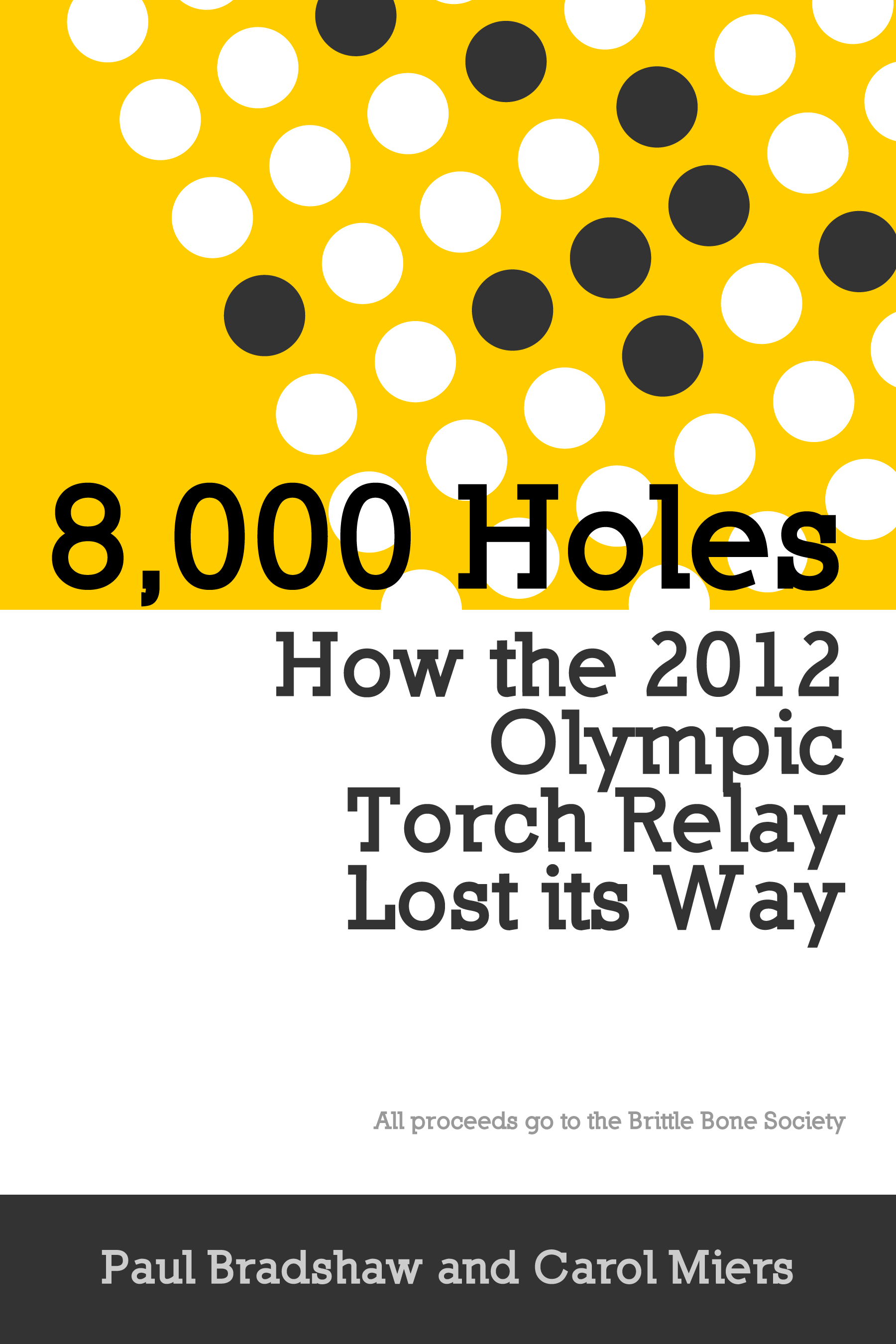
8,000 Holes: How the 2012 Olympic Torch Relay Lost its Way was published on day 66 of the 70-day Olympic torch relay. All proceeds went to the Brittle Bone Society, of which Jack is an ambassador. The publishers – Leanpub – agreed to give their commission on the book to the charity as well. This was all organised over email in 24 hours a couple days before the book went live.

We organised an interview with Jack Binstead which was published in The Guardian the day after – the day that the torch was to go through his home town and the day that he would be flying out of the country to avoid it. An interview with Journalism.co.uk on the ebook itself – Help Me Investigate’s first – was published the same day.

We published data on where torchbearer places went in The Guardian’s datablog two days after that, and serialised the book throughout the week, along with some additional pieces – for example, on how LOCOG missed their target of 50% of places going to young people by other 1,000 places. A lengthier interview with Jack and his mother was published at the end of the week.

In theory this should have captured interest in the torch relay at just the right time – but I think we misjudged two factors.

The first was beyond our control: the weather changed.

Until now, the weather had been awful. When it changed, the mood of the country changed, and there was less interest in the missed promises of the Olympic torch relay. But it also coincided with another change: the final week of the torch relay was also the last few days before the opening ceremony – and as the weather changed, attention shifted to the Olympic Games itself.

The torch relay, which had been squeezed dry of every possible angle for nine weeks, was – finally – yesterday’s news. It was no longer about who was carrying the torch, but about where that torch was going, and who might carry the last one.

Still, the book raised money for a deserving charity, and its story is not over. There’s a long tail of interest to tap into here, which having an ebook increases. When the next torch relay comes around, I wonder, will it benefit from a resurgence of interest?

Get the free ebook for the full story: 8,000 Holes: How the 2012 Olympic Torch Relay Lost its Way - Leanpub.com/8000holes

A case study in online journalism part 3: ebooks (investigating the Olympic torch relay)

8000 Holes - book cover

In part one I outlined some of the data journalism processes involved in the Olympic torch relay investigation, in part 2 I explained how verification, SEO and ‘passive aggressive newsgathering’ played a role. This final part looks at how ebooks offered a new opportunity to tell the story in depth – and publish while the story was still topical.

Ebooks – publishing before the event has even finished

After a number of stories from a variety of angles I reached a fork in the road. It felt like we had been looking at this story from every angle. More than one editor, when presented with an update, said that they’d already ‘done the torch story’. I would have done the same.

But I thought of a quote on persistence from Ian Hislop that I’d published on the Help Me Investigate blog previously. “It is saying the same true thing again and again and again and again until the penny drops.”

Although it sometimes felt like we might be boring people with our insistence on continuing to dig we needed, I felt, to say the same thing again. Not the story of ‘Executive carries the torch’ but how that executive and so many others came to carry it, why that mattered, and what the impact was. A longform report. Continue reading

London Olympics 2012 Medal Tables At A Glance?

Looking at the various medal standings for medals awarded during any Olympics games is all very well, but it doesn’t really show where each country won its medals or whether particular sports are dominated by a single country. Ranked as they are by the number of gold medals won, the medal standings don’t make it easy to see what we might term “strength in depth” – that is, we don’t get an sense of how the rankings might change if other medal colours were taken into account in some way.

Four years ago, in a quick round up of visualisations from the 2008 Beijing Olympics (More Olympics Medal Table Visualisations) I posted an example of an IBM Many Eyes Treemap visualisation I’d created showing how medals had been awarded across the top 10 medal winning countries. (Quite by chance, a couple of days ago I noticed one of the visualisations I’d created had appeared as an example in an academic paper – A Magic Treemap Cube for Visualizing
Olympic Games Data
).

Although not that widely used, I personally find treemaps a wonderful device for providing a macroscopic overview of a dataset. Whilst getting actual values out of them may be hit and miss, they can be used to provide a quick orientation around a hierarchically ordered dataset. Yes, it may be hard to distinguish detail, but you can easily get your eye in and start framing more detailed questions to ask of the data.

Whilst there is still a lot more thinking I’d like to do around the use of treemaps for visualising Olympics medal data using treemaps, here are a handful of quick sketches constructed using Google visualisation chart treemap components, and data scraped from NBC.

The data I have scraped is represented using rows of the form:

Country, Event, Gold, Silver, Bronze

where Event is at the level of “Swimming”, “Cycling” etc rather than at finer levels of detail (it’s really hard finding data at even this level of data in an easily grabbable way?)

I’ve then treated the data as hierarchically structured over three levels, which can be arranged in six ways:

  • MedalType, Country, Event
  • MedalType, Event, Country
  • Event, MedalType, Country
  • Event, Country, MedalType
  • Country, MedalType, Event
  • Country, Event, MedalType

Each ordering provides a different view over the data, and can be used to get a feel for different stories that are to be told.

First up, ordered by Medal, Country, Event:

This is a representation, of sorts, of the traditional medal standings table. If you look to the Gold segment, you can see the top few countries by medal count. We can also zoom in to see what events those medals tended to be awarded in:

The colouring is a bit off – the Google components is not as directly scriptable as a d3js treemap, for example – but with a bit of experimentation it may be able to find a colour scheme that better indicates the number of medals allocated in each case.

The Medal-Country-Event view thus allows us to get a feel for the overall medal standings. But how about the extent to which one country or another dominated an event? In this case, an Event-Country-Medal view gives us a feeling for strength in depth (ie we’re happy to take a point of view based on the the award of any medal type:

The Country-Event-Medal view gives us a view of the relative strength in depth of each country in each event:

and the Country Medal Event view allows us to then tunnel in on the gold winning events:

I think that colour could be used to make these charts even more accessible – maybe using different colouring schemes for the different variations – which is something I need to start thinking about (please feel free to make suggestions in the comments:-). It would also be good to have a little more control over the text that is displayed. The Google chart component is a little limited in this respect, so I think I need to find an alternative for more involved play – d3js seems like it’d be a good bet, although I need to do a quick review of R based treemap libraries too to see if there is anything there that may be appropriate.

It’d probably also be worth jotting down a few notes about what each of the six hierarchical variants might be good for highlighting, as well as exploring just as quick doodles with the Google chart component simpler treemaps that don’t reveal lower level structure, leaving that to be discovered through interactivity. (I showed the lower levels in the above treemaps because I was exploring static (i.e. printable) macroscopic views over the medal standings data.)

Data allowing, it would also be interesting to be able to get more detailed data visualised (for example, down to the level of actual events- 100m and Long Jump, for example, rather than Tack and Field, as well as the names of individual medalists.

PS for another Olympics related visualisation I’ve started exploring, see At A Glance View of the 2012 Olympics Heptathlon Performances

PPS As mentioned at the start, I love treemaps. See for example this initial demo of an F1 Championship points treemap in Many Eyes and as an Ergast Motor Sport API powered ‘live’ visualisation using a Google treemap chart component: A Treemap View of the F1 2011 Drivers and Constructors Championship