Category Archives: data journalism

Telegraph plans to expand MPs database site in build up to election (Q&A)

I asked Tim Rowell, Digital Publisher at Telegraph.co.uk 3 questions about how they dealt with the MPs expenses story online. The main headline is that the new domain hosting the expenses database – parliament.telegraph.co.uk -will expand in the run-up to the next election along with the MP expenses database itself.

There are also curious “legal reasons” given for disabling the embed/email option on the PDFs. I’m pushing on that because I don’t see how publication on your site is different from allowing someone to embed it on their own, or email it. If you have any insight on that, let me know. [See response below]

Here are the responses in full:

When the team was going through the expenses and reporting, how was this longer term online strategy incorporated?

From day one, it was agreed that we would work towards the publication of an online database that contained not only the files themselves but also an aggregation of publicly available data (Parliament Parser, They Work for You, Register of Members Interests etc.) with our own unique data analysis.

The publication by Parliament last week of the redacted files has provided a glimpse into the scale of operation required to analyse such a volume of documentation but one has to realise that the full files contain many, many more pages.

The launch yesterday of the database is the first phase. We will, in due course, publish the full uncensored files for all 646 MPs. Crucially, the expenses investigative team of reporters spent a week aggregating and processing the data (the unique 2007/8 analysis of the Additional Costs Allowance) themselves. Integration in action again! The end result of that work is the first accurate breakdown of those ACA figures. We soon realised that this data provided a great basis upon which to build the Complete Expenses Files supplement in last Saturday’s newspaper.

Why Issuu? And why is the ’email/embed’ option disabled for “secret documents”?

“Secret documents’ is not our term, it is Issuu’s. We think Issuu is a great product and that it provides a fantastic user experience and have plans to use it more extensively. But for legal reasons we need to be sure that the document cannot be downloaded. By disabling the download function, Issuu automatically restricts email/embed.

[further to that:]  How is publication on your site different from allowing someone to embed it on their own, or emailing it?

It is a precautionary measure. In the unlikely event that one of the source documents puts at risk the identity of a supplier or the full postcode of an MP we need to be confident that a) we can amend that file immediately and b) that the file has not been distributed more widely. For that reason, we do not want the files to be downloadable. We’d be very happy for other to embed the files in their pages but if you restrict the download option in Issuu you restrict the ability to embed.

Am I right in thinking the pages on each MP are static and so indexable by search engines, even though they’re generated from a database?

Yes. You may also notice that it is on a new domain parliament.telegraph.co.uk. We will be enhancing our political resources over the coming months as we build up to the General Election. This application is not just for the Expenses files, we have plans to develop this area into a full service that enables our users to engage more closely with the democratic process.

MPs expenses data: now it’s The Telegraph’s turn

The Telegraph have finally published their MPs’ expenses data online – and it’s worth the wait. Here are some initial thoughts and reactions:

  • Firstly, they’ve made user behaviour an editorial feature. In plain English: they’re showing the most searched-for MPs and constituencies, which is not only potentially interesting in itself, but also makes it easier for the majority of users who are making those searches (i.e. they can access it with a click rather than by typing)
  • There’s also a table for most expensive MPs. As this is going to remain static, it would be good to see a dedicated page with more information – in the same way the paper did in its weekend supplement.
  • The results page for a particular MP has a search engine-friendly URL. Very often, database-generated pages have poor search engine optimisation, partly because the URLs are full of digits and symbols, and partly because they are dynamically generated. This appears to avoid both problems – the URL for the second home allowance of Khalid Mahmood MP, for example, is http://parliament.telegraph.co.uk/mpsexpenses/second-home/Khalid-Mahmood/mp-11087
  • The uncensored expenses files themselves are embedded using Issuu. This seems a strange choice as it doesn’t allow users to tag or comment – and the email/embed option is disabled for “secret documents”
  • There’s some nice subtle animation on the second home part of expenses, and clear visualisation on other parts.
  • The MP Details page is intelligently related both to the Telegraph site (related articles) and the wider web, with the facility to easily email that MP, go to their Wikipedia entry, and ‘bookmark’.
  • Joy of joys, you can also download the MPs expenses spreadsheet from here (on Google Docs) – although this is for all MPs rather than the one being viewed. Curiously, while viewing you can see who else is viewing and even (as I did) attempt to chat (no, they didn’t chat back).

I’ll most likely update this post later as I get some details from behind the curtain.

And there are more general thoughts around the online treatment of expenses generally which I’ll try to blog at another point.

USA Today’s awesome jobs forecast interactive


USA Today interactive - click for larger image

USA Today interactive - click for larger image

Here’s a hugely rich interactive from USA Today which does a number of things very well.

Firstly, it’s an intelligent use of resources: the recession is likely to last for some time, and be the biggest ongoing story of our time. With everyone talking about it, you need something with that ‘wow’ factor, that will not only attract a great deal of attention now, but also a long tail of repeat visits.

Secondly, it’s personalised – not only can you get information on jobs growth in your state, but your particular industry in your state.

Thirdly, it’s dynamic – the graphic promises to be updated each month “with revised data from Moody’s Economy.com.”

There’s one major element missing – interaction. Find a way to capture users’ experiences (value) and you have an extra dimension that really capitalises on all the attention your interactive is getting.

Still, I’m not complaining…

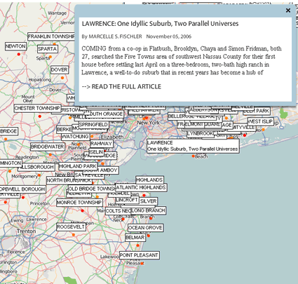
Adding value to the archives: Suburbified.com mashes up NYT real estate articles

Want to know the value of opening up your article databases and APIs? Suburbified is one of the first mashups created using the New York Times’ recently opened API.

suburbified

suburbified

Here’s what it does, according to KillerStartUps: Continue reading

Sport and data – now it’s more than just ‘interactive’

I’ve written previously on the Online Journalism Blog about ‘Why fantasy football may hold the key to the future of news‘. Now it seems The Guardian has taken things up a notch with the wonderful Chalkboard feature: an interactive database-driven toolkit that allows you to create your own ‘chalkboards’ illustrating whatever point you may wish to make about a team or player’s performance. Here’s my first attempt below:

Cute, yes? But more than just cute. This is an idea that takes sports data and makes it more than just ‘interactive’. This makes it communicative

Because you are not just toying with data but creating it to make a point. Once you create a chalkboard it is published to everyone, with space for comments. You can send it, share it or embed it – as I have.

Clearly there are improvements that can be made – starting with searchability/findability from the chalkboard/team page and the odd bug (the description which I entered was not visible on the test I did above, and limiting it to the final 15 minutes does not seem to have worked – you still see all passes).

But really that would be picking holes in what is a beautifully thought-through piece of work – a piece of work that understands if you’re to make news work online it has to be as much a platform as a destination (a platform which in turn opens up plenty of opportunities for monetisation).

The site claims match stats will be available 15 minutes after the full time whistle. Suddenly the calls to local radio to bemoan the manager’s tactics seem one-dimensional. And spending 60 seconds reading the match report is nothing compared to the time that will be spent carefully constructing your argument as to why your star midfielder should not have been sold to that close relegation rival…

Thanks to Alex Lockwood for the tip-off.

The future of investigative journalism: databases and algorithms

There’s a great article over at Miller-McCune on investigative journalism and what you might variously call computer assisted reporting and database journalism. Worth reading in full, the really interesting stuff comes further in, which I’ve quoted below in full:

“Bill Allison, a senior fellow at the Sunlight Foundation and a veteran investigative reporter and editor, summarizes the nonprofit’s aim as “one-click” government transparency, to be achieved by funding online technology that does some of what investigative reporters always have done: gather records and cross-check them against one another, in hopes of finding signs or patterns of problems

“… Before he came to the Sunlight Foundation, Allison says, the notion that computer algorithms could do a significant part of what investigative reporters have always done seemed “far-fetched.” But there’s nothing far-fetched about the use of data-mining techniques in the pursuit of patterns. Law firms already use data “chewers” to parse the thousands of pages of information they get in the discovery phase of legal actions, Allison notes, looking for key phrases and terms and sorting the probative wheat from the chaff and, in the process, “learning” to be smarter in their further searches.

“Now, in the post-Google Age, Allison sees the possibility that computer algorithms can sort through the huge amounts of databased information available on the Internet, providing public interest reporters with sets of potential story leads they otherwise might never have found. The programs could only enhance, not replace, the reporter, who would still have to cultivate the human sources and provide the context and verification needed for quality journalism. But the data-mining programs could make the reporters more efficient — and, perhaps, a less appealing target for media company bean counters looking for someone to lay off. “I think that this is much more a tool to inform reporters,” Allison says, “so they can do their jobs better.”

“… After he fills the endowed chair for the Knight Professor of the Practice of Journalism and Public Policy Studies, [James] Hamilton hopes the new professor can help him grow an academic field that provides generations of new tools for the investigative journalist and public interest-minded citizen. The investigative algorithms could be based in part on a sort of reverse engineering, taking advantage of experience with previous investigative stories and corruption cases and looking for combinations of data that have, in the past, been connected to politicians or institutions that were incompetent or venal. “The whole idea is that we would be doing research and development in a scalable, open-source way,” he says. “We would try to promote tools that journalists and others could use.”

Hat tip to Nick Booth 

Model for the 21st century newsroom pt.6: new journalists for new information flows

new journalists for new information

new journalists for new information

Information is changing. The news industry was born in a time of information scarcity – and any understanding of the laws of supply and demand will tell you that that made information valuable.

But the past 30 years have seen that the erosion of that scarcity. Not only have the barriers to publishing,  broadcast and distribution been lowered by desktop publishing, satellite and digital technologies, and the web – but a booming PR industry has grown up to provide these news organisations with ‘cheap’ news.

Information is changing. Increasingly, we are not seeking information out – instead, it finds us. The scarcity is not in information, but in our time to wade through it, make meaning of it, and act on it.

Information is changing, and so journalists must too. In the previous parts of this series I’ve looked at how the news process could change in a multiplatform environment; how to involve the former audience; what can now happen after a story is published; journalists and readers as distributors; and new media business models. In this part I want to look at personnel – and how we might move from a generic, hierarchy of ‘reporters’, ‘subs’ and ‘editors’ to a more horizontal structure of roles based on information types. Continue reading

US election coverage – who’s making the most of the web?

Elections bring out the best in online journalism. News organisations have plenty of time to plan, there’s a global audience up for grabs, and the material lends itself to interactive treatment (voter opinions; candidates’ stances on various issues; statistics and databases; constant updates; personalisation).

Not only that, but the electorate is using the internet for election news more than any other medium apart from television (and here are some reasons why).

PaidContent has a good roundup of various UK editors’ views, and decides blogs, Twitter and data are the themes (more specifically, liveblogging and mapping). Continue reading

Elections08: Storytelling with public databases

Written by Wilbert Baan

Today is the day of the US elections. I don’t think we ever had a live event on the web that will get so much live coverage. This means incredible amounts of information will be published over all kind of services and social networks. Websites like Facebook, Twitter, Flickr, WordPress, Blogger and many more.

Most popular web services have programmable interfaces. These interfaces allow developers to extract information out of the system. This creates a whole new genre of storytelling: storytelling with public databases. You can aggregate the information you need and sort it the way you want.

To prove the concept I made three small mock-ups. They all use search.twitter.com to see how people voted.

When I made the first the first animation Erik Borra replied by developing the idea into something that stores the data retrieved from Twitter in a database. I made a new interface that shows a graph based on what people say they voted on Twitter. And the result is a Twitter Poll.

These three examples are not representative data, it is extracted from Twitter. But it shows you how much personal and valuable information is in the public database. All you have to do is ask yourself what you want to tell to your readers and if this information is available.

I voted

This animation gets the latest twitter message where someone says they voted on McCain or Obama. It automatically refreshes. Continue reading

Why fantasy football may hold the key to the future of news

This season, after years of loyalty to the BBC/Channel 4 fantasy football competition, I’ve switched to The Guardian’s. Their game takes advantage of the reams of player data now available to newspapers – not just goals scored, clean sheets and assists, but also clearances, interceptions, tackles, shots on target, and so on, making for a very different challenge indeed.

The move mirrors that made by The Telegraph a year ago when they introduced a Flash element to their match reports that allowed you to look at an incredible range of match statistics. As I wrote at the time: it’s like having your own ProZone.

What’s all this got to do with the future of news? This: data. It’s one of the few advantages that news organisations have, and they should be doing more with it. What the Guardian fantasy football and the Telegraph demonstrate is the flexibility of that data.

And if we can do it in sport, why aren’t we doing it more elsewhere? Schools tables, pollution records, crime data, geotagged information, and election results are just a few that spring to mind – can you add some more?

For a good example of a particularly creative use of data (again with a sport twist), see Channel 4’s alternative Olympics medals table, which matches medals results against various other country stats, such as human rights record.

Oh, and by the way, if you want to join my fantasy football friends’ league, search for Game 39 – or just post a comment below…

More database-related posts