Category Archives: data journalism

How to investigate companies: recommendations from Graham Barrow

Graham Barrow

Graham Barrow has worked to prevent money laundering and fraud for decades — in recent years working with journalists to investigate companies. In a guest post he shares his tips with Tony Jarne on what you can do when you are following the money.

Many times, as journalists, we need to investigate businesses to tell our stories. You need to track companies to know how Russia is avoiding the sanctions and who allegedly profited from PPE contracts during the pandemic.

But, how do we begin, and what are the details we need to look out for? To navigate the company’s world, Graham gives some advice when you are tracking the money.

Start with Companies House

Companies House is where all the businesses based in the UK need to be registered. It is fully transparent, open, and free. Check the basics of a company: who are the directors? Does the company have real activity? A website? If a company does not have a website, it is a red flag.  

Continue reading

VIDEO: How automation played a central role in data journalism — and is now playing it again

Automation was key to the work of data journalism pioneers such as Adrian Holovaty — and it’s becoming increasingly central once again. This video, made for students on the MA in Data Journalism at Birmingham City University, explores the variety of roles that automation plays in data journalism; new concepts such as robot journalism, natural language generation (NLG) and structured journalism; and how data journalists’ editorial role becomes “delegated to the future” through the creation of algorithms.

You can find the video about Poligraft, and the FT on robot journalism at those links.

This video is shared as part of a series of video posts.

The third edition of the Online Journalism Handbook is now out!

The online journalism handbook: skills to survive and thrive in the digital age, by Paul Bradshaw

A new, third, edition of the Online Journalism Handbook is now out.

A comprehensive update to the 2017 second edition, it sees the addition of a new chapter on writing for email and chat.

There are new sections on formats from scrollytelling and charticles to threads, vertical Stories, social audio and audiograms, plus advice on how to use gifs, memes and emoji professionally as a journalist.

One notable development of the last few years reflected in the book is the improvement in accessibility provision — which is covered alongside techniques for better inclusivity and diversity in journalism practice.

Developments around harassment and online abuse, misinformation, news avoidance, and trust are all covered — and, of course, the impact of the pandemic on journalistic practices, including remote interviewing tips.

I’ll be publishing extracts and the material I had to leave out (it’s 20,000 words longer than the last edition) in the coming months.

The Inverted Pyramid of Data Journalism in Finnish (Datajournalismin käänteinen pyramidi)

I was recently invited to speak to students at Tampere University in Finland, and had the opportunity — with the help of Esa Sirkkunen — to translate the ‘Inverted pyramid of data journalism‘ into Finnish. I’m sharing it here for anyone else who might find it useful.

Datajournalismin käänteinen pyramidi
Ideoi
Kokoa
Siisti
Taustoita 
Yhdistä
Kysymys
Kommunikoi

What is dirty data and how do I clean it? A great big guide for data journalists

Image: George Hodan

If you’re working with data as a journalist it won’t be long before you come across the phrases “dirty data” or “cleaning data“. The phrases cover a wide range of problems, and a variety of techniques for tackling them, so in this post I’m going to break down exactly what it is that makes data “dirty”, and the different cleaning strategies that a journalist might adopt in tackling them.

Four categories of dirty data problem

Look around for definitions of dirty data and the same three words will crop up: inaccurate, incomplete, or inconsistent.

Dirty data problems:
Inaccurate: Data stored as wrong type; Misentered data; Duplicate data; abbreviation and symbols.
Incomplete: Uncategorised; missing data.
Inconsistent: Inconsistency in naming of entities; mixed data
Incompatible data:  Wrong shape;
‘Dirty’ characters (e.g. unescaped HTML)

Inaccurate data includes duplicate or misentered information, or data which is stored as the wrong data type.

Incomplete data might only cover particular periods of time, specific areas, or categories — or be lacking categorisation entirely.

Inconsistent data might name the same entities in different ways or mix different types of data together.

To those three common terms I would also add a fourth: data that is simply incompatible with the questions or visualisation that we want to perform with it. One of the most common cleaning tasks in data journalism, for example, is ‘reshaping‘ data from long to wide, or vice versa, so that we can aggregate or filter along particular dimensions. (More on this later).

Continue reading

Angles for data stories — in Finnish (yleistä näkökulmaa datatarinoihin)

I recently had the opportunity — thanks to Esa Sirkkunen of Tampere University — to translate the diagram from ‘8 angles that journalists use most often to tell data stories‘ into Finnish. I’m sharing it here for anyone else who might find it useful.

 8 yleistä näkökulmaa datatarinoihin
Mittakaava
Muutos
Sijoitus
Variaatio
Tutkia
Suhteet
 Puuttuva/huono
Johtaa

VIDEO PLAYLIST: An introduction to Python for data journalism and scraping

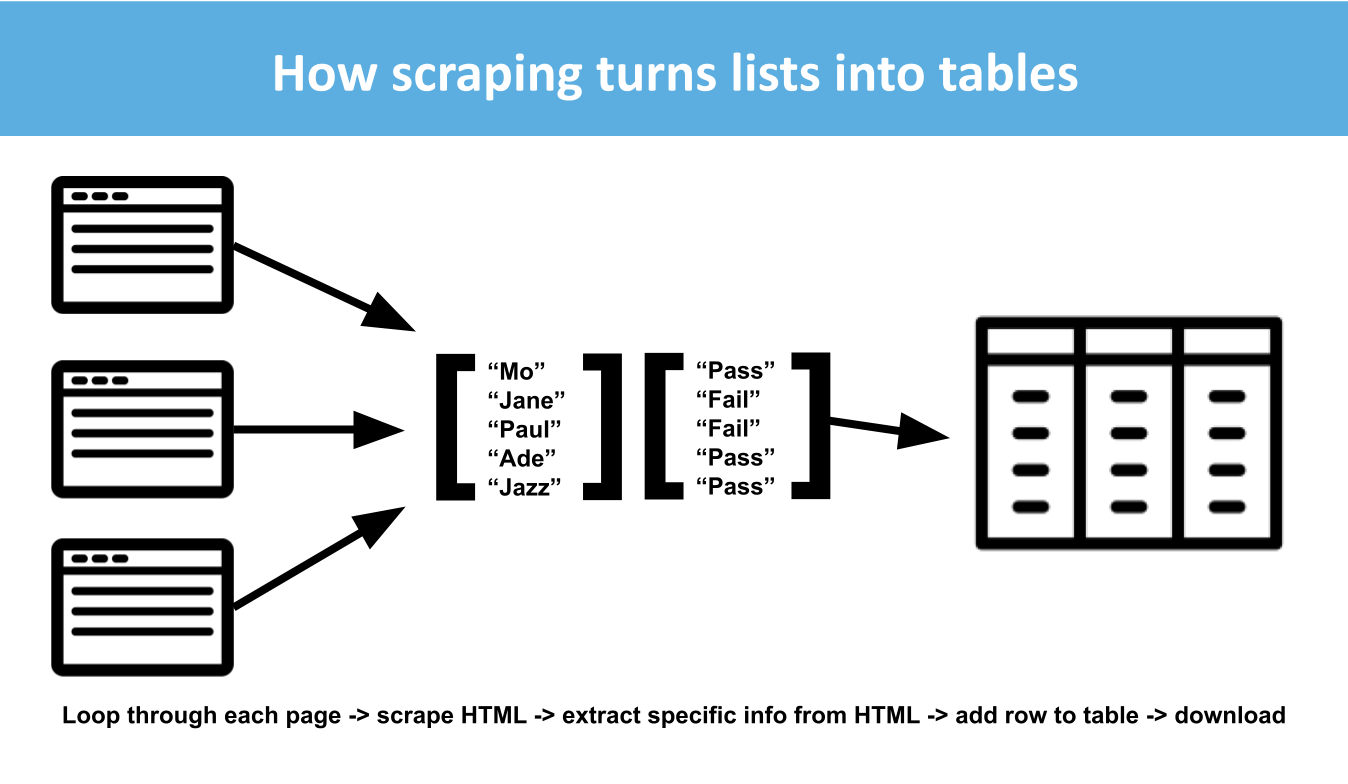
Python is an extremely powerful language for journalists who want to scrape information from online sources. This series of videos, made for students on the MA in Data Journalism at Birmingham City University, explains some core concepts to get started in Python, how to use Colab notebooks within Google Drive, and introduces some code to get started with scraping.

Continue reading

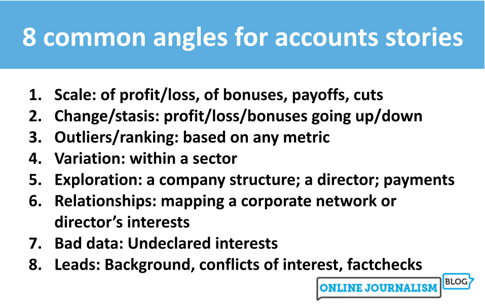
Here’s how the ‘8 data story angles’ can help you get stories from company accounts

8 common angles for accounts stories
Scale: of profit/loss, of bonuses, payoffs, cuts
Change/stasis: profit/loss/bonuses going up/down
Outliers/ranking: based on any metric
Variation: within a sector
Exploration: a company structure; a director; payments
Relationships: mapping a corporate network or director’s interests
Bad data: Undeclared interests
Leads: Background, conflicts of interest, factchecks

A couple of years ago I mapped out eight common angles for identifying stories in data. It turns out that the same framework is useful for finding stories in company accounts, too — but not only that: the angles also map neatly onto three broad techniques.

In this post I’ll go through each of the three techniques — looking at cash flow statements; compiling data from multiple accounts; and tracing people and connections — and explain how they can be used to get stories, with examples of articles that have used those techniques successfully.

We start, naturally, with the money…

Continue reading

9 способов найти историю в финансовых отчётах компаний

Моя статья на русском здесь.

This is a masterclass in writing a story about company directors’ pay — so I reverse-engineered it

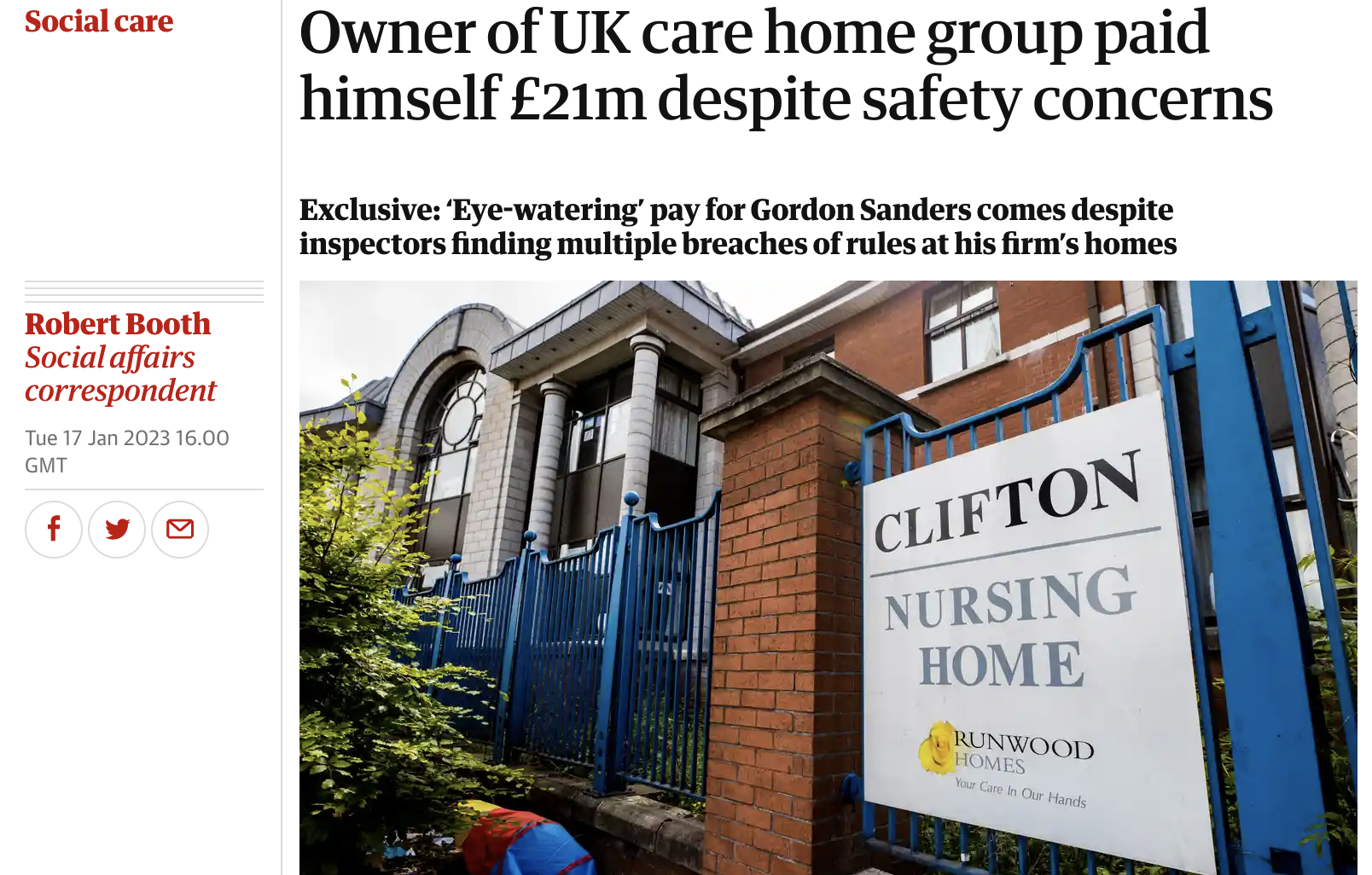
Owner of UK care home group paid himself £21m despite safety concerns

Company directors’ pay regularly provides material for stories — and this front page story by The Guardian’s Robert Booth was such a masterclass in the genre (as well as other open source intelligence techniques) that I decided to reverse-engineer it for a Twitter thread.

I’ve embedded the thread below, or you can read it on Threadreader here.

Using company accounts in journalism

You can find other posts about using company accounts at the following links: