Category Archives: computer aided reporting

FAQ: How has journalism been transformed?

In the latest FAQ, I’m publishing here answers to some questions from a Turkish PR company (published on LinkedIn here)…

Q: In your view, what has been the most significant transformation in digital journalism in recent years? 

There have been so many major transformations in the last 15 years. Mobile phones in particular have radically transformed both production and consumption — but having been through all those changes, AI feels like a biggest transformation than all the changes that we’ve already been through. 

It’s not just playing a role in transforming the way we produce stories, it’s also involved in major changes around what happens with those stories in terms of how they are distributed, consumed, and even how they are perceived: the rise of AI slop and AI-facilitated misinformation is going to radically accelerate the lack of trust in information (not just the media specifically). I’m being careful to say ‘playing a role’ because of course the technology itself doesn’t do anything: it’s how that technology is designed by people and used by people. 

Continue reading

Visualisation as an editorial process

In the second part of this extract from a book chapter in the new Routledge Companion to Visual Journalism, I look at the editorial processes involved in data visualisation, along with the ethical considerations and challenges encountered along the way.

Decisions around what data to visualise and how to visualise it involve a range of ethical considerations and challenges, and it is important to emphasise that data visualisation is an editorial process just as much as any other form of factual storytelling.

Journalists and designers employ a range of rhetorical devices to engage an audience and communicate their story, from the choice of the chart and its default views or comparisons, to the use of colour, text and font, and animations and search suggestions (Segel and Heer 2011; Hullman & Diakopoulos 2011).

Chart types are story genres

The chart that a journalist chooses to visualise data plays a key role in suggesting the type of story that is being told, and what the user might do with the data being displayed.

If a pie chart is chosen then this implies that the story is about composition (parts of a whole). In contrast, if a bar chart is used then the story is likely to be about comparison.

Line charts imply that the reader is being invited to see something changing over time, while histograms (where bars are plotted along a continuum, rather than ranked in order of size) invite us to see how something is distributed across a given scale.

Scatterplots — which plot points against two values (such as the cancer rate in each city against the same city’s air pollution) — invite us to see relationships.

Continue reading

Data, data visualization and interactives within news

In this extract from a book chapter in the new Routledge Companion to Visual Journalism, I look at how the explosion of data as a source for journalists, and the separation of content from interface in online publishing, have combined to lay the foundations for a range of new storytelling forms, from interactive infographics and timelines to charticles and scrollytelling.

Although the term ‘data journalism’ is a relatively recent one, popularised around 2010, data has been part of journalism throughout its history, from early newsletters covering stock prices and shipping schedules in the 17th century, to The Guardian’s 1821 first edition front page table of school spending, US investigations of politicians’ travel expenses in the 1840s and campaigning factchecking of lynching in the 1890s.

The introduction of computers into the newsroom in the 20th century added a new dimension to the practice. After some early experimentation by CBS News in predicting the outcome of the 1952 presidential election by applying computer power to data, a major breakthrough came in the 1960s with Philip Meyer’s use of databases and social science methods to investigate the causes of riots in Detroit.

Continue reading

How to ask AI to perform data analysis

Consider the model: Some models are better for analysis — check it has run code

Name specific columns and functions: Be explicit to avoid ‘guesses’ based on your most probably meaning

Design answers that include context: Ask for a top/bottom 10 instead of just one answer

'Ground' the analysis with other docs: Methodologies, data dictionaries, and other context

Map out a method using CoT: Outline the steps needed to be taken to reduce risk

Use prompt design techniques to avoid gullibility and other risks: N-shot prompting (examples), role prompting, negative prompting and meta prompting can all reduce risk

Anticipate conversation limits: Regularly ask for summaries you can carry into a new conversation

Export data to check: Download analysed data to check against the original

Ask to be challenged: Use adversarial prompting to identify potential blind spots or assumptions

In a previous post I explored how AI performed on data analysis tasks — and the importance of understanding the code that it used to do so. If you do understand code, here are some tips for using large language models (LLMs) for analysis — and addressing the risks of doing so.

Continue reading

I tested AI tools on data analysis — here’s how they did (and what to look out for)

Mug with 'Data or it didn't happen' on it
Photo: Jakub T. Jankiewicz | CC BY-SA 2.0

TL;DR: If you understand code, or would like to understand code, genAI tools can be a useful tool for data analysis — but results depend heavily on the context you provide, and the likelihood of flawed calculations mean code needs checking. If you don’t understand code (and don’t want to) — don’t do data analysis with AI.

ChatGPT used to be notoriously bad at maths. Then it got worse at maths. And the recent launch of its newest model, GPT-5, showed that it’s still bad at maths. So when it comes to using AI for data analysis, it’s going to mess up, right?

Well, it turns out that the answer isn’t that simple. And the reason why it’s not simple is important to explain up front.

Generative AI tools like ChatGPT are not calculators. They use language models to predict a sequence of words based on examples from its training data.

But over the last two years AI platforms have added the ability to generate and run code (mainly Python) in response to a question. This means that, for some questions, they will try to predict the code that a human would probably write to solve your question — and then run that code.

When it comes to data analysis, this has two major implications:

  1. Responses to data analysis questions are often (but not always) the result of calculations, rather than a predicted sequence of words. The algorithm generates code, runs that code to calculate a result, then incorporates that result into a sentence.
  2. Because we can see the code that performed the calculations, it is possible to check how those results were arrived at.
Continue reading

Die umgekehrte Pyramide des Datenjournalismus: Vom Datensatz zur Story

Die umgekehrte Pyramide des Datenjournalismus
Ideen entwickeln
Daten sammeln
Reinigen
Kontextualisieren
Kombinieren
Fragen
Kommunizieren

Datenjournalistische Projekte lassen sich in einzelne Schritte aufteilen – jeder einzelne Schritt bringt eigene Herausforderungen. Um dir zu helfen, habe ich die “Umgekehrte Pyramide des Datenjournalismusentwickelt. Sie zeigt, wie du aus einer Idee eine fokussierte Datengeschichte machst. Ich erkläre dir Schritt für Schritt, worauf du achten solltest, und gebe dir Tipps, wie du typische Stolpersteine vermeiden kannst.

(Auch auf Englisch, Spanisch, Finnisch, Russisch and Ukrainisch verfügbar.)

Continue reading

9 takeaways from the Data Journalism UK conference

Attendees in a lecture theatre with 'data and investigative journalism conference 2025 BBC Shared Data Unit' on the screen.

Last month the BBC’s Shared Data Unit held its annual Data and Investigative Journalism UK conference at the home of my MA in Data Journalism, Birmingham City University. Here are some of the highlights…

Continue reading

How do I get data if my country doesn’t publish any?

Spotlight photo by Paul Green on Unsplash

In many countries public data is limited, and access to data is either restricted, or information provided by the authorities is not credible. So how do you obtain data for a story? Here are some techniques used by reporters around the world.

Continue reading

Making video and audio interviews searchable: how Pinpoint helped with one investigation

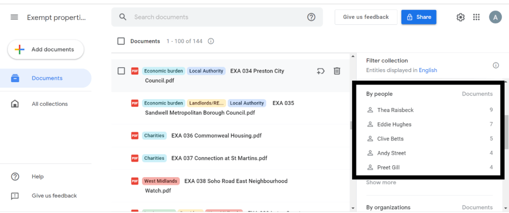
Pinpoint creates a ranking of people, organisations, and locations with the number of times they are mentioned on your uploaded documents.

MA Data Journalism student Tony Jarne spent eight months investigating exempt accommodation, collecting hundreds of documents, audio and video recordings along the way. To manage all this information, he turned to Google’s free tool Pinpoint. In a special guest post for OJB, he explains how it should be an essential part of any journalist’s toolkit.

The use of exempt accommodation — a type of housing for vulnerable people — has rocketed in recent years.

At the end of December, a select committee was set up in Parliament to look into the issue. The select committee opened a deadline, and anyone who wished to do so could submit written evidence.

Organisations, local authorities and citizens submitted more than 125 pieces of written evidence to be taken into account by the committee. Some are only one page — others are 25 pages long.

In addition to the written evidence, I had various reports, news articles, Land Registry titles an company accounts downloaded from Companies House.

I needed a tool to organise all the documentation. I needed Pinpoint

Continue reading

Investigating the World Cup: tips on making FOIA requests to create a data-driven news story

Image by Ambernectar 13

Beatriz Farrugia used Brazil’s freedom of information laws to investigate the country’s hosting of the World Cup. In a special guest post for OJB, the Brazilian journalist and former MA Data Journalism student passes on some of her tips for using FOIA.

I am from Brazil, a country well-known for football and FIFA World Cup titles — and the host of the World Cup in 2014. Being a sceptical journalist, in 2019 I tried to discover the real impacts of that 2014 World Cup on the 213 million residents of Brazil: tracking the 121 infrastructure projects that the Brazilian government carried out for the competition and which were considered the “major social legacy” of the tournament.  

In 2018 the Brazilian government had taken the website and official database on the 2014 FIFA World Cup infrastructure projects offline — so I had to make Freedom of Information (FOIA) requests to get data.

The investigation took 3 months and more than 230 FOIA requests to 33 different public bodies in Brazil. On August 23, my story was published.

Here is everything that I have learned from making those hundreds of FOIA requests:

Continue reading