Category Archives: data journalism

6 ways of communicating data journalism (The inverted pyramid of data journalism part 2)

UPDATE: A new version of the inverted pyramid, with new stages and resources for each, is now available.

Last week I published an inverted pyramid of data journalism which attempted to map processes from initial compilation of data through cleaning, contextualising, and combining that. The final stage – communication – needed a post of its own, so here it is.

UPDATE: Now in Spanish too.

Below is a diagram illustrating 6 different types of communication in data journalism. (I may have overlooked others, so please let me know if that’s the case.)

Communicate: visualised, narrate, socialise, humanise, personalise, utilise

Modern data journalism has grown up alongside an enormous growth in visualisation, and this can sometimes lead us to overlook different ways of telling stories involving big numbers. The intention of the following is to act as a primer for ensuring all options are considered.
Continue reading

The inverted pyramid of data journalism – in Spanish

Barely 7 hours after I published yesterday’s ‘Inverted pyramid of data journalism‘, it had been translated into Spanish – by the wonderful Mauro Accurso. The post is copied in full below.

Ya hace un tiempo traduje todo el Modelo para la redacción del siglo XXI cuya parte principal es el Diamante de noticias en contraposición a la clásica pirámide invertida que enseñan en cualquier facultad de periodismo (luego vimos el ciclo de vida de las noticias digitales: el diamante de noticias reimaginado y otra vez eldiamante de noticias reinterpretado).

Pero ahora una vez más Paul Bradshaw nos trae un diagrama interesante para, en este caso, explicar el proceso de creación del periodismo de datos. Esta pirámide invertida del periodismo de datos muestra de forma simple como se avanza desde una gran cantidad de información que incrementalmente se va enfocando hasta llegar al punto de comunicar los resultados a la audiencia de la forma más clara posible. A continuación, la traducción del artículo donde podemos ver lasdiferentes etapas del proceso de data journalism: Continue reading

Cleaning data using Google Refine: a quick guide

I’ve been focusing so much on blogging the bells and whistles stuff that Google Refine does that I’ve never actually written about its most simple function: cleaning data. So, here’s what it does and how to do it:

  1. Download and install Google Refine if you haven’t already done so. It’s free.
  2. Run it – it uses your default browser.
  3. In the ‘Create a new project’ window click on ‘Choose file‘ and find a spreadsheet you’re working with. If you need a sample dataset with typical ‘dirty data’ problems I’ve created one you can download here.
  4. Give it a project name and click ‘Create project‘. The spreadsheet should now open in Google Refine in the browser.
  5. At the top of each column you’ll see a downward-pointing triangle/arrow. Click on this and a drop-down menu opens with options including Facet; Text filter; Edit cells; and so on.
  6. Click on Edit cells and a further menu appears.
  7. The second option on this menu is Common transforms. Click on this and a final menu appears (see image below).

You’ll see there are a range of useful functions here to clean up your data and make sure it is consistent. Here’s why:

Trim leading and trailing whitespace

Sometimes in the process of entering data, people put a space before or after a name. You won’t be able to see it, but when it comes to counting how many times something is mentioned, or combining two sets of data, you will hit problems, because as far as a computer or spreadsheet is concerned, ” Jones” is different to “Jones”.

Clicking this option will remove those white spaces.

Collapse consecutive whitespace

Likewise, sometimes a double space will be used instead of a single space – accidentally or through habit, leading to more inconsistent data. This command solves that problem.

Unescape HTML entities

At some point in the process of being collected or published, HTML may be added to data. Typically this represents punctuation of some sort. “"” for example, is the HTML code for quotation marks. (List of this and others here).

This command will convert that cumbersome code into the characters they actually represent.

To titlecase/To uppercase/To lowercase

Another common problem with data is inconsistent formatting – occasionally someone will LEAVE THE CAPS LOCK ON or forget to capitalise a name.

This converts all cells in that column to be consistently formatted, one way or another.

To number/To date/To text

Like the almost-invisible spaces in data entry, sometimes a piece of data can look to you like a number, but actually be formatted as text. And like the invisible spaces, this becomes problematic when you are trying to combine, match up, or make calculations on different datasets.

This command solves that by ensuring that all entries in a particular column are formatted the same way.

Now, I’ve not used that command much and would be a bit careful – especially with dates, where UK and US formatting is different, for example. If  you’ve had experiences or tips on those lines let me know.

Other transforms

In addition to the commands listed above under ‘common transforms’ there are others on the ‘Edit cells’ menu that are also useful for cleaning data:

Split / Join multi-valued cells…

These are useful for getting names and addresses into a format consistent with other data – for example if you want to split an address into street name, city, postcode; or join a surname and forename into a full name.

Cluster and edit…

A particularly powerful cleaning function in Google Refine, this looks at your column data and suggests ‘clusters’ where entries are similar. You can then ask it to change those similar entries so that they have the same value.

There is more than one algorithm (shown in 2 drop-down menus: Method and Keying function) used to cluster – try each one in turn, as some pick up clusters that others miss.

If you have any other tips on cleaning data with Google Refine, please add them.

Can we go beyond ‘Share on Facebook’?

ProPublica have created a rather wonderful news app around education data. As Nieman reports:

“The app invites both macro and micro analysis, with an implicit focus on personal relevance: You can parse the data by state, or you can drill down to individual schools and districts — the high school you went to, or the one that’s in your neighborhood. And then, even more intriguingly, you can compare schools according to geographical proximity and/or the relative wealth and poverty of their student bodies.”

This is exactly what data journalism is great at.

What’s more, the Nieman article talks breathlessly about ProPublica aiming to make data “more social”. What they describe is basically an embedded ‘Share this’ text box (admittedly nicely seamless) and a hashtag. But the news app page actually has a lot more to it: for example, once you’ve given it permission to access your Facebook account, it tells you how many friends have used the app, and appears to try to connect you to schools in your profile. This is how that’s presented on the homepage:

This came as a refreshing relief, because the ‘share this’ strategy reminds me of organisations who say their social media strategy is to ‘get everyone on Twitter’.

Still, it made me think of the range of challenges that Facebook and other social media platforms present. For example, if you land on one of the comparison pages, the offering isn’t so compelling: the reason to install the Facebook app is just “Share this”.

As I’ve written before, technology is a tool, not a strategy, so here are some other opportunities that might be explored:

  1. Publish your school’s scores to Facebook graphically, not just the generic link. Images work particularly well in news feeds, and would be much better than the dry list of names that is generated by the ‘Share this’ button.
  2. Turn conventional news values on their head: be positive. This is a curious one: positive headlines seem to get shared more on social media, so could users celebrate their school’s ratings as much as bemoan them? Could they generate a virtual report card with a ‘Try harder!’ line? Imagine a Facebook editor who asks “Where can we put the exclamation mark?” Yes, I know, it makes me feel uncomfortable too – but I also hear Yoda’s voice saying “You must unlearn what you have learned…”
  3. Build on where they’ve come from: if a friend has used the app to send them to a comparison page, can you build on that in the way you invite the user to connect through Facebook? Could they add something to what the friend has done, and correspond back and forth?
  4. A Facebook-based quiz which sees how well you guess where your school rates on different scales. Perhaps you could compete against your current or former classmates…
  5. A campaigning tool that would allow people to use data on their local school to petition for more support –
  6. Or a collaboration tool to help parents and students raise money, or organise provision.

Competition, fun, campaigning, conversation, collaborating – those are genuinely social applications of technology. It would be interesting to start a discussion about what else might suit a news app’s integration with Facebook. Any ideas?

Why the “Cost to the economy” of strike action could be misleading

It’s become a modern catchphrase. When planes are grounded, when cars crash, when computers are hacked, and when the earth shakes. There is, it seems, always a “cost to the economy”.

Today, with a mass strike over pensions in the UK, the cliche is brought forth again:

“The Treasury could save £30m from the pay forfeited by the striking teachers today but business leaders warned that this was hugely outbalanced by the wider cost to the economy of hundreds of thousands of parents having to take the day off.

“The British Chambers of Commerce said disruption will lead to many parents having to take the day off work to look after their children, losing them pay and hitting productivity.”

Statements like these (by David Frost, the director general, it turns out) pass unquestioned (also here, here and elsewhere), but in this case (and I wonder how many others), I think a little statistical literacy is needed.

Beyond the churnalism of ‘he said-she said’ reporting, when costs and figures are mentioned journalists should be asking to see the evidence.

Here’s the thing. In reality, most parents will have taken annual leave today to look after their children. That’s annual leave that they would have taken anyway, so is it really costing the economy any more to take that leave on this day in particular? And specifically, enough to “hugely outbalance” £30m?

Stretching credulity further is the reference to parents losing pay. All UK workers have a statutory right to 5.6 weeks of annual leave paid at their normal rate of pay. If they’ve used all that up halfway into the year (or 3 months into the financial year) – before the start of the school holidays no less – and have to take unpaid leave, then they’re stupid enough to be a cost to the economy without any extra help.

And this isn’t just a fuss about statistics: it’s a central element of one of the narratives around the strikes: that the Government are “deliberately trying to provoke the unions into industrial action so they could blame them for the failure of the Government’s economic strategy.”

If they do, it’ll be a good story. Will journalists let the facts get in the way of it?

UPDATE: An inverse – and equally dubious – claim could be made about the ‘boost’ to the economy from strike action: additional travel and food spending by those attending rallies, and childcare spending by parents who cannot take time off work. It’s like the royal wedding all over again… (thanks to Dan Thornton in the comments for starting this chain of thought)

My online journalism book is now out

The Online Journalism Handbook, written with Liisa Rohumaa, has now been published. You can get it here.

I’ve been blogging throughout the process of writing the book – particularly the chapters on data journalism, blogging and UGC – and you can still find those blog posts under the tag ‘Online Journalism Book‘.

Other chapters cover interactivity, audio slideshows and podcasting, video, law, some of the history that helps in understanding online journalism, and writing for the web (including SEO and SMO).

Meanwhile, I’ve created a blog, Facebook page and Twitter account (@OJhandbook) to provide updates, corrections and additions to the book.

If you spot anything in the book that needs updating or correcting, let me know. Likewise, let me know what you think of the book and anything you’d like to see added in future.

How I hacked my journalism workflow (#jcarn)

I’ve been meaning to write a post for some time breaking down all the habits and hacks I’ve acquired over the years – so this month’s Carnival of Journalism question on ‘Hacking your journalism workflow’ gave me the perfect nudge.

Picking those habits apart is akin to an act of archaeology. What might on the surface look very complicated is simply the accumulation of small acts over several years. Those acts range from the habits themselves to creating simple shortcuts and automated systems, and learning from experience. So that’s how I’ve broken it down:

1. Shortcuts

Shortcuts are such a basic part of my way of working that it’s easy to forget they’re there: bookmarks in the browser bar, for example. Or using the Chrome browser because its address bar also acts as a search bar for previous pages.

I realise I use Twitter lists as a shortcut of sorts – to zoom in on particular groups of people I’m interested in at a particular time, such as experts in a particular area, or a group of people I’m working with. Likewise, I use folders in Google Reader to periodically check on a particular field – such as data journalism – or group – such as UK journalists. Continue reading

Merging Datasets with Common Columns in Google Refine

It’s an often encountered situation, but one that can be a pain to address – merging data from two sources around a common column. Here’s a way of doing it in Google Refine…

Here are a couple of example datasets to import into separate Google Refine projects if you want to play along, both courtesy of the Guardian data blog (pulled through the Google Spreadsheets to Yahoo pipes proxy mentioned here):

University fees data (CSV via pipes proxy)

University HESA stats, 2010 (CSV via pipes proxy)

We can now merge data from the two projects by creating a new column from values an existing column within one project that are used to index into a similar column in the other project. Looking at the two datasets, both HESA Code and institution/University look like candidates for merging the data. Which should we go with? I’d go with the unique identifier (i.e. HESA code in the case) every time…

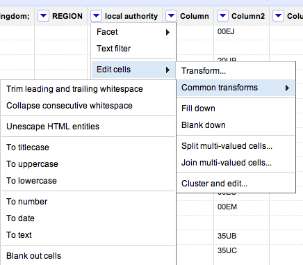
First, create a new column:

Now do the merge, using the cell.cross GREL (Google Refine Expression Language) command. Trivially, and pinching wholesale from the documentation example, we might use the following command to bring in Average Teaching Score data from the second project into the first:

cell.cross("Merge Test B", "HESA code").cells["Average Teaching Score"].value[0]

Note that there is a null entry and an error entry. It’s possible to add a bit of logic to tidy things up a little:

if (value!='null',cell.cross("Merge Test B", "HESA code").cells["Average Teaching Score"].value[0],'')

Here’s the result:

Coping with not quite matching key columns

Another situation that often arises is that you have two columns that almost but don’t quite match. For example, this dataset has a different name representation that the above datasets (Merge Test C):

There are several text processing tools that we can use to try to help us match columns that differ in well-structured ways:

In the above case, where am I creating a new column based on the contents of the Institution column in Merge Test C, I’m using a couple of string processing tricks… The GREL expression may look complicated, but if you build it up in a stepwise fashion it makes more sense.

For example, the command replace(value,"this", "that") will replace occurrences of “this” in the string defined by value with “that”. If we replace “this” with an empty string (” (two single quotes next to each other) or “” (two double quotes next to each other)), we delete it from value: replace(value,"this", "")

The result of this operation can be embedded in another replace statement: replace(replace(value,"this", "that"),"that","the other"). In this case, the first replace will replace occurrences of “this” with “that”; the result of this operation is passed to the second (outer) replace function, which replaces “that” with “the other”). Try building up the expression in realtime, and see what happens. First use:
toLowercase(value)
(what happens?); then:
replace(toLowercase(value),'the','')
and then:
replace(replace(toLowercase(value),'the',''),'of','')

The fingerprint() function then separates out the individual words that are left, orders them, and returns the result (more detail). Can you see how this might be used to transform a column that originally contains “The University of Aberdeen” to “aberdeen university”, which might be a key in another project dataset?

When trying to reconcile data across two different datasets, you may find you need to try to minimise the distance between almost common key columns by creating new columns in each dataset using the above sorts of technique.

Be careful not to create false positive matches though; and also be mindful that not everything will necessarily match up (you may get empty cells when using cell.cross; (to mitigate this, filter rows using a crossed column to find ones where there was no match and see if you can correct them by hand). Even if you don’t completely successful cross data from one project to another, you might manage to automate the crossing of most of the rows, minimising the amount of hand crafted copying you might have to do to tidy up the real odds and ends…

So for example, here’s what I ended up using to create a “Pure key” column in Merge Test C:
fingerprint(replace(replace(replace(toLowercase(value),'the',''),'of',''),'university',''))

And in Merge Test A I create a “Complementary Key” column from the University column using fingerprint(value)

From the Complementary Key column in Merge Test A we call out to Merge Test C: cell.cross("Merge Test C", "Pure key").cells["UCAS ID"].value[0]

Obviously, this approach is far from ideal (and there may be more “correct” and/or efficient ways of doing this!) and the process described above is admittedly rather clunky, but it does start to reveal some of what’s involved in trying to bring data across to one Google Refine project from another using columns that don’t quite match in the original dataset, although they do (nominally) refer to the same thing, and does provide a useful introductory exercise to some of the really quite powerful text processing commands in Google Refine …